elander_ said:
Looking falloutish means following a similar style independently of the artist personal style, which any good artist should be able to adapt to the Fallout theme. This is obviously something a Fallout 3 game needs to have.
Unfortunately I don't see a similarity beyond some basic aspects of critters we know. I consider this a matter of style. I've seen different cartoonists, for instance, draw the same characters in their own style, and that isn't a difference in style we see here. The Robobrain is probably the only piece I'd recognize if I didn't know this was Fallout (3) concept art.
However, I'll say this about style: Fallout's creatures tend to look somewhat comic-like, slightly goofy. In contrast, this concept art looks very rough and gritty, and fundamentally different.
I'm not the first to point out that the Super Mutants bear little resemblance to those of the original games, unless you consider "big, extremely muscular humanoids" a close match. The same goes for the beasts. Oh, is that a rad scorpion? I wouldn't recognize it, I merely assume so because it IS Fallout 3 concept art. I mean, it's a big scorpion. There isn't much you can get wrong there, but the artist sure gave it a good try. Hey, he mentions using discarded concepts in other projects, so maybe that's a demon scorpion he originally drew for a different game.
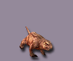
The Deathclaw is particularly galling to me. Oh, it hits the basic notes, but to me it looks far too much like the Devil. By that, I don't mean fearsome. I mean I can almost see a goatee there. The shape of the face is completely different from the original Deathclaw. Then there's of course all those spikes and pointy bits. Hey, it's a demon! Yay!
As for the Brahmin, I'll simply say I don't like the style. Brahmin in Fallout always rather pleasant, goofy creatures. There was nothing revolting about them. Now look at the new concept art. Oh my deity, it looks like a ghoul cow. Disgusting.
Look, you can say you like that style. But Falloutish it isn't. It evokes a completely different feel than Fallout.
tunguska said:
Actually those robots look pretty good. They show some imagination. I doubt they will make it into the game though. If Zenimax managed to hire some competent artists surely it was only by accident.
What do you find especially imaginative? The Robobrain, the one that looks like a simplified Mr. Handy, or the two humanoids? Oh no, it's, the Sputnikbot, right? Yeah, super imaginative. I award one point for Sputnikbot, and minus two points for the unoriginal humanoids and something that looks like Mr. Handy with less details.
The clothes, robots and items are the "best" in terms of being "fallouty" as far as I am concerned. I don't have a problem with the jump suits in the concept art, but they look more loose in the game, don't they?
Unfortunately I can only categorize this concept art into the parts that don't completely miss the mark and hose that do. I'm not endeared by any of it.


![Glory to Codexia! [2012] Codex 2012](/forums/smiles/campaign_tags/campaign_slushfund2012.png)


