Putting the 'role' back in role-playing games since 2002.
Donate to Codex
Good Old Games
  • Welcome to rpgcodex.net, a site dedicated to discussing computer based role-playing games in a free and open fashion. We're less strict than other forums, but please refer to the rules.

    "This message is awaiting moderator approval": All new users must pass through our moderation queue before they will be able to post normally. Until your account has "passed" your posts will only be visible to yourself (and moderators) until they are approved. Give us a week to get around to approving / deleting / ignoring your mundane opinion on crap before hassling us about it. Once you have passed the moderation period (think of it as a test), you will be able to post normally, just like all the other retards.

KickStarter Phoenix Point - the new game from X-COM creator Julian Gollop

PanteraNera

Arcane
Joined
Nov 7, 2014
Messages
1,059
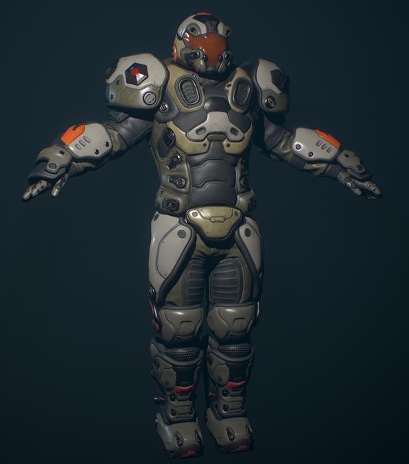
So with Phoenix Project the theme seems to be "sports".
The heavies shoulder pads certainly look like it incorporates a football.
playing-football-500x500.jpg

Mission accomplished, a great success :D .
 

CthuluIsSpy

Arcane
Joined
Dec 26, 2014
Messages
8,692
Location
On the internet, writing shit posts.
When the shoulder-pads are so big they block your aim.
But he fires from the hip :P

Looks like he bends back and raise the shoulder in front of his face.

Actually not sure what he is doing in that animation when I think about it.

Maybe its a reload animation? He does appear to be pulling that lever thing in the front. Maybe that cycles a new projectile into the chamber? It looks more like a grenade launcher than a machine gun.
 

PanteraNera

Arcane
Joined
Nov 7, 2014
Messages
1,059
Another shot of the Heavy from discord:
a56b85c4dc2f2d2685a78a09af82d65c-png.jpg


Maybe its a reload animation? He does appear to be pulling that lever thing in the front. Maybe that cycles a new projectile into the chamber? It looks more like a grenade launcher than a machine gun.

It actually is a grenade launcher :)
Or maybe it is a animation related to an weapon specific skill.
 

PanteraNera

Arcane
Joined
Nov 7, 2014
Messages
1,059
To be honest, I agree that the shoulder pad thing needs to die. I've hated it at least since World of Warcraft.
Well I do think it is hard to do a good silhouette that is easily read-able and for that matter distinguishable from top-down / iso-view while not looking silly up close.
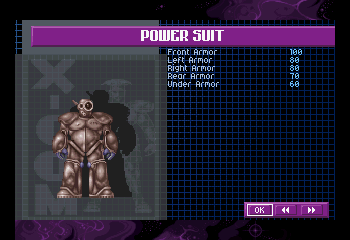
On the other hand shoulder-pads have quite a tradition in X-Com:

maxresdefault.jpg

PersonalArmour.gif

images

PLAYSTATION--XCOM%20UFO%20Defense%20_Nov30%201_47_01.png
 
Last edited:

PanteraNera

Arcane
Joined
Nov 7, 2014
Messages
1,059
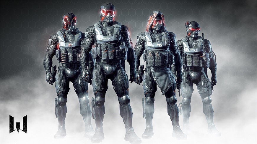
Futuristic armor must have shoulderpads or you will be shot. Think it's a law.
Crysis-guys beg to differ:
572bf54e7e25f1968b5d93470b805714246040c4.jpg

Fortunately the only image we saw since fig showing Synedrion showed that it was going to be Crysis-like. So there is hope that at least one faction might be shoulder-pad-free :P .

Also the head on the left building in this concept really remind me of Fallout 1:
Disciples_of_Anu_Concep_Art_4.jpg

But could be just me :)
 

Grotesque

±¼ ¯\_(ツ)_/¯
Patron
Vatnik
Joined
Apr 16, 2012
Messages
9,398
Divinity: Original Sin Divinity: Original Sin 2


The first time I saw the still image I really thought it's another of Shog-goth photoshopped image for another round of laughs.
That soldier looks like a 3 year old's cheap plastic toy.
Well, if Gollop likes it, it's law and everybody must... gobble it up! :)


Same.

Man, I was so excited about this game for a while. Recently, with each update I want to play it less and less.
The-more-real-you-get-the-more-unreal-the-world-gets-_--id4248-1.jpg
 

Mustawd

Guest
The first time I saw the still image I really thought it's another of Shog-goth photoshopped image for another round of laughs.
That soldier looks like a 3 year old's cheap plastic toy.

I thought it was a joke at first. Ugh.

The only hope I have is that modders will fix the look. Please god modders...fix the look.
 

warci

Educated
Joined
Mar 6, 2018
Messages
82
It's not about the shoulder pads per se, it's the mindblowing 'muricah blandness of design that hurts my brain. Even looking at the low-res original, you've got a bunch of dudes in purple spandex suits evolving to some kind of cosplay fail thing built from cardboard boxes and empty bottles (the power suit). It looks like it was barely past the prototype stage but immediately rushed to the frontlines. the art tells a story here.
the nu-art just smells like the game is probably in the unity engine.
 

PanteraNera

Arcane
Joined
Nov 7, 2014
Messages
1,059
It's not about the shoulder pads per se, it's the mindblowing 'muricah blandness of design that hurts my brain. Even looking at the low-res original, you've got a bunch of dudes in purple spandex suits evolving to some kind of cosplay fail thing built from cardboard boxes and empty bottles (the power suit). It looks like it was barely past the prototype stage but immediately rushed to the frontlines. the art tells a story here.
the nu-art just smells like the game is probably in the unity engine.
Different art style.
Well, you guys should know me by now.
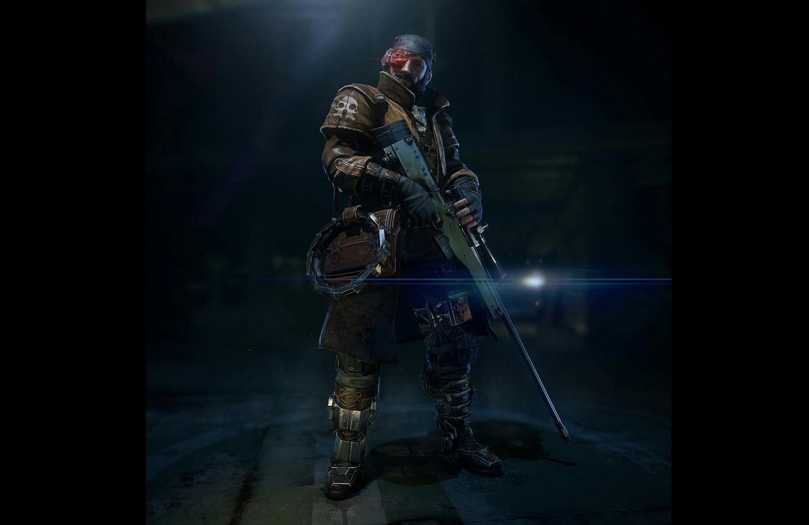
I certainly liked the initial pitch a lot more. For example the New Jericho faction, that looked post-apocalyptic but not silly like Fallout 3&4 raiders, it had seriousness and grittiness. By the concept you could tell that they have to use what they can get their hands on. Don't get me started at the "Thing-like" alien creatures. Or regarding the current topic the Phoenix Project soldiers. Or the other factions.

While I still am very unhappy with the direction the game is heading to, visually, I am actually quite positive about the game as I really have a blast with Backer Build 3.
As my codex preview takes some more time, just some quick words: this game is in a sea of 2AP clones a glimm of hope, as it does use a TU system that lets you do a lot of stuff, just like in the original. It does not go all the way, it introduce some new game mechanics and it is visually very similar to Firaxis XCOM, but the gameplay is fun!
Currently I am having 8 PP bases, with 6 aircraft all of them with up to 8 soldiers. I cover most of the world, can do missions were they pop up, and they do pop up not "artificially" (scripted) but "organically" as the alien thread tries to expand. While there are still a lot of features missing, the combination of the current GeoScape and BattleScape are enough for me to make this game highly enjoyable even so far as stating: "Phoenix Point might become the true X-Com successor after all".

As UnstableVoltage said several times, yes they want to make this a financial success. I can life with them changing the art-style to be more appealing to the NuXCOM-Players, because if they are successful this might be a chance that other developers will also make more complex games as well.

Still I am with anyone that says, that pretty much everything looked better as in more distinct, grimm, horrifying, interesting, "realistic" in the original pitch.
 

Galdred

Studio Draconis
Patron
Developer
Joined
May 6, 2011
Messages
4,496
Location
Middle Empire
Steve gets a Kidney but I don't even get a tag.
I'd call it a minor gripe, too, but you can't really deny that there's a certain difference between a Space Marine tank like that and a guy in military outfit... with football shoulder pads.
yes, the guy with football shoulder pads can still raise his arms!

Another shot of the Heavy from discord:
a56b85c4dc2f2d2685a78a09af82d65c-png.jpg


Maybe its a reload animation? He does appear to be pulling that lever thing in the front. Maybe that cycles a new projectile into the chamber? It looks more like a grenade launcher than a machine gun.

It actually is a grenade launcher :)
Or maybe it is a animation related to an weapon specific skill.

Ok, this one probably can't either...

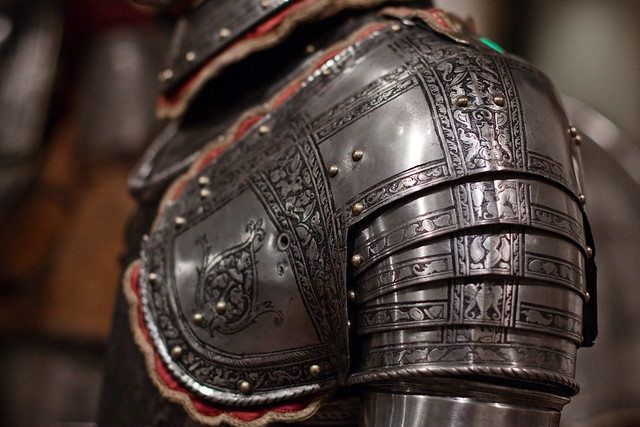
Now look at how the problem was solved centuries ago, by having articulation on the pauldrons:

5059944507_717b9d99a2_z.jpg


34h8jyf.jpg
 
Last edited:

Taka-Haradin puolipeikko

Filthy Kalinite
Patron
Joined
Apr 24, 2015
Messages
20,709
Codex 2016 - The Age of Grimoire Make the Codex Great Again! Grab the Codex by the pussy Bubbles In Memoria
To be honest, I agree that the shoulder pad thing needs to die. I've hated it at least since World of Warcraft.
Well I do think it is hard to do a good silhouette that is easily read-able and for that matter distinguishable from top-down / iso-view while not looking silly up close.
On the other hand shoulder-pads have quite a tradition in X-Com:

maxresdefault.jpg

PersonalArmour.gif

images

PLAYSTATION--XCOM%20UFO%20Defense%20_Nov30%201_47_01.png
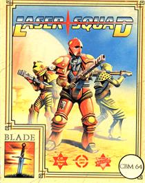
Pads have been in Gollop's games longer than that.
Thumb_Laser_Squad_-_1988_-_Blade_Software.jpg

8019a6208a76c4552142c4937a1e66c1.gif

Its one of those cases where concept that look good in pixels turns horrible when presented in more "realistic" fashion.
 

As an Amazon Associate, rpgcodex.net earns from qualifying purchases.
Back
Top Bottom