- Joined
- Jan 28, 2011
- Messages
- 100,694


More on the inventory from Will: https://www.othersideentertainment.com/forum/index.php?topic=1172.msg18776#msg18776
That's kewl! I love it!
Dragging items into the world is one of my fav parts of Arx Fatalis. I might stray towards that one.
As for my screenshot...
Also, please IGNORE that 'collectibles' window in my screenshot. The collectibles was really just for something to do in our early prototypes (since we didn't have a fully functional inventory yet).
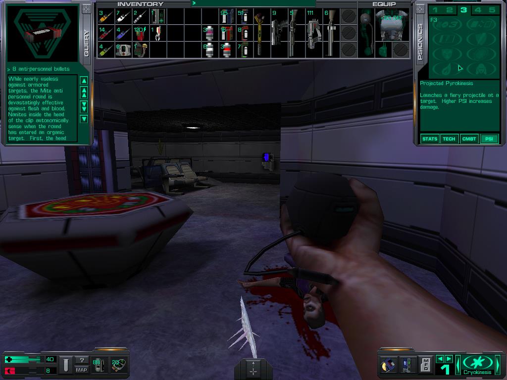
System shock was definitely an inspiration for the current layout. And yes, I'm curious what people think because moving stuff around isn't that big of deal.
Like system shock, the simulation doesn't stop just because you are looking at your inventory, so keeping a lot of open space is good.
The 3d preview is a nice thing I added because it didn't take long. As for the paper doll (where you see your dude) I'm on the fence about keeping it.
As much as I'd love to innovate on inventory, we might not do anything too crazy for inventory. I'd rather we spend our 'innovation' points on active gameplay.
I only spent a day on this inventory UI, when I jump back into it I'll improve the layout.
We're not doing a tetris layout (items that take up more than 1 block), but holy crap it would be cool to do something like that resident evil picture that CyberP linked to.
Also, looking at that picture, it looks like that breifcase is 8 feet wide!!! lol!!!
When it comes to the map, I really want to do something like ARK. Which is actually really easy to do in this engine. What do you guys think about having a map like that?
System Shock 2:

Resident evil 4:

ARK (Map):


![Have Many Potato [2013] Codex 2013](/forums/smiles/campaign_tags/campaign_potato2013.png)
![The Year of Incline [2014] Codex 2014](/forums/smiles/campaign_tags/campaign_incline2014.png)


![Glory to Codexia! [2012] Codex 2012](/forums/smiles/campaign_tags/campaign_slushfund2012.png)


