- Joined
- Jun 18, 2002
- Messages
- 28,547
Game looks cartoony and shit.
And this skeletons let the game look cartoony and shit. If they pull off such thing in SS3 then LG 2.0 will not last long.The environments aren't bad, but those skellingtons look ridiculous. I wonder if they yell 'I'M BIG BONED!!' when attacking.


"There’s a ‘reality bug’ going around in TV, film, and games," says Wells, "where fantasy has become inundated by gritty photo-realism. With Underworld Ascendant, I want to bring back more whimsy and less brooding."
"I asked myself, ‘What if the world bore the authorship of a tabletop game?'" Wells says on the look’s stylistic origins. "Think of the old lead figures and miniature play fields… Everything appears hand-crafted, as if sculpted by an artist, with a genuine sense of levity and naiveté to the art."
"The authored look is a unique counterpart to Underworld Ascendant’s Improvisation Engine," says OtherSide creative director and founder Paul Neurath. "It’s a look that invites the player to interact and explore with the world in a more tangible way."
"This will be an Underworld for the 21st century," notes OtherSide Austin studio director Warren Spector, who worked with Neurath on the original Ultima Underworld and System Shock games. "It’s a modern continuation of Looking Glass’ design tenets, where players are empowered to tell their own stories."

"I asked myself, ‘What if the World of Warcraft bore the authorship of a tabletop game?'" Wells says on the look’s stylistic origins. "Think of the old lead figures and miniature play fields… Everything appears hand-crafted, as if sculpted by an artist, with a genuine sense of levity and naiveté to the art."


"I asked myself, ‘What if the World of Warcraft bore the authorship of a tabletop game?'" Wells says on the look’s stylistic origins. "Think of the old lead figures and miniature play fields… Everything appears hand-crafted, as if sculpted by an artist, with a genuine sense of levity and naiveté to the art."
The problem may be that they seem to be going for modern fantasy art as seen in tabletop game rulebooks (and D&D in particular), which tends to be oversaturated, DeviantART-tier amateur stuff, rather than for the good ol' fantasy art from the late 1980s and 1990s.
Nate Wells said:"The artistic vision for Underworld Ascendant is born out of my feelings about the state of fantasy in the world. Not just in games but in film, television and books. Recently fantasy has crossed over into the mainstream with Game of Thrones and the Tolkien movies. One of the things that I really feel is fantasy used to be fun, and now it is gritty, brooding and loaded with political allegory. For me I just have the amazing memories of pen and paper gaming back in the early 80's and how much fun it was and what a sense of humor it had about itself and I feel that fantasy has lost its self-awareness and its sense of humor. That was my jumping off point for the art direction for Underworld Ascendant.
So I went back and dug out my dusty old Dungeon and Dragons books from my parent's home and started thumbing through them. I asked myself what was it that I loved so much about that era in fantasy? What I found really was there was a sense of levity, and this naivete to the art, because a lot of that early art was not done by professionals it was done by game designers that could 'kinda' draw. So when you go back to those early 1st edition books you think 'wow I can't believe that this piece of art actually made it into a book'. These days we have these amazing professional artists and they choose to use their skills to do fantasy and science fiction which is fantastic, but everyone is getting so deadly serious about it. They want all their fantasy to look...real and feel real. My feeling is most games in the fantasy realm lately have caught this reality bug also. It seems that most groups are about trying to bring fantasy to absolute realism with real trees, and real grass and time of day and all that stuff. I think chasing photo-realism in fantasy isn't the answer. I think to recapture a retro sense of fantasy, fantasy the way our inner child remembers it. We didn't have Game of Thrones or Lord of the Rings telling us what a castle looked like or what a giant two-headed zombie looked and acted like.
So for Ascendant, what if the world bore the Authorship of a tabletop game? Think of the old lead figures, the miniature play fields and what if Ascendant used that philosophy of everything being hand crafted and looking hand crafted? Natural, man-made...all of it. All of it looks like it was sculpted by an artist. That and bringing back some of the levity to the fantasy. We don't have to be so deadly serious and bleak. A little more whimsy, and a little less brooding. "
Actually, they've explicitly said the art is inspired by the old stuff.
I don't think it looks much like WoW. It's some kind of stylized, but not that style.


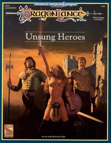
AD&D art is from the late 80s and 90s. Take a look at really early 1st ed stuff, it can get pretty silly-looking. Actually, you probably wouldn't like it.

AD&D art is from the late 80s and 90s. Take a look at really early 1st ed stuff, it can get pretty silly-looking. Actually, you probably wouldn't like it.
AD&D art is from the late 80s and 90s. Take a look at really early 1st ed stuff, it can get pretty silly-looking. Actually, you probably wouldn't like it.
It doesn't look good or even nostalgic
(to anyone below age 40)
UnderTorchlight
Nothing more to see here...move along....
Actually, they've explicitly said the art is inspired by the old stuff. Here, from November: https://www.underworldascendant.com/news/1123_update.php
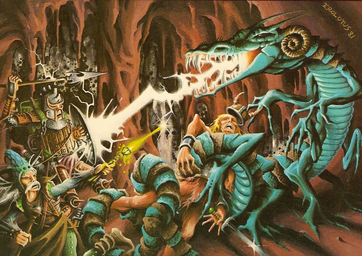
If they were determined to base their art-style on the early AD&D era, they should have chosen Erol Otus for inspiration rather than people who could "kinda draw".Nate Wells said:What I found really was there was a sense of levity, and this naivete to the art, because a lot of that early art was not done by professionals it was done by game designers that could 'kinda' draw. So when you go back to those early 1st edition books you think 'wow I can't believe that this piece of art actually made it into a book'.


