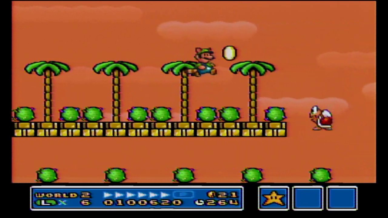
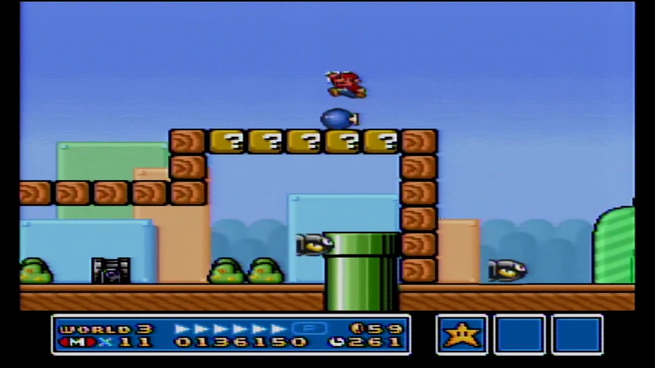
For what it's worth, that is the All Stars version. They tried to bring it up to parity with World. It has more visual noise and color saturation, but I don't think these are improvements. Look at that garish melon sky, like Liberace was the art director. I prefer the austerity and cleanliness of the original. More is not always better. Plus there are changes in style/concept I don't agree with, for example:
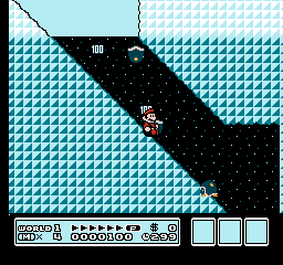
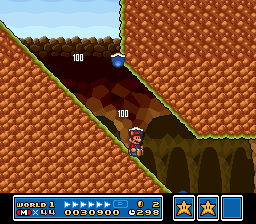
Two different vibes here. Often (in fact, most of the time) when game developers remake a game, they go for the most obvious, literal re-imagining of the visuals. "It's underground therefore we have to make it look more undergroundy caverny." From the surreal to the prosaic, and who wants prosaic Mario? It's like having Mario run around a normal human cit- huh, what's that?....
World I don't have an issue with because it had its style out of the gate and it looks better than All Stars 3 anyway imo. But I never cared for Nintendo's color or design sense from SNES on, Yoshi's Island and Super Metroid being the exceptions, and not counting DKC because Rare.


