Pathfinder: Kingmaker Kickstarter Update #17: Character Screen Preview
Pathfinder: Kingmaker Kickstarter Update #17: Character Screen Preview
Game News - posted by Infinitron on Tue 27 June 2017, 22:51:13
Tags: Owlcat Games; Pathfinder: KingmakerIn today's Pathfinder: Kingmaker Kickstarter update, Owlcat give us a look at their plans for the character screen UI. For this element of the game, they've chosen an approach that's quite different from Pillars of Eternity. It's expansive and stylized rather than compact, with five tabs to hold all of the information. The most interesting of these is the "Class" tab, which aims to display a kind of timeline of all of a character's past and future development options to help players plan their builds. Here is Owlcat's description of the tabs, along with a couple of concept images that demonstrate their aesthetic.
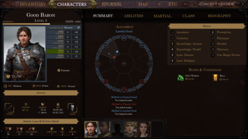
Let's start our tour with the first tab, one that contains general information about the character. The Central part of this screen shows alignment (and we follow the alignment system from the Core Rulebook, as you can see). All the decisions that changed the main character's alignment lead to the line appearing in the circle, showing consequences and shifts in alignment. A log below the circle provides additional information and reminds you of the decisions you've made on your journey. Computer RPGs are all about decisions, it is a pillar for this genre, and it deserves representation at the center of the screen of your character.
Our companions are far less flexible in their alignment, they follow it, and only rare events can force them to evaluate (and probably change) their views. Because of that, we felt that it will be inappropriate to use the same amount of space to depict alignment for them. Their central block is all about their personal quest, the journey they have in the Stolen Lands. You can see important events and decisions they made as well as their next goal.
The second screen is all about abilities of the character, class features as well as feats - basically an encyclopedia of the character's capabilities. Take note of the left-most block of information; it does not change between most of the tabs and contains information that is frequently needed or relevant to other tabs (like Stats, Experience or Level). This is also a concept screen for the Abilities tab and does not represent build of any character or abilities and feats that are existing in the game.
The third screen provides information on the martial prowess of the character, to hit rolls, different kinds of AC, damage from attacks... As you can see, there is no magic counterpart of this screen, and that is on purpose. We discussed this a lot and decided that it will be more convenient to see that information on the special tab on the screen dedicated to selecting spells and meta-magic. So there is a dedicated tab in the spellbook (or book of prayers for divine casters) devoted to the stats and values important for magic-users.
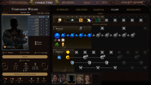
The fourth screen is the most difficult one to develop, as we want to showcase all of the possibilities for character development, those that were already selected as well as those that are far in the future. We want the player to be able to plan the character in detail. In fact, we are hoping to introduce a feature, that will allow leveling up a character with a single-click, if all of the abilities were selected in advance. We spent a lot of time putting all of the information on just one screen and organizing it in such way that does not make your head explode just from looking at it.
So we came to this screen as a result of that search. It is simple enough if a character has just one class while still showing elements of the development both in the past and in the future. In case of multiclassing (especially if there are 3 or more classes), the screen becomes more complicated, but still convenient, as it shows most of the directions in which such a character could be developed. Please note that what you see below is a concept of the screen, not a screenshot from the game and can have some inconsistencies.
The last screen is devoid of game mechanical information; it is all about the story of the character: biography, alignment, personal quest and of course full body portrait.
Owlcat are at their most authentic when talking about this kind of nuts & bolts RPG design. You may also be interested in Sunday's update about the system they've developed for creating spells and spell effects.


Let's start our tour with the first tab, one that contains general information about the character. The Central part of this screen shows alignment (and we follow the alignment system from the Core Rulebook, as you can see). All the decisions that changed the main character's alignment lead to the line appearing in the circle, showing consequences and shifts in alignment. A log below the circle provides additional information and reminds you of the decisions you've made on your journey. Computer RPGs are all about decisions, it is a pillar for this genre, and it deserves representation at the center of the screen of your character.
Our companions are far less flexible in their alignment, they follow it, and only rare events can force them to evaluate (and probably change) their views. Because of that, we felt that it will be inappropriate to use the same amount of space to depict alignment for them. Their central block is all about their personal quest, the journey they have in the Stolen Lands. You can see important events and decisions they made as well as their next goal.
The second screen is all about abilities of the character, class features as well as feats - basically an encyclopedia of the character's capabilities. Take note of the left-most block of information; it does not change between most of the tabs and contains information that is frequently needed or relevant to other tabs (like Stats, Experience or Level). This is also a concept screen for the Abilities tab and does not represent build of any character or abilities and feats that are existing in the game.
The third screen provides information on the martial prowess of the character, to hit rolls, different kinds of AC, damage from attacks... As you can see, there is no magic counterpart of this screen, and that is on purpose. We discussed this a lot and decided that it will be more convenient to see that information on the special tab on the screen dedicated to selecting spells and meta-magic. So there is a dedicated tab in the spellbook (or book of prayers for divine casters) devoted to the stats and values important for magic-users.
The fourth screen is the most difficult one to develop, as we want to showcase all of the possibilities for character development, those that were already selected as well as those that are far in the future. We want the player to be able to plan the character in detail. In fact, we are hoping to introduce a feature, that will allow leveling up a character with a single-click, if all of the abilities were selected in advance. We spent a lot of time putting all of the information on just one screen and organizing it in such way that does not make your head explode just from looking at it.
So we came to this screen as a result of that search. It is simple enough if a character has just one class while still showing elements of the development both in the past and in the future. In case of multiclassing (especially if there are 3 or more classes), the screen becomes more complicated, but still convenient, as it shows most of the directions in which such a character could be developed. Please note that what you see below is a concept of the screen, not a screenshot from the game and can have some inconsistencies.
The last screen is devoid of game mechanical information; it is all about the story of the character: biography, alignment, personal quest and of course full body portrait.
There are 30 comments on Pathfinder: Kingmaker Kickstarter Update #17: Character Screen Preview


