Wasteland 2 Kickstarter Update #43: New UI, Grid Inventory!
Wasteland 2 Kickstarter Update #43: New UI, Grid Inventory!
Game News - posted by Infinitron on Sat 1 February 2014, 00:51:45
Tags: Chris Keenan; inXile Entertainment; Michael A. Stackpole; Nathan Long; Wasteland 2The latest Wasteland 2 Kickstarter update contains a small progress report on the game's ongoing development:

As an extra treat, Stephen Blackmoore's novella has been released, and should show up in the folder of the game's Early Access release within 24 hours, as well as at Ranger Center. Furthermore, the folks at inXile have apparently coaxed Michael Stackpole into returning to finish his job - he'll be working with Nathan Long, and together they will release two novellas. Nice.
Development at this point is going faster than ever! Now that we have all of our tools in a great place, we’re spending most of our time making the experience better. You might have noticed that we haven’t updated the beta code in a while and there is a good reason for that. The next update contains some major upgrades almost across the board. We’ve made some huge leaps in optimization and reducing our memory footprint. With your help, we’ve killed over 200 bugs in this update and implemented some great reactivity and conversation suggestions that we received from the community. The inventory system has had an exciting overhaul (more on that later) and a new town (Prison) is being added. The Prison used to be Ranger Center until they took over the Guardian Citadel and made it their home. The OSX build has been in testing and we’re fixing some compatibility issues so there is a good chance it will be ready when the next code update is live. Linux has not been forgotten and will follow after OSX is released.
Because of the scope of the update it's taking a little longer than anticipated, we'll keep you posted on its status as we keep working on it. Last update we talked about offering a one-time chance to get into the early beta for only $10 to all our backers. The timing of this promotion will coincide with the update going out, so it is not yet available now. It will be a short run promotion so we’ll make sure to notify everyone in an update when it has started.
But the exciting part of the update is this:Because of the scope of the update it's taking a little longer than anticipated, we'll keep you posted on its status as we keep working on it. Last update we talked about offering a one-time chance to get into the early beta for only $10 to all our backers. The timing of this promotion will coincide with the update going out, so it is not yet available now. It will be a short run promotion so we’ll make sure to notify everyone in an update when it has started.
Inventory & Character Screen Upgrade


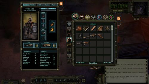
We’re extremely happy with how the new inventory is coming along. It greatly reduces the amount of unnecessary micromanagement and is much more visually appealing than the previous iteration. Instead of being list based, we were able to make it more icon based with unique icons for all items. The list style inventory works well for a game like WL2 with lots of items to collect, but lacks a bit of the soul that comes with an icon based inventory. There is something special about getting to see all the items you own in one spot. We had always hoped to go with an icon based system, but early in the project we were hesitant to commit to it due to the greatly increased art costs. We’re now at the point where we feel comfortable taking on the challenge and know it will make for a better experience.
The image above shows the new backpack. Long gone are the days of hitting the backpack button and having 4-7 packs pop open. By selecting the party member along the side, you can see the contents of their pack. If you select the “All” button, it will show you the contents of all packs in one easy to read space. Hovering over an item in this mode will highlight the party member on the left to show whose bag it’s in. Drag it to the PC you want to have it and you’re good to go!
When you mouse over the item, you will get all stat and useful information displayed in a small pop-up. You also can further examine the items by double clicking to read the details and see any additional description information.
This grid-based inventory is not limited for space. You can manually keep it sorted yourself under the all items tab if you have your own system in mind, or have the game auto-sort it under one of the other tabs (which will not re-set your manual sorting).
At the same time, we’re also updating the character, attribute, skills and dossier screens. No longer will they be full screen but instead a more compact window, which gives us space to combine it with another screen. Additionally, dropping items in the world, adding them to hotkey bars, and trading becomes much easier when you can move this compact window around to the most convenient screen spot.
We’d love to hear your thoughts on the new inventory vs. the previous one. Please leave comments on our forums or in this Kickstarter update. It will be included in our next code update so those in the beta will go hands-on shortly!
Oh boy. I did not see that one coming. 

We’re extremely happy with how the new inventory is coming along. It greatly reduces the amount of unnecessary micromanagement and is much more visually appealing than the previous iteration. Instead of being list based, we were able to make it more icon based with unique icons for all items. The list style inventory works well for a game like WL2 with lots of items to collect, but lacks a bit of the soul that comes with an icon based inventory. There is something special about getting to see all the items you own in one spot. We had always hoped to go with an icon based system, but early in the project we were hesitant to commit to it due to the greatly increased art costs. We’re now at the point where we feel comfortable taking on the challenge and know it will make for a better experience.
The image above shows the new backpack. Long gone are the days of hitting the backpack button and having 4-7 packs pop open. By selecting the party member along the side, you can see the contents of their pack. If you select the “All” button, it will show you the contents of all packs in one easy to read space. Hovering over an item in this mode will highlight the party member on the left to show whose bag it’s in. Drag it to the PC you want to have it and you’re good to go!
When you mouse over the item, you will get all stat and useful information displayed in a small pop-up. You also can further examine the items by double clicking to read the details and see any additional description information.
This grid-based inventory is not limited for space. You can manually keep it sorted yourself under the all items tab if you have your own system in mind, or have the game auto-sort it under one of the other tabs (which will not re-set your manual sorting).
At the same time, we’re also updating the character, attribute, skills and dossier screens. No longer will they be full screen but instead a more compact window, which gives us space to combine it with another screen. Additionally, dropping items in the world, adding them to hotkey bars, and trading becomes much easier when you can move this compact window around to the most convenient screen spot.
We’d love to hear your thoughts on the new inventory vs. the previous one. Please leave comments on our forums or in this Kickstarter update. It will be included in our next code update so those in the beta will go hands-on shortly!

As an extra treat, Stephen Blackmoore's novella has been released, and should show up in the folder of the game's Early Access release within 24 hours, as well as at Ranger Center. Furthermore, the folks at inXile have apparently coaxed Michael Stackpole into returning to finish his job - he'll be working with Nathan Long, and together they will release two novellas. Nice.
There are 113 comments on Wasteland 2 Kickstarter Update #43: New UI, Grid Inventory!


