
MRY
Wormwood Studios

Conquest of Camelot.


none of you intended to play this shit anyway.
Although MRY makes a good point - it's quite common thing I noticed with remasters of classic pixel art. Higher visual fidelity is joined a the hip with a drop in artistic quality. The resulting picture just looks clearer but it doesn't look better.
Why are you guys bitching?

Right click, search image, 9/10 you get your answer.EDIT: Does anyone know what game this is from btw? Loom? Fuck it looks good. Reminds me that I need to get around to playing Loom one of these days.
It's probably unavoidable given that original artists had to painstakingly sweat over every pixel with limited color palette. When you give it to the new guy, even if he is excellent artist, he is not going to pour his soul into it and lose sleep over preserving every tiniest detail like a museum curator working of restoration of Mona Lisa.

You don't? But who will make our Krome Studios hate threadnone of you intended to play this shit anyway.
I did.
You don't? But who will make our Krome Studios hate threadnone of you intended to play this shit anyway.
I did.

It has to be profitable for a company to assign more than interns to develop it.So a game has to be profitable to be good now?
It has to be profitable for a company to assign more than interns to develop it.So a game has to be profitable to be good now?

Why are you guys bitching, none of you intended to play this shit anyway.
Although MRY makes a good point - it's quite common thing I noticed with remasters of classic pixel art. Higher visual fidelity is joined a the hip with a drop in artistic quality. The resulting picture just looks clearer but it doesn't look better.
Having the ranger cast a shadow is a bad call. It emphasizes that the scale is all wrong. Especially because there's already that circular "token shadow" beneath it, which makes the actual light-sourced shadow confusing as well.
[EDIT]
Also, I think even the enemy portraits run smack into Brian Moriarty's point re: the loom VGA upgrade.
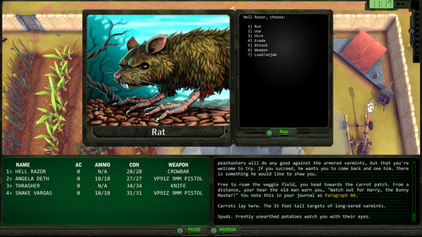
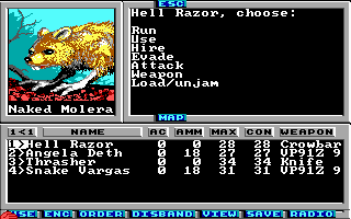
The paint-over is "faithful" in the sense that it is the same picture, only done at a higher resolution and with more colors. But everything about how the original is done is driven by the limited number of pixels and palette. (As with Loom EGA->VGA.) The illustration is a technically excellent piece of art under its original specs. The paint-over is not a technically excellent piece of art at its current specs -- it looks fairly amateurish, akin to the art in Hero-U. There's very little thought to light sourcing, for instance. But it's not just that the rendering is amateurish. As more details emerge, aspects of the original design stop working as well (including the composition, the orientation, etc.). Just as a cave painting might be particularly vivid in the flickering light of a torch, but rather unimpressive under neon floodlights, the original Wasteland works better under its original limitations. Another example of this is that the added textural detail on the ground and the plant make it very clear that this is basically an ordinary-scale rat. But these are actually "three foot tall black rats." The original pixel art is ambiguous -- the plant could be anything from a large weed to a stunted tree, and what you're seeing on the ground could be cracked earth or large rocks. But the rendered illustration seem to depict the plant as some kind vine (a grapevine?) and the ground as cracked earth. As a result, it's hard to read the rat as being three feet tall. (NB: The original wasteland also used this art for bunnies and opossums, which obviously is stretching the pixel ambiguity too far.)
I'll note also that the illustration actually is not that faithful. For instance, the original rat has missing patches of fur that are well-rendered in the original art (despite the trickiness of doing so with limited colors and pixels), but the redone rat is thickly furred. Further, the artist seems to have misread the rat's hands as chicken feet, or perhaps not referred back to actual rat hands, and the result is extremely odd -- the whole thing looks like a Hero-U meep:
$15? That's a big fuck NO!
I just don't see what its offering that the last shitty remaster didn't offer other than a few cutscenes. I'll by Terminator over this. Sure, T is a boomer game but better imho.
Its the post apoc-ness. Odd shit though, the game has some fallout 3-4 looking mechanics (lock picking, scavenging).


