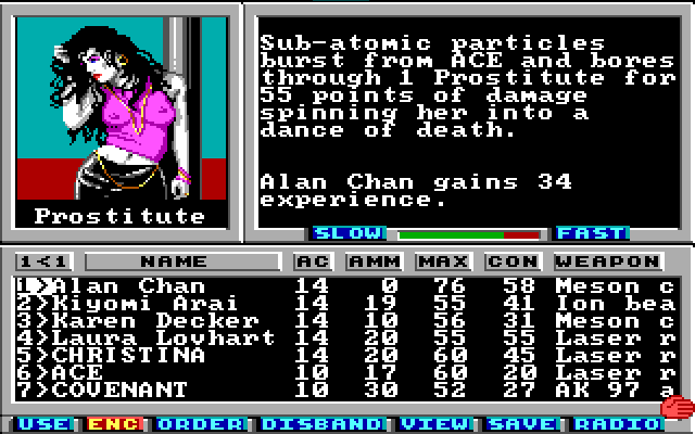
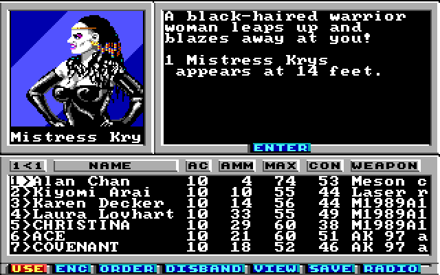
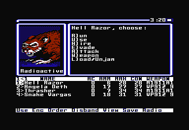
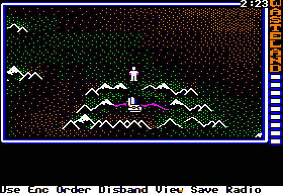
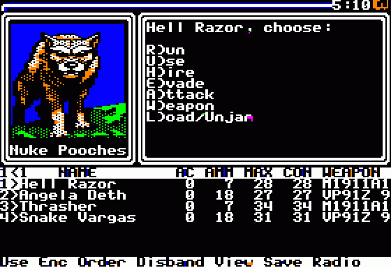
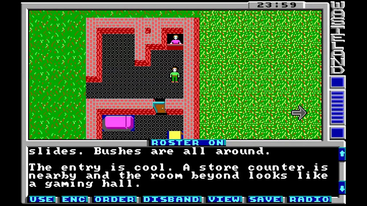
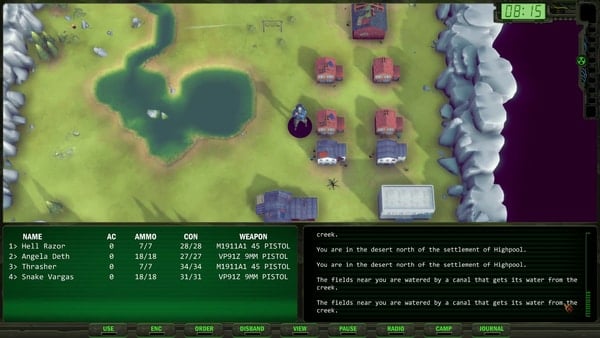
Also, it's not like the rat is the worst of the bunch, it was just the easiest for me to find the VGA art so that I could do a 1:1 comparison.
Here's another:
For some reason I can't embed this image, but here's the original:
So, a few things.
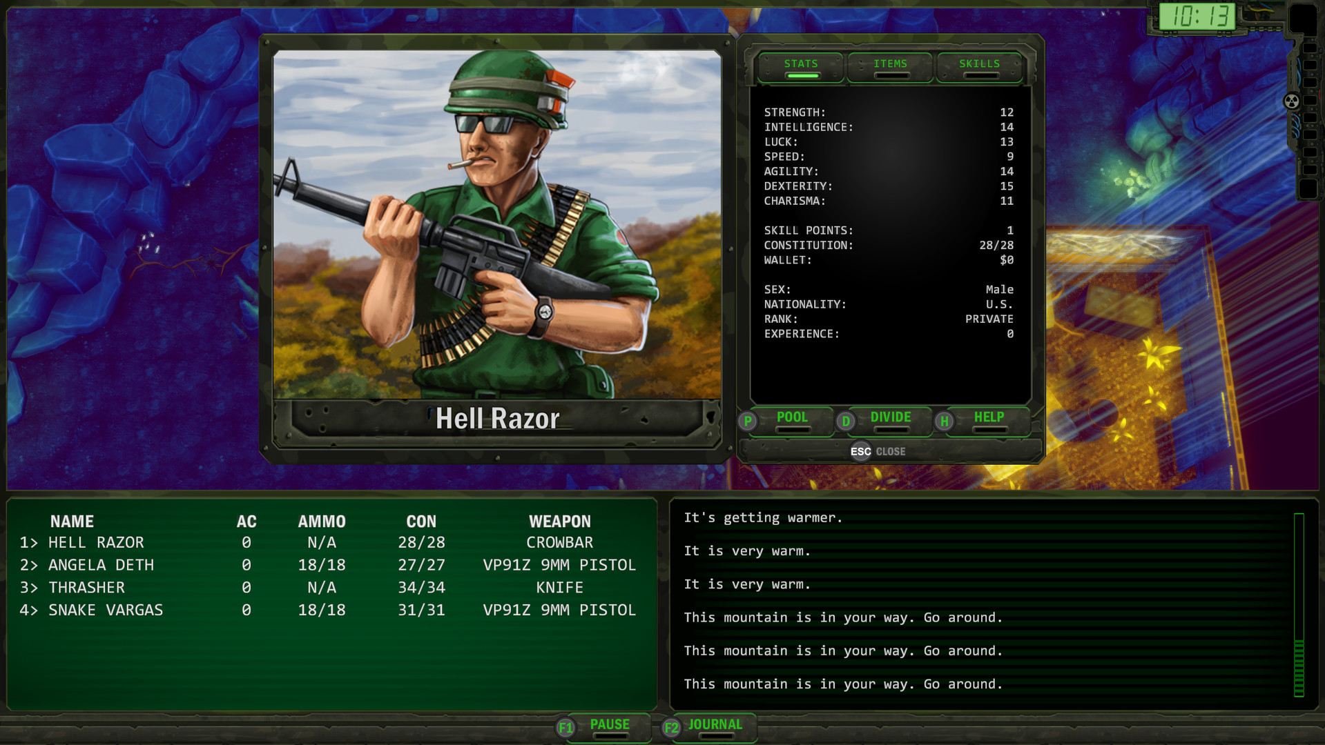
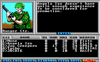
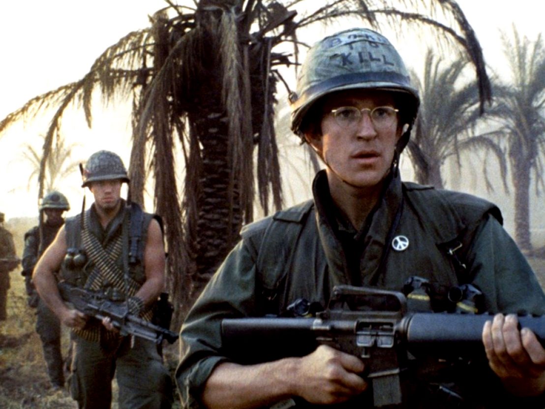
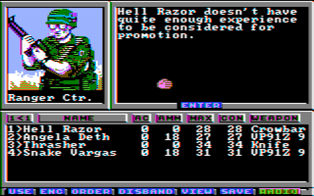
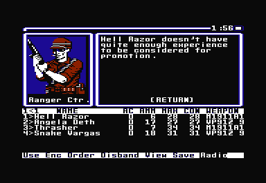
This one actually is *not* an overpaint. As you can see, the artist has changed the position of the gun, which in turn has changed the position of the ranger's arms. The direction the ranger is looking is also changed. I believe this is because the new illustration is not a perfect square, and the artist thought that have the gun pointed that way would be more realistic or dramatic, but the effect is generally for the worse. For instance, the ranger patch, which is a focal point of the original, is now replaced by the watch as the focal point. (FWIW, I actually read the "watch" as an identity bracelet in the original, but I guess it's probably a watch.) The canteen is also downgraded in prominence (possibly turned into a pouch of some kind). The original soldier looks quite heavily laden with gear, but the new one is missing the backpack altogether. The original's glasses actually read to me as regular glasses (not sunglasses); I took him to be a little dorky but still awesome, like so:

The new one also renders the brown material behind the ranger as a forest with fall foliage (I think?), which makes no sense whatsoever for the setting.
By changing the soldier's orientation, this also ceases to be a portrait of one of your guys at ease and looking at you (the player), and becomes a guy at the ready, looking at something off camera to the left, ready to fight.
On a technical level, the new soldier has no apparent light source (though the light source in the original is not great either). On his helmet the light is shining from above and to the left, but on his left (our right) shoulder, it's shining from above and to the right.


