Putting the 'role' back in role-playing games since 2002.
Donate to Codex
Good Old Games
  • Welcome to rpgcodex.net, a site dedicated to discussing computer based role-playing games in a free and open fashion. We're less strict than other forums, but please refer to the rules.

    "This message is awaiting moderator approval": All new users must pass through our moderation queue before they will be able to post normally. Until your account has "passed" your posts will only be visible to yourself (and moderators) until they are approved. Give us a week to get around to approving / deleting / ignoring your mundane opinion on crap before hassling us about it. Once you have passed the moderation period (think of it as a test), you will be able to post normally, just like all the other retards.

Development Info Project Eternity Kickstarter Update #34: First Art Update

Zed

Codex Staff
Patron
Staff Member
Joined
Oct 21, 2002
Messages
17,068
Codex USB, 2014
Tags: Obsidian Entertainment; Pillars of Eternity

Ohweeee! It's Tuesday (actually Wednesday where I am...) and that means we get another Project Eternity Tuesday Wednesday update!

Today's update comes from Art Director Rob Nesler, so it's about art. Duh. It covers both environmental art and character art. Nesler tried his best not to use bad words, and I think he did a fucking good job with it.

Often, when starting a project, the artists and I just want to start drawing sh-ssstuff. Especially with contracted 3D games, we have a basic idea of the world we’re making, an initial list of some of the things in it, the basic parameters for making assets, and so we just get started. With Project Eternity, we are starting the development of a rich storied RPG from scratch, zilch, nada. Oh, and we rendered that really cool image for you all at update #20, and so we felt we could take a step back--Waayyy back.
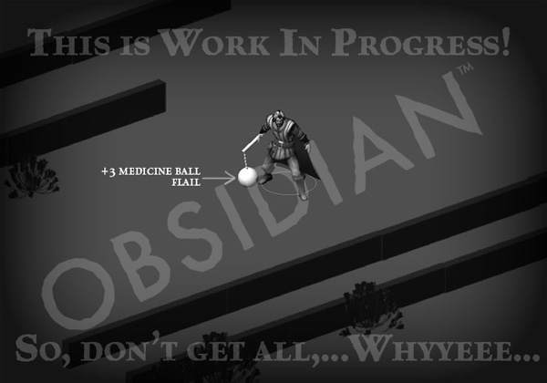
MedicineBallFlail.jpg


We are stepping back some years in visual “perspective”: to a fixed isometric view--so, NO “perspective”--of an essentially two-dimensional world. The traversable environment is pre-rendered to a high degree of realism, but we’re using a modern 3D game engine: Unity, for 3D characters, creatures, effects and animated props to be rendered in real-time and to assemble it all together, seamlessly. With this decision we’ve opened up a whole kit and caboodle of possibilities in terms of visual fidelity, occlusion, lighting, effects, and physics. At the same time, we’ve created some immediate technical problems that needed to be solved, before we could all go out and start making sh...‘er...stuff.

DungeonLevelModel.jpg

It's a long update with many pretty pictures, so you'll want to have a look yourself.
 
Self-Ejected

Kosmonaut

Lost in Space
Joined
Jul 11, 2008
Messages
4,741
Location
CCCP
I liked this update, didn't mind the dumb humor. I kinda dig those WIP images, but the concept art is awful.

Nevermind. Overall I like what I'm seeing :obsidianfanboi:

AumauaWizard.jpg
 
Self-Ejected

Excidium

P. banal
Joined
Aug 14, 2009
Messages
13,696
Location
Third World
The character models are p. detailed for a top down game. Very nice.

They should also include that flail as a secret weapon in the final game. :M
 

Tigranes

Arcane
Joined
Jan 8, 2009
Messages
10,350
Terribly unfunny, but some nice pictures to look at. Not too fussed about judging the art style thus far, but wish that eventually they will show us a world that has enough twists on the high fantasy art style, and doesn't have the plasticky look of 3D games...
 

Shadenuat

Arcane
Joined
Dec 9, 2011
Messages
11,977
Location
Russia
All I see 's future dungeon I'd roam and loot
I'm happy man
Dum de dum du de dum
 

Jaesun

Fabulous Ex-Moderator
Patron
Joined
May 14, 2004
Messages
37,431
Location
Seattle, WA USA
MCA Dead State Divinity: Original Sin Project: Eternity Torment: Tides of Numenera Shadorwun: Hong Kong Divinity: Original Sin 2 BattleTech
Yeah I still am not liking the character concept art. But that is all it is. Hoping the actual portraits look awesome, like some of the wasteland 2 art has been so far. <3
 

Stinger

Arcane
Joined
Aug 13, 2011
Messages
1,366
I'm really liking how the character models look. Detailed enough for a top down view- and it's not like we'll ever zoom in any closer than that during cutscenes seeing as voice acting is pretty limited.

All the important features show up and it looks like it'd mesh reasonably well with the mock-up background art posted earlier.
 

FeelTheRads

Arcane
Joined
Apr 18, 2008
Messages
13,716
Goddamn, that concept art if awful.

And thankfully this update is written by an art director not a writer! Jesus fuck, talk about trying too hard.
 

jewboy

Arbiter
Joined
Mar 13, 2012
Messages
657
Location
Oumuamua
I liked the writing. I don't care how hard he 'tried'. I bet your favorite writer tries even harder. The real question is: does he succeed?
 

Apexeon

Arcane
Joined
Nov 10, 2012
Messages
864
Us artist get no love on the inside or the outside (the good old universal meh to 4 days of hard work :().
I should of got a real job like those wall street dudes who rake it in $$$$.
 

Hormalakh

Magister
Joined
Nov 27, 2012
Messages
1,503
Us artist get no love on the inside or the outside (the good old universal meh to 4 days of hard work :().
I should of got a real job like those wall street dudes who rake it in $$$$.


This is RPGcodex. A "meh" is the highest form of flattery you'll ever get. The artists should be honored.
 

Blasterhead

Educated
Joined
Nov 25, 2010
Messages
43
I've seen plenty of bad concept art, and this is not bad concept art. Actually, I think it's pretty good. The clothing is interesting and made with functionality in mind (plently of concept artists just add doo-dads all over and it's a mess). I usually despise tattoo/skin detail/whatever, but this has actually been done pretty tastefully.

Remains to be seen how they colour & render it (it's work in progress, so don't get all URRR), but I think it's working already.

I'll take this over glowy/over-the-top/typical fantasy designs any day. Hopefully they don't go glowy...
 

TwinkieGorilla

does a good job.
Patron
Joined
Oct 19, 2007
Messages
5,480
Serpent in the Staglands Divinity: Original Sin Torment: Tides of Numenera Wasteland 2 Shadorwun: Hong Kong Divinity: Original Sin 2 BattleTech Pathfinder: Wrath
Terribly unfunny, but some nice pictures to look at. Not too fussed about judging the art style thus far, but wish that eventually they will show us a world that has enough twists on the high fantasy art style, and doesn't have the plasticky look of 3D games...

Bro, you need to relax or you'll find your tires slit sooooon enough.
 

piydek

Cipher
Joined
Feb 13, 2006
Messages
819
Location
Croatia
...and doesn't have the plasticky look of 3D games...

Yeah, this is my only concern actually. All the images shown - both in concept art and in those 3D designs look very "round", tidy, neat, "friendly" even I'd say. And i don't really get the feeling of texture of materials. So yeah, it does feel kind of plasticky. Those two things I don't really like. The rest is good.
 

Ion Prothon II

Liturgist
Joined
Jan 10, 2012
Messages
1,011
Location
Ołobok Zdrój
We are stepping back some years in visual “perspective”: to a fixed isometric view--so, NO “perspective”--of an essentially two-dimensional world.

O... orthographic projection?
...
hxGTz.jpg


They can put there even a penisaurus together with furfags covered in vaseline and I don't care anymore.
Better don't fuck up your stuff this time, Obsidian, I'm watching you.
 

As an Amazon Associate, rpgcodex.net earns from qualifying purchases.
Back
Top Bottom