Mustawd
Guest
Ass of Gods is something you’d think about if you like to receive an....oh...I see...
Are you trolling me? Fine! I'll bite.
My old argument is that the name is suggestive: Ass of Gods... if they had done some sexy girl poster with name it would help with marketing. I mean, really help~ Or they could just change the name a bit.
They bobbed and weaved and basically avoid my argument and said something along the line the name was fine.


Google Translate said:Test: Ash of Gods: Redemption (Tactic RPG)
THE COPY SAGA
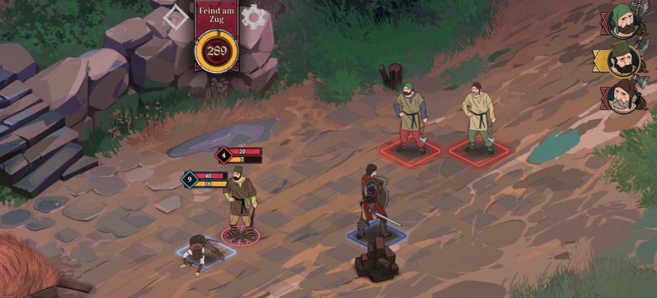
In May 2017, the Moscow developers of AurumDust on Steam asked for the green light for their tactical role-playing game Ash of Gods: Redemption . Even then, not only the art design, but also the targeted game mechanics reminded of The Banner Saga . Now the game has been released for just under 23 euros. Whether it's more than a brazen clone, we reveal in the test.
Good and bad copy
The world of games is known to live on mutual inspiration and fertilization. Especially successful titles usually attract many imitators - and that's a good thing. Because if you creatively expand the model with your own ideas, great games can come out of it. Already in the pioneer days, the excitement over Dungeon Master led to Ultima Underworld and without Dark Souls would be The Surge or Niohmaybe not created. One could keep the list going forever if one thinks of all the entertaining epigones of Diablo or Mario. But this positive eclecticism is immediately reversed into the negative, an uninspired imitation, when copying as bluntly as this Moscow studio.
Not only the art design, even the two heroes, father and daughter, follow the example of The Banner Saga: Rook and Alette send their regards.
Yes, the intro is dramatically successful and well animated. In these apocalyptic scenes, there is also something of a different approach. But even if you admit that this comic style reminiscent of some cartoon series of the 80s or Dragon's Lair belongs to anyone: The staged by the Unity Engine Ash of Gods imitated after the introduction, the complete style design of The Banner Saga in such a bold way that you immediately recognize the model not only in the depiction of the characters, clothing, landscape and travel, but also in that of the hero and even within the user interface and the tactic grid (!). If I did not know better, I would tap on a modification.
In any case, as a graphic designer at Stoic Studios, I would feel hurt in my artistic copyrights. Especially if you want to emulate a game mechanic, which is okay, you should definitely create the obvious, namely the visual, otherwise it will be an image! While decking Lords of the Fallen , Deck13 has largely mimicked Dark Souls, but at least re-created the art design as well as the hero.
Dreister plagiarism
But it does not stop at Artdesign yes with the theft of ideas, because even the initial situation is similar: Here, too, a father and his daughter is on the way - and both look like relatives of Rook and Alette from The Banner Saga, Are you crazy? The story around A mythical war of the gods is another, after all, it comes from the Russian fantasy author Sergey Malitsky, but the motive of the traveling companions in the sign of the Apocalypse is again identical. Even the description of the journey over the yellowed map on one side and the representation of the trek from the side is the same. It was one of the distinctive features of The Banner Saga that the perspective changed into this view. Later you can see more similarities in the amulets and equipment as well as the rise of the companions ...
Even the turn-based combat system with its dual principle (you can attack the life or energy of the opponent) was copied cheeky.
And storytelling? Following the same pattern: It is driven by many dialogues and text windows with decisions. Only with the big difference that the characters do not want to grow closer to one's heart, especially since the storytelling is either confused or the companions themselves are simply staid. Although the folklore that has suddenly become a reality with the eschatological "harvest" and the approach of the demonic "reaper" makes quite curious, also the direction comes quickly to the point, so that the danger to the country is noticeable. It is also interesting that magic amulets, so-called "Strixes", protect people from insanity - and you and your companions only have a limited supply. In addition, morality plays a role, which changes depending on decisions in dialogues. That's nice, but there were also those higher-level values that encourage the management of a collective? Exactly there.
The big problem of the story is also: The German translation is so sloppy, that one can not understand the meaning in too many places or a character in a conversation looks so clumsy, that epic flair dries up immediately! Especially if you want to tell so much, you should not allow such gross stylistic errors and phrases from the Google translator. So many interesting in the beginning figure is thus completely messed up.
Round tactics like a blueprint
Over time, the companions ascend and you can distribute skill points.
Maybe one would have been able to ignore this, if not so much text could be endured and there would be at least clear differences in game mechanics with new tactical ideas. But even the core of the game, the turn-based struggle between small groups, is staged almost identically - only much more opaque than in the original. Here, too, you fight in a checkerboard-like grid, where each character has two bars, as in The Banner Saga - one for life, another for the energy needed for special actions.
And of course one can target one or the other with his attacks, so that even the dual principle of the role model of Stoic Games becomes completely visible. Although I can tell before the blow how much damage I would do, but it comes too often to strange situations, also by side effects that make the tactics not so logical as in The Banner Saga. Especially since it is completely meaningless that special attacks the performer still take off life! This simply artificially increases the risk, because who dies once is lost forever - who does not like that, must follow the alternative story mode.
On the yellowed world map you can decide on a route.
The most obvious innovation is incidentally in the playable cards: These can be used instead of an action, for example to heal figures to increase the defensive or to strengthen attacks. At first you only have one hand full, but soon you can build a deck. However, this does not contribute much to the tactical entertainment, as this creates even more arbitrariness on the battlefields - I recommend you rather Wartile , the better this mixture. Or Regalia: Of Men and Monarchs , or Battle Brotherswho are creative within the fantasy tactics and follow their own paths. Here you even take over the deficits of The Banner Saga, such as the statics in the field, instead of upgrading the battles over height advantages, ground differences or destructible obstacles. And even if one ignored all the three copied things, at most a satisfactory score in the low range would have been possible.

How the fuck word ash is suggesting word ass?That is basically their position: We are too highbrow for that tactic, but we are too hardheaded to change the name once deciding.
The first part is fine, but in that case the second part make no sense.


If you had a lisp, maybe, dunno. But then such is the laclongquan school of marketing: sex sells.How the fuck word ash is suggesting word ass?That is basically their position: We are too highbrow for that tactic, but we are too hardheaded to change the name once deciding.
The first part is fine, but in that case the second part make no sense.


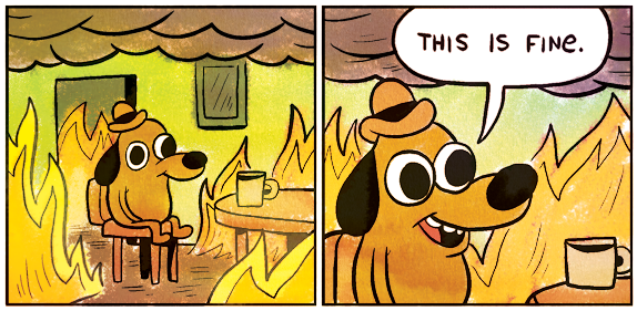


Who on Earth think an avatar of a computer game being an ugly man mug will sell?


Graphics - They are good. Probably the only good thing about this game. All females are drawn as sluts and even the older ones are dressed like edgy teenagers. I assume that the graphic artists were used to draw hentai or are Thief 4 fans.

Graphics - They are good. Probably the only good thing about this game. All females are drawn as sluts and even the older ones are dressed like edgy teenagers. I assume that the graphic artists were used to draw hentai or are Thief 4 fans.
I see what you did there and I aint falling for it. The devs dont sound like that type of people at all.
Screenshot or it didnt happen.
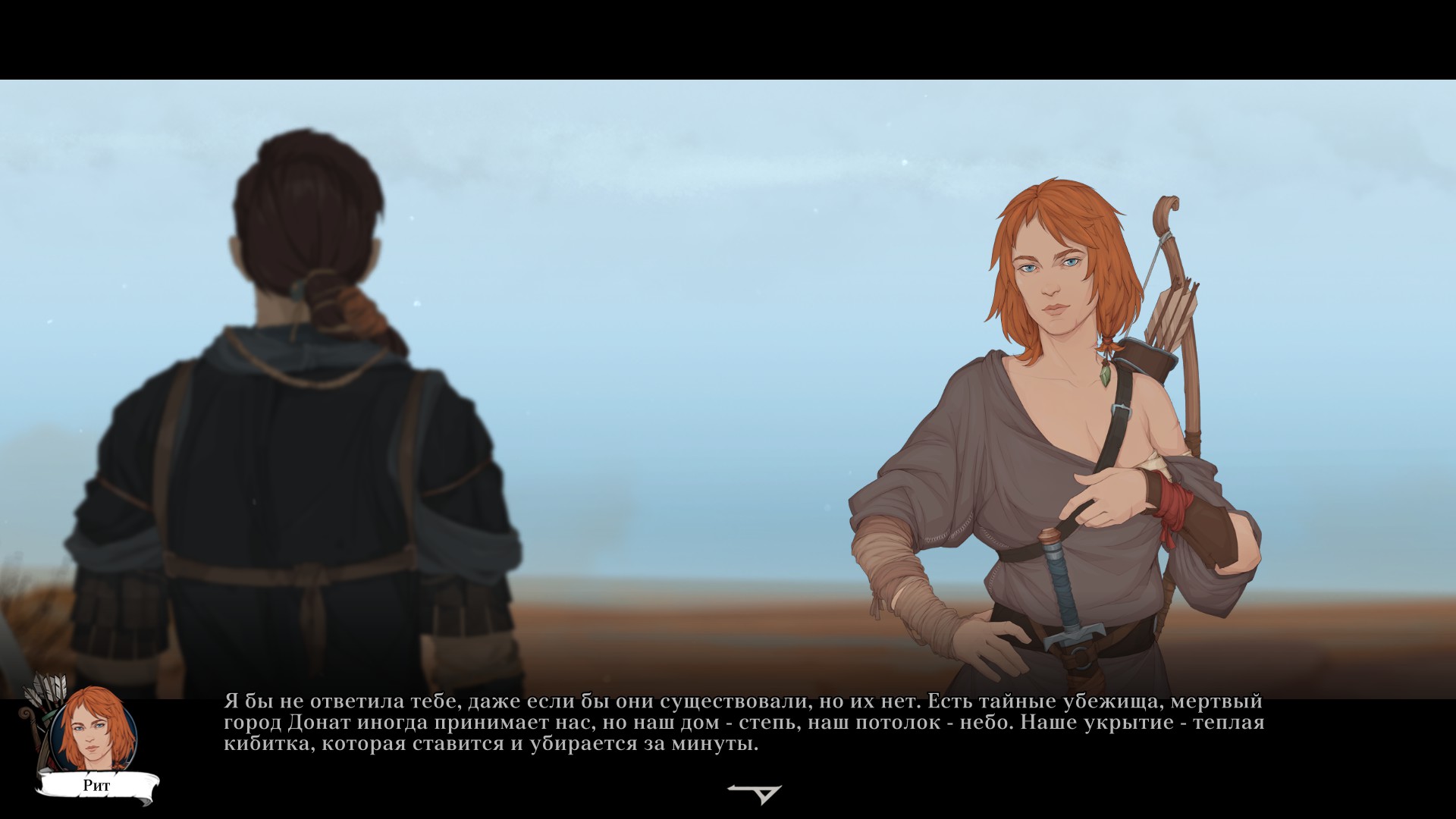
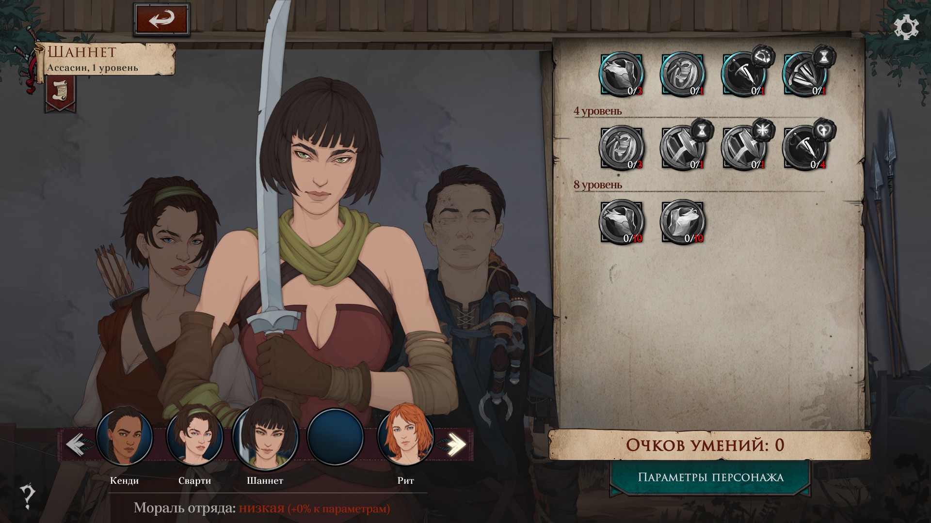
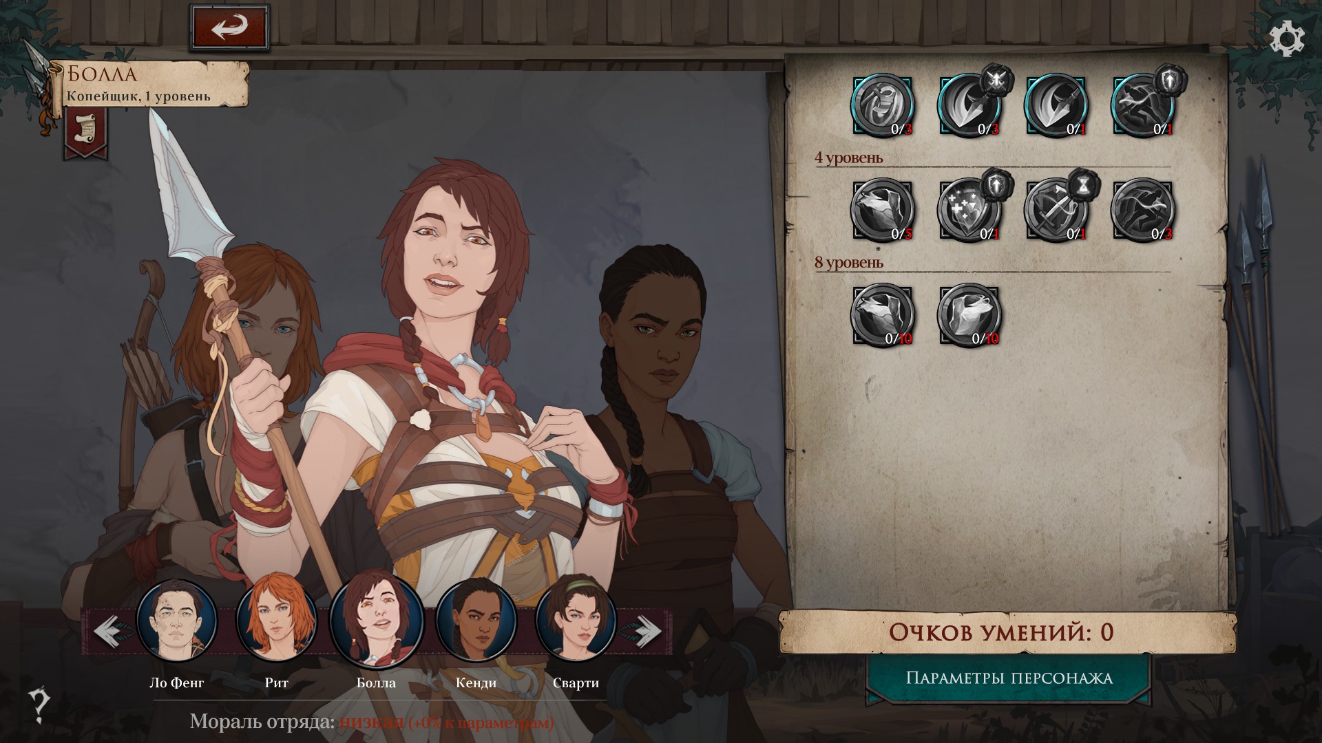

And dress full cloth, sure.
The artists can draw many things but "hentai" is not one topic I see them did it with any seriousness.
Graphics - They are good. Probably the only good thing about this game. All females are drawn as sluts and even the older ones are dressed like edgy teenagers. I assume that the graphic artists were used to draw hentai or are Thief 4 fans.
I see what you did there and I aint falling for it. The devs dont sound like that type of people at all.
Screenshot or it didnt happen.
I uninstalled the game. Check Steam screenshots:


The backstory is that all 4 were monastery harlots. Has your interest risen?
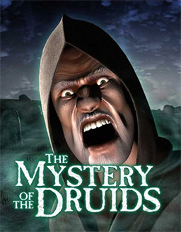
Who on Earth think an avatar of a computer game being an ugly man mug will sell?

Who on Earth think an avatar of a computer game being an ugly man mug will sell?

I am so sorry to bring bad news to the two clearly avid fans of this game but nobody remember this and this should illustrate really well why.
Torment is THE exception to this type of marketing.
That's not to say you can not use a man's face as the game's main image, but it should be something, well, other than a scarred face, an empty-eye face, or screaming man face.
It's just not done.


I haven't even played this game. No mention of ugly covers is complete without it however.two clearly avid fans of this game


