Not great, BUT 40% is very substantial and will be felt in gameplay. Not like the usual 2% increase that numbers go up gives you.oh god no. Not the "damage goes up X%" skill tree.
-
Welcome to rpgcodex.net, a site dedicated to discussing computer based role-playing games in a free and open fashion. We're less strict than other forums, but please refer to the rules.
"This message is awaiting moderator approval": All new users must pass through our moderation queue before they will be able to post normally. Until your account has "passed" your posts will only be visible to yourself (and moderators) until they are approved. Give us a week to get around to approving / deleting / ignoring your mundane opinion on crap before hassling us about it. Once you have passed the moderation period (think of it as a test), you will be able to post normally, just like all the other retards.
You are using an out of date browser. It may not display this or other websites correctly.
You should upgrade or use an alternative browser.
You should upgrade or use an alternative browser.
Eternity Avowed Pre-Release Thread [GAME RELEASED, GO TO NEW THREAD]
- Thread starter Infinitron
- Start date
jf8350143
Liturgist
- Joined
- Apr 14, 2018
- Messages
- 1,358
The dialogue UI is awful.
They keep the weapon upgrade system from Pillars, which is nice. Third person mode is also pretty good.
The skill tree looks pretty bad, at least for the first level. It might get better at later level but I don't have high hopes for it.
They keep the weapon upgrade system from Pillars, which is nice. Third person mode is also pretty good.
The skill tree looks pretty bad, at least for the first level. It might get better at later level but I don't have high hopes for it.
jf8350143
Liturgist
- Joined
- Apr 14, 2018
- Messages
- 1,358
They said later that the reason why the sword sound like a mace at the beginning is it's under leveled(maybe not sharp enough to cut through the enemy). After they upgrade it the sound goes back to normal.The weird thing for me here is how everything clashes. The player strikes with a sword, but the sound effects and enemy feedback make it seem they're bludgeoning with a mace, or at least punching with the sword's guard. The mushrooms and protrusions give me the impression the game takes place underwater, but that's clearly not the case. The colors fail to complement each other in every instance. It's as if two very different people designed the game completely oblivious from one another and then a third one mashed everything together. It's disconcerting.
They do this so the player knows when their equipment is not working well.
It's a nice touch and has some potential.
Trash Player
Augur
- Joined
- Jun 13, 2015
- Messages
- 513
If they add in a rudimentary Grounded-in-Eora, it will boost sales a lot. Open world survival sandbox is the go-to for AA now. It is a shame to waste the art assets from a financial standpoint.
- Joined
- Aug 1, 2019
- Messages
- 640


Not great, BUT 40% is very substantial and will be felt in gameplay. Not like the usual 2% increase that numbers go up gives you.oh god no. Not the "damage goes up X%" skill tree.
It is, but it is still lazy as fuck game design, please do not defend this.
"Let's create a new power, effect, or ability-"--- 'Nah, too expensive, just edit the cell in that database row on the back end"--> (Fn=x*1.40) "All set, New Upgrade ready!"
Last edited:
PunchYouInTheFace
Educated

Oh I know you're gonna like it. Just like you like Inquisition.Haha horny baiting and that FUCKING consoleshit UI. You know exactly who the target audience is.
Retards.
The skill tree is fine but I want to see non-combat perks.
Silverfish
Liturgist
- Joined
- Dec 4, 2019
- Messages
- 4,025
GUYS WOW I JUST LEVELED UP
DO I GET THE 25% FART DAMAGE BONUS OR THE 2% CHANCE TO CRIT ON A MOONLESS NIGHT AT SEA? IM SO EXCITED!!
In true Obsidian fashion, +25% fart damage will come with a penalty of -25% fart radius.
I can't believe I'm saying this, but this game is uglier than Dragon Age 4.
How is that possible? This is a crime against my eyeballs.
Whoever wins, we lose...
At least we are getting Tainted Grail: The Fall of Avalon, even with lower graphics, it has much more style than these two fuckups...
Tyranicon
A Memory of Eternity

- Joined
- Oct 7, 2019
- Messages
- 8,469
I really have no idea what the hell happened in the industry to where the art design sucks this hard. Everything looks like sickening cartoonish shit.I can't believe I'm saying this, but this game is uglier than Dragon Age 4.
How is that possible? This is a crime against my eyeballs.
Whoever wins, we lose...
At least we are getting Tainted Grail: The Fall of Avalon, even with lower graphics, it has much more style than these two fuckups...
Did all these 30-something art directors go to the same school or something?
Quillon
Arcane
- Joined
- Dec 15, 2016
- Messages
- 5,583
I remember they spent time and effort to make a medieval bathroom right/realistic through iterations in deadfire, an isometric gaym, both games' looks were realistic af but now just cos it is said something along the lines of "the living lands is wacky" in the lore they went crazy on everything and they don't need a second invite to paint the game eye melting purple & pink(again after TOW)the garish, hyper-cartoony look of Avowed.
Talented people left for jobs where they aren't being slaved away and where they get paid their worth. There's no creative freedom in the AAA space anymore, so there's no reason to stomach shitty pay and working conditions. This goes for programmers too.I really have no idea what the hell happened in the industry to where the art design sucks this hard. Everything looks like sickening cartoonish shit.I can't believe I'm saying this, but this game is uglier than Dragon Age 4.
How is that possible? This is a crime against my eyeballs.
Whoever wins, we lose...
At least we are getting Tainted Grail: The Fall of Avalon, even with lower graphics, it has much more style than these two fuckups...
Did all these 30-something art directors go to the same school or something?
The industry is filled with incompetent soyboys and tumblrinas who are mentally stuck at being 10 years old, hence the amount of infantile dialogue, childish writing and cartoonish art styles.
Tyranicon
A Memory of Eternity

- Joined
- Oct 7, 2019
- Messages
- 8,469
Even their bots are shit.
"Wow! I can't wait to explore the Living Lands, a mysterious island filled with adventure and danger, coming this Fall! This is a real human opinion!"
-ObsidianFan334
Who the fuck do you think this is fooling? It's almost as bad as the Dragon Age shills having "I cream 4 Solas" in their actual Twitter handles.

That one particular fight against Mushroom Men in the newest trailer does seem a lot more fluent than the very first clumsiness-fest we've seen, though.
I like how the player staggers after attacking them—because of the inappropriate weaponry.
There's some hope yet.
EDIT:
Damn, I blame it on the morning brain fog. There was no stagger. Just a thud sound instead of a 'swish', the player attacked with the hand-guard instead of the blade, and the Mushroom Men glowed.
In other words, a made-up, nonsensically telltale graphical effect and a confusing translation of the weapon having bouncied off of something as a character suddenly getting clumsy.
Man...
Last edited:
PunchYouInTheFace
Educated

You think like that because all you see in Deadfire and 1 are the miniature of the world/building/people, and even then the character design looks cartoonish-ish, despite semi-realistic environment.both games' looks were realistic
This game is no different.
All I hear is that you people have mental dissonance over the much bigger, first person world design. If this game was an Isometric RPG, it still going to look the same compared to Deadfire and Pillars 1.
FreeKaner
Prophet of the Dumpsterfire
I remember they spent time and effort to make a medieval bathroom right/realistic through iterations in deadfire, an isometric gaym, both games' looks were realistic af but now just cos it is said something along the lines of "the living lands is wacky" in the lore they went crazy on everything and they don't need a second invite to paint the game eye melting purple & pink(again after TOW)the garish, hyper-cartoony look of Avowed.
Things being grey and brown does not make them realistic. If anything a lot of medieval fantasy lacks color. I personally like what they did with armor and weapon designs especially.
IHaveHugeNick
Arcane
- Joined
- Apr 5, 2015
- Messages
- 1,870,558
People are gonna mod the color palette within 24 hours, I don't see what the problem is.
Quillon
Arcane
- Joined
- Dec 15, 2016
- Messages
- 5,583
What I meant with purple and pink is mostly the spell fx blown to our faces or on the objects in the environment from the gameplay videos you can see, very simlar with TOW, which is separate from unrealistic artstyle of the game which it was in pillows 1&2.I remember they spent time and effort to make a medieval bathroom right/realistic through iterations in deadfire, an isometric gaym, both games' looks were realistic af but now just cos it is said something along the lines of "the living lands is wacky" in the lore they went crazy on everything and they don't need a second invite to paint the game eye melting purple & pink(again after TOW)the garish, hyper-cartoony look of Avowed.
Things being grey and brown does not make them realistic. If anything a lot of medieval fantasy lacks color. I personally like what they did with armor and weapon designs especially.
This looks more fable-y than that Fable gaym lol, apart from the character that game looks great.
Baron Tahn
Scholar
- Joined
- Aug 1, 2018
- Messages
- 668
Just give us something interesting ffs. I don't care what colour it is just give us good dungeons, some good progression, some good exploration and don't shove the damn agenda in my face every goddamn second. Is it too much to ask for someone to just make a game as good as Ultima Underworld, Arx Fatalis, Dark Messiah or even just something with some depth like Morrowind?! What is the malfunction with these people.
FreeKaner
Prophet of the Dumpsterfire
What I meant with purple and pink is mostly the spell fx blown to our faces or on the objects in the environment from the gameplay videos you can see, very simlar with TOW, which is separate from unrealistic artstyle of the game which it was in pillows 1&2.
This looks more fable-y than that Fable gaym lol, apart from the character that game looks great.
Yeah there is a trend of just oversaturating games with particle effects to overcompensate for lack of coherent VFX direction in general, though I like how equipment and environment looks on this one so the VFX just being that didn't particularly jump at me.

- Joined
- May 29, 2010
- Messages
- 37,370
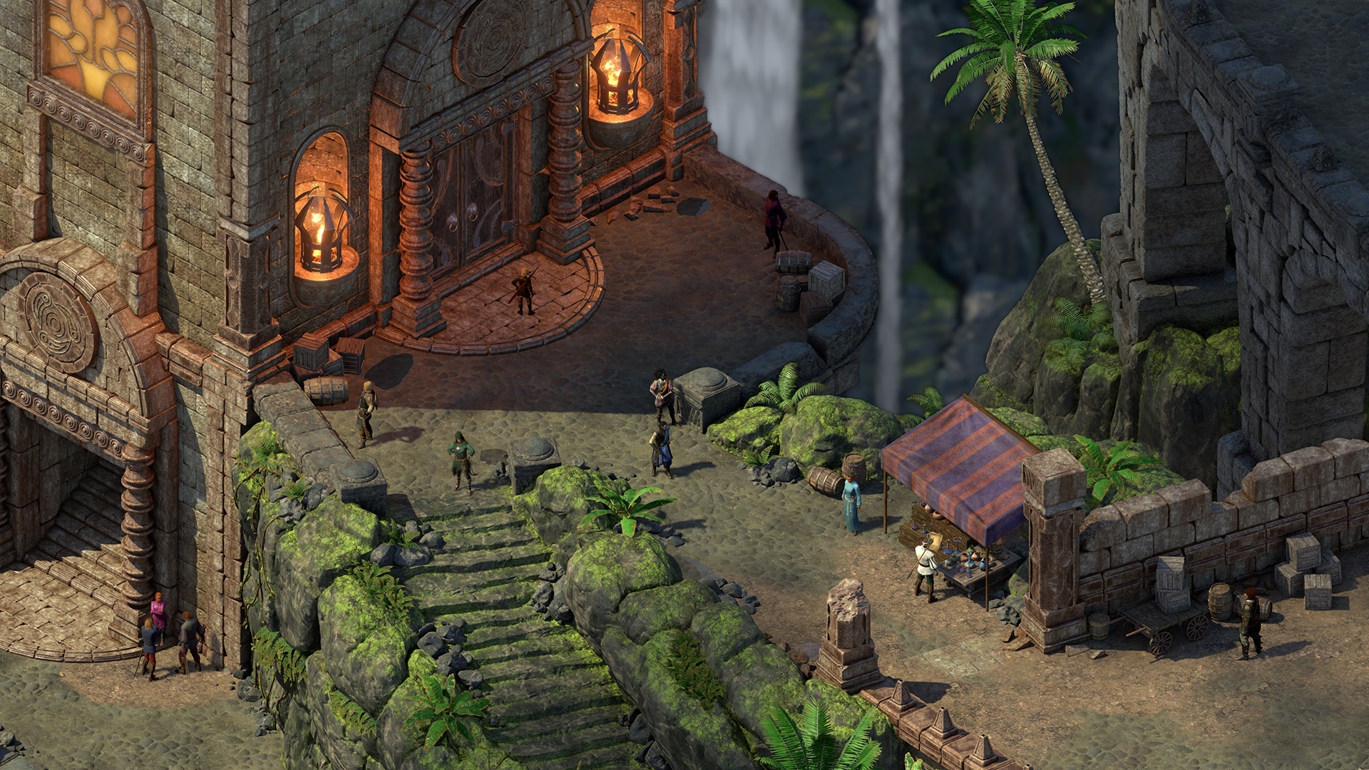
The latest trailer actually did start off with a couple of pseudo-iso shots, allowing one to make the comparison.You think like that because all you see in Deadfire and 1 are the miniature of the world/building/people, and even then the character design looks cartoonish-ish, despite semi-realistic environment.both games' looks were realistic
This game is no different.
All I hear is that you people have mental dissonance over the much bigger, first person world design. If this game was an Isometric RPG, it still going to look the same compared to Deadfire and Pillars 1.


And here's Deadfire.

- Joined
- Jan 28, 2011
- Messages
- 100,767


With the addition of third person perspective it might be possible to create an isometric mode mod for Avowed.
Yes, unfortunately very too much to ask.Just give us something interesting ffs. I don't care what colour it is just give us good dungeons, some good progression, some good exploration and don't shove the damn agenda in my face every goddamn second. Is it too much to ask for someone to just make a game as good as Ultima Underworld, Arx Fatalis, Dark Messiah or even just something with some depth like Morrowind?! What is the malfunction with these people.
Complex, immersive FPS simms is the most expensive genre (development-wise) with the least audience, and therefore the payout is poor even if it is a success.
No large companies, only madmen without personal lives like Ratower now risk it.
Then again, developing tools are getting more accessible by the day, many graphical assets are free, latest remakes of legendary games pave way for broader audience, and AI is likely going to help gifted single-developers' plight immensely very soon.
There's hope!
PunchYouInTheFace
Educated

It's Deadfire HD+ 4K.The latest trailer actually did start off with a couple of pseudo-iso shots, allowing one to make the comparison.You think like that because all you see in Deadfire and 1 are the miniature of the world/building/people, and even then the character design looks cartoonish-ish, despite semi-realistic environment.both games' looks were realistic
This game is no different.
All I hear is that you people have mental dissonance over the much bigger, first person world design. If this game was an Isometric RPG, it still going to look the same compared to Deadfire and Pillars 1.


And here's Deadfire.

Shoutout to Deadfire environmental artist. Hands down the best Pre-rendered environment ever created.
PunchYouInTheFace
Educated

If the single developer is "Gifted" they will not need an AI.AI is likely going to help gifted single-developers
If they need AI, the single developer is not gifted.


