- Joined
- Apr 16, 2004
- Messages
- 6,926
I’ve spent some time with EA, starting after The Factory was released, and collected my thoughts below. Some of this feedback warrants separate threads for discussion as the implications could be significant, and it may make more sense to move specific discussions over to the ITS forums.
Vault Dweller, sorry this took me so long. You probably don’t even remember, but I asked for a combat demo key a while back to give you feedback. I never got around to playing it seriously, but my guilt is your gain! That is, if you find this valuable…
As a heads-up, this is long. Best viewed on desktop, I imagine it’ll be hell on mobile. Also, I linked images to 99% of bugs and typos, but at least in preview-view, hyperlink text doesn't appear any differently than regular text. This has been a pain in the ass to format, and I'm not changing. If something reads like there should be a picture accompanying it, there probably is. Mouse over the text.
Summary
What an enjoyable romp, if uneven and obviously unfinished. I played through the game twice – first time blind with an unoptimized hybrid character and then a second time with some meta knowledge and referencing a Steam guide. The first run was more fun tbh, the pistelero main character with Evans doing duty as a shotgunner was hard, but we hit our stride. True RNG, of course.
The game ran well at 2560x1600 on my i5-2500k paired with an AMD R290 on Windows 7; I got 30 to 40 fps, which is more than admirable on hardware that is the better part of a decade old. Video settings.
The second run I gamed it so that I could use all the companions and use a different set of gear, as well make other Big Choices. After pistols and shotguns, I wanted to try hammers. I don’t think I made the character well, but I did get some hilarious moments when NPCs called him by his name.

Before proceeding, I have to admit something about my feedback: I kinda view Colony Ship’s goals are to build a better AOD and better Fallout. This is in in narrative, tone, quest structure, and especially combat. I think that anyone familiar with the original Fallouts and Iron Tower’s history will understand why I think this, but it has to be said upfront.
Also: I loved Dungeons Rats, and I also enjoyed AoD but don’t remember it as well as DR. because I immediately re-played DR 2 or 3 times. Combat in Colony Ship is easier, while feeling familiar. I think I’m glad there isn’t crafting, although a Cespnar-style NPC who can selectively upgrade or craft equipment from found relics would be a nice touch, if not already planned. Combat is satisfying overall, as is itemization, questing, and map design. The world leaves you asking questions that you *want* to find answers to, and that’s a good thing.
Overall impressions and worldbuilding
The game feels good, but unfinished. Obvious the title is in EA, so not everything is there (literally, many maps are not present, but also some description text is WIP). But there’s also other things missing from the content that is there, and I can’t tell if it’s planned or not. If Pillars of Eternity vomited dialogue at your from all corners of the world, Colony Ship is spartan by comparison.

The tone of writing is good, appropriate. It is pulpy, to the point, occasionally verbose but never too frequently so. Yet, I feel as if the pendulum has swung too far to the other side, away from Pillars, in that there are essentially no NPCs offering flavor or detail to support the world. If a NPC can be interacted with it is either a vendor selling items, or a quest vendor dispensing McGuffin-hunting pretext. One thing I noticed was that in the setups to the Arena (“courthouse”) fights, the Chief Justice spins a lot of yarn about the murdering and thieving the defendants allegedly perpetrated, yet outside of this text, I don’t get the feeling that the Pit is that dangerous.
Yes, the specifics of quests are a form of worldbuilding that reinforces the nature of the Pit, but there’s no NPCs lounging around just waiting to tell you how miserable they are. In Fallout, there were little nuggets of text some non-quest NPCs would drop that helped paint a picture of the world. Sometimes that text actually was tangentially connected to a quest, but it was found by the player outside the loop of “NPC initiates a quest, player solves quest and gets the reward”. Such narrative elements reinforced the believability and fantasy of the version of California that Fallout took place in, despite not being essential to the core gameplay loops.
Think about how a Children of the Cathedral healer would appear in Junktown, and their dialogue made them feel like something outside of your immediate awareness was occurring – the world was alive outside the player’s concerns. Fallout managed to convey that the player didn’t really matter (until they did, of course). Another example is gamblers in Gizmos, telling you “Just one more pull…” or the literal trash you found in containers all over the world. Literal trash! Those touches made the world feel real, believable – all without drowning you in exposition. Colony Ship could use a good dose more of that style of worldbuilding; although on the trash front, I certainly am not advocating for Bethesda-style junk laying everywhere.
The feeling of progression in exploring levels, such as train depot / armory, is very good and rewarding. It has an old-school feel where the item you need to progress is not in the proverbial barrel next to the challenge, or even in the same map. You’re expected to try to go into areas you can’t quite handle yet, fail, and go searching elsewhere for things to do so that you can come back stronger.
The music is excellent and atmospheric, although more variety in either in certain maps - or portions thereof – or within dialogues would be appreciated.
Combat
Balance of encounter design is good, i.e. Sharpface encounter with only 1 party member (Evans) and using your combat reputation to scare 3 goons away such it's 2 v 3 rather than 2 v 6. I had fun with the large set-piece fights, and more feedback on combat is in a later section below. One point though – I really hope there will be some gruesome death animations. Not photorealistic / saw type stuff, but over-the-top Fallout style death animations. I know it’s not likely, but it would add some punch to the gameplay.
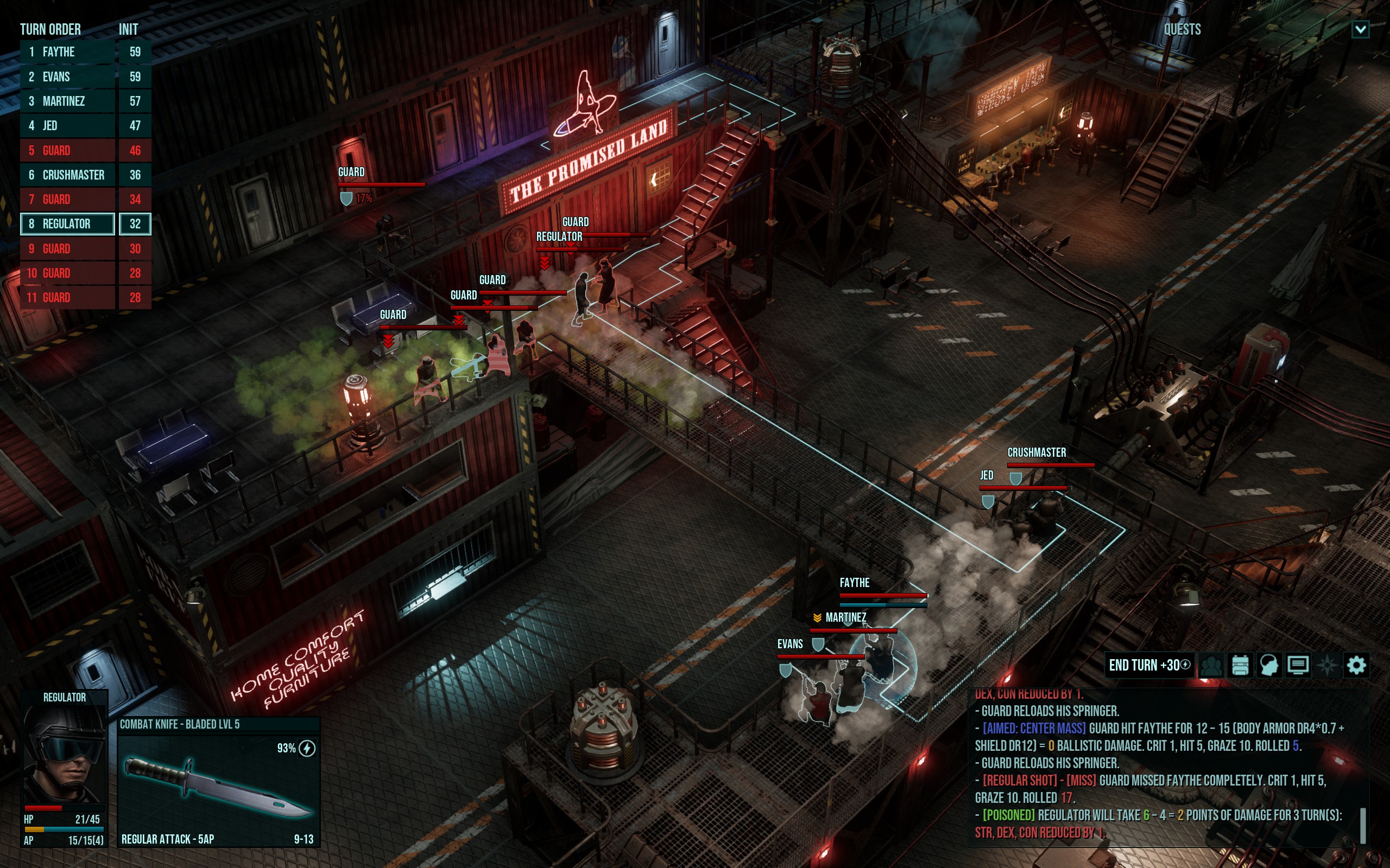
FYI - I found this fight very difficult solely due to the positioning of your party at the start of it. This was true whether I had 2 characters or 4. I wouldn’t change a thing about it, just goes to show you how much map design and NPC placement can impact fight difficulty. I think fight difficulty due to map factors like this is a great way to throw more roadblocks at the player, without enriching them with advanced gear. The whole "the rich get richer" scenario with optional combat scenarios we talked about a while back. I love the idea that the reward for tough optional combat is more difficulty combat. It's also ok to make the rewards narrative or non-material, especially in a game like this where there are so many questions about the world.
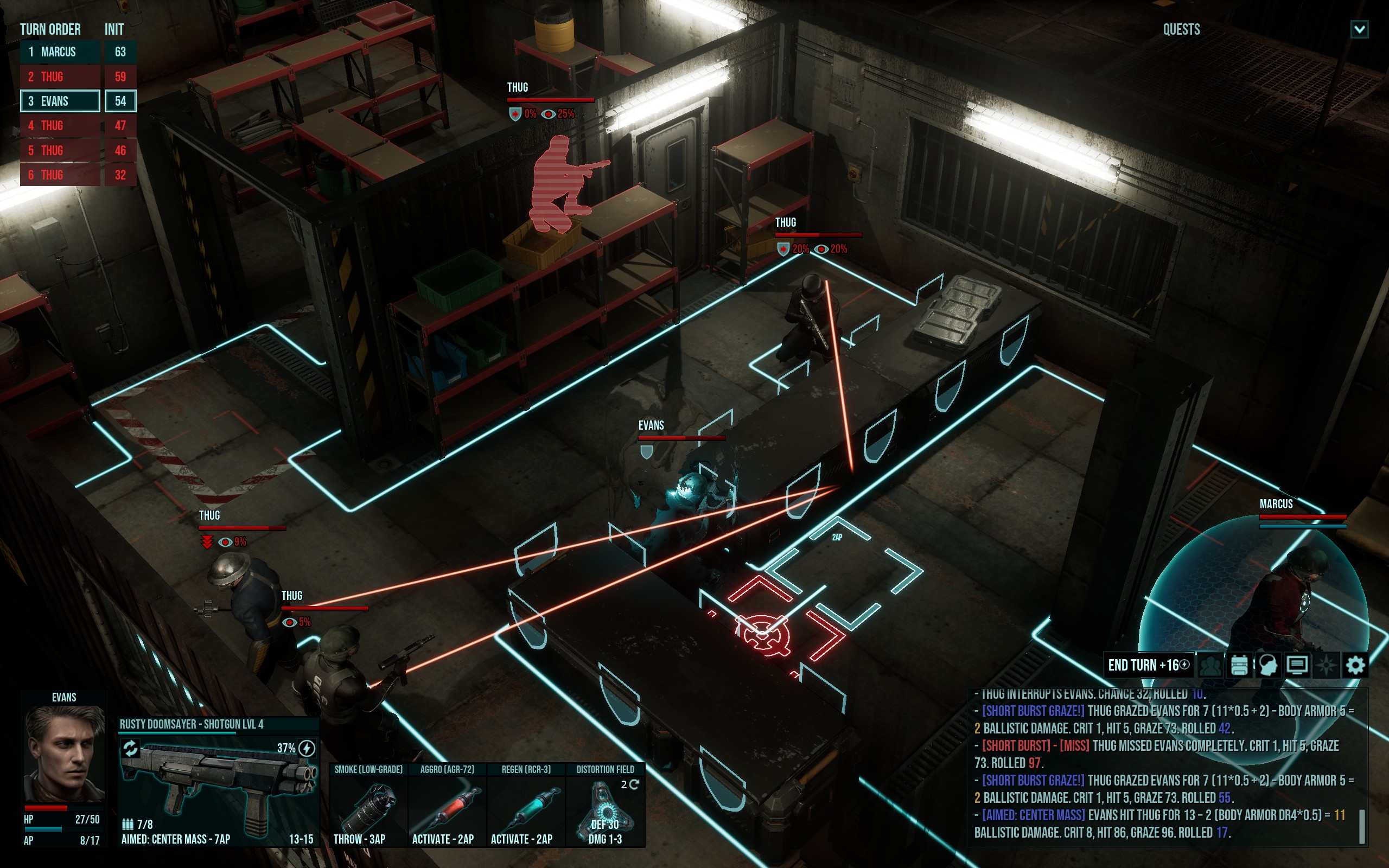
Quests
My first playthrough (2 characters) I sided with Jonas, killed Mercy, fought all the Regulators and then cleared The Black Hand without Detroit’s help. I did this with 2 characters, the MC and Evans spec’d for shotgun.
Second playthrough (4 characters) I sided with Braxton, killed Mercy, fought the crew at The Promised Lands and I intend to clear Detroit; although I haven’t attempted that yet. I knew this would take some time to put together, and I had time today. I’ll update after clearing if it warrants it.
System mechanics, companions & items
The system mechanics used make sense, I was able to work through them without any external sources – although I felt pretty dumb when I realized I had ignored CHA on my first character, only for the small party size to end up playing to the build’s advantages.
System mechanics
I like the “natural” nature of the mechanics; how the numerical values map neatly on a 0 to 100(+) percentage scale, such that +10 evasion means someone is 10% harder to hit (if not already at 95% cap). One thing that I think is missing is good documentation in the UI of attribute thresholds, like we see in player guides. This isn’t a criticism unique to Colony Ship tho, as this has been an issue going back to the AD&D 2e cRPGs back in the 90s. I do wish there was a way to present attribute scores in tabular fashion with their dependent stats to quickly visualize thresholds in-game, through something like the Vault Boy info window, but that’s probably not a feature many would ever truly use anyway.
Companions
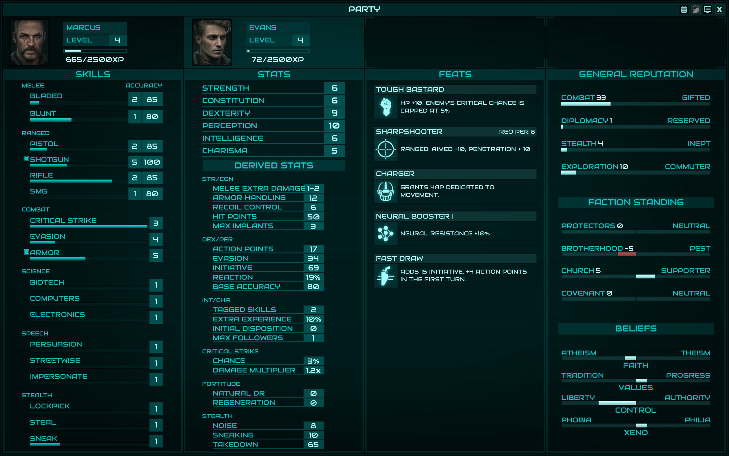
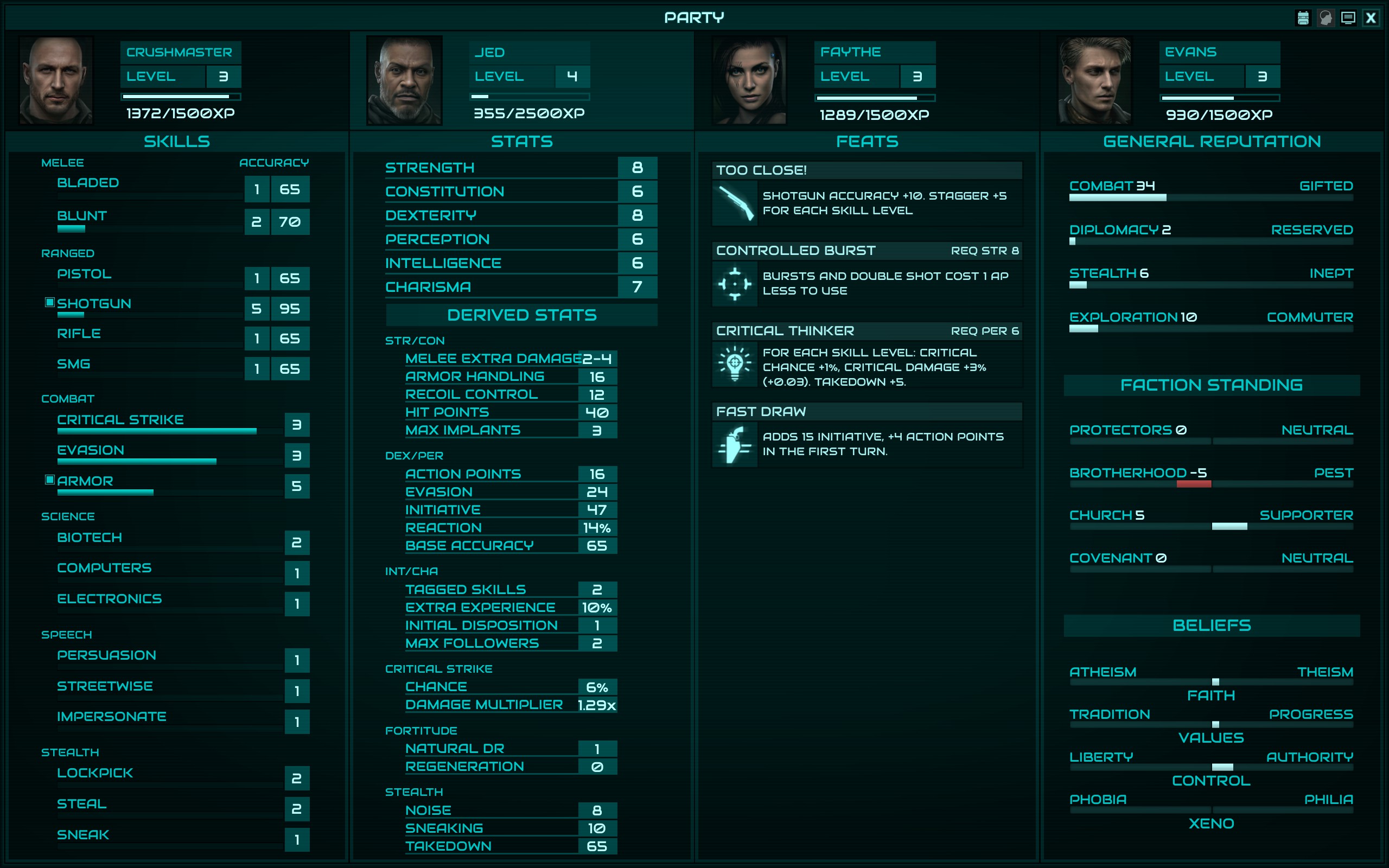
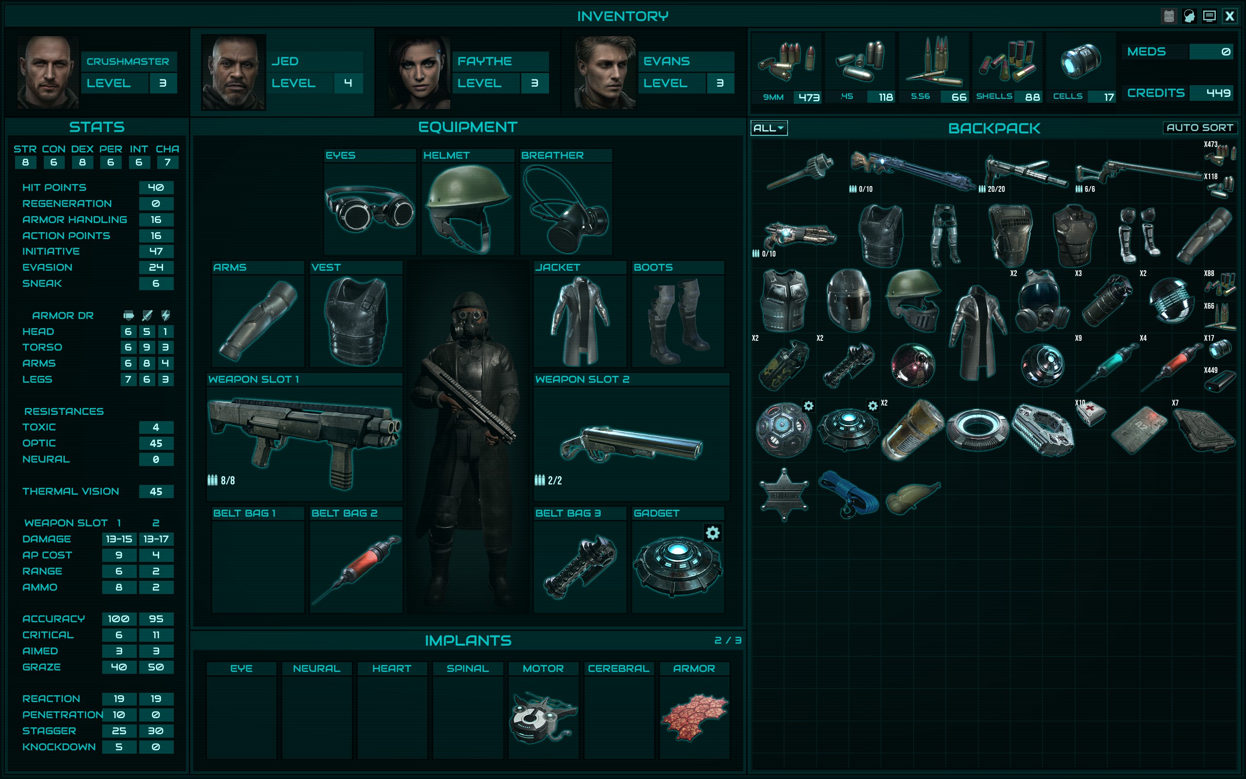
Without really knowing what I was doing, I first recruited Evans and turned him into a shotgun user. I finished the Factory with him having shotgun and armor tagged, and overall he was a better shotgun user than Jed, who I used on my second run. It comes down to Evans having more HP, and better across the board accuracy due to his better PER, such that even without rifles tagged, if you give him Old Betsy he can plunk away at far enemies just fine while using the shotgun most of the time. Jed does not have similar flexibility OR staying power: he is less tanky due to his lower HP, and is a worse shot because of his PER. It probably makes more sense for Jed to have the 50 HP and Evans the 40, although it pains me to recommend that as Evans is a bro. Jed almost seems like a better SMG user, maybe I’ll try that next time.
Items
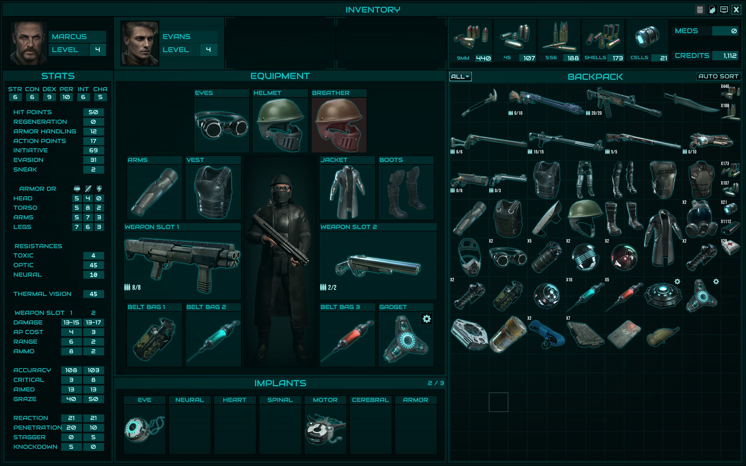
I vastly prefer hand-placed, hand-generated items over programmatic, so it’s no surprise that I enjoyed playing within the design principles here. At first I was a bit overwhelmed by all the permutations of gear, but I gradually realized that armor was being segmented into tiers based on the Armor Handling needed to negate the debuffs, and within each tier there were worse/better versions of every armor piece, as well as ones suited to more melee or ranged or energy defense. It really is a nice, customizable system. My only gripe is that in the current early access build, it's too easy to never encounter a piece of armor which reduces AP. Thus, the feat that adds to Armor Handling and reduces the AP penalty seems like a waste, but it’s actually a sleeper feat from what I can tell. I expect that this will catch players unaware, and it’s a bit of a nasty surprise. You may want to consider teasing some armor with –AP earlier, such that the value of the armor handling feat is more apparent.
See the suggestions section for more there, I hope there is a very limited upgrade system planned (think collecting item pieces to be assembled in BG2). I also think the gadget upgrade paths should be more opaque.
User interface
Other than the items related to worldbuilding above, this is the only other area of the game that I think could use significant improvement. Right now, the UI is functional and gets the job done. But, I think with a bit more thought and resources put into it, it could elevate the game significantly.
Suggestions
Collected below.
Bugs
It’s EA, and its got bugs. For the UI stuff, note that I’m playing in 2560x1600 on Win7 with no display scaling (i.e. DPI setting is at native 100%).
Typos
If there is text, there are typos.
Vault Dweller, sorry this took me so long. You probably don’t even remember, but I asked for a combat demo key a while back to give you feedback. I never got around to playing it seriously, but my guilt is your gain! That is, if you find this valuable…
As a heads-up, this is long. Best viewed on desktop, I imagine it’ll be hell on mobile. Also, I linked images to 99% of bugs and typos, but at least in preview-view, hyperlink text doesn't appear any differently than regular text. This has been a pain in the ass to format, and I'm not changing. If something reads like there should be a picture accompanying it, there probably is. Mouse over the text.
Summary
What an enjoyable romp, if uneven and obviously unfinished. I played through the game twice – first time blind with an unoptimized hybrid character and then a second time with some meta knowledge and referencing a Steam guide. The first run was more fun tbh, the pistelero main character with Evans doing duty as a shotgunner was hard, but we hit our stride. True RNG, of course.
The game ran well at 2560x1600 on my i5-2500k paired with an AMD R290 on Windows 7; I got 30 to 40 fps, which is more than admirable on hardware that is the better part of a decade old. Video settings.
The second run I gamed it so that I could use all the companions and use a different set of gear, as well make other Big Choices. After pistols and shotguns, I wanted to try hammers. I don’t think I made the character well, but I did get some hilarious moments when NPCs called him by his name.

Before proceeding, I have to admit something about my feedback: I kinda view Colony Ship’s goals are to build a better AOD and better Fallout. This is in in narrative, tone, quest structure, and especially combat. I think that anyone familiar with the original Fallouts and Iron Tower’s history will understand why I think this, but it has to be said upfront.
Also: I loved Dungeons Rats, and I also enjoyed AoD but don’t remember it as well as DR. because I immediately re-played DR 2 or 3 times. Combat in Colony Ship is easier, while feeling familiar. I think I’m glad there isn’t crafting, although a Cespnar-style NPC who can selectively upgrade or craft equipment from found relics would be a nice touch, if not already planned. Combat is satisfying overall, as is itemization, questing, and map design. The world leaves you asking questions that you *want* to find answers to, and that’s a good thing.
Overall impressions and worldbuilding
The game feels good, but unfinished. Obvious the title is in EA, so not everything is there (literally, many maps are not present, but also some description text is WIP). But there’s also other things missing from the content that is there, and I can’t tell if it’s planned or not. If Pillars of Eternity vomited dialogue at your from all corners of the world, Colony Ship is spartan by comparison.

The tone of writing is good, appropriate. It is pulpy, to the point, occasionally verbose but never too frequently so. Yet, I feel as if the pendulum has swung too far to the other side, away from Pillars, in that there are essentially no NPCs offering flavor or detail to support the world. If a NPC can be interacted with it is either a vendor selling items, or a quest vendor dispensing McGuffin-hunting pretext. One thing I noticed was that in the setups to the Arena (“courthouse”) fights, the Chief Justice spins a lot of yarn about the murdering and thieving the defendants allegedly perpetrated, yet outside of this text, I don’t get the feeling that the Pit is that dangerous.
Yes, the specifics of quests are a form of worldbuilding that reinforces the nature of the Pit, but there’s no NPCs lounging around just waiting to tell you how miserable they are. In Fallout, there were little nuggets of text some non-quest NPCs would drop that helped paint a picture of the world. Sometimes that text actually was tangentially connected to a quest, but it was found by the player outside the loop of “NPC initiates a quest, player solves quest and gets the reward”. Such narrative elements reinforced the believability and fantasy of the version of California that Fallout took place in, despite not being essential to the core gameplay loops.
Think about how a Children of the Cathedral healer would appear in Junktown, and their dialogue made them feel like something outside of your immediate awareness was occurring – the world was alive outside the player’s concerns. Fallout managed to convey that the player didn’t really matter (until they did, of course). Another example is gamblers in Gizmos, telling you “Just one more pull…” or the literal trash you found in containers all over the world. Literal trash! Those touches made the world feel real, believable – all without drowning you in exposition. Colony Ship could use a good dose more of that style of worldbuilding; although on the trash front, I certainly am not advocating for Bethesda-style junk laying everywhere.
The feeling of progression in exploring levels, such as train depot / armory, is very good and rewarding. It has an old-school feel where the item you need to progress is not in the proverbial barrel next to the challenge, or even in the same map. You’re expected to try to go into areas you can’t quite handle yet, fail, and go searching elsewhere for things to do so that you can come back stronger.
The music is excellent and atmospheric, although more variety in either in certain maps - or portions thereof – or within dialogues would be appreciated.
Combat
Balance of encounter design is good, i.e. Sharpface encounter with only 1 party member (Evans) and using your combat reputation to scare 3 goons away such it's 2 v 3 rather than 2 v 6. I had fun with the large set-piece fights, and more feedback on combat is in a later section below. One point though – I really hope there will be some gruesome death animations. Not photorealistic / saw type stuff, but over-the-top Fallout style death animations. I know it’s not likely, but it would add some punch to the gameplay.

· Need option to “wait” such that your combat order drops lower in a given turn – not wait until next turn.
· Need option to set item type of a bag slot (stim / regen / etc), such that after combat the slot is refilled from inventory automatically.
· Selecting party members for placement is a bit clunky, and there’s no elegant way to swap member’s position. Currently you have this awkward dance of moving one member to an unoccupied tile, moving another to where they were, etc. We should have the same option to switch places like we do in combat.
· Frog hitboxes block all ranged weapon attacks on humanoids at-distance, should be able to fire over frogs. Frogs also blocking throwing grenades over them sometimes
· Status effects applying when 0 dmg is done doesn't feel right. I don’t want combat to be any easier, so not sure how to address this, but it doesn’t feel right to take no damage and still be impacted by the maluses. I’ve seen this with:
· Toxic / Psi resist are kinda cryptic right now, is toxic resist just a DT applied to poison? While neural is a percentage chance that panic isn’t inflicted? Or is it a DT against psi damage? Or both?
· Killing enemies with blunt weapons, especially the Utility Hammer, triggers exaggerated rag-doll deaths where the enemies look unencumbered by lofty concepts such as mass and inertia.
· Need option to set item type of a bag slot (stim / regen / etc), such that after combat the slot is refilled from inventory automatically.
· Selecting party members for placement is a bit clunky, and there’s no elegant way to swap member’s position. Currently you have this awkward dance of moving one member to an unoccupied tile, moving another to where they were, etc. We should have the same option to switch places like we do in combat.
- During positioning phase at start of combat, double-clicking on a party member’s name in the initiative queue should actually select them.
· Frog hitboxes block all ranged weapon attacks on humanoids at-distance, should be able to fire over frogs. Frogs also blocking throwing grenades over them sometimes
- General recommendation: we should be able to shoot and throw grenades over short / small things. It is the flip side of the same logic that says we can’t target the feet of a murderous plant-blob -> the plant-blob doesn’t have feet, so the rules of what does/doesn’t apply in combat are adjusted. With the frogs it is rules regarding line of sight / blocked shots due to height. In general, when non-humanoid enemies are created there should be thought about how (1) what types of aimed attacks do and don’t make sense against them and (2) if this new enemy type is large/small, how they should block or not-block ranged attacks for enemies behind or near them.
· Status effects applying when 0 dmg is done doesn't feel right. I don’t want combat to be any easier, so not sure how to address this, but it doesn’t feel right to take no damage and still be impacted by the maluses. I’ve seen this with:
- Spitters applying the “poisoned” effect when all spit damage was resisted
- Psychers applying panic from 0 damage psych attack
- Bullfrogs applying kneecapped / crippled when all damage was resisted
· Toxic / Psi resist are kinda cryptic right now, is toxic resist just a DT applied to poison? While neural is a percentage chance that panic isn’t inflicted? Or is it a DT against psi damage? Or both?
· Killing enemies with blunt weapons, especially the Utility Hammer, triggers exaggerated rag-doll deaths where the enemies look unencumbered by lofty concepts such as mass and inertia.

Quests
My first playthrough (2 characters) I sided with Jonas, killed Mercy, fought all the Regulators and then cleared The Black Hand without Detroit’s help. I did this with 2 characters, the MC and Evans spec’d for shotgun.
Second playthrough (4 characters) I sided with Braxton, killed Mercy, fought the crew at The Promised Lands and I intend to clear Detroit; although I haven’t attempted that yet. I knew this would take some time to put together, and I had time today. I’ll update after clearing if it warrants it.
Despite the fact that my party on the second playthrough was obviously more powerful, I had much more trouble storming The Promised Lands than I did clearing the Regulators’ base. I don’t know if this is intentional, and I didn’t mind it, but that’s my experience. Assaulting Jonas’s stronghold felt a lot like some of the dungeon rat’s fights I had to try from many different angles before I was happy with it. In the end, smoke + poison and a sacrificial Regulator made it possible, while most of the crew hung back until the right moment. I actually kept the named Regulator, Maxon? alive for the whole 2 part siege.
Clearing The Black Hand was surprisingly easy with a 2 person party when both MC and Evans using rifles even though they weren’t spec’d for them in that run. Detroit fight TBD.
· Crossroads – feels overly rushed, especially the scenario where you talk the thugs away and Braxton’s group shoots them dead outside of Abe’s. There should be a bit more foreplay here between you and Jonas and Braxton. This whole quest line feels inspired by Junktown in Fallout 1 with the Killian vs Gizmo dynamic. The pacing in Fallout was better in my opinion.
· Zeke in Power Station – after returning the oxidizer, he mentions he needs a forcefield module. No new quest is created in the journal for this.
· Solomon’s “find a man who came to me” quest does not appear in the journal. Fine if intended, just FYI.
· Quest: Ace Up Your Sleeve -> Cole's dialogue doesn't indicate where Isaiah is, but quest journal knows.
- Cole's dialogue not containing it reflects the larger concerns re: worldbuilding
System mechanics, companions & items
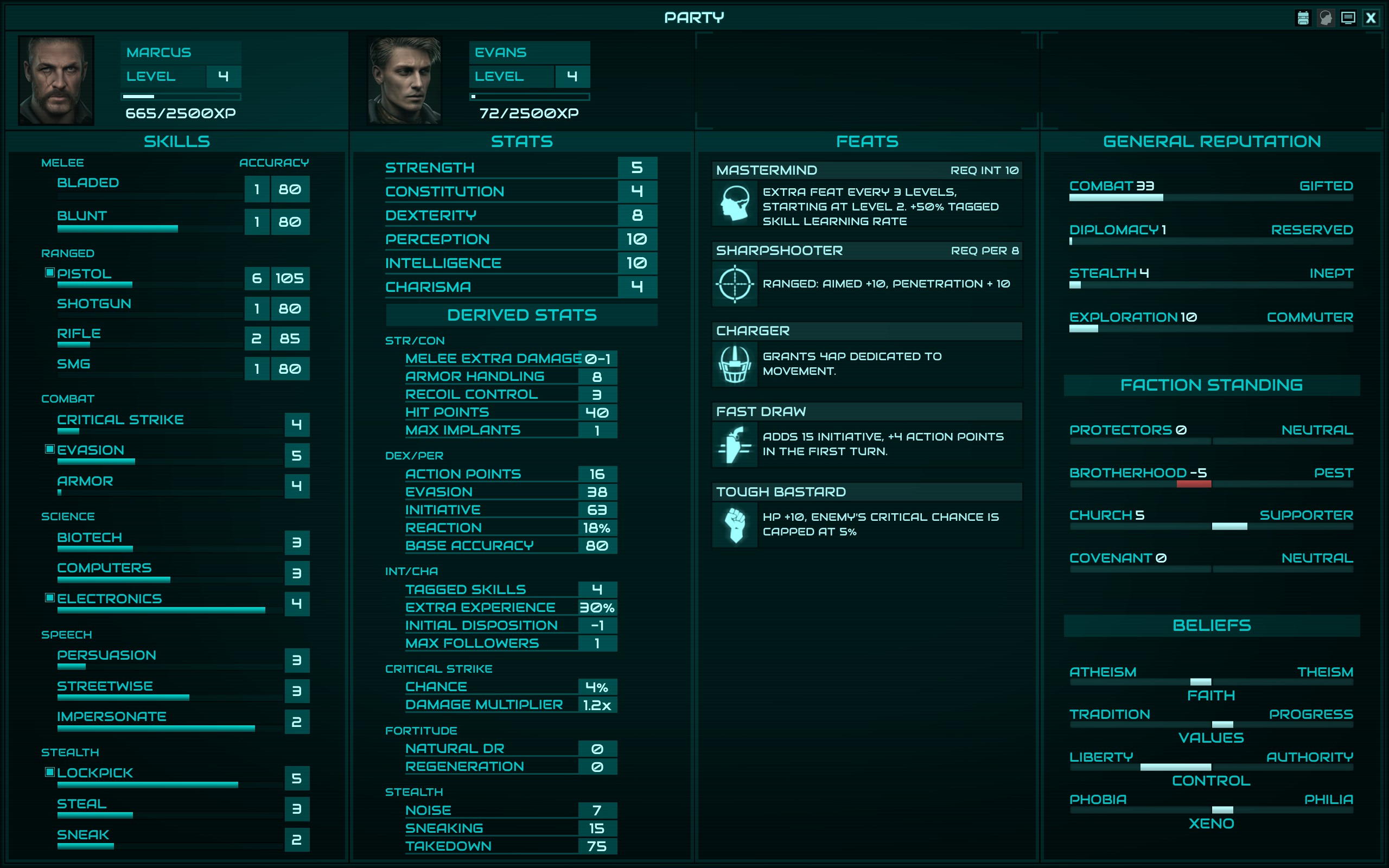
The system mechanics used make sense, I was able to work through them without any external sources – although I felt pretty dumb when I realized I had ignored CHA on my first character, only for the small party size to end up playing to the build’s advantages.
Marcus
Evans


Evans


CRUSHMASTER
Jed
Faythe
Evans
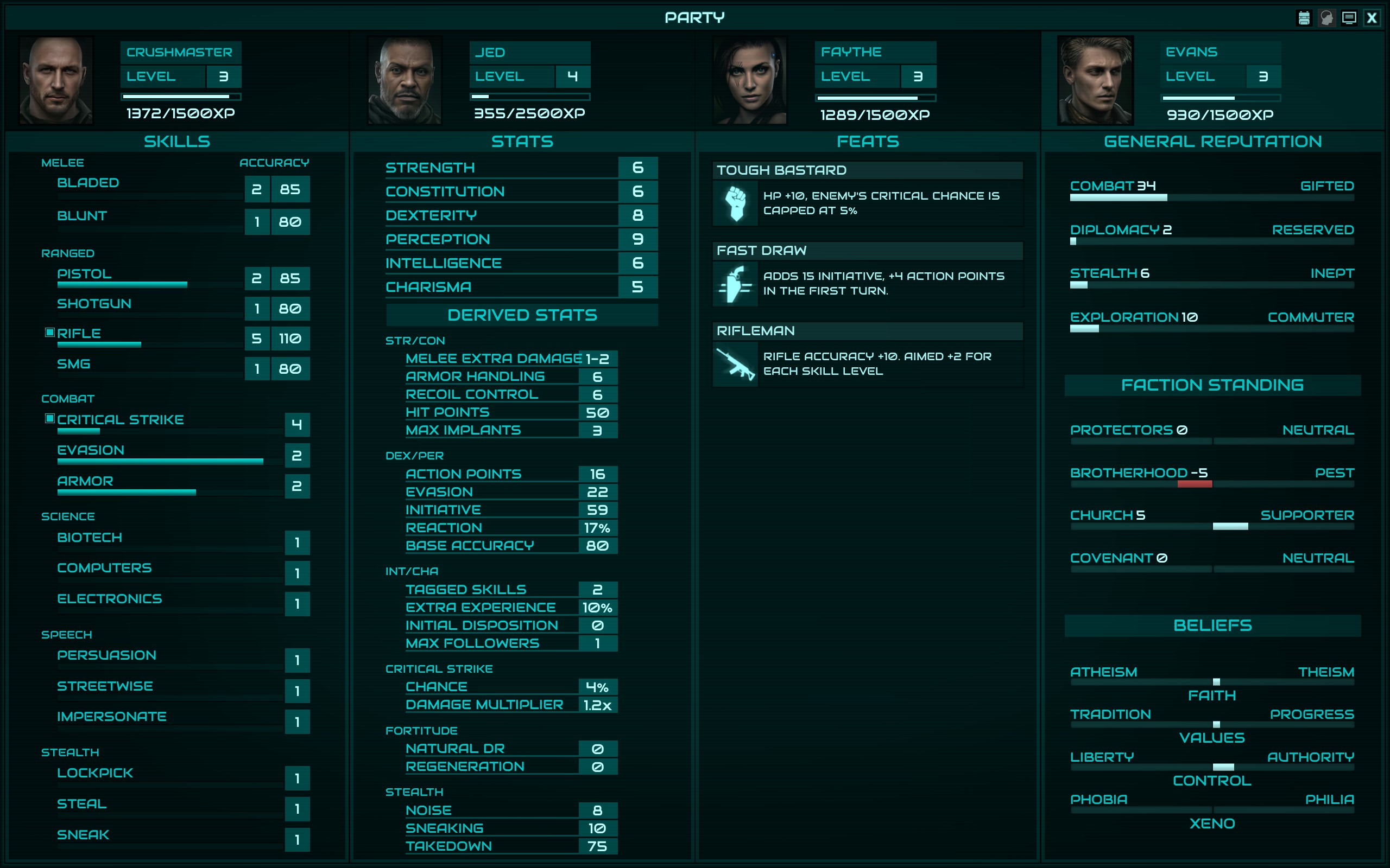
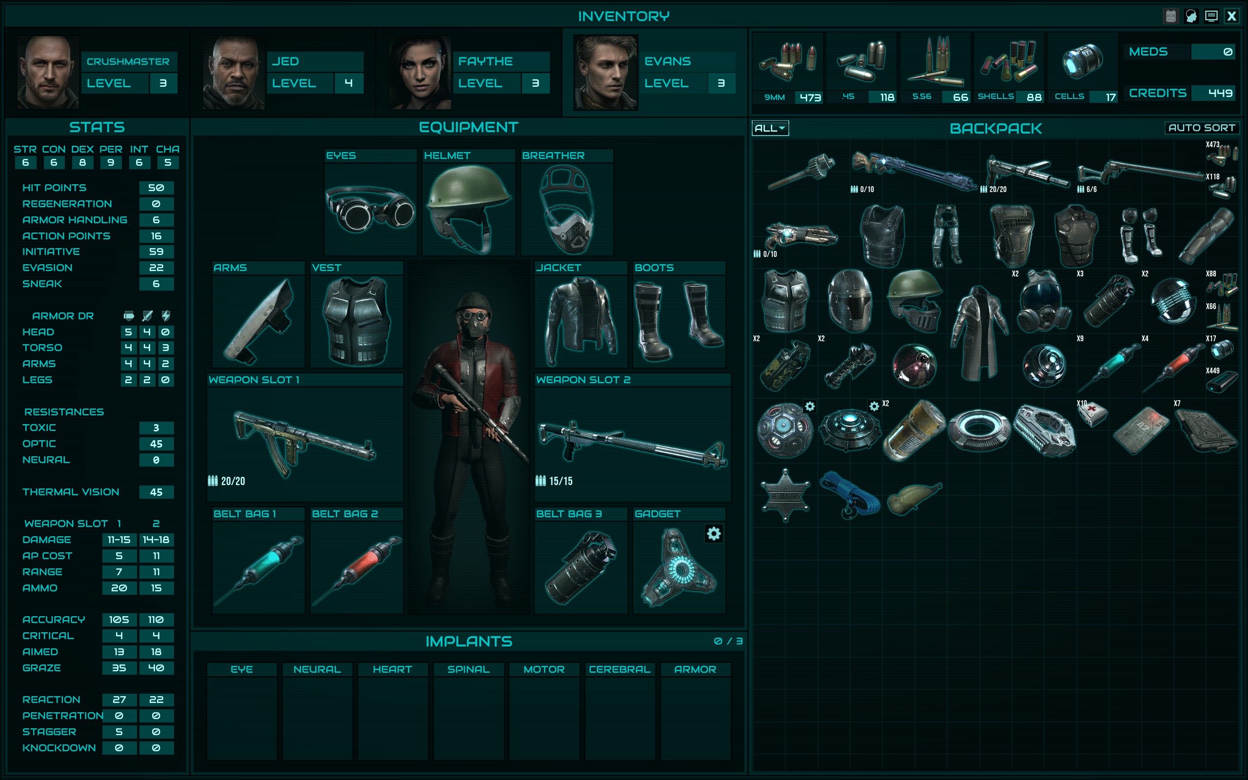


Jed


Faythe


Evans


System mechanics
I like the “natural” nature of the mechanics; how the numerical values map neatly on a 0 to 100(+) percentage scale, such that +10 evasion means someone is 10% harder to hit (if not already at 95% cap). One thing that I think is missing is good documentation in the UI of attribute thresholds, like we see in player guides. This isn’t a criticism unique to Colony Ship tho, as this has been an issue going back to the AD&D 2e cRPGs back in the 90s. I do wish there was a way to present attribute scores in tabular fashion with their dependent stats to quickly visualize thresholds in-game, through something like the Vault Boy info window, but that’s probably not a feature many would ever truly use anyway.
Picking a feat every level is a nice bit of customization, but I feel some feats are so obviously superior to others that I wonder if they shouldn’t be re-examined. In particular, Fast Draw is such an obvious choice for all characters that on my second run I actively avoided taking it for the main character so I could experience more breadth in character types. +15 initiative and +4 ap at the start of every fight is very good, it’s a mini-neuro stim for free at the start of every fight. As is often the case in games with AP systems, perks/feats/whatever that add AP end up being the most desirable. This is true, although to a slightly lesser extent, for the Charger feat. 4 movement APs will be used by almost every character multiple times per fight, it makes so much more sense to pick it and Fast Draw over feats that may not even fire every combat, or save 1 AP situationally, rather than 4 free APs always.
Companions
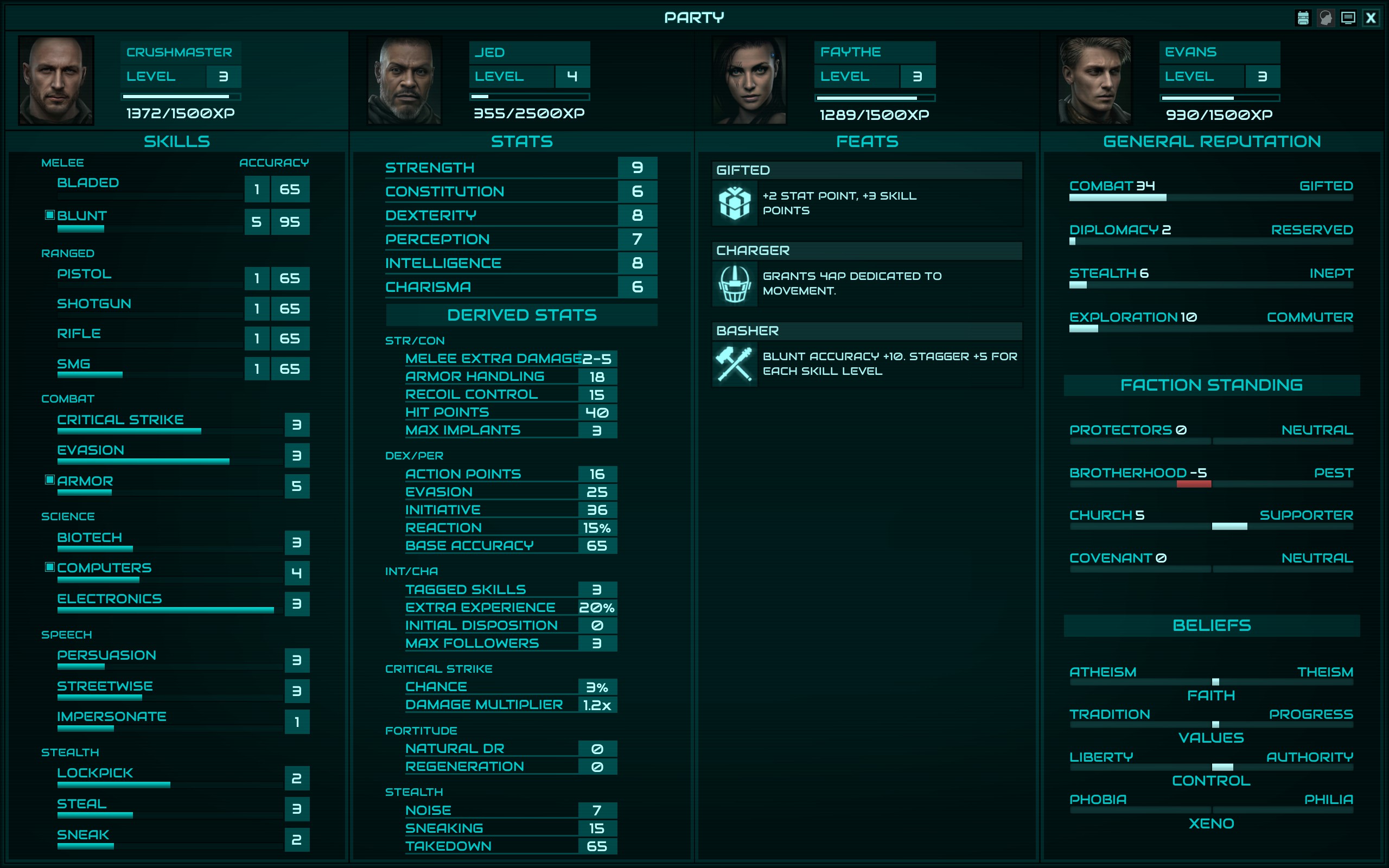
Without really knowing what I was doing, I first recruited Evans and turned him into a shotgun user. I finished the Factory with him having shotgun and armor tagged, and overall he was a better shotgun user than Jed, who I used on my second run. It comes down to Evans having more HP, and better across the board accuracy due to his better PER, such that even without rifles tagged, if you give him Old Betsy he can plunk away at far enemies just fine while using the shotgun most of the time. Jed does not have similar flexibility OR staying power: he is less tanky due to his lower HP, and is a worse shot because of his PER. It probably makes more sense for Jed to have the 50 HP and Evans the 40, although it pains me to recommend that as Evans is a bro. Jed almost seems like a better SMG user, maybe I’ll try that next time.
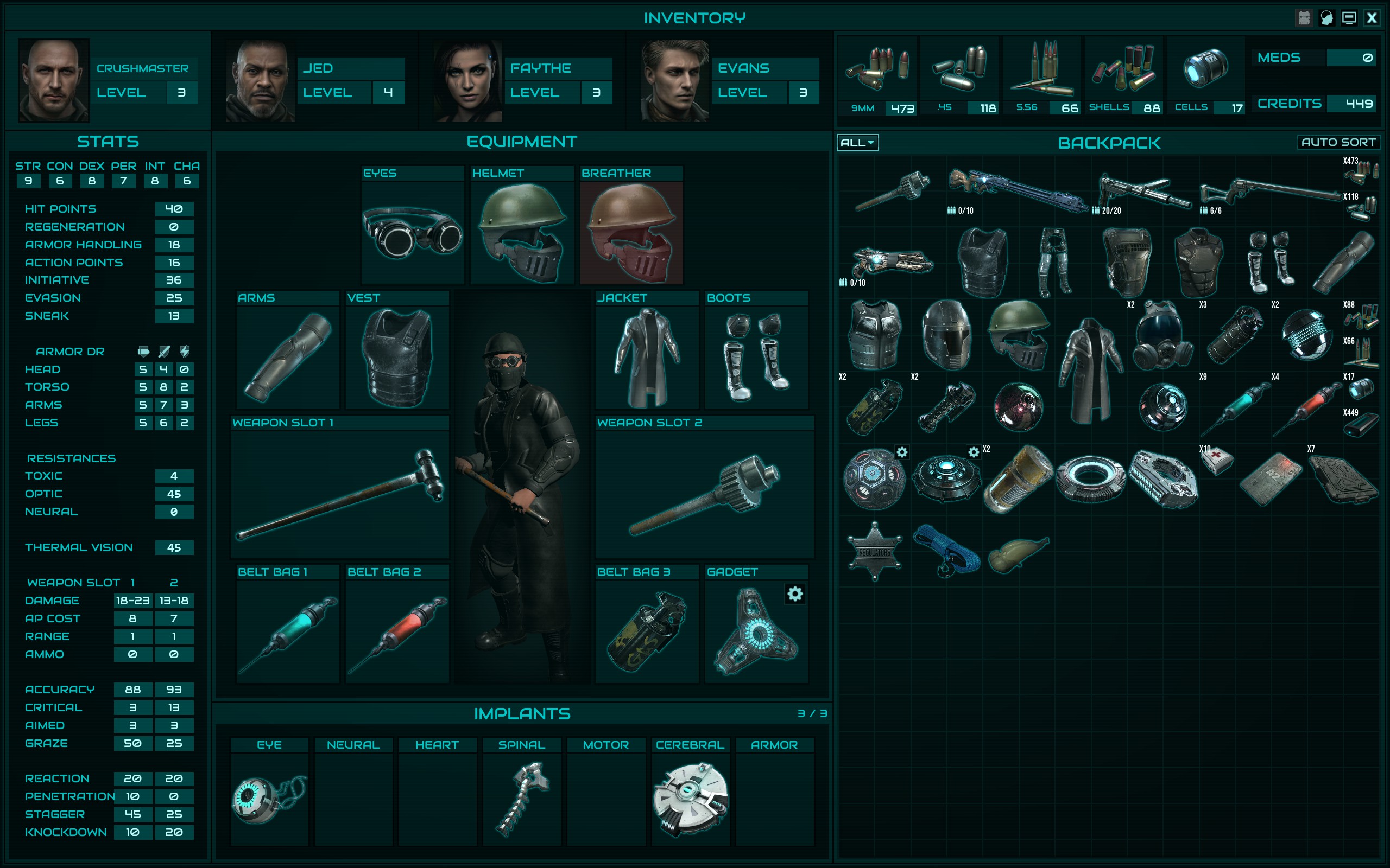
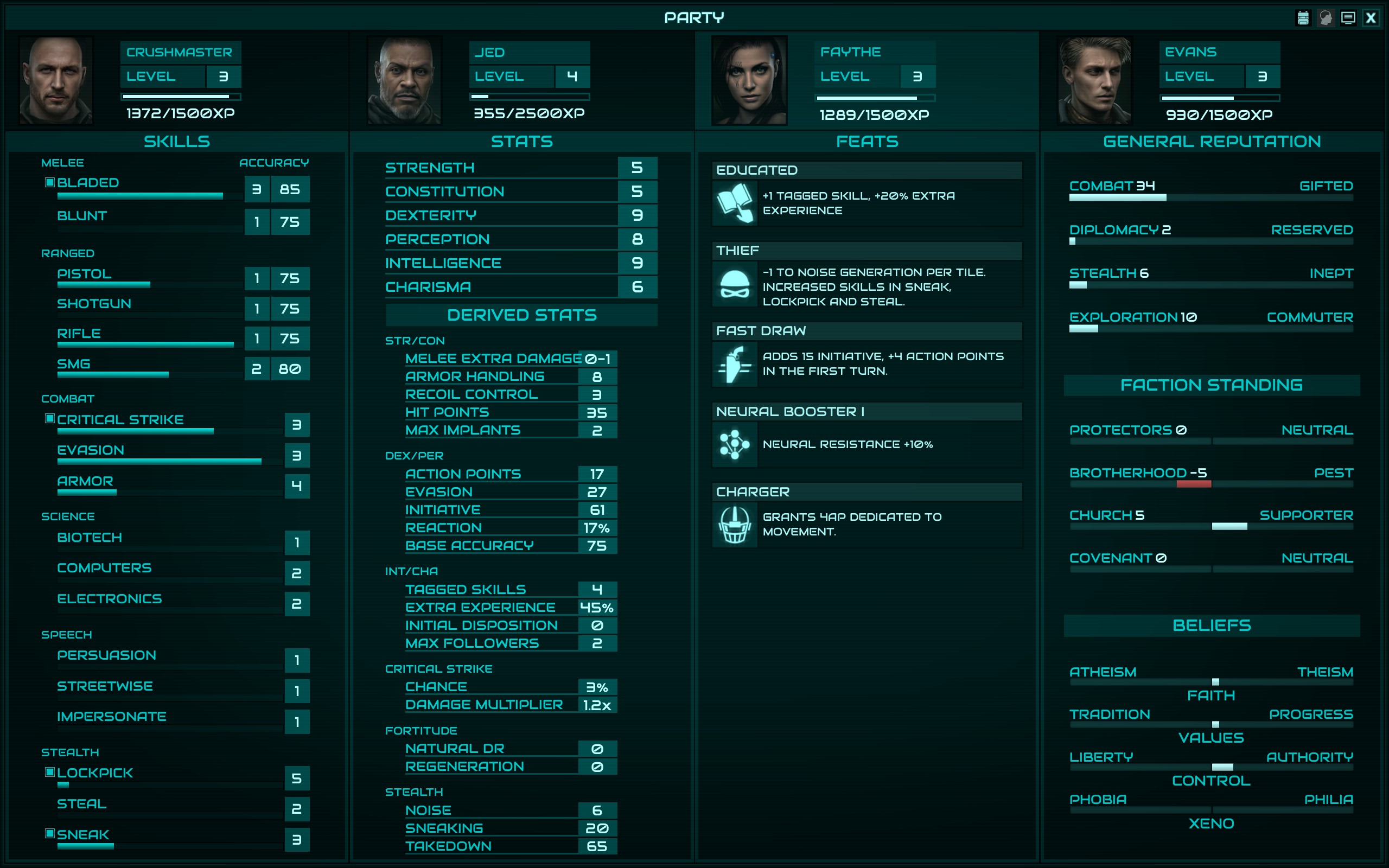
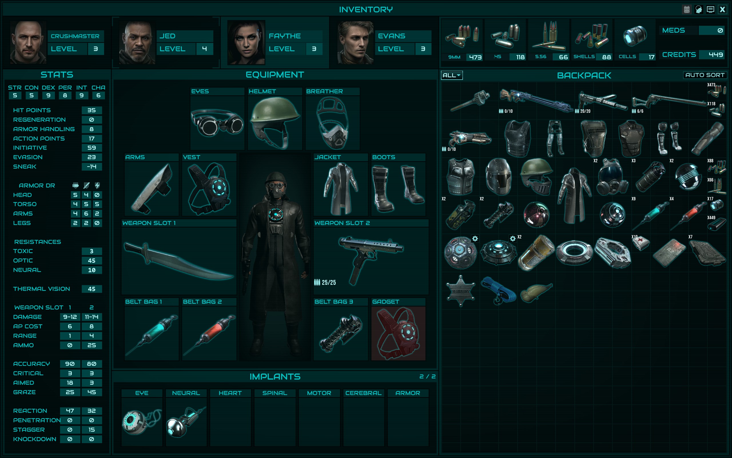
Faythe is a utility knife, and I regret tagging Blade for her. She was just too weak. Even my 30 HP pistelero ended up being far more robust than her, because he had tagged Evasion and had better Armor Handling. It probably makes more sense to just tag non-combat skills for her, and outfit her with either an SMG with plenty of +REACT or a rifle with +ACC and +Aim to plunk away with leg/arm debuffs.
When considering the companions from a narrative perspective, I wish they spoke up a bit more. I don’t mean BG1NPC project, not at all, but just a bit more. Especially when big decisions are going to be made, i.e. supporting Braxton vs Jonas or in weighing actions when Stanton wants to take out The Black Hand. For example, after I took out Jonas, I was surprised to see Evans take a visceral dislike of my choice and Faythe to celebrate it. A bit of commentary before the decision is made on who to support would be welcome. That gets to a bigger issue I have with the Crossroads quest tho, it’s underbaked. You could theoretically make your decision on who to support within the first 30 minutes of the game, prior to recruiting anyone perhaps other than Evans.
Faythe asking you to spare whats-his-name from the Hydroponics zone was a nice touch of personality tho, and I gather there will be repercussions for leaving her at Whiskey Jack’s, killing him, and coming back to be dressed down by Faythe. I’m guessing it sets up a betrayal scenario.
Items
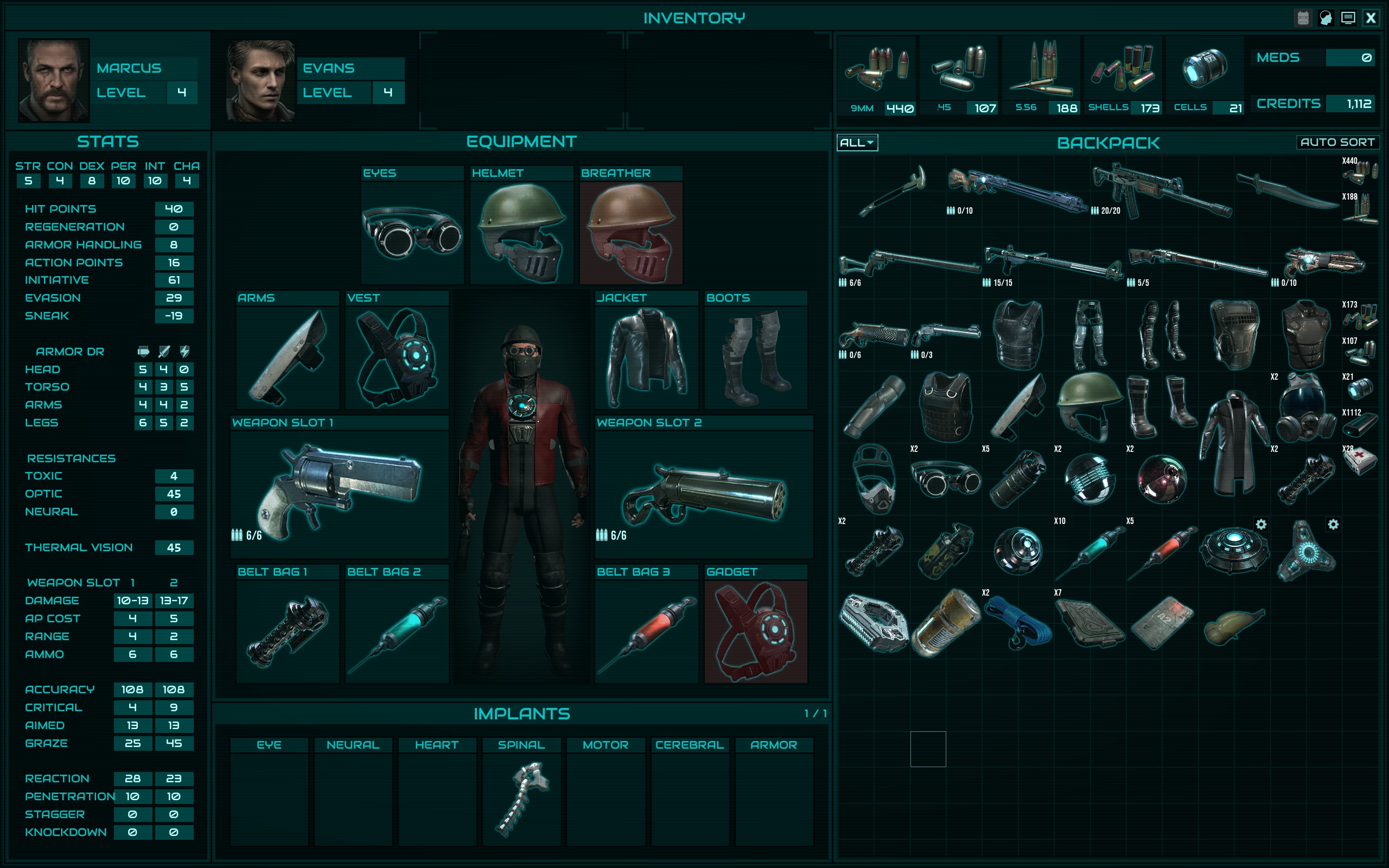
I vastly prefer hand-placed, hand-generated items over programmatic, so it’s no surprise that I enjoyed playing within the design principles here. At first I was a bit overwhelmed by all the permutations of gear, but I gradually realized that armor was being segmented into tiers based on the Armor Handling needed to negate the debuffs, and within each tier there were worse/better versions of every armor piece, as well as ones suited to more melee or ranged or energy defense. It really is a nice, customizable system. My only gripe is that in the current early access build, it's too easy to never encounter a piece of armor which reduces AP. Thus, the feat that adds to Armor Handling and reduces the AP penalty seems like a waste, but it’s actually a sleeper feat from what I can tell. I expect that this will catch players unaware, and it’s a bit of a nasty surprise. You may want to consider teasing some armor with –AP earlier, such that the value of the armor handling feat is more apparent.
See the suggestions section for more there, I hope there is a very limited upgrade system planned (think collecting item pieces to be assembled in BG2). I also think the gadget upgrade paths should be more opaque.
Finally – what the hell does the cloaking device do? I get –10 thermal vision, so if you’re in a smoke screen and the enemy has thermal vision, it’s less effective by a flat 10% when aiming at the character. But what is “Enemy Detection +35%/Turn”?


User interface
Other than the items related to worldbuilding above, this is the only other area of the game that I think could use significant improvement. Right now, the UI is functional and gets the job done. But, I think with a bit more thought and resources put into it, it could elevate the game significantly.
I think the UI should be skeuomorphic, with the same general layout and color pattern that is in place now, but with physicality anchoring it rather than vector-drawn graphics. For example, during character creation / in the character screen, the flat neon blue ribboning would be replaced with neon lights, i.e. blown glass tubes through which blue neon light radiates, with the subtly swirling gases contained within. Framing the UI in a physical space that makes sense in the context of Colony Ship would add a level of details that, again, helps the player buy into the world. It also adds some screenshot bling that helps draw the eyes of potential new players.
I’m not suggesting something on the level of HighFleet, but I do think this would make a significant impact on how the game views for those not already drinking the ITS koolaid.
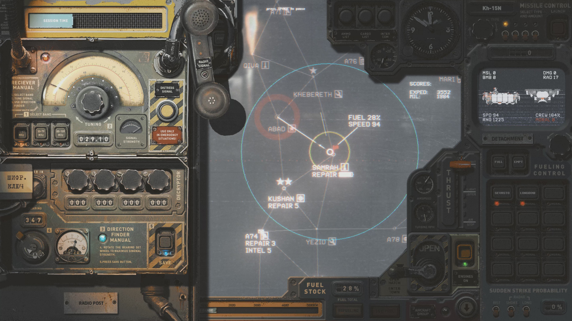 Notes on UI below:
· Separate save slots for each character is a welcome feature.
· Character creation UI is flat, consider adding physical elements - blue ribbing is neon tubes with gas that swirls, etc
· into CYOA scenes:
· Improve readability of text over other graphics: 1-2px black outline to floaters, item values, item quantities. Example of floater text low-contrast problem.
· Dialogue window:
· Barter window: need to show current amount of credits gain/lost, total amounts of ammunition per-type & ranged weapon loaded ammo counter – both of which are in the inventory view already. The ranged weapon loaded ammo counter will also make it less likely the player sells a weapon full of ammo, since they currently cost the same.
· Loot window – should not be fullscreen, should be a centered pop-up.
· Log window – the line spacing between multiple lines of the same message should be tighter than the line spacing between different messages, to improve at-a-glance readability.
· Local map
I’m not suggesting something on the level of HighFleet, but I do think this would make a significant impact on how the game views for those not already drinking the ITS koolaid.

· Separate save slots for each character is a welcome feature.
· Character creation UI is flat, consider adding physical elements - blue ribbing is neon tubes with gas that swirls, etc
· into CYOA scenes:
- text should be better framed, need more margin on left side of the text to bring it closer to the center of the screen. It’s fine to stay on the left-side of the screen, but the text edge shouldn’t run all the way to the left; on a larger screen, that creates a lot of player head panning. It’s done correctly for The Pit intro slide, good padding on the left-margin, but the intro CYOA could use a readability pass.
· Improve readability of text over other graphics: 1-2px black outline to floaters, item values, item quantities. Example of floater text low-contrast problem.
· Dialogue window:
- dedicated areas for dialogue and responses that don’t resize and reposition themselves. Avoids the resizing effect when two segments of dialogue differ in length by a significant amount. In a game with text like this, reading should be easy. Fallout had it right with the dedicated NPC / player response areas.
- With the suggestion above, some NPC dialogue would need to scroll to keep a fixed location for replies. Yet, currently that scrolling occurs even though there is plenty of vertical space unused. Below are cases were scrolling was found:
§ Solomon’s into dialogue really highlights this, also why isn't it using the full vertical space? link.
§ Chief Justice talking about Hard Ben
§ Mercy.
- Disposition meter is cryptic to me. I gather than the bar going to the right is bad, and to the left is good…. but that is counter-intuitive. In cultures that read left-to-right, seeing a bar fill to the right is read as progress, i.e. a good thing. Swap the direction, with growth of the bar in the good/bad direction green/red, starting at light hues and progressively getting darker at the ends of the meter.
· Barter window: need to show current amount of credits gain/lost, total amounts of ammunition per-type & ranged weapon loaded ammo counter – both of which are in the inventory view already. The ranged weapon loaded ammo counter will also make it less likely the player sells a weapon full of ammo, since they currently cost the same.
· Loot window – should not be fullscreen, should be a centered pop-up.
· Log window – the line spacing between multiple lines of the same message should be tighter than the line spacing between different messages, to improve at-a-glance readability.
- See this image for an example of the line spacing making it hard to distinguish when one message ends and another begins.
· Local map
- Rather than use screenshots from the level, make the images look as if they’re either postcards or rendered on a handheld computer; if postcard, make the location names appear as physical badges on a map, as if the player is looking at an annotated map
- Open the correct local map for the area you're in, i.e. when in Camptown open that map, not Main Street
Suggestions
Collected below.
The Pit
· Turret in storage container needs a death SFX, something satisfying.
· There should be a few more flavor NPCs and objects to interact with that really demonstrate (a) the current state of the Pit under Jonas’s “rule” and (b) provide narrative context for Braxton’s desire to clean up The Pit. As it is, the player doesn’t really see a big issue in the pit, one that warrants a law and order revolution, other than the thugs immediately outside your apartment..
Armory
· Frog psyche room in Armory L1 – need option / CYOA scene to destroy/harvest eggs. This should also be small quest hook, i.e. destroying or taking some eggs is recognized or rewarded somehow
· Armory A2 – interacting with computer console describes the player stepping within range of the autocannons, as does dialogue with Sharp Face. There’s no autocannons visible on the map, so they should be added.
Hydroponics
· Hydroponics Delta tower – once you sneak in vent you can’t sneak out. Should let the player exit back out vent without killing crew or starting combat.
· Using the transit pod should provide some narrative text, like with the elevator and emergency stasis field.
· The non-camp Reid towers in hydroponics, especially the two the player goes through to find the bioreactor parts, could use some interactions with descriptive text on certain items. The broken glass reactor vessels, etc. Scavenging the bioreactor parts and finding the worm with bright sludge trail is great and atmospheric, a bit more of that would help build up this map.
Factory
· Vendor at Fort Stanton does not have many credits, can’t even sell gear acquired from clearing the ambush fight. Intentional?
UI
· Input: support the numpad!! If it was good enough for Baldur’s Gate, it’s good enough for Colony Ship. I couldn’t tell you how many times I tried to select dialogue responses with the numpad 1-2-3, or confirm a popup with the numpad’s enter key. This should be trivially easy for your programmer, just add the directX scancodes for numpad numbers & enter.
· Have an OPTIONAL zoom to NPC when initiating proper dialogue (i.e. not on barks)
· Have an OPTIONAL camera zoom lock that prevents you from zooming too far in or out
· Inventory – change item type filter from drop-down to dedicated horizontal row of buttons, like in barter screen
· When dismissing companion, have option to stop showing “You can find your companions at Whiskey Jack”
· When an information popup appears with the only option of “Ok”, such as the “You can find your companions..” message, spacebar or enter (including NUMPAD enter!) should dismiss it. This is default windows popup behavior and would be appreciated by your keyboard-loving fans (myself included).
· Track human/animal/plant/etc kills in character sheet. This isn’t just vanity, I wished I had this info when trying to evaluate the relative value of a Feat that activates on NPC death vs a at the start of combat. Maybe it’s on me for not knowing this instinctively, but with a party of 4 I didn’t have a strong sense of who was doing the killing, except that Faythe was doing the least.
· Party management screen:
Item / graphics / sfx
· Specularity on biorecycler and some other metal objects on Main Street is too high, they looks wet / covered in plastic wrap. See here.
· Gadgets in general need better descriptions. That isn’t to say they should have clinical MMO-style presentation of stats, but a bit more relevant information keeping with the tone and style of the current descriptions.
· Gadgets’ upgrade screen - for upgrades not yet found, make the upgrade items icons silhouettes and disable tooltips; i.e. the player needs to find these things to learn about them. There’s no way my character should know what the MK2/3 items look like or will do. Imagine this with silhouettes for the unfound upgrades – a bit of mystery is a good thing.
· Should add throwing knives that persist on corpse, with some % chance of recovering on map after a miss
· Bulldog I/II SFX is too thin, it sounds like a BB gun. Especially the .45 model. Ever shot a 1911? It should boom like the 223 pistol in Fallout
· Gunslinger jacket’s inventory icon should reflect that the jacket is red when worn, also helps differentiate from the other jackets.
Miscellaneous
· It’s odd that you don’t find credit sticks ever, on corpses or in locked containers
· Turret in storage container needs a death SFX, something satisfying.
· There should be a few more flavor NPCs and objects to interact with that really demonstrate (a) the current state of the Pit under Jonas’s “rule” and (b) provide narrative context for Braxton’s desire to clean up The Pit. As it is, the player doesn’t really see a big issue in the pit, one that warrants a law and order revolution, other than the thugs immediately outside your apartment..
Armory
· Frog psyche room in Armory L1 – need option / CYOA scene to destroy/harvest eggs. This should also be small quest hook, i.e. destroying or taking some eggs is recognized or rewarded somehow
· Armory A2 – interacting with computer console describes the player stepping within range of the autocannons, as does dialogue with Sharp Face. There’s no autocannons visible on the map, so they should be added.
Hydroponics
· Hydroponics Delta tower – once you sneak in vent you can’t sneak out. Should let the player exit back out vent without killing crew or starting combat.
· Using the transit pod should provide some narrative text, like with the elevator and emergency stasis field.
· The non-camp Reid towers in hydroponics, especially the two the player goes through to find the bioreactor parts, could use some interactions with descriptive text on certain items. The broken glass reactor vessels, etc. Scavenging the bioreactor parts and finding the worm with bright sludge trail is great and atmospheric, a bit more of that would help build up this map.
Factory
· Vendor at Fort Stanton does not have many credits, can’t even sell gear acquired from clearing the ambush fight. Intentional?
UI
· Input: support the numpad!! If it was good enough for Baldur’s Gate, it’s good enough for Colony Ship. I couldn’t tell you how many times I tried to select dialogue responses with the numpad 1-2-3, or confirm a popup with the numpad’s enter key. This should be trivially easy for your programmer, just add the directX scancodes for numpad numbers & enter.
· Have an OPTIONAL zoom to NPC when initiating proper dialogue (i.e. not on barks)
· Have an OPTIONAL camera zoom lock that prevents you from zooming too far in or out
- I love the camera in CS, and I appreciate that it gives you maximal freedom to manipulate it. I think for a lot of people the freedom will confuse them, so you may want to consider implementing these optional zoom limits and defaulting the game to use them.
· Inventory – change item type filter from drop-down to dedicated horizontal row of buttons, like in barter screen
· When dismissing companion, have option to stop showing “You can find your companions at Whiskey Jack”
· When an information popup appears with the only option of “Ok”, such as the “You can find your companions..” message, spacebar or enter (including NUMPAD enter!) should dismiss it. This is default windows popup behavior and would be appreciated by your keyboard-loving fans (myself included).
· Track human/animal/plant/etc kills in character sheet. This isn’t just vanity, I wished I had this info when trying to evaluate the relative value of a Feat that activates on NPC death vs a at the start of combat. Maybe it’s on me for not knowing this instinctively, but with a party of 4 I didn’t have a strong sense of who was doing the killing, except that Faythe was doing the least.
· Party management screen:
- show total HP to be healed somewhere, to make medkit math easier
- add option to dismiss party member. It’s fine that it’s in the character sheet, leave it there, but add it here as well. Character sheet is counter-intuitive.
Item / graphics / sfx
· Specularity on biorecycler and some other metal objects on Main Street is too high, they looks wet / covered in plastic wrap. See here.
· Gadgets in general need better descriptions. That isn’t to say they should have clinical MMO-style presentation of stats, but a bit more relevant information keeping with the tone and style of the current descriptions.
- At a minimum, the Energy Shield description should say that it inhibits melee attacks
· Gadgets’ upgrade screen - for upgrades not yet found, make the upgrade items icons silhouettes and disable tooltips; i.e. the player needs to find these things to learn about them. There’s no way my character should know what the MK2/3 items look like or will do. Imagine this with silhouettes for the unfound upgrades – a bit of mystery is a good thing.
· Should add throwing knives that persist on corpse, with some % chance of recovering on map after a miss
· Bulldog I/II SFX is too thin, it sounds like a BB gun. Especially the .45 model. Ever shot a 1911? It should boom like the 223 pistol in Fallout
· Gunslinger jacket’s inventory icon should reflect that the jacket is red when worn, also helps differentiate from the other jackets.
Miscellaneous
· It’s odd that you don’t find credit sticks ever, on corpses or in locked containers
- I did find a single credit stick on the bartender at The Promised Land after the siege.
Bugs
It’s EA, and its got bugs. For the UI stuff, note that I’m playing in 2560x1600 on Win7 with no display scaling (i.e. DPI setting is at native 100%).
UI
· Party management screen layout has element placement problems
· Text in character sheet also overflows sometimes (melee extra damage)
Armory
· Depot A2 - training computer, no option to "go back" out of training token options, you have to select then and there.
· Sharp Face – in assertive combat dialogue it says 2 men slip off , but it’s actually 3. His combat team goes from 6 to 3.
Hydroponics
· Map: train station text is mostly off the map
· Entering first tower in hydroponics, when the cursor falls over doorway into top floor of tower selects the "sneak" option into barracks on the floor underneath.
· Top of tower with bridge to bioreactor parts: when pathing from here to the red dot , the party gets stuck on the strangled corpse.
Factory
· No local map image (as of 7/16/2021)
· Rifle 5 check in scripted event doesn’t use Evan’s skill if PC’s is too low.
· When you first depart with Smiles, before the ambush, she doesn’t climb down ladders with you. Saving, quitting and loading doesn’t fix. After that, she is missing in some scripted interactions, but she IS present for the ambush fight. It is purely a cosmetic issue.
Miscellaneous
· Guns loaded with ammo sell for same price as empty
· Combat – in placement phase, possible to get overlapping text that isn’t readable. Image.
· Bodies that fall down and rest on stairs can't always be looted -> Mercy & Braxton fights both had this occur. Can select the bodies, but player can’t path to them to loot. Example here.
· Party management screen layout has element placement problems
· Text in character sheet also overflows sometimes (melee extra damage)
Armory
· Depot A2 - training computer, no option to "go back" out of training token options, you have to select then and there.
· Sharp Face – in assertive combat dialogue it says 2 men slip off , but it’s actually 3. His combat team goes from 6 to 3.
Hydroponics
· Map: train station text is mostly off the map
· Entering first tower in hydroponics, when the cursor falls over doorway into top floor of tower selects the "sneak" option into barracks on the floor underneath.
· Top of tower with bridge to bioreactor parts: when pathing from here to the red dot , the party gets stuck on the strangled corpse.
Factory
· No local map image (as of 7/16/2021)
· Rifle 5 check in scripted event doesn’t use Evan’s skill if PC’s is too low.
· When you first depart with Smiles, before the ambush, she doesn’t climb down ladders with you. Saving, quitting and loading doesn’t fix. After that, she is missing in some scripted interactions, but she IS present for the ambush fight. It is purely a cosmetic issue.
Miscellaneous
· Guns loaded with ammo sell for same price as empty
- Suggestion of adding ammo counter for ranged weapons in this screen helps address, although price should still be [base item] + [1 credit/ammo except if it’s energy then 15/per]
· Combat – in placement phase, possible to get overlapping text that isn’t readable. Image.
· Bodies that fall down and rest on stairs can't always be looted -> Mercy & Braxton fights both had this occur. Can select the bodies, but player can’t path to them to loot. Example here.
Typos
If there is text, there are typos.
· The Pit intro - (T)he Promised Land needs the T capitalized, since the name on the sign starts with "The" as well. Link
· Evans' intro dialogue - eying should be eyeing
· Solomon's into dialogue – use of oblong here doesn’t match any definition of it I can find, oblong is an adjective. Probably meant to write metal pulpit / lectern / podium.
· Boone - algae quest, "choke-full of" should be "chock-full of"
· Zeke - air purifier quest, oxydizer should be oxidizer.
· Zeke – override module quest; text when installing it says "operating reserves, voltage, reactance" reactance should be replaced with “resistance”, unless you really do mean reactance, in which case you should either use power or amperage. Reactance does not sound correct to me and my engineering background.
· Flashbang (low & mid) description text maluses doesn't match stat block below
· Jed: "what brought you here" -> "disposition failure text " text has double space, plus no coloring on [disposition: failure]
· Traveling with Smiles in the Factory - Keeper dialogue, "I'll back before you know it. " -> missing “be”, it should “I'll BE back”
· Talking to Bartholomew - "For once, he isn't..." should be -> For ONE, he isn’t…
· Stanton – when the player is persuading him to recruit Detroit gang to attack the Black Hand, he says “… Attacking the Black Hand out won’t be easy…” -> is the word OUT correct? Should it say “out in the open”? “out of the blue”? Doesn’t sound correct as-is.
· Similar to the above, the player’s response to Faythe that offers “No Terran…” sounds off. Is a Terran a name for people who live(d) on earth? I don’t think I saw that language elsewhere. Maybe “I know Terrans…” if Terrans are indeed old-earth inhabitants, or just use language used elsewhere.
· Text blocks missing closed quotes, I’m sure there’s more as this is a hard one to notice while reading.
· Evans' intro dialogue - eying should be eyeing
· Solomon's into dialogue – use of oblong here doesn’t match any definition of it I can find, oblong is an adjective. Probably meant to write metal pulpit / lectern / podium.
· Boone - algae quest, "choke-full of" should be "chock-full of"
· Zeke - air purifier quest, oxydizer should be oxidizer.
- when returning with the oxidizer, player’s text says "I found an oxydizer you needed", it should be THE oxidizer, not an
· Zeke – override module quest; text when installing it says "operating reserves, voltage, reactance" reactance should be replaced with “resistance”, unless you really do mean reactance, in which case you should either use power or amperage. Reactance does not sound correct to me and my engineering background.
· Flashbang (low & mid) description text maluses doesn't match stat block below
· Jed: "what brought you here" -> "disposition failure text " text has double space, plus no coloring on [disposition: failure]
· Traveling with Smiles in the Factory - Keeper dialogue, "I'll back before you know it. " -> missing “be”, it should “I'll BE back”
· Talking to Bartholomew - "For once, he isn't..." should be -> For ONE, he isn’t…
· Stanton – when the player is persuading him to recruit Detroit gang to attack the Black Hand, he says “… Attacking the Black Hand out won’t be easy…” -> is the word OUT correct? Should it say “out in the open”? “out of the blue”? Doesn’t sound correct as-is.
· Similar to the above, the player’s response to Faythe that offers “No Terran…” sounds off. Is a Terran a name for people who live(d) on earth? I don’t think I saw that language elsewhere. Maybe “I know Terrans…” if Terrans are indeed old-earth inhabitants, or just use language used elsewhere.
· Text blocks missing closed quotes, I’m sure there’s more as this is a hard one to notice while reading.
- Mercy – no closed quotes after first text block ..”It’s the downside that worries me[“]
- Maryam - "We don't know what awaits us at the end of our journey." dialog, first paragraph doesn't close quotations at end
- Carlos – no closed quotes at the end of his first paragraph.
- Chief Justice – no closed quotes at the end of the first paragraph here either.
Tagging Elhoim for good measure as well.
Last edited:


