Putting the 'role' back in role-playing games since 2002.
Donate to Codex
Good Old Games
  • Welcome to rpgcodex.net, a site dedicated to discussing computer based role-playing games in a free and open fashion. We're less strict than other forums, but please refer to the rules.

    "This message is awaiting moderator approval": All new users must pass through our moderation queue before they will be able to post normally. Until your account has "passed" your posts will only be visible to yourself (and moderators) until they are approved. Give us a week to get around to approving / deleting / ignoring your mundane opinion on crap before hassling us about it. Once you have passed the moderation period (think of it as a test), you will be able to post normally, just like all the other retards.

Do older games sometimes look better from being less cluttered? (Minimalism?)

Louis_Cypher

Arcane
Joined
Jan 1, 2016
Messages
2,000
I recently fired up 'Severance: Blade of Darkness'. During the opening, from about 1 minute 20 seconds below (should play from there), there is a valley or gorge that is just very visually and audibly satisfying. It struck me as another example of how late 1990s and early 2000s games captured the feel of mysterious worlds, in very few polygons, often constructed from simple shapes representing flat rock planes or pillars of unadorned rock. I was enjoying the scenery of a game that I never played upon release, despite it technically being 20 years old, from a time ostensibly primitive compared to current capabilities, more than I do in many modern games. Perhaps level designers had a good sense for placement of terrain, and could translate it into game design. The sound design sells the scene, and the whole thing gives a cool vibe:


There is almost no actual detail beyond the textures. No grass. No twigs. No bushes. No random rocks. Yet it feels like a real place, full of shallow pools, cascading from one section of a river to another, and one that is inviting to explore. These days we have the technology to place shrubs everywhere, fill it with sand, put decorations everywhere, make the rocks realistic, or fill an internal man-made space with candles and baroque furnishings. I personally find that the eye can slide off too much detail. The suggestion of what is there, the impression, is more important than the detail.

ozne5gE.png
xOPFjz4.png


Dark Souls I in general used a lot of interesting architecture, from studying European ruins and churches, had lots well placed architectural features, mysterious stairs, and nice walls or coblestones of undressed stone. Resembling Dunluce Castle, Klis Fortress, or Heidelberg Castle. The way that people sometimes prefer an ancient ruin, to the actual living colours that temples in Greece or South Asia were sometimes painted in, it shows a aesthetically interesting world pretty devoid of ornamentation in many areas, as if the Undead Parish has been long cleared of any objects by human scavengers, wind and elements.

Is that actually preferable to say tons of baroque details in a video game level? I find my eye sometimes just slides off environments that are packed with objects, depending of course on how tastefully it's done.

eA1C67G.png


I was looking at some screenshots and footage from 'Enotria: The Last Song', which looks great even if it's apparently not a game on par with some other Soulslikes. It has quite beautiful architecture, presumbly inspired by medieval Italian hill towns. I would say I much prefer say the bare bridge or whatever pictured above as a playing area, when compared to something absolutely loaded with objects.
 

Konjad

Patron
Joined
Nov 3, 2007
Messages
5,456
Location
Strap Yourselves In Codex Year of the Donut Codex+ Now Streaming! Torment: Tides of Numenera Wasteland 2 Steve gets a Kidney but I don't even get a tag.
It doesn't matter how many polygons you need to work with, if you're artistically incompetent the end result will always be mediocre at best. Meanwhile if you are skilled you can create beauty even through simplicity.
 

ind33d

Learned
Joined
Jun 23, 2020
Messages
1,809
it's very possible we all like Dark Souls 1 not because of its gameplay but because its graphics were so shitty it made you use your imagination, yes

morrowind probably also worked like this
 

Alienman

Retro-Fascist
Patron
Joined
Sep 10, 2014
Messages
18,230
Location
Mars
Codex 2016 - The Age of Grimoire Make the Codex Great Again! Grab the Codex by the pussy Codex Year of the Donut Shadorwun: Hong Kong Divinity: Original Sin 2 Steve gets a Kidney but I don't even get a tag.
I think a good level between clutter and visual clarity peaked in the 360/PS3 era. While games look better now, they have just become overly cluttered. However, I think the overuse of shaders, stuff being blurry is a worse sin overall. Nothing looks “clean” anymore. Compare that to older games running with 4x anti-alias.
 

JC'sBarber

Educated
Joined
Sep 14, 2024
Messages
129
It's easy to say that older games had better aesthetics, and that's the reason they held up so well, which is true but it ignores the fact that if you ported the exact same assets and environments into a newer engine, like UE5, you would see that it ends up looking like most modern games today sans the polygon counts and 4K textures. It's the way modern software renders games that is worse, not so much the aesthetics.
 

Necrensha

Educated
Joined
Aug 31, 2024
Messages
452
Location
Deep underground
This is another 'muh realism' problem, you know, it just doesn't look real enough in those darn old games, gotta add more random bullshit to the area.
Here's the perfect example:
 

tommy heavenly6

Learned
Joined
Dec 22, 2022
Messages
217
If video games don't look like the room of the average thot under 40 these days, gamers deem it visually unimpressive, which is why they need now yellow paint to tell them what's interactable and what not
 

JarlFrank

I like Thief THIS much
Patron
Joined
Jan 4, 2007
Messages
34,382
Location
KA.DINGIR.RA.KI
Steve gets a Kidney but I don't even get a tag.
It's not about amount of clutter, but the type of clutter. For example I really like cluttered Thief fan missions, but being fan missions for a 20 year old game they run on an old engine that isn't capable of modern visual effects. So even if a level is cluttered with a lot of objects, there's no bloom, there's no chromatic aberration, there's no other weird visual effects that muddy up the scene.

There's just the objects, the textures, the architecture, the lighting.

Games from around the year 2000 look great because they had the technology to portray locations quite realistically, but didn't have the tech to fill your screen with bullshit effects.
They have a visual clarity that lets you read the scene at a glance.
 

NecroLord

Dumbfuck!
Dumbfuck
Joined
Sep 6, 2022
Messages
14,924
I recently fired up 'Severance: Blade of Darkness'. During the opening, from about 1 minute 20 seconds below (should play from there), there is a valley or gorge that is just very visually and audibly satisfying. It struck me as another example of how late 1990s and early 2000s games captured the feel of mysterious worlds, in very few polygons, often constructed from simple shapes representing flat rock planes or pillars of unadorned rock. I was enjoying the scenery of a game that I never played upon release, despite it technically being 20 years old, from a time ostensibly primitive compared to current capabilities, more than I do in many modern games. Perhaps level designers had a good sense for placement of terrain, and could translate it into game design. The sound design sells the scene, and the whole thing gives a cool vibe:


There is almost no actual detail beyond the textures. No grass. No twigs. No bushes. No random rocks. Yet it feels like a real place, full of shallow pools, cascading from one section of a river to another, and one that is inviting to explore. These days we have the technology to place shrubs everywhere, fill it with sand, put decorations everywhere, make the rocks realistic, or fill an internal man-made space with candles and baroque furnishings. I personally find that the eye can slide off too much detail. The suggestion of what is there, the impression, is more important than the detail.

ozne5gE.png
xOPFjz4.png


Dark Souls I in general used a lot of interesting architecture, from studying European ruins and churches, had lots well placed architectural features, mysterious stairs, and nice walls or coblestones of undressed stone. Resembling Dunluce Castle, Klis Fortress, or Heidelberg Castle. The way that people sometimes prefer an ancient ruin, to the actual living colours that temples in Greece or South Asia were sometimes painted in, it shows a aesthetically interesting world pretty devoid of ornamentation in many areas, as if the Undead Parish has been long cleared of any objects by human scavengers, wind and elements.

Is that actually preferable to say tons of baroque details in a video game level? I find my eye sometimes just slides off environments that are packed with objects, depending of course on how tastefully it's done.

eA1C67G.png


I was looking at some screenshots and footage from 'Enotria: The Last Song', which looks great even if it's apparently not a game on par with some other Soulslikes. It has quite beautiful architecture, presumbly inspired by medieval Italian hill towns. I would say I much prefer say the bare bridge or whatever pictured above as a playing area, when compared to something absolutely loaded with objects.

What counts is aesthetics and presentation.
Not everything has to be ultra realistic, and games back in the day were not concerned with that. What really mattered was the gameplay.
 

Humanophage

Arcane
Joined
Dec 20, 2005
Messages
5,441
I don't fully agree. Older 3D was prohibitively ugly - not just the models, but also the blocky, geometric, headache-inducing environments. 2D had the baroque detail at the time and was beautiful. In fact, early 3D was so ugly and was overwhelming 2D at such a rapid pace at one point that I almost lost enthusiasm for gaming because everything was turning so irritatingly fugly. It's untrue that games didn't care about presentation back then. There was a huge graphics race.

Intermediate 3D was a bit more tolerable, but it suffered from more invisible walls such that the baroque bush is actually an impenetrable rock. I think the annoyance comes from there being so many elements which appear interactable or having uneven texture, but in fact are not and the underlying structure is still as blocky as it was before. Whereas old 3D might feel more alive because the shapes are meaningful (e.g., you can jump on a ledge in Gothic if it looks like a ledge). That said, I still think modern 3D like Witcher 3 or Jagged Alliance 3 looks fairly attractive while something like NWN1, Warcraft 3 or Quake 2 looks ugly.

It might be a little different for highly action-packed games like shooters because it's easier to understand what's going on in Unreal Tournament than in something like Hunt. But in truth it's probably an unfair advantage and actual combat is more like Hunt. But then UT is more pleasant.

The bottom line is that 3D is usually either ugly or uncanny, or incomprehensible. 2D > 3D.
 
Last edited:

Louis_Cypher

Arcane
Joined
Jan 1, 2016
Messages
2,000
It's not about amount of clutter, but the type of clutter. For example I really like cluttered Thief fan missions, but being fan missions for a 20 year old game they run on an old engine that isn't capable of modern visual effects. So even if a level is cluttered with a lot of objects, there's no bloom, there's no chromatic aberration, there's no other weird visual effects that muddy up the scene.

There's just the objects, the textures, the architecture, the lighting.

Games from around the year 2000 look great because they had the technology to portray locations quite realistically, but didn't have the tech to fill your screen with bullshit effects.
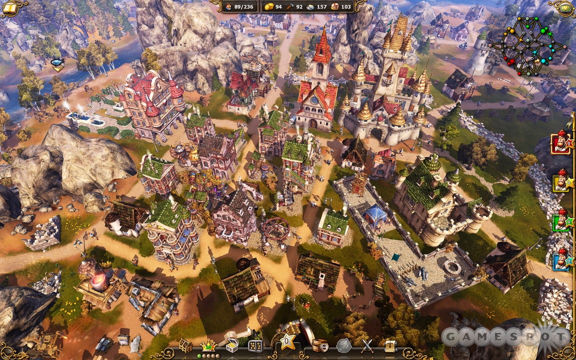
They have a visual clarity that lets you read the scene at a glance.
Although I've heard the term before, I didn't know what chromatic abberation actually was:

uibu0fI.png


bdrBOlC.jpeg


I guess in older games, if you run something like 'Severance: Blade of Darkness' in 4K on a modern PC, it renders the entire level sharply without any visual effects based on distance or anything else. I didn't consciously notice that, but I enjoy playing old games in modern high resolutions, high fps, and them just being matter-of-fact sharper games.

On the topic of clutter, personally I like the aesthetic design of a lot of 3D games from roughly 1998 to roughly 2008, so things like Morrowind, or Thief, or Deus Ex, or Unreal and Quake engine games like 'Klingon Honor Guard' (but not some others like NWN):

eRq2XOq.png


eSGklHq.png


But it's not that I think the engines are superior to modern ones like Unreal Engine 4 or Unreal Engine 5... I think the levels were just more evocative in layout, the sound design and other elements made much more concise use of fewer resources. If the same economy of resources were applied to modern games, I think they would be just as compelling, but as someone said above, many journos and stuff probably think visual clutter = fidelity to reality (which may be one of the reasons they have to highlight what is actually interactable so much with yellow paint etc). It's the imagination of the developer that made these games evocative, just like boomer shooters in general had imaginative fictional settings like hell worlds, alien fortress planets, and arcane dimensions; the level layout would suggest logical reasons why an object was where it was, and there wasn't much superfluous stuff beyond that.

To give an example of clutter, I felt 'Dark Souls III', being developed for the more powerful 8th gen of consoles, contained more cluttered visual environments than 'Dark Souls I' and 'Dark Souls II'. Say on the High Wall of Lothric, there is furniture and undead trees everywhere in some spefic areas, compared to Undead Burg and Undead Parish. Still a decent game, but I actually found myself preferring the DS/DS1/DS2 level of minimalism.

yQlZPuA.png


To be honest, although I like 'Space Marine 2', (and 'Rogue Trader' was decent enough for one run), so I'm not picking on them, I find some modern interpretations of 40K to be a bit high on clutter. I think that a lot of the details in modern 40K games can be a bit too much, like they are trying to actually ape the actual art of John Blanche and others. Wheras it was given in past games that outside of the Imperial Palace or a Cardinal World, the technology of the Imperium is a lot more utilitarian. Tube televisions, purity seals, wax, candles, gothic arch shaped air conditioning units, etc risk just becoming a bad cliche. 2nd Edition 40K was quite utilitarian and the setting could benefit from some spartan totalitarian brutalism:

OSsqmYo.png


7i0B22l.png


j9ob9XA.png


It's the setting of the fort, growing out of a rock formation, rather than the detail of the structure itself, in the diorama above, that creates a sense of interest. The background of a jungle for example, is something that pulls the imagination into the scene, as if some lone lone Catachan regiment has been making it's way through a rainforest. In that last image, the Imperial landing pad doesnt need to be anything more than a octagon with a tower, it actually feels more like an isolated outpost; it's the beauty of Scotland, as opposed to the beauty of a city.
 

dbx

Arcane
Patron
Joined
Dec 14, 2009
Messages
4,049
Location
Wannabe Austria
I don't like environments that are too unclettered, seems rather unrealistic to me.
But modern games have amped that shit to over 9000 to a point everything is as filled with trash as some rando mubai/sanfran street...
You walk down some apartment complex and corridors are full of trash w.t.f. I've been in some poor and rundown apartments for lowlife but they still tried to clean up the place, the buildings and structures were rundown and decrepit but otherwise they were all somewhat clean and devoid of trash.
Either level designer are all living in some gypsy apartment complex in romania or in designated shitting streets in india.
 

Kabas

Arcane
Patron
Joined
Feb 10, 2018
Messages
1,732
Quake modders can easily give many modern games a run for their money when it comes to being visually stunning.
7iN23iY.png
gEyiFyJ.png
beOwox8.jpg

It definitely takes some artistic skill and good knowledge of the avaliable tools to make a game look good.
 

mondblut

Arcane
Joined
Aug 10, 2005
Messages
22,715
Location
Ingrija
Quake modders can easily give many modern games a run for their money when it comes to being visually stunning.

Buildings were never a problem for early 3D. They are, after all, made of primitive blocks.

When a 40-polygon human walks in, that's when you want to gouge out your eyes.
 

rumSaint

Educated
Patron
Joined
Sep 1, 2023
Messages
187
Location
Poland
Enjoy the Revolution! Another revolution around the sun that is.
While some cases of graphics looks like shit (early psx, blocky poly crap), everything boils down to art direction and ability of artists and level designers to create meaningful environments/maps. There are already plenty of examples in this thread already.

I personally loved art direction of WH40K Space Hulk (even though game was kinda bad).


While I cannot stand Battle Sector.
warhammer-40-000-battlesector-pc-game-steam-wallpaper-3.jpg


Of course stylized graphics will be timeless (HoMM3).
 
Joined
Dec 19, 2012
Messages
1,795
It's not about amount of clutter, but the type of clutter. For example I really like cluttered Thief fan missions, but being fan missions for a 20 year old game they run on an old engine that isn't capable of modern visual effects. So even if a level is cluttered with a lot of objects, there's no bloom, there's no chromatic aberration, there's no other weird visual effects that muddy up the scene.

There's just the objects, the textures, the architecture, the lighting.

Games from around the year 2000 look great because they had the technology to portray locations quite realistically, but didn't have the tech to fill your screen with bullshit effects.
They have a visual clarity that lets you read the scene at a glance.

I guess in older games, if you run something like 'Severance: Blade of Darkness' in 4K on a modern PC, it renders the entire level sharply without any visual effects based on distance or anything else. I didn't consciously notice that, but I enjoy playing old games in modern high resolutions, high fps, and them just being matter-of-fact sharper games.

Never thought much about this, but you're right. I remember even back in the day preferring the look of Descent 1/2 at higher resolutions than a more 'cluttered' Descent 3 with more geography all over the place. I think the original 2 games played a lot better due to this, as well.
 

Ezekiel

Arcane
Joined
May 3, 2017
Messages
6,703
I don't fully agree. Older 3D was prohibitively ugly - not just the models, but also the blocky, geometric, headache-inducing environments. 2D had the baroque detail at the time and was beautiful. In fact, early 3D was so ugly and was overwhelming 2D at such a rapid pace at one point that I almost lost enthusiasm for gaming because everything was turning so irritatingly fugly. It's untrue that games didn't care about presentation back then. There was a huge graphics race.

Intermediate 3D was a bit more tolerable, but it suffered from more invisible walls such that the baroque bush is actually an impenetrable rock. I think the annoyance comes from there being so many elements which appear interactable or having uneven texture, but in fact are not and the underlying structure is still as blocky as it was before. Whereas old 3D might feel more alive because the shapes are meaningful (e.g., you can jump on a ledge in Gothic if it looks like a ledge). That said, I still think modern 3D like Witcher 3 or Jagged Alliance 3 looks fairly attractive while something like NWN1, Warcraft 3 or Quake 2 looks ugly.

It might be a little different for highly action-packed games like shooters because it's easier to understand what's going on in Unreal Tournament than in something like Hunt. But in truth it's probably an unfair advantage and actual combat is more like Hunt. But then UT is more pleasant.

The bottom line is that 3D is usually either ugly or uncanny, or incomprehensible. 2D > 3D.


Original Spyro looks better. All that detail in the remake makes it gaudier and less dreamlike.
 

JarlFrank

I like Thief THIS much
Patron
Joined
Jan 4, 2007
Messages
34,382
Location
KA.DINGIR.RA.KI
Steve gets a Kidney but I don't even get a tag.
dreamlike
I think that word captures quite well why I like early 3D graphics so much. They have a dreamlike quality to them. Even when they go for realism, the low level of detail makes things feel a little surreal, a little dreamy.
 

As an Amazon Associate, rpgcodex.net earns from qualifying purchases.
Back
Top Bottom