Putting the 'role' back in role-playing games since 2002.
Donate to Codex
Good Old Games
  • Welcome to rpgcodex.net, a site dedicated to discussing computer based role-playing games in a free and open fashion. We're less strict than other forums, but please refer to the rules.

    "This message is awaiting moderator approval": All new users must pass through our moderation queue before they will be able to post normally. Until your account has "passed" your posts will only be visible to yourself (and moderators) until they are approved. Give us a week to get around to approving / deleting / ignoring your mundane opinion on crap before hassling us about it. Once you have passed the moderation period (think of it as a test), you will be able to post normally, just like all the other retards.

Incline Good D&D artwork

nikolokolus

Arcane
Joined
May 8, 2013
Messages
4,090
Another one. I'm clearly a huge fan of the art from the AD&D era. Best depiction of the Magic Mouth spell that I've ever seen.
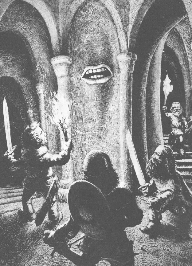
magic-mouth1.jpg


There's something about this art that makes me immediately think Dungeons & Dragons. Some of it's nostalgia, but a lot of it has to do with how it's dark and gritty instead of bright and colorful. The dungeons look dank and dangerous. You can practically smell the wet stone and hear the clatter of armor echoing through the corridors. The modern D&D art doesn't always capture the same feeling, since the focus has mostly moved away from underground exploration.

There's a few things about this composition that I love: 1. It completely captures the idea of the "mythic underworld" as a place with its own rules and features that defies the logic of the surface world 2. The characters all look like regular folk, who are probably in over their heads. These aren't heroes, but they are plucky and brave - quintessential adventurers. 3. Finally, you don't know if they're going to win through or get eaten by the beastie peering back up the stairs and that gives the whole scene tension.
 

Neanderthal

Arcane
Joined
Jul 7, 2015
Messages
3,626
Location
Granbretan
You can't see er lugs though can you?

Fuck me i'm a pedantic cunt, neh mind fucking great drawings anyway.
 
Last edited:

Alex

Arcane
Joined
Jun 14, 2007
Messages
9,213
Location
São Paulo - Brasil
Another classic. Kind of makes you wonder if the party escaped this scenario, or if this was the last time they were ever seen:

trampier%2Bspider.JPG

I think they got it. The wizard seems to be warning the fighter about what is going on, and the dwarf is already going for his sword. Also there are at least two more further back that should be able to help if those three manage to still get caught.
 
Joined
Feb 28, 2011
Messages
4,158
Location
Chicago, IL, Kwa
B7Z-VL6CMAAz841.jpg


http://bigcomicpage.com/2015/08/20/...t-of-tony-diterlizzi-hc-dark-horseturnaround/

Amount of books in the world I want: 1
Amount of fairies and tieflings with huge funny ears per page: all of them


I normally really like DiTerlizzi's work, but what the fuck is going on with the anatomical proportions here? Does he know where nipples are on breasts that size? Also, why is one of them shaped like a crushed lime? And what's up with the creature's right tentacle-arm being fused into its belly?

Not one of his better works.

:decline:


(Still miles ahead of fucking Wayne Reynolds though).
 

Immortal

Arcane
In My Safe Space
Joined
Sep 13, 2014
Messages
5,070
Location
Safe Space - Don't Bulli
what the fuck is going on with the anatomical proportions here?
Does he know where nipples are on breasts that size?
Also, why is one of them shaped like a crushed lime?

Her breasts are in a corset and are being squished against it As far as I can tell. Doesn't look weird to me..
It does give a squished lime appearance and the fats in the breast are being pushed up.. while the nipple is still covered..

Not the best example but:


Neanderthal

Arcane
Joined
Jul 7, 2015
Messages
3,626
Location
Granbretan
I'm just not gettin it, perhaps a few more examples'd help.

Old perv rubs hands together.

But seriously is that a babby Displacer Beast that she's holding?
 

Atlantico

unida e indivisible
Patron
Joined
Sep 7, 2015
Messages
17,122
Location
Midgard
Make the Codex Great Again!
I adore Tony Diterlizzi's art, I was just lost in all those dreamy drawings when I got the Planescape setting back in '94.

Elmore is a legend to me as well, but he's a close second.
 

Alchemist

Arcane
Joined
Jun 3, 2013
Messages
1,439
The new Tony Diterlizzi book is indeed awesome, I got it for Christmas.

I normally really like DiTerlizzi's work, but what the fuck is going on with the anatomical proportions here? Does he know where nipples are on breasts that size? Also, why is one of them shaped like a crushed lime? And what's up with the creature's right tentacle-arm being fused into its belly?

Her breasts are in a corset and are being squished against it As far as I can tell. Doesn't look weird to me..
It does give a squished lime appearance and the fats in the breast are being pushed up.. while the nipple is still covered..

I've studied a lot of breasts in corsets over the years (you know, for science) - and yep, they definitely do that. Diterlizzi knows what he's doing for sure, and the tentacle is coming out of the cat's back, since it's a displacer beast - so that's also fine.

I'm just not gettin it, perhaps a few more examples'd help.

Old perv rubs hands together.
Sounds like a Codex General thread that needs to happen... (the Corset Crowd?). I'd be in firm support of that.

I adore Tony Diterlizzi's art, I was just lost in all those dreamy drawings when I got the Planescape setting back in '94.
Elmore is a legend to me as well, but he's a close second.
I've been collecting art books of all the great TSR D&D artists (the Diterlizzi one is the latest). Also got the two massive Complete Elmore books - if you don't have them you should definitely check them out. They are amazing, very high quality books and include almost everything he has done. By the way, the website listing is out of date on the latest one (Complete Elmore II) it's actually available now (I have it), though the site says it's at the printer.

I still need to get a good Clyde Caldwell collection, and unfortunately I don't think a Jeff Easley collection even exists yet.
 

vonAchdorf

Arcane
Joined
Sep 20, 2014
Messages
13,465
Now we get this:

We1YzBq.png

The old pictures had much more realistic weaponry and armor. When did they decide to go all "rule of cool" on that stuff?
 

Alchemist

Arcane
Joined
Jun 3, 2013
Messages
1,439
Now we get this:

We1YzBq.png

The old pictures had much more realistic weaponry and armor. When did they decide to go all "rule of cool" on that stuff?
The decline started with 3rd edition and its "dungeonpunk" aesthetic. Then came the rise of Wayne Reynolds and the inevitable influence of World of Warcraft on many fantasy artists.

I will say though, that 5th edition overall has taken a welcome step back towards some realism, and it's somewhat less cartoony than 4th edition. Still could be better though.
 

nikolokolus

Arcane
Joined
May 8, 2013
Messages
4,090
Now we get this:

We1YzBq.png

The old pictures had much more realistic weaponry and armor. When did they decide to go all "rule of cool" on that stuff?
The armor and weapons from the golden and silver age of RPGs was plenty unrealistic, it's just that so much of the newer shit you see from Wayne Reynolds et al. is the fucked up scale . . . well that and I find that the art of composition is sort of a lost art - most of the shit churned out in the last ten years feels too posed (like the pic you posted) or hyper-exaggerated.
 

vonAchdorf

Arcane
Joined
Sep 20, 2014
Messages
13,465
Now we get this:

We1YzBq.png

The old pictures had much more realistic weaponry and armor. When did they decide to go all "rule of cool" on that stuff?
The armor and weapons from the golden and silver age of RPGs was plenty unrealistic, it's just that so much of the newer shit you see from Wayne Reynolds et al. is the fucked up scale . . . well that and I find that the art of composition is sort of a lost art - most of the shit churned out in the last ten years feels too posed (like the pic you posted) or hyper-exaggerated.

I was mostly thinking about scale, but also things like huge cauldrons when I said "realistic". Or war hammers. The dwarf (top-right) in the Elmore picture holds something resembling an actual war hammer, while the DnD 5e dwarf lady wields something completely fictional and unbalanced (though it's smaller than during the worst years).
 
Unwanted

Irenaeus II

Unwanted
Dumbfuck Repressed Homosexual The Real Fanboy
Joined
Jun 9, 2015
Messages
3,251
Location
Rio de Janeiro, Cidade Desespero
5ed was an improvement in art, but here and there you get bad art cases like this badly posed you go grrl dwarf with epic mythic equipment. The Orc Paladin in the Player's Handbook is bad too.

Here's something good from 5e for a change:

I was going to post something good from the Player's Handbook, but as I was going through the pages, I came to the realization that I couldn't find a cool fighting dude in the book who looks like anything I liked. I was here thinking to myself, why do I say I like the art in 5ed anyway?? So I was looking at the drawings and I saw cool art of women, old guys, monsters and equipment (unfortunately weapon and armor still unrealistic). But get this: Not a single good looking dude! The men drawings are all awful in 5ed PH... I was like wtf... Then I searched a bit on the internet for "good 5ed art" and came across an article that explains a lot!

https://gomakemeasandwich.wordpress.com/2015/07/28/wtf-wotc-your-art-direction-is-confusing/

, I keep thinking about last year and how the release of D&D 5th Edition wound up being a pretty big deal for me – despite that I still have not purchased any 5E products or even played the game. I got to have lunch with Mike Mearls and discuss the future direction of D&D and D&D art direction – something which was way encouraging.

Now, why am I linking this and who are these people?

The blogger:
About
In addition to being a cranky feminist blogger, I am an artist, (...)

Mike Mearls
http://dnd.wizards.com/taxonomy/term/396

Mike Mearls is the senior manager for the D&D research and design team. He led the design for 5th Edition D&D. His other credits include the Castle Ravenloft board game, Monster Manual 3 for 4th Edition, and Player’s Handbook 2 for 3rd Edition.

Well, there you have it! It explains a lot. I think this guy has been shown the light because I remember liking the art in 5ed Monster Manual and Dungeon Master's Guide more than PH! More on that later, after I peruse the book for example of good dude art. Hope I don't have another disappointment.

In the meantime, here's some good old Elmore to blow everything out of the water:

philip-fleetwood-i-500.jpg


knightsLarry_Elmore.jpg


elmorebanner-800x500.jpg


Yeah, he draws hot chicks too.
 

ProphetSword

Arcane
Developer
Joined
Jun 7, 2012
Messages
1,758
Location
Monkey Island
Don't know if anyone else has already posted this one, but every time I saw it in the Dungeon Master's Guide as a teenager, it would just make me think how cool an urban adventure could be. A powerful picture can tell a story all on its own, and this one certainly does.

David-A-Trampier-art.jpg
 

Melan

Arcane
Patron
Joined
Oct 20, 2012
Messages
6,967
Location
Civitas Quinque Ecclesiae, Hungary
PC RPG Website of the Year, 2015 Codex 2016 - The Age of Grimoire Make the Codex Great Again! Grab the Codex by the pussy Insert Title Here RPG Wokedex Strap Yourselves In Codex Year of the Donut Codex+ Now Streaming! Enjoy the Revolution! Another revolution around the sun that is. I helped put crap in Monomyth
Emirikol did nothing wrong, GTA D&D is the best D&D.

Our best campaigns have invariably been about a band of amoral assholes trying to get rich and make a name for themselves in a world populated by corrupt and violent sociopaths.
 

ProphetSword

Arcane
Developer
Joined
Jun 7, 2012
Messages
1,758
Location
Monkey Island
It took me years of owning this book to realize that the monster on the cover is facing off against a barely visible and much smaller man in the lower right hand corner. What I have never figured out is why the monster is holding his axe wrong...

Mosaic_PDF1.jpg
 

nikolokolus

Arcane
Joined
May 8, 2013
Messages
4,090
I always liked that Easley painting when I was younger, but making the ranger so dark and low contrast with the background was a poor choice.
 

Alchemist

Arcane
Joined
Jun 3, 2013
Messages
1,439
Well the actual book doesn't look quite as faded as that image above (which appears to have a shadow gradient applied in the bottom bit) :
lkewP4S.jpg


Looks fine to me. The warrior is secondary but the focus should be on the monster on a monster book anyway. Easley knows what he's doing. And yeah, the giant can stab with that pointy bit of the halberd just fine.
 

As an Amazon Associate, rpgcodex.net earns from qualifying purchases.
Back
Top Bottom