Looks ok for the most part
Looks like shit, I have seen 5 year old browser strategy games with better looking graphics.
Looks ok for the most part
They also look extremely samey. These 2 towns are almost indistinguishable. One has red roofs while the other one has yellow. The buildings say nothing about their purpose, they are just some random houses with few flying around to suggest that they are magical.I think my main problem with the town screens is the wasted screen space. All the buildings are basically in the background and super clustered.
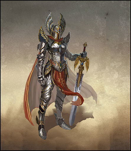
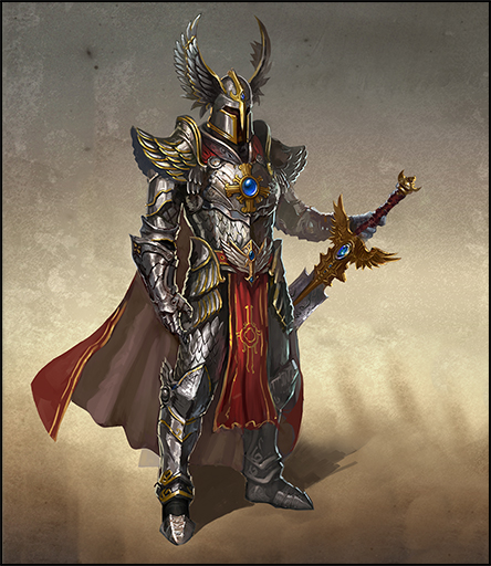
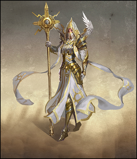
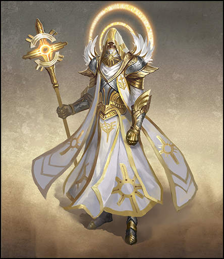


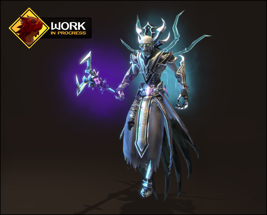
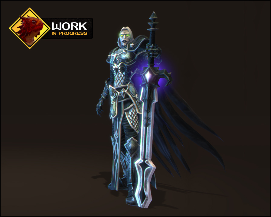
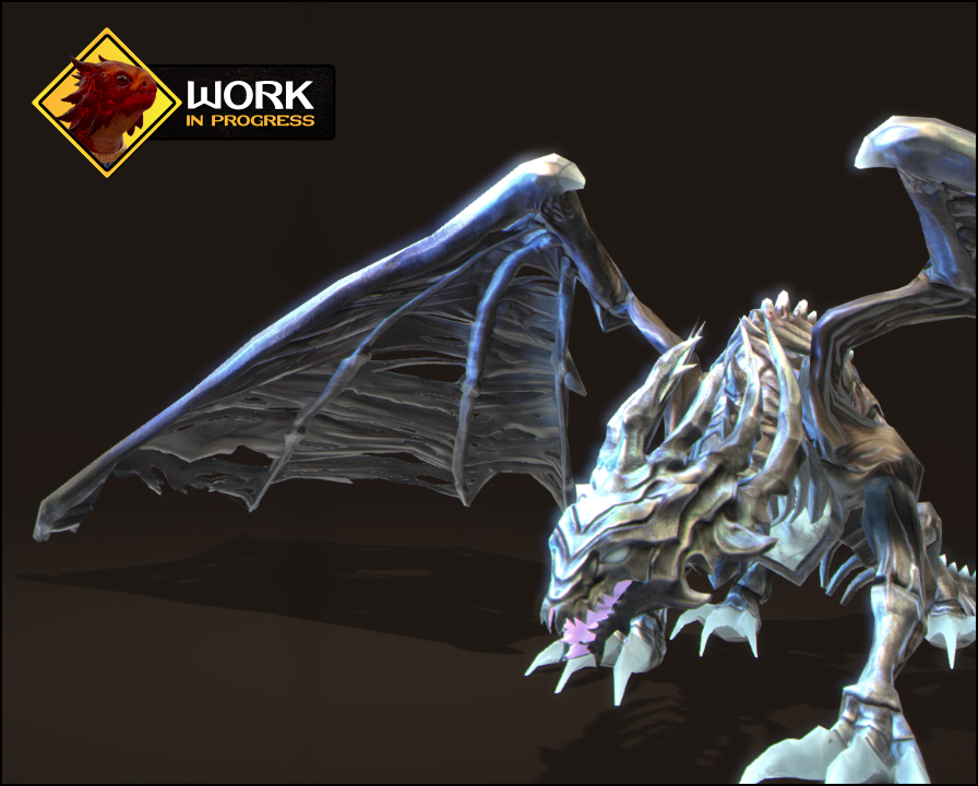
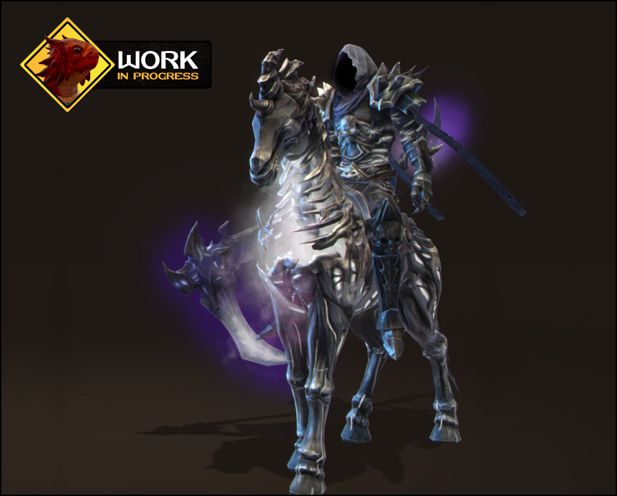
Oh shit, I didn't know, sorry.It's a turn-based strategy game
True, you didn't.I didn'tIt's a turn-based strategy game


I'm amazed how much people care about graphics here. It's a turn-based strategy game, there are game mechanics and campaigns to discuss. Graphics are tertiary at best.

and yet the worst thing about HomoVI was the utter disgrace that was its gameplay, and some of those dumbfuckeries (like the absurd zone of control stuff) will pass over to the next installment, making it pure shit by default. We're just kicking a lying man in the nuts right now.I'm amazed how much people care about graphics here. It's a turn-based strategy game, there are game mechanics and campaigns to discuss. Graphics are tertiary at best.

oh.Joined:
Jan 18, 2015

well aren't you a fucking retardTrue, you didn't.I didn'tIt's a turn-based strategy game
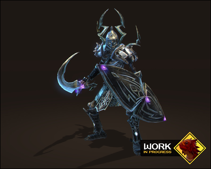
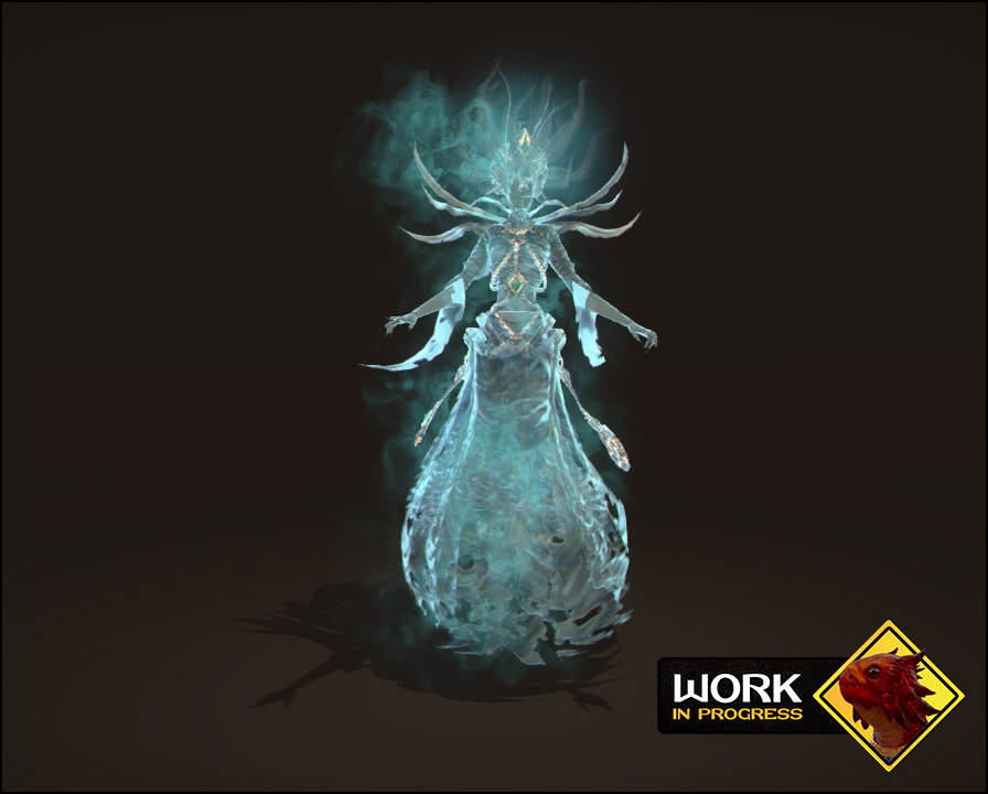
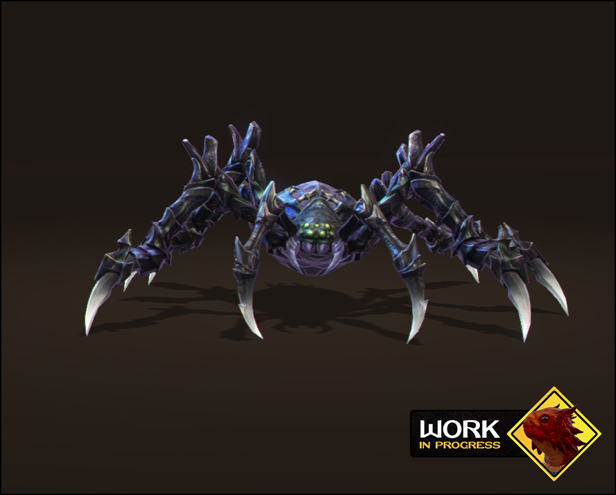
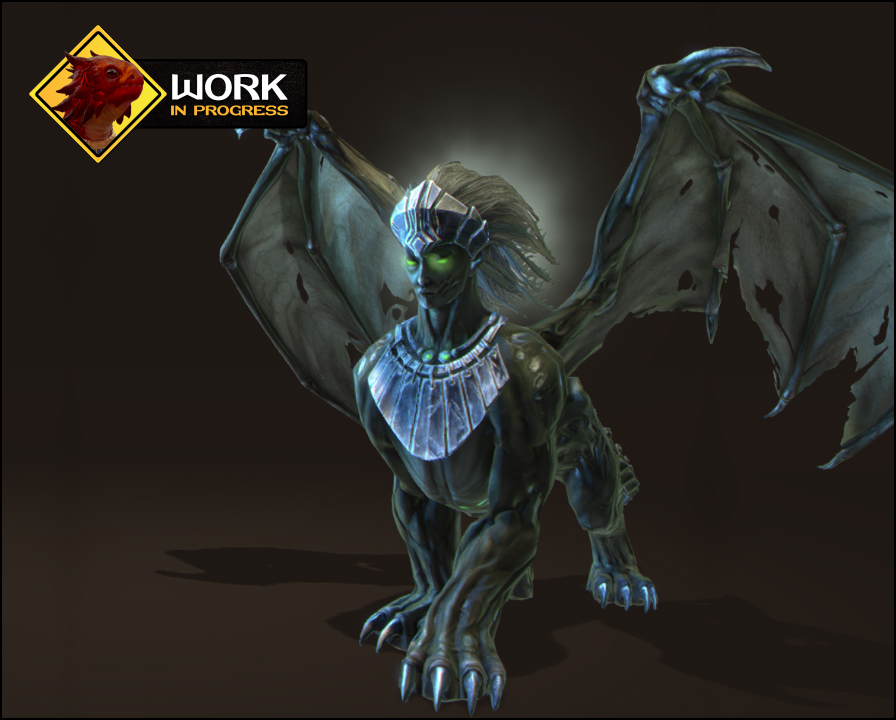
Now you pick one letter out of my post and totally ignore the rest! This is fun. About as fun as nitpicking every little scratch on necropolis units and then making fun of consoletards and graphic whores.
I'm amazed how much people care about graphics here. It's a turn-based strategy game, there are game mechanics and campaigns to discuss. Graphics are tertiary at best.


