There is such a thing as too low res. At the risk of repeating myself, Apple II had more detailed sprites. This is not "old school". This is deliberate ugliness.
-
Welcome to rpgcodex.net, a site dedicated to discussing computer based role-playing games in a free and open fashion. We're less strict than other forums, but please refer to the rules.
"This message is awaiting moderator approval": All new users must pass through our moderation queue before they will be able to post normally. Until your account has "passed" your posts will only be visible to yourself (and moderators) until they are approved. Give us a week to get around to approving / deleting / ignoring your mundane opinion on crap before hassling us about it. Once you have passed the moderation period (think of it as a test), you will be able to post normally, just like all the other retards.
You are using an out of date browser. It may not display this or other websites correctly.
You should upgrade or use an alternative browser.
You should upgrade or use an alternative browser.
Minotaurs & Unicorns - upcoming classic oldschool retro RPG
- Thread starter Chris Koźmik
- Start date
Chris Koźmik
Silver Lemur Games

- Joined
- Nov 26, 2012
- Messages
- 416
Sorry to disturb the graphics discussion, but I have a question related to the game mechanic.
It's about getting attributes. Generally, I want the level up system extremely simple, it just increases HP/MP and combat stats (based on profession). Attributes would be obtained in dungeons. I was thinking of crystals, when you find one it tells you what it grants (strength, wisdom, etc) and you select a character in yout party, he/she will get that bonus to attribute.
Another source of temporary boosts (mostly resistances) would be from drinkable sources (wells, fountains).
What you think about such system? And do you have ideas for something similar?
V_K
Arcane
To me that scream "M&M clone".
In "Magic candle" to increase stats you had to find gods' burial places, learn their chants and wake them. That was rather more fun.
In "Magic candle" to increase stats you had to find gods' burial places, learn their chants and wake them. That was rather more fun.
Kidd
Educated
- Joined
- Apr 24, 2012
- Messages
- 29
This may just be me, but even when looking at the latest screenshot without the font outline (good progress, btw), I'm still kind of irked out. It looks like I'm watching a Frankenstein of two separate screenshots from two separate games. Namely, the pixels (ie resolution) of the font is not the same size as the pixels used in other assets. The inventory icons have the very same problem.
I set up a little mishmash here, showing different elements together in zoomed up format.

I should be watching a neat pixel grid, yet I'm not.
Your explanation that there would be too little text using too much screen estate with a larger font size makes sense. And I believe you could possibly get away with it by doing two things.
First of all, make the inventory screen not use up simply the game-world's graphics, but have it maximise into fullscreen. This is not ideal for a multitude of reasons (biggest one being that you'll need to create a new interface for clicking separate characters, which I believe would feel unnatural).
Second, and here's the big kicker, don't introduce the character portraits on the higher resolution menu screen. It looks jarring and inconsistent. There's a reason why games like Seiken Densetsu 3 for the SNES used separate artwork for the same characters when in menus and while in-game, since the menus used the SNES' higher resolution mode to make it easy to read lots of text.
In the end, I think a complete overhaul of the inventory screen would be a better way for you to solve the presentation issues. Approach the new design with the idea that you should have a fixed pixel grid in your interface and you'll find ways to get around that problem. This is a problem tons of developers have solved in several different ways, so I'm confident you can do the same! =)
I like how you're willing to iterate on your work based on feedback. I wouldn't be posting this if I didn't believe you'd take my feedback to heart, nor would I if I didn't give a crap about your game. Please keep it up! Hearing more of your character system once you're ready to share would be a far more interesting thing to talk about than your game's pixel grid.
I set up a little mishmash here, showing different elements together in zoomed up format.

I should be watching a neat pixel grid, yet I'm not.
Your explanation that there would be too little text using too much screen estate with a larger font size makes sense. And I believe you could possibly get away with it by doing two things.
First of all, make the inventory screen not use up simply the game-world's graphics, but have it maximise into fullscreen. This is not ideal for a multitude of reasons (biggest one being that you'll need to create a new interface for clicking separate characters, which I believe would feel unnatural).
Second, and here's the big kicker, don't introduce the character portraits on the higher resolution menu screen. It looks jarring and inconsistent. There's a reason why games like Seiken Densetsu 3 for the SNES used separate artwork for the same characters when in menus and while in-game, since the menus used the SNES' higher resolution mode to make it easy to read lots of text.
In the end, I think a complete overhaul of the inventory screen would be a better way for you to solve the presentation issues. Approach the new design with the idea that you should have a fixed pixel grid in your interface and you'll find ways to get around that problem. This is a problem tons of developers have solved in several different ways, so I'm confident you can do the same! =)
I like how you're willing to iterate on your work based on feedback. I wouldn't be posting this if I didn't believe you'd take my feedback to heart, nor would I if I didn't give a crap about your game. Please keep it up! Hearing more of your character system once you're ready to share would be a far more interesting thing to talk about than your game's pixel grid.
Hobo Elf
Arcane
The first two screenies give me a head ache. That pixelated beholder is too close to the screen. Looks like it's glued to the screen. It looks awful and my eyes don't like it at all.
Chris Koźmik
Silver Lemur Games

- Joined
- Nov 26, 2012
- Messages
- 416
Yeah, I will replace these later (the ones from the first post are rather dated).The first two screenies give me a head ache. That pixelated beholder is too close to the screen. Looks like it's glued to the screen. It looks awful and my eyes don't like it at all.
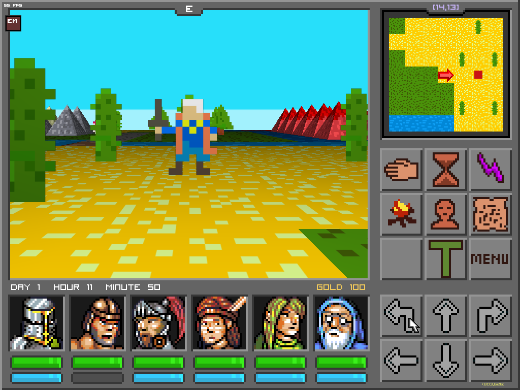
BTW, there are new character portraits. What you think?
rpgcodexusername
Arcane
pretty good, use that style foar the monsters too
They look better. If you could go to that level of detail on the map and enemies, things could get better. Also, your color palette is too saturated.
V_K
Arcane
That's much better. Though since you've switched from EGA to VGA for them, you'll have to do the same for interface icons  .
.
Chris Koźmik
Silver Lemur Games

- Joined
- Nov 26, 2012
- Messages
- 416
Palette of character portraits or of the main 3D view or both?Also, your color palette is too saturated.
You mean number of colours or the style? Or both?Though since you've switched from EGA to VGA for them, you'll have to do the same for interface icons.
V_K
Arcane
You mean number of colours or the style? Or both?[/quote]Though since you've switched from EGA to VGA for them, you'll have to do the same for interface icons.
Number of colours, but I guess it'd take some style changes to accomodate them too.
Main 3D view.Palette of character portraits or of the main 3D view or both?
They look better. If you could go to that level of detail on the map and enemies, things could get better. Also, your color palette is too saturated.
Yeah, they're a huge improvement. It would be nice to see that improvement in the enemies and map as Cosmic Misogynerd said.
Last edited:
Now please increase details on NPCs and monsters in the 3D view
Luzur
Good Sir
well, i cant do more then agree with Taxalot and the others.
Chris Koźmik
Silver Lemur Games

- Joined
- Nov 26, 2012
- Messages
- 416
Question.
Enter the city (the left one) near the start. There are 3 doors leading to temple, trainer and a shop. How to make some sort of description so the player knows what is where? At the moment I have put some icons on the walls next to each building but... These are not very readable, not pretty and you can't see them if you are right in front of the door...
Ideas how solve it?
deuxhero
Arcane
Portraits look MUCH better. Not amazing, but they look good on their own merits and not just LOOK AIM RETRO.
Luzur
Good Sir
Question.
Enter the city (the left one) near the start. There are 3 doors leading to temple, trainer and a shop. How to make some sort of description so the player knows what is where? At the moment I have put some icons on the walls next to each building but... These are not very readable, not pretty and you can't see them if you are right in front of the door...
Ideas how solve it?
do it Koschey's way or simply add a information bar to the UI?
DraQ
Arcane
This. New portraits are... ok, assuming very retro stylization, but main viewport is still shit.Now please increase details on NPCs and monsters in the 3D view
Also low res textures and sprites don't mesh well with high res 3D.
dragonbait
Augur
I don't have anything against pixilated images, however there is a difference between top down pixilated images, and 1st person 3d view pixilated images in that top down pixilated images look at least halfway decent as in below.
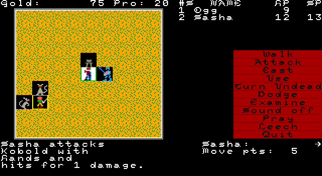
But when it is thrown in our face...
as in below...

Those pixilated images (and I'm talking about the ones in the 3d screen portion of this screenshot), it just does not have the same impact. You'd expect to see a more detailed image in the 3d view. I mean this isn't 1982. As much as I love the Atari 2600...
But even the Atari 2600 Solaris game looks better than the 3d view of Minotaurs and Unicorns.
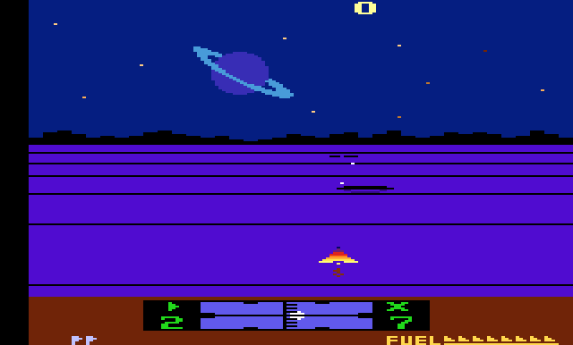
See what I mean? Even though you may be limited in the graphics capablilities of the atari 2600 you can still at least make the graphics cool looking. This is partially why having a pixilated game (nowadays) at least needs to have good pixel style. Way back when, they did it in Solaris, so there is no reason that you can't do it in your game. You gotta at least give your game a style that looks decent.
That being said, I do hope your game progresses as it does has potential, and I prefer rpg's so I hope you can find a graphical style that works for you.

But when it is thrown in our face...
as in below...

Those pixilated images (and I'm talking about the ones in the 3d screen portion of this screenshot), it just does not have the same impact. You'd expect to see a more detailed image in the 3d view. I mean this isn't 1982. As much as I love the Atari 2600...
But even the Atari 2600 Solaris game looks better than the 3d view of Minotaurs and Unicorns.

See what I mean? Even though you may be limited in the graphics capablilities of the atari 2600 you can still at least make the graphics cool looking. This is partially why having a pixilated game (nowadays) at least needs to have good pixel style. Way back when, they did it in Solaris, so there is no reason that you can't do it in your game. You gotta at least give your game a style that looks decent.
That being said, I do hope your game progresses as it does has potential, and I prefer rpg's so I hope you can find a graphical style that works for you.
poetic codex
Augur
- Joined
- Aug 14, 2010
- Messages
- 292
I think we scared him away. codexia's brutal honesty isn't for the faint of heart.
I think we scared him away. codexia's brutal honesty isn't for the faint of heart.
Yeah it appears that way. Too bad, this was just starting to look interesting.
Chris Koźmik
Silver Lemur Games

- Joined
- Nov 26, 2012
- Messages
- 416
No, that's not it, I'm accustomed to much, much higher level of whinning 
I just run out of money... I thought I could pull it of, but now the risk is a bit too high to me
If by any chance you have an idea how to raise $3,000 (yes, not much) I'm all ears.
I just run out of money... I thought I could pull it of, but now the risk is a bit too high to me
If by any chance you have an idea how to raise $3,000 (yes, not much) I'm all ears.


![Have Many Potato [2013] Codex 2013](/forums/smiles/campaign_tags/campaign_potato2013.png)


