deus ex but JC is sergeant motoko from GITS. sold
-
Welcome to rpgcodex.net, a site dedicated to discussing computer based role-playing games in a free and open fashion. We're less strict than other forums, but please refer to the rules.
"This message is awaiting moderator approval": All new users must pass through our moderation queue before they will be able to post normally. Until your account has "passed" your posts will only be visible to yourself (and moderators) until they are approved. Give us a week to get around to approving / deleting / ignoring your mundane opinion on crap before hassling us about it. Once you have passed the moderation period (think of it as a test), you will be able to post normally, just like all the other retards.
You are using an out of date browser. It may not display this or other websites correctly.
You should upgrade or use an alternative browser.
You should upgrade or use an alternative browser.
KickStarter Peripeteia - Deus Ex-inspired FPS/RPG set in anime cyberpunk Poland - coming to Early Access on February 21st
- Thread starter Shodanon
- Start date
- Joined
- Mar 25, 2012
- Messages
- 2,336


The difference is that what you're describing isn't exploiting an insufficient model to the detriment of suspension of disbelief, but the opposite, leveraging an unexpected affordance of a sophisticated collision system in a way that furthers the fictional engagement.
When it comes to LAM climbing, though, that wasn't a feature of the DX's physics system, it was a limitation of it. Considering things in their proper fictional context, the ability to stack crates and furniture to reach high places advanced DX's diegetic consistency, whereas rock-climbing on sticky bombs lessened it, and it was only possible because the physics system did not implement relevant mass or adhesion factors.
The important bit is that the game's rules (which include the physics system) allowed for it, the fictional part is just dressing over the rules. After all when you (not you specifically) play a 2D platformer like Super Mario you do not fret over mario standing on the air at a corner of a tile (or wonder why he doesn't just hide behind the bushes to avoid the monsters) but instead you actually take advantage of the game's physics to make a longer jump. Similarly with the way Lara jumps off slopes in the earlier Tomb Raider games (that the level designers even took advantage of for secret areas) - or really most 3D games (especially first person games) that treat the player (and most characters and other objects) like a big solid box or cylinder.
prengle
Savant
- Joined
- Oct 31, 2016
- Messages
- 357
I'm not the map designer BUT I'll relay the answer: the current demo was made in Probuilder and its tendency to create a trillion separate meshes that can't be merged easily seems to be one of the reasons for our performance issues. It's NOT a brush tool either, there is no carve tool which makes it way, way worse than Hammer. And since both you and Dillon Rogers suggested RTCSG, Snake tried it and judged that while it's good, his current pipeline with Hammer is faster. He just has experience with it from his HL2 modding days.
having experience with hammer/worldcraft is fine, and in fact using a brush/bsp-based editor is fucking rad, but if your mapper dude's going to use one, has he tried using trenchbroom before? it's a lot more intuitive and you can still convert maps made with it to unity, pretty sure that's what dusk does with its custom mapping pipeline
kinda amazed you blatantly shilled on nu-/v/ though, don't think i've seen a game do that and release since.. bug fables??
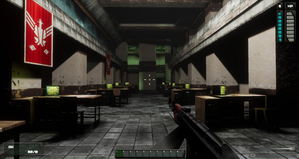
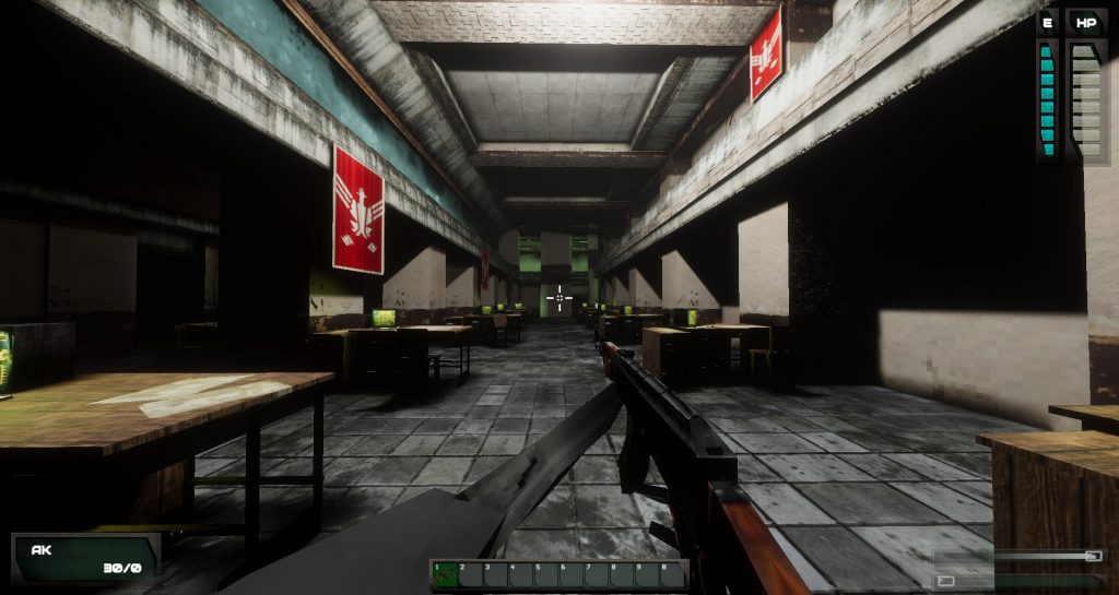
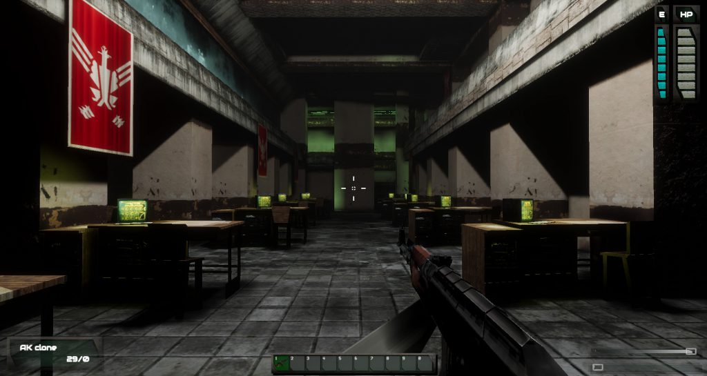
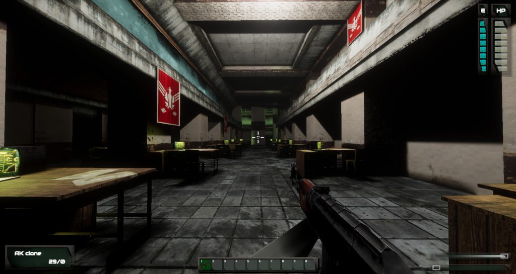
Not digging the art direction, unfortunately, it's got that faux-retro stylisation that puts me off big time. Sure, the "90sGraphics" handle is there for a reason, but they could shoot for 2000 and Deus Ex itself. I realise it's hard for indie studios to budget modern visuals, but perhaps the cel-shading route might've been a better approach.
i'm very picky when it comes to games that specifically try to imitate "retro" visuals and i think what they're doing here is pretty cool (waifu protag or not) although the combination of source-esque lighting and unfiltered textures is kinda odd, it's like some unholy fusion between the half-life 2 leak and winquake. i'm not sure if i love it or hate it, it'd take time for me to get used to.
gloomwood is the only other EPIC RETRO INDIE FPS i've seen that's kinda nailed the aesthetic it was going for (which is amazing considering how many of those games dave oshry has under his belt now) and that's because the developer actually loves thief fms and took the time to sit down and study them
Gargaune
Arcane
- Joined
- Mar 12, 2020
- Messages
- 3,798
Not in the context of an Immersive Sim, though, and that's what my following paragraph on "embodiment" was about. I don't regard the Immersive Sim as merely an emergent gameplay sandbox, but as a sophisticated roleplaying experience (even if not necessarily an RPG) which uses emergent gameplay and high-affordance simulations, among other things, to achieve comprehensive embodiment and diegetic immersion. The chief aim is to draw the player into a functional and believable fiction, which gives rise to more stringent demands than on Mario's or Lara's interactions.The important bit is that the game's rules (which include the physics system) allowed for it, the fictional part is just dressing over the rules. After all when you (not you specifically) play a 2D platformer like Super Mario you do not fret over mario standing on the air at a corner of a tile (or wonder why he doesn't just hide behind the bushes to avoid the monsters) but instead you actually take advantage of the game's physics to make a longer jump. Similarly with the way Lara jumps off slopes in the earlier Tomb Raider games (that the level designers even took advantage of for secret areas) - or really most 3D games (especially first person games) that treat the player (and most characters and other objects) like a big solid box or cylinder.
In Roguey's example, the emergent gameplay solution is the result of a highly detailed collision system (to the point the conclusion is "We should start planning this, not having it happen as a bug"), whereas DX's LAM climbing comes about from a lack of physical detail. Further, this lack of detail is incongruous with some of DX's other objects, e.g. boxes breaking underfoot or how you trip off of microscopes. But when you're balancing JC on a hockey puck glued to the wall with chewing gum, you can't escape the notion that you're doing something you shouldn't be able to do per the fiction.
It's not the end of the world, I just don't do it, but Spector's pointing to LAM climbing as an example of what makes Deus Ex an "Immersive Sim" propagated some skewed ideas about the subgenre's core experience which, in turn, can lead to replication problems.
I tend to file these sorts of visuals under "referential humour" and that's a real problem for me getting my groove on, especially in an Immersive Sim. I'm much happier with a best effort for the budget than trying to paper it over with a throwback artstyle. For instance, I just checked out Gloomwood and at first I was like "cool, Unreal-era graphics", until the weapons and characters popped up and the heavy stylisation became apparent. In fairness, I wasn't particularly happy with Dishonored's stylised character designs either.i'm very picky when it comes to games that specifically try to imitate "retro" visuals and i think what they're doing here is pretty cool (waifu protag or not) although the combination of source-esque lighting and unfiltered textures is kinda odd, it's like some unholy fusion between the half-life 2 leak and winquake. i'm not sure if i love it or hate it, it'd take time for me to get used to.
gloomwood is the only other EPIC RETRO INDIE FPS i've seen that's kinda nailed the aesthetic it was going for (which is amazing considering how many of those games dave oshry has under his belt now) and that's because the developer actually loves thief fms and took the time to sit down and study them
In contrast, I think Momomyth looks great. It's not rocking the latest and greatest in the visual department, but it plays its art style straight and I haven't seen anything to throw me off in its videos.

- Joined
- May 29, 2010
- Messages
- 37,274
deus ex but JC is sergeant motoko from GITS. sold
Marie comes across as more of a head-in-the-clouds mess than Motoko. Drinks hard, lives in a hovel, has specific opinions about the tastes of various batteries.
- Joined
- Apr 24, 2015
- Messages
- 21,248


Typical Pole.deus ex but JC is sergeant motoko from GITS. sold
Marie comes across as more of a head-in-the-clouds mess than Motoko. Drinks hard, lives in a hovel, has specific opinions about the tastes of various batteries.
- Joined
- Mar 25, 2012
- Messages
- 2,336


Not in the context of an Immersive Sim, though, and that's what my following paragraph on "embodiment" was about.
That is the case for all gameplay-oriented games (i mention that to exclude more narrative oriented games like visual novels where the main point is driving a story), immersive sims aren't special here. In fact the interaction between gameplay systems is one of the most important aspects of an immersive sim and in general what makes an immersive sim "immersive sim" is all about the gameplay. Do not be confused by the name, its descriptive value is pretty much as useful as "adventure" for adventure games.
Gargaune
Arcane
- Joined
- Mar 12, 2020
- Messages
- 3,798
I think we've got a fundamendal difference of perspective here, because I do regard the "immersive" part as significant. They're not primarily "story" games, Immersive Sims are indeed about gameplay first, but that gameplay needs to be contextualised to drive a compelling fictional experience. Just a sandbox action game with emergent gameplay doesn't cut it in my book, and it would hardly warrant its own genre denomination in the first place. And this extends to more than just the need for emergent gameplay, you've got the primacy of first-person perspective, fixed temporal localisation, diegetic interfaces etc., there's a whole bunch of design patterns that go into making an Immersive Sim and you can trace them to that pursuit of "embodiment" which goes farther than most action games.Not in the context of an Immersive Sim, though, and that's what my following paragraph on "embodiment" was about.
That is the case for all gameplay-oriented games (i mention that to exclude more narrative oriented games like visual novels where the main point is driving a story), immersive sims aren't special here. In fact the interaction between gameplay systems is one of the most important aspects of an immersive sim and in general what makes an immersive sim "immersive sim" is all about the gameplay. Do not be confused by the name, its descriptive value is pretty much as useful as "adventure" for adventure games.
- Joined
- Mar 25, 2012
- Messages
- 2,336


Yeah sounds like it, for me names in genres, etc are not descriptive since they almost never have much to do with their names and often they're just references to other games (Adventure, Roguelike) or just something random that stuck (Walking Simulators).I think we've got a fundamendal difference of perspective here, because I do regard the "immersive" part as significant.
lol, I never thought I'd see the day when people would be nostalgic about late 90s graphics 
- Joined
- Mar 25, 2012
- Messages
- 2,336


lol, I never thought I'd see the day when people would be nostalgic about late 90s graphics
Everyone was a kid at some point and as long as you can attach some date to a graphical look/style then some people will be nostalgic.
In ~14-15 years people who grew up during the mid-2000s will be nostalgic for the monochromatic undersaturated shiny UE3 look found in many xbox 360 games (even those not using UE3) :-P
the reason why copper dreams initially appealed to me because it has PS1 / MGS1 like graphics. it does happens, i like 16 bit pixel art too and that's why indie games spamming this type of artstyle doesn't bothers me that muchlol, I never thought I'd see the day when people would be nostalgic about late 90s graphics
- Joined
- Jan 28, 2011
- Messages
- 100,644


https://90s.graphics/2021/03/13/first-person-renderer/
First person renderer
We first showed this off on Twitter in early February, but like many things in Peripeteia, the early versions are often proof of concepts before we begin to actually implement them. I’ve finished doing that now, so it’s a good chance to write a nice blog post about it. A new first-person renderer is feature that’s been asked for quite a bit after releasing our first demo, primarily because the way we handled the in-hand models for weapons caused clipping issues, and was inconsistent over various camera fields of view.
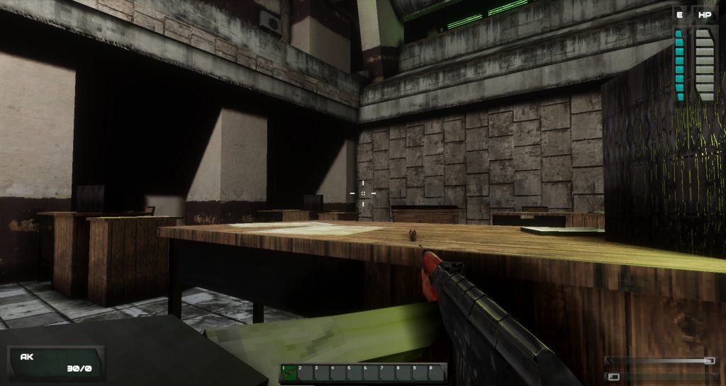
Gun at FoV 60. For some guns, the models weren’t visible at the value set so low. AK looks good though!
Gun at FoV 100. Looks distorted and unappealing.
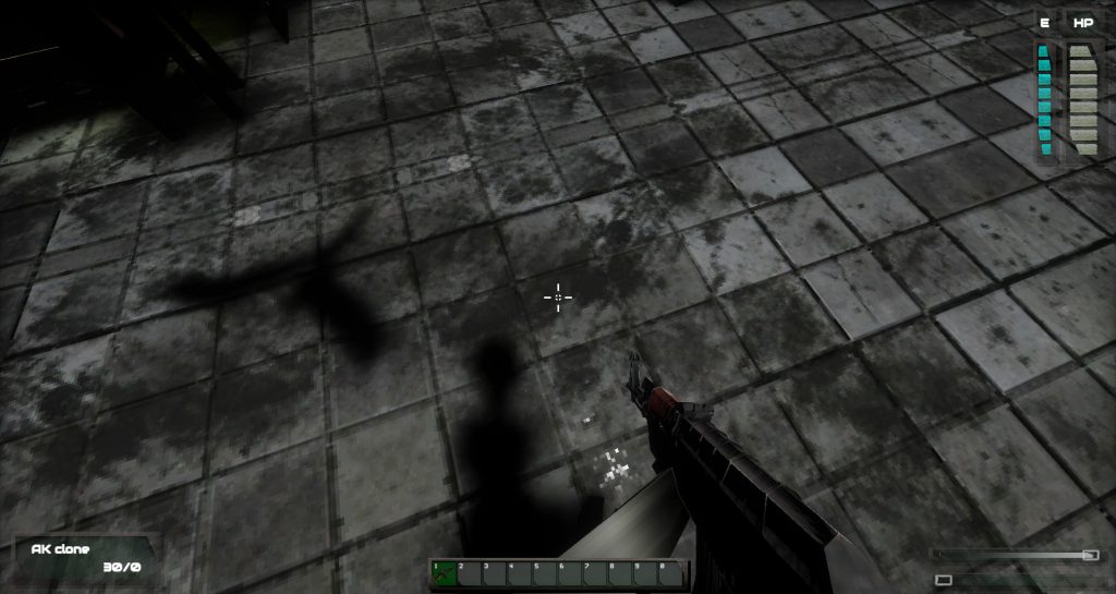
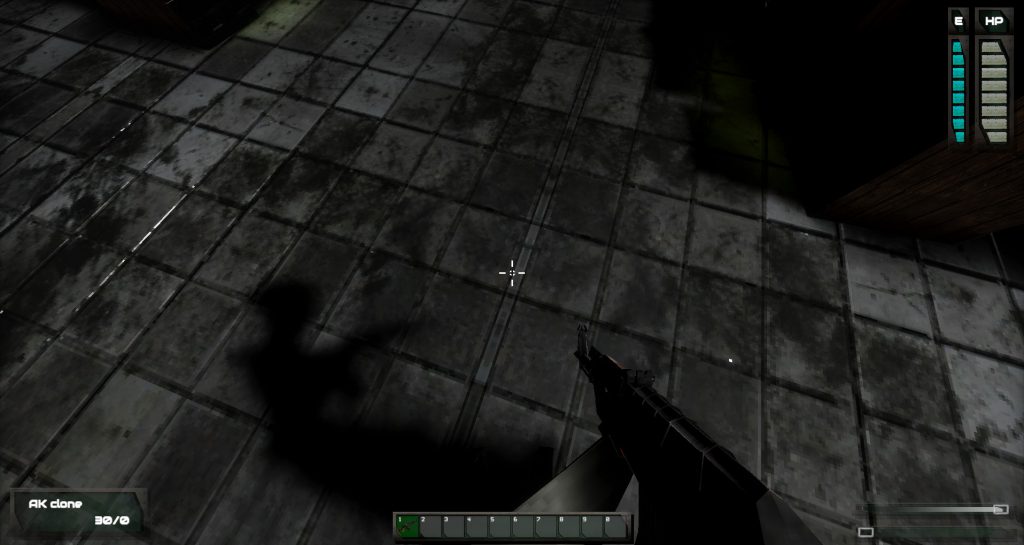
Most first person shooters on the market render the weapon model from a separate camera, which is efficient and easy. There are, however, some issues to that approach when working in Unity. First of all, rendering in-hand models for guns on a secondary camera doesn’t allow use of real-time shadows, which is quite important in Peripeteia. While the light meter is a useful tool, sometimes it’s just quicker to make use of the body awareness we’re going for and take a quick glance on Marie’s legs or at the gun.
Gun rendered on separate camera, lit by a light source behind the wall. Not an issue in a typical shooter.
Gun as rendered in Peripeteia demo. Proper shadow maps but it has its problems.
This method of rendering was the one shown in early February and it quickly turned out to be insufficient. The official Unity way of resolving the problem of no real time shadows on weapons wasn’t adequate for us either, unfortunately. Unity suggests placing a set of tiny weapons and hands in front of the world view camera. While this sounds like a joke at first glance, this is a great method for disembodied cameras that don’t show the rest of the character or have them cast shadows, using the same model as in third person – like we do.
To our rescue came this handy asset, which is highly recommended: First Person View 3 by Drunken Lizard Games. In the early days of Peripeteia we decided to not use any store bought assets for budgetary reasons (as in: we don’t have a budget), but the generosity of our patrons allows us for such purchases.
The asset itself only provides you with a set of shaders to use on your weapon and hands- which is great as it gave me a lot of control (including the ability to modify them in HDRP sharer graph), although the process of implementing it took a bit longer than expected. Thankfully, now Peripeteia will have proper first person weapons!
What was achieved?
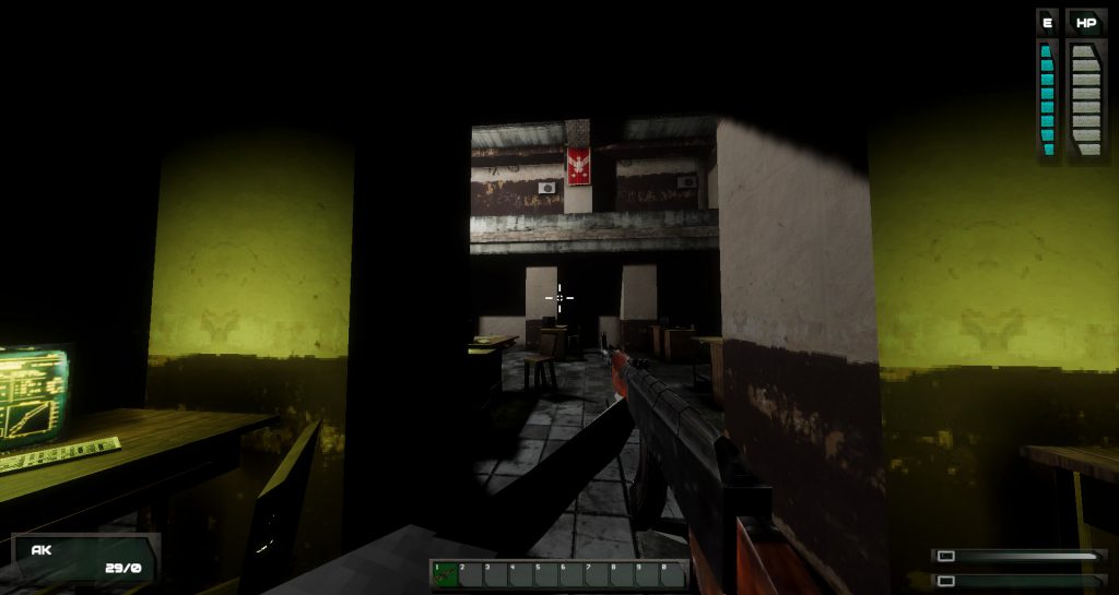
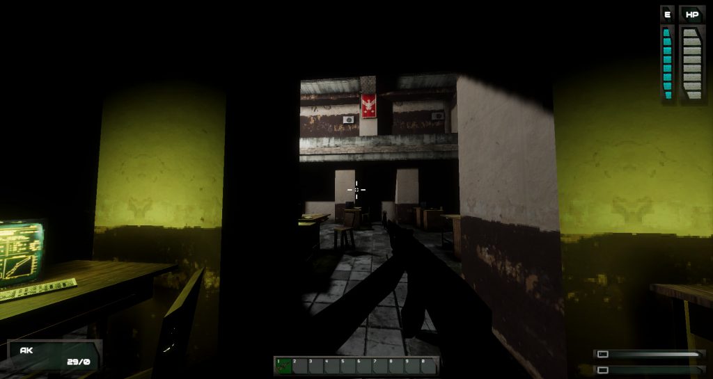
No more weapons clipping with the environment. While the player controller has been set up to minimize such instances, when getting close to objects such as desks, or when leaning to walls, the weapons would disappear inside them.
AKs clipping into geometry take away from the immersion
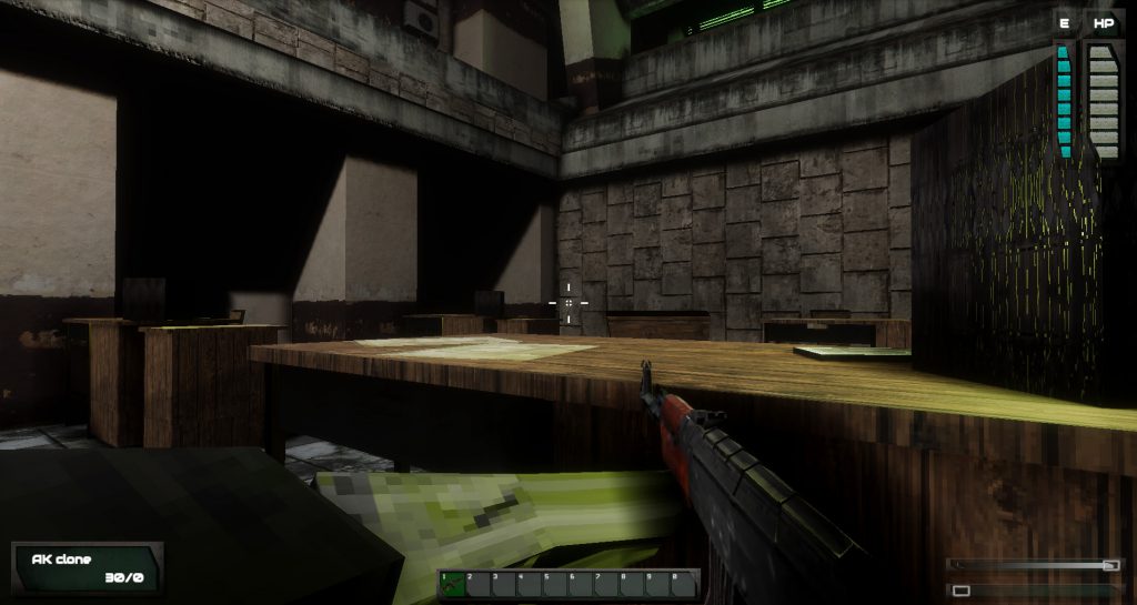
Current weapon model
A separate field of view for each weapon. This allows us to consistently position the gun on the screen, for the most aesthetically pleasing effect – independently of the field of view set by the player.
Current weapon view at FoV 60.
Same shoat at FoV 100. The way the gun is displayed stays consistent.
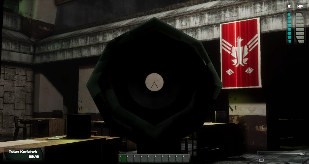
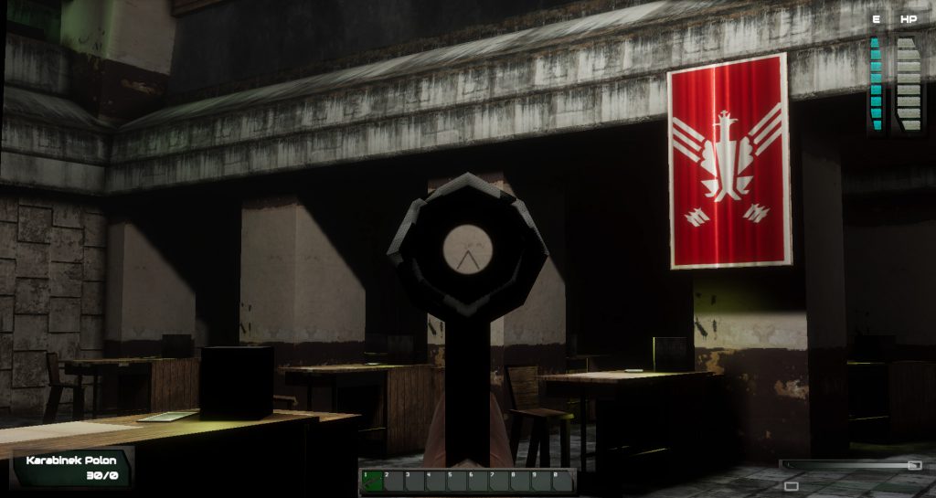
A better sight picture when aiming. Without previously being able to control the field of view of the gun camera, guns using scopes had limited visibility, which caused problems even with the relatively low power optic of the Polon rifle. Another issue was the camera plane clipping into the gun models, which doesn’t happen anymore.
Polon scope as seen (through) in the current demo
New Polon sights
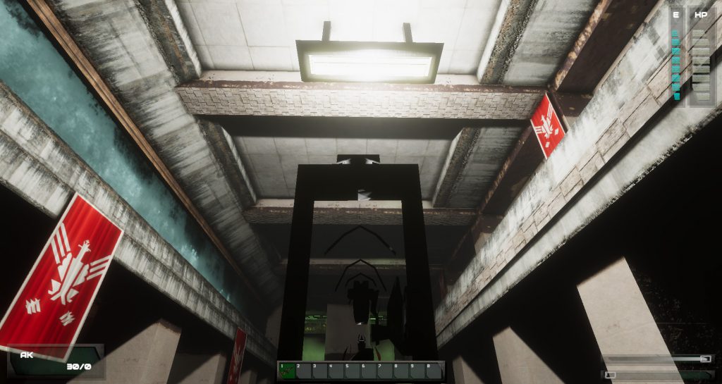
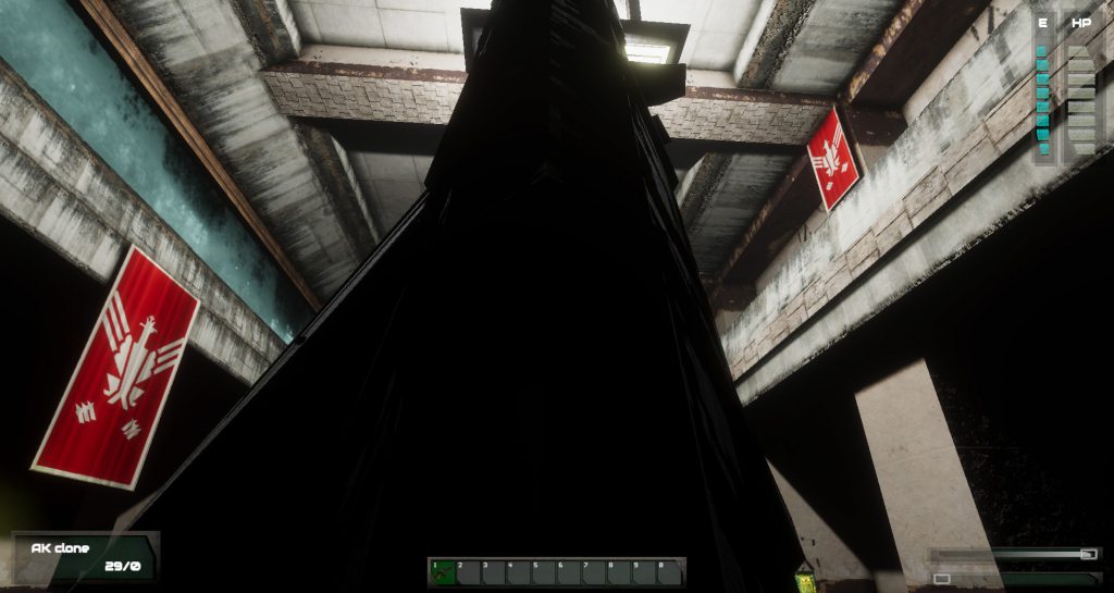
AK clipping into the camera when making abrupt movements
Current behavior of the AK
While this is a fantastic asset, the fact it renders the guns and hands at a different field of view than the rest of the environment causes a single problem: the way their shadows are projected. With the default settings, a shadow of a disembodied set of hands holding a gun would accompany you. This has been fixed by applying a different set of invisible shadowcasters to each object that switched its renderer to the custom one.
Seeing your shadow without arms would probably take away from the immersion as well.
We F.E.A.R. now.
One last thing I’d like to write about is a small detail that will likely not be noticed but that I’m very proud of. When firing the gun, casings ejected by it will be rendered at the same FoV as the gun itself (default 60), but at they fly, the FoV they are rendered in is changed to correspond to the world camera. It looks pretty trippy in the editor view and is quite seamless in-game, even when showering a nearby wall with brass.
This looks weird and gives off a different impression compared to your twitter avatar, tbh. Maybe fix it?
- Joined
- Aug 14, 2008
- Messages
- 2,946

I didn't know there's an updated demo. Gonna give it a shot later. Funny thing is, I couldn't stop thinking about this game. I still don't like the aesthetics, but there's something about the Thief/Deus Ex controls and mechanics that really appeal to me.

- Joined
- May 29, 2010
- Messages
- 37,274
It takes place in an alternate 1990s Poland. You play as a cyborg anime girl who assassinates people.What's the story gonna be like? Will you do what deus ex did and do predictions of what the real world will end up in a few decades (or whenever the game is set in)?
What year is this actually set in?
- Joined
- Jan 28, 2011
- Messages
- 100,644


Gargaune
Arcane
- Joined
- Mar 12, 2020
- Messages
- 3,798
Those, um, parting words at 1:53 were a nice touch.
I don't trust a dev who can't stop jumping up and down in games.




![The Year of Incline [2014] Codex 2014](/forums/smiles/campaign_tags/campaign_incline2014.png)


