-
Welcome to rpgcodex.net, a site dedicated to discussing computer based role-playing games in a free and open fashion. We're less strict than other forums, but please refer to the rules.
"This message is awaiting moderator approval": All new users must pass through our moderation queue before they will be able to post normally. Until your account has "passed" your posts will only be visible to yourself (and moderators) until they are approved. Give us a week to get around to approving / deleting / ignoring your mundane opinion on crap before hassling us about it. Once you have passed the moderation period (think of it as a test), you will be able to post normally, just like all the other retards.
You are using an out of date browser. It may not display this or other websites correctly.
You should upgrade or use an alternative browser.
You should upgrade or use an alternative browser.
Steam Banner
- Thread starter MF
- Start date
KeighnMcDeath
RPG Codex Boomer
- Joined
- Nov 23, 2016
- Messages
- 15,447
Do we have an atmosphere irl picture of Titan? I mean, I get Mars-esque vibes from some of these. I know way back there was a Mines of Titan game that ended up as MARS Sage. Loved Laser Slots.
https://nssdc.gsfc.nasa.gov/planetary/titan_images.html
https://www.space.com/12638-amazing-photos-titan-saturn-moon.html
https://nssdc.gsfc.nasa.gov/planetary/titan_images.html
https://www.space.com/12638-amazing-photos-titan-saturn-moon.html
My 2 cents:
1) The first 3 banners don't tell me anything about the game. It could be a blocky indie shooter, an RTS, etc. I'm not suggesting that our banner is any clearer (or would impress any marketing agency) but it's easier to criticize someone else's stuff so...
2) The rest are way too busy and I don't think that anyone would understand what's going on there.
3) I'd agree with your Heineken friend that the old banner was charming, clear, and simple. So I'd leave it as is and focus on better screens that tell a story of how you play the game. And a video or two. And some articles about the game's concepts.
Bonus point: remember Sierra's Outpost? They butchered the mechanics but the marketing wasn't too bad.
True, it's not giving any indication of what kind of game it is, nor is it pretty enough to be enthralling on its own. AoD's banner definitely is, as far as I'm concerned
Yeah I remember Outpost. It wasn't a very good game but I enjoyed it as a kid based on look & feel alone. Sierra definitely nailed that part.
The problem is that base-building is only 25% to 50% of TO, depending on how you play it. Also, building mostly takes place underground because of the extreme cold. It's still mostly a story-driven RPG and communicating all the elements in a single image is hard.
I've acted on your advice and changed the store presence two days ago, which seems to be working already, taking into account that I just updated the game to 1.13. I'm tidying up some of my development posts here on the codex to use them as articles for the website -which could also use an update- and Steam announcements. I'll reach out to some other sites when a few more things are in place.
That saturn O has nothing to do with 70s aesthetics. It looks too cutesy and rather reminds me of that time in the mid 2000's when everyone was doing 3d reflective buttons on ps.
Excuse me if I sound rough, I don't mean to be hurtful.
Not hurtful at all, just truth. I know it strayed a lot from the '70s idiom after a bunch of compromises. The first draft was much more in line with what I was going for.
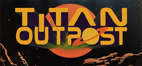
In fact, I couldn't let it go and went back to my very first version, spent some more time on it and didn't compromise on anything this time, framed it with some Chesley Bonestell rocks as if you're looking at Titan from one of Saturn's moons without an atmosphere and I'm actually pretty happy with the result:
And here without the orange 'o' (I'm kind of attached to it)
I mean, it still doesn't tell you much about the game, but does it look groovy or what?
No, you really can't see Saturn. That picture looks cool, but it's wildly inaccurate. Like I said, I took some artistic license with Titan Outpost, but not so much that you can see space through the haze.Probably not exactly like this but yes you can.
Yes. The Huygens probe took two pictures on the surface before it died. You can see some pebbles and mostly a lot of fog. The first link you posted.Do we have an atmosphere irl picture of Titan?
I'm inclined to upload the image above right now, but that's recency bias. I'll sleep on it, compile the results from here and make a decision tomorrow. Right now I'm going to take VD's advice to heart and do some more write-ups.
Last edited:
V_K
Arcane
It does look cool. Although I'd say it conveys more of a 70s space opera feel than hard sci-fi :DView attachment 12195
And here without the orange 'o' (I'm kind of attached to it)
View attachment 12197
I mean, it still doesn't tell you much about the game, but does it look groovy or what?
The orange "o" has to go in this version, you already have an orange planet in the background.
Vault Dweller
Commissar, Red Star Studio

- Joined
- Jan 7, 2003
- Messages
- 28,044
I think it looks fantastic. Huge improvement.In fact, I couldn't let it go and went back to my very first version, spent some more time on it and didn't compromise on anything this time, framed it with some Chesley Bonestell rocks as if you're looking at Titan from one of Saturn's moons without an atmosphere and I'm actually pretty happy with the result:
View attachment 12195
I mean, it still doesn't tell you much about the game, but does it look groovy or what?
HarveyBirdman
Liturgist
- Joined
- Jan 5, 2019
- Messages
- 1,048
A New Hope's twin suns is still the most iconic "look, we are in space, but grounded on a planet" shot I've ever seen. If you have anything that can evoke this feeling, then use it.
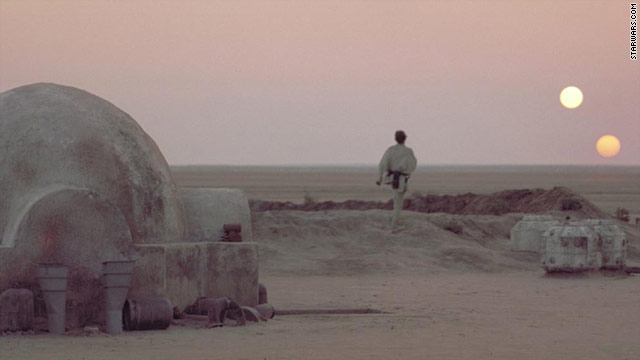

This looks cool, though maybe a bit dark. The silhouette is a great idea, but it's kind of hard to see. Also, is the object in the center likewise central to the game?
AdolfSatan
Arcane
- Joined
- Dec 27, 2017
- Messages
- 2,028
That second one looks miles ahead of all the other iterations! Now you have something that standa out.
Perhaps I'd keep looking for the right shade of yellow, or change the colour of the jumping-out effect (sorry, don't have the English vocabulary for this) to violet for extra 70s cheese, but now I'm just talking personal preference.
Perhaps I'd keep looking for the right shade of yellow, or change the colour of the jumping-out effect (sorry, don't have the English vocabulary for this) to violet for extra 70s cheese, but now I'm just talking personal preference.
Bigg Boss
Arcane
- Joined
- Sep 23, 2012
- Messages
- 7,528
My 2 cents:
1) The first 3 banners don't tell me anything about the game. It could be a blocky indie shooter, an RTS, etc. I'm not suggesting that our banner is any clearer (or would impress any marketing agency) but it's easier to criticize someone else's stuff so...
2) The rest are way too busy and I don't think that anyone would understand what's going on there.
3) I'd agree with your Heineken friend that the old banner was charming, clear, and simple. So I'd leave it as is and focus on better screens that tell a story of how you play the game. And a video or two. And some articles about the game's concepts.
Bonus point: remember Sierra's Outpost? They butchered the mechanics but the marketing wasn't too bad.
True, it's not giving any indication of what kind of game it is, nor is it pretty enough to be enthralling on its own. AoD's banner definitely is, as far as I'm concerned
Yeah I remember Outpost. It wasn't a very good game but I enjoyed it as a kid based on look & feel alone. Sierra definitely nailed that part.
The problem is that base-building is only 25% to 50% of TO, depending on how you play it. Also, building mostly takes place underground because of the extreme cold. It's still mostly a story-driven RPG and communicating all the elements in a single image is hard.
I've acted on your advice and changed the store presence two days ago, which seems to be working already, taking into account that I just updated the game to 1.13. I'm tidying up some of my development posts here on the codex to use them as articles for the website -which could also use an update- and Steam announcements. I'll reach out to some other sites when a few more things are in place.
That saturn O has nothing to do with 70s aesthetics. It looks too cutesy and rather reminds me of that time in the mid 2000's when everyone was doing 3d reflective buttons on ps.
Excuse me if I sound rough, I don't mean to be hurtful.
Not hurtful at all, just truth. I know it strayed a lot from the '70s idiom after a bunch of compromises. The first draft was much more in line with what I was going for.
In fact, I couldn't let it go and went back to my very first version, spent some more time on it and didn't compromise on anything this time, framed it with some Chesley Bonestell rocks as if you're looking at Titan from one of Saturn's moons without an atmosphere and I'm actually pretty happy with the result:
View attachment 12195
And here without the orange 'o' (I'm kind of attached to it)
View attachment 12197
I mean, it still doesn't tell you much about the game, but does it look groovy or what?
No, you really can't see Saturn. That picture looks cool, but it's wildly inaccurate. Like I said, I took some artistic license with Titan Outpost, but not so much that you can see space through the haze.Probably not exactly like this but yes you can.
Yes. The Huygens probe took two pictures on the surface before it died. You can see some pebbles and mostly a lot of fog. The first link you posted.Do we have an atmosphere irl picture of Titan?
I'm inclined to upload the image above right now, but that's recency bias. I'll sleep on it, compile the results from here and make a decision tomorrow. Right now I'm going to take VD's advice to heart and do some more write-ups.
I forgot all about the haze. Thanks.
I've read on theories about Titan being terraformed with a tidally locked Saturn in the sky, so that explains the confusion. One day I do believe Titan will look like that though since it is only a a hundred million years old or so.
Latest one looks great! Previous one that VK commented on was good too though. Would go with the orange O-version. As an alternative to the screenshots, maybe just add something like "a Classical cRPG Odyssey!" or "An Old School cRPG Experience!" in a much smaller white/silver "sci-fi" font (maybe in a plaque) underneath. Maybe "[a/b] with Spacestation-Management Elements!". I think delivering as much defining information as possible in your logo is important if your product/brand isn't already something people recognise.
the orange 'O' has my support; the crowd shouting "orange 'O' bad" have clearly not thought this through
- Joined
- Oct 1, 2018
- Messages
- 8,637
Looks great.
Alright, thanks for the input everyone! Much appreciated.
I'm still happy with the new version and it's evoked uniformly positive response, so a slightly altered version of that's going to be it.
Now, to decide on that orange 'o'.....
Just kidding, I'm using both right now.
I'm still happy with the new version and it's evoked uniformly positive response, so a slightly altered version of that's going to be it.
Now, to decide on that orange 'o'.....

Just kidding, I'm using both right now.


