Putting the 'role' back in role-playing games since 2002.
Donate to Codex
Good Old Games
  • Welcome to rpgcodex.net, a site dedicated to discussing computer based role-playing games in a free and open fashion. We're less strict than other forums, but please refer to the rules.

    "This message is awaiting moderator approval": All new users must pass through our moderation queue before they will be able to post normally. Until your account has "passed" your posts will only be visible to yourself (and moderators) until they are approved. Give us a week to get around to approving / deleting / ignoring your mundane opinion on crap before hassling us about it. Once you have passed the moderation period (think of it as a test), you will be able to post normally, just like all the other retards.

Summoners Fate

Craig Stern

Sinister Design
Developer
Joined
Feb 15, 2009
Messages
405
Location
Chicago
Posting this as a favor for a game dev friend of mine! The creator of Hero Mages (linky) is now Kickstarting a new game called Summoners Fate.

Summoners Fate is a fantasy turn-based tactics game / CCG hybrid, complete with destructible terrain, knockback abilities, environmental hazards, a single-player campaign centered on dungeon exploration, and a cross-platform multiplayer mode. This gif kinda gives you the idea, I think:

c09f39224d9433502698d3fd6b1f65a9_original.gif


Now, Summoners Fate is not actually an RPG; as far as I can tell, persistent growth in this game occurs entirely through getting new cards for your summoner's deck. I had a little Q&A with the developer last night over FB chat to talk about its progression and team-building mechanics; for those curious:

Do your characters level up in this game?
They do not. You power them up/equip them during game using the cards. Stats carry over room-to-room, but refresh after resting on the next adventure

Aha! Okay--so this is what I would normally categorize as a "fantasy strategy game." Definitely not right for the RPG Codex, but should fit right in on Tacticular Cancer. Does the player's collection of cards change over time? Are there decks tied to individual characters?
Yes. Deck are not tied to specific characters; you build a deck of heroes, spells, weapons. Certain characters (Summoners) are allowed to be the main hero and the cards are played via them so that there is relative LOS on the board. Player gets to customize a team + deck, which is Summoner, starting party, and 20 cards in a deck. Player can customize the deck to build optimized strategies (ex: a deck where squirrels overrun the opponent).

Got it. What differentiates the summoners? Do teams consist of unique characters, or are they filled up with generic units of different classes?

Summoners will have more health than any other unit since the player loses if they die. With some exceptions, they generally have weaker physical attack but their abilities manipulate the casting of cards in some way. Ex: a Wizard might be able to cast Arcane spells at a Discount, so decks of all Arcane cards compliment him as a Summoner. Other characters may be generic (ex: Goblin Warrior) while others may be named (Skull Crusher, Goblin Champion).

Interesting. Why would a player go for generics when they have the option of picking uniques? Is there a point buy system for team composition or something?

Casting cost. You need some generic troops to fill the gap leading up to more powerful units or you'll just get trounced. Special units generally have bonuses that boost the generics into bigger units (Kind of like how every MtG deck needs those 1/1 creatures)

Oh, okay. So your team is always sitting in your deck to start
Correct

And here's some more detail, from a description he sent me:

Battles are quick, averaging 3 minutes to complete. When you complete a battle, your resources, surviving characters and remaining cards in your deck carry over to the next room in the dungeon, creating a strategic layer of resource management. Only when you complete the dungeon do you return to the overworld map and have the opportunity to rest, restoring your characters and deck to their initial stats.

As you explore, you find cards to add to your collection. You use cards to build decks, enabling for a range of strategies. The game will have a set of over 400 cards at launch, with 200 unique playable characters you can collect. Cards can be used to destroy characters and environment, create new characters, transform, enhance, and alter the game.

Summoners Fate is currently at around 60% of its funding goal on Kickstarter, with 21 days left to go: https://www.kickstarter.com/projects/1181148431/summoners-fate-fast-and-fun-tactical-rpg-ccg-adven
 

thesheeep

Arcane
Patron
Joined
Mar 16, 2007
Messages
10,098
Location
Tampere, Finland
Codex 2012 Strap Yourselves In Codex Year of the Donut Codex+ Now Streaming! Serpent in the Staglands Dead State Divinity: Original Sin Torment: Tides of Numenera Codex USB, 2014 Shadorwun: Hong Kong Divinity: Original Sin 2 BattleTech Bubbles In Memoria A Beautifully Desolate Campaign Pillars of Eternity 2: Deadfire Pathfinder: Kingmaker Steve gets a Kidney but I don't even get a tag. Pathfinder: Wrath I'm very into cock and ball torture I helped put crap in Monomyth
The concept looks interesting enough, but being developed for mobile first and foremost is never a good sign, IMO.

3e8accb930b53719122c92805ef3dfb3_original.png

Just look at the order the platforms appear in...

I don't think there are many cases of great games for mobile that just happened to find their way to the PC platform as well.

Also, all those platforms and not even linux (despite both Android and macOS being derivates of it to begin with) is an absolute :keepmymoney:.
 

RossD20Studios

Literate
Joined
Oct 29, 2017
Messages
20
Location
Salt Lake City, UT
The concept looks interesting enough, but being developed for mobile first and foremost is never a good sign, IMO.

3e8accb930b53719122c92805ef3dfb3_original.png

Just look at the order the platforms appear in...

I don't think there are many cases of great games for mobile that just happened to find their way to the PC platform as well.

Also, all those platforms and not even linux (despite both Android and macOS being derivates of it to begin with) is an absolute :keepmymoney:.

Hi thesheep,

I'm Ross, the developer working on this game. Craig shared his post with me so I thought I'd hop on and introduce myself. Honestly, I'm surprised I haven't joined these forums earlier, seems exactly like my crowd as far as the games go.

I saw your comment about concerns with being developed for mobile first (which is true, btw) and wanted to ask if you would be willing to share what those concerns are? Where I'm coming in the mobile-first approach was trying to find a way to create greater accessibility to the tactics genre. I'm personally a huge fan of tactics based games (both in digital and physical form) but struggle sometimes with the difficulty to quickly jump into a match and play for a full session (hard to find time with kids and work). I'm also big into CCG games like Magic the Gathering and wanted to find a way to introduce elements of deck building into the genre as a way to keep the strategies fresh. My first attempt at this was back in 2006 designing an actual tabletop board game, which I later made into a browser-based game called Hero Mages. Anyway, that's my motivation behind it, I'd love to hear your concerns.

Regarding Linux: I'm developing the game in AS3 which can export natively to iOS, Android, PC and Mac. I'm not certain there is a way to create a Linux runtime, but if this is something you think would help add to the game's reputation, I'm more than willing to look into it.
 

rashiakas

Cipher
Patron
Joined
Oct 4, 2011
Messages
837
Pathfinder: Wrath
Blech, more cheap mobile shit. Those round buttons alone are a huge turnoff.
 

RossD20Studios

Literate
Joined
Oct 29, 2017
Messages
20
Location
Salt Lake City, UT
Blech, more cheap mobile shit. Those round buttons alone are a huge turnoff.

Ha, I wish it was cheap! Actually, I've spent over 18 months working 80+ hours a week making this so far, plus paying all the artists bills. Thanks for the feedback on the buttons - those I can certainly change (right now, it's just my programmer art placeholders). Any recommendations for a style you think would work well with this?

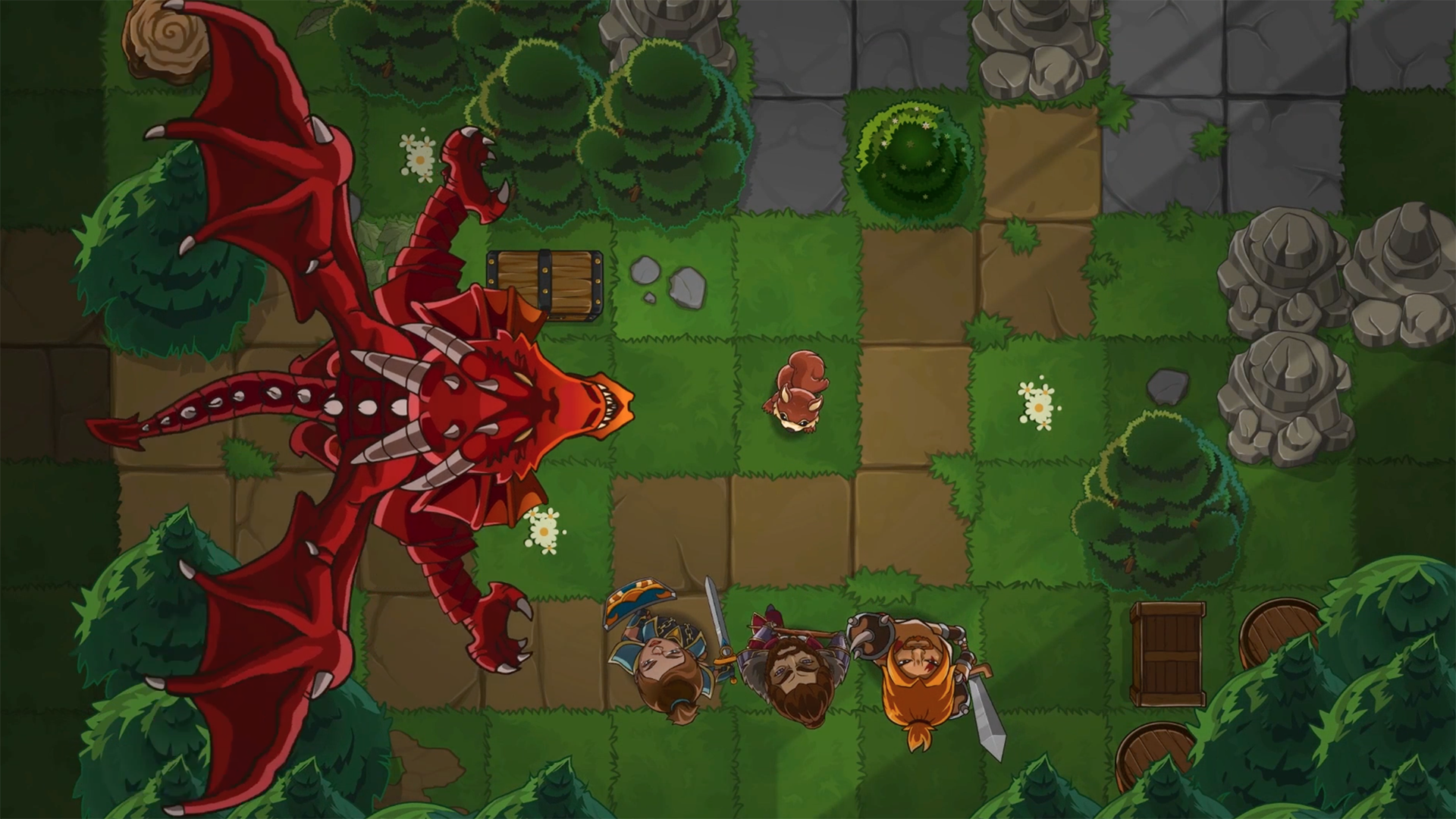
Anyway, since you hate the buttons, here's a screenshot without them. Cheers!
summonersFate_redDragonFliesOverhead.png
 

thesheeep

Arcane
Patron
Joined
Mar 16, 2007
Messages
10,098
Location
Tampere, Finland
Codex 2012 Strap Yourselves In Codex Year of the Donut Codex+ Now Streaming! Serpent in the Staglands Dead State Divinity: Original Sin Torment: Tides of Numenera Codex USB, 2014 Shadorwun: Hong Kong Divinity: Original Sin 2 BattleTech Bubbles In Memoria A Beautifully Desolate Campaign Pillars of Eternity 2: Deadfire Pathfinder: Kingmaker Steve gets a Kidney but I don't even get a tag. Pathfinder: Wrath I'm very into cock and ball torture I helped put crap in Monomyth
I saw your comment about concerns with being developed for mobile first (which is true, btw) and wanted to ask if you would be willing to share what those concerns are? Where I'm coming in the mobile-first approach was trying to find a way to create greater accessibility to the tactics genre. I'm personally a huge fan of tactics based games (both in digital and physical form) but struggle sometimes with the difficulty to quickly jump into a match and play for a full session (hard to find time with kids and work). I'm also big into CCG games like Magic the Gathering and wanted to find a way to introduce elements of deck building into the genre as a way to keep the strategies fresh. My first attempt at this was back in 2006 designing an actual tabletop board game, which I later made into a browser-based game called Hero Mages. Anyway, that's my motivation behind it, I'd love to hear your concerns.
Mobile games in 99.9% of cases are at least one of:
a) Extremely simple
b) Just meant to waste your time instead of being something to actually dig into and immerse yourself
c) Having an interface that was meant for touch screens which never, never, never translates well to desktop - it always feels super cheap
d) Meant to suck money out of your pockets - and designed around mechanics like micro payments. That never translates into good game design
e) They just always look the same, seriously. Anyone can identify a mobile game by absurdly large buttons, fonts, etc. There's just no other way to develop them due to the limited space and input possibilities of the platform
f) Almost always going for the cutesy-comicy art direction. It's no wonder people get fed up with it. It does look cheap
g) Experimental playground of hipsters with "ideas"

Having all of these in mind, I just cannot come to expect anything positive from a game that announces itself as mobile first.
Games made specifically for tablet have it a bit better, since they can offer a less shitty environment due to size alone, but still...

Now, I'm not saying there aren't any exceptions. I may have played one or two. The Quest comes to mind.
But as such, a mobile game naturally causes reactions from desktop gamers - especially when it looks like a mobile game at the very first glance - such as
Blech, more cheap mobile shit. Those round buttons alone are a huge turnoff.
You will not find many people willing to look past that point, here.


Regarding Linux: I'm developing the game in AS3 which can export natively to iOS, Android, PC and Mac. I'm not certain there is a way to create a Linux runtime, but if this is something you think would help add to the game's reputation, I'm more than willing to look into it.
I don't really understand why anyone would still develop in ActionScript, to be honest. Flash has gone the way of the dodo. If you feel it is the only language you are comfortable with, I'd just switch to Haxe and OpenFL (or other Haxe libraries, but OpenFL is specifically modelled after AS3, I used it myself for a time since I used to work with AS3 as well). You will increase your platforms, your performance, available tools, ...
If you really still want to use SWF (but again, as a coder clinging to dying tech doesn't make sense to me, it's our job to go with the times), there is even SWF support here, though I assume there are limits.
 
Last edited:

RossD20Studios

Literate
Joined
Oct 29, 2017
Messages
20
Location
Salt Lake City, UT
Mobile games in 99.9% of cases are at least one of:
a) Extremely simple
b) Just meant to waste your time instead of being something to actually dig into and immerse yourself
c) Having an interface that was meant for touch screens which never, never, never translates well to desktop - it always feels super cheap
d) Meant to suck money out of your pockets - and designed around mechanics like micro payments. That never translates into good game design
e) They just always look the same, seriously. Anyone can identify a mobile game by absurdly large buttons, fonts, etc. There's just no other way to develop them due to the limited space and input possibilities of the platform
f) Almost always going for the cutesy-comicy art direction. It's no wonder people get fed up with it. It does look cheap
g) Experimental playground of hipsters with "ideas"

Man, I cannot thank you enough for this feedback! Honestly, I've been a bit puzzled at why I am struggling to gain traction with certain groups and you have helped me understand why our screenshots/art are creating a negative impression of what the game actually is.

I'm not entirely sure what to do with this information yet and I'm open to your suggestions. I am not going to change the character/environment art style (too invested at this point) but I can certainly adapt the UI.

One thing that would help me in particular is to get your personal perspective as a fan of these genres on a deeper dive of what this game is about and how it works. I would like to know from you if the core problem is our perception (appearance of these screenshots) or whether or not you actually think the game is shallow/has no depth. Here is an article I wrote for Gamasutra that goes into some of our unique combat mechanics. If you would be so kind to educate me further, please take a read and let me know if this changes what you think about the game.

Regarding the payment model, I'll speak to that here direct since its not in my Gamasutra. Yes, this is a free-to-play game (which I know is already a whole new head-ache for you). To be honest, I don't have much choice on this because premium game models on mobile rarely ever lead to a livable income. However, I am sincere in saying that I have a very different idea for how I am approaching it. I am, myself, an adamant hater of "pay-to-win" systems because I have been burned by many games I've spent money on.

Here's my approach: All of the cards in the game are collectible over-time playing the game for free (via single player and/or multiplayer) - there are no "premium" cards that you have to buy with real money, and there are no timer-locked chests. This begs the question - "what's the motivation to ever want to buy cards then?" My answer to that is honestly to provide such a large diversity of cards and strategic options that players who enjoy the game want to help support it and build their collection out directly. I didn't make the game to be competitive and "require" certain cards. In fact, I'm going to do my best to ensure everyone starts with a competitive set of cards off the bat that you can win and continue to win with.

One of my favorite games is Warhammer 40K tabletop. It's entirely possible to play and win at this game without every buying beyond your starter army. But I find the game is so much fun playing with different characters that I've purchased 5 display cases worth of miniatures. Winning alone is not what I find fun about tactical strategy games. For me, it's the creativity of how I win. It's the excitement of what my opponent comes up with for their strategy. It's learning something new, win or lose. That's the spirit I'm investing in for Summoners Fate.
 

thesheeep

Arcane
Patron
Joined
Mar 16, 2007
Messages
10,098
Location
Tampere, Finland
Codex 2012 Strap Yourselves In Codex Year of the Donut Codex+ Now Streaming! Serpent in the Staglands Dead State Divinity: Original Sin Torment: Tides of Numenera Codex USB, 2014 Shadorwun: Hong Kong Divinity: Original Sin 2 BattleTech Bubbles In Memoria A Beautifully Desolate Campaign Pillars of Eternity 2: Deadfire Pathfinder: Kingmaker Steve gets a Kidney but I don't even get a tag. Pathfinder: Wrath I'm very into cock and ball torture I helped put crap in Monomyth
Yeah, I don't think the payment model is a problem per se.
I play quite a few F2P games, as I know others here do.
Path of Exile, Paladins, Faeria (I really loved that one), etc. People generally know F2P can work.

I really think the biggest problem is that the game just looks like the typical mobile fare at the very first glance.
Not sure there's much you can do about it since you say yourself it is a mobile game first.

However, if you do bring the game to desktop platforms, I can only suggest revamping the UI as much as possible to use the platform capabilities.
Won't help with the campaign, but certainly with the reception once released.
 
Last edited:

RossD20Studios

Literate
Joined
Oct 29, 2017
Messages
20
Location
Salt Lake City, UT
Yeah, I don't think the payment model is a problem per se.
I play quite a few F2P games, as I know others here do.
Path of Exile, Paladins, Faeria (I really loved that one), etc. People generally know F2P can work.

Dude, you're awesome. I really your appreciate your candid feedback. Seriously, it's a huge help! Good to know that F2P is not the issue - let's dive further into the problem.

I really think the biggest problem is that the game just looks like the typical mobile fare at the very first glance.
Not sure there's much you can do about it since you say yourself it is a mobile game first.

However, if you do bring the game to desktop platforms, I can only suggest revamping the UI as much as possible to use the platform capabilities.
Won't help with the campaign, but certainly with the reception once released.

I don't think we're a hopeless case for desktop; I play a lot of desktop games as well, and my first game, Hero Mages, was desktop-first designed. I want Summoners Fate to be a true cross-platform game, so help me by providing some more details/examples of the "must-haves" that would change your impression. There is still 18 days in our campaign, and absolutely enough time to revamp the UI and show off PC capabilities.

1. Can you recommend a UI style that would make our game sit better with the desktop player audience? I'd really love a chance to show you how committed I am to player feedback.
2. What other PC capabilities are you referring to would you like me to add?

Did you have a chance to take a look at the combat mechanics design? Here it is:
Designing Unique Tactical Combat Mechanics for Summoners Fate

Appearance is deceiving, and I am trying to do something new with our approach to accessibility WITHOUT diluting the gameplay depth. I'm not a typical mobile dev looking to gouge players with gimmicks and cheap, diluted gameplay - I'm a serious hardcore tactics player trying to find a way to bring my favorite genre to more players so they can enjoy it.
 

RossD20Studios

Literate
Joined
Oct 29, 2017
Messages
20
Location
Salt Lake City, UT
Appearance is deceiving,
Yes, and all the more damaging when I have like 10 seconds to form an impression about the game.

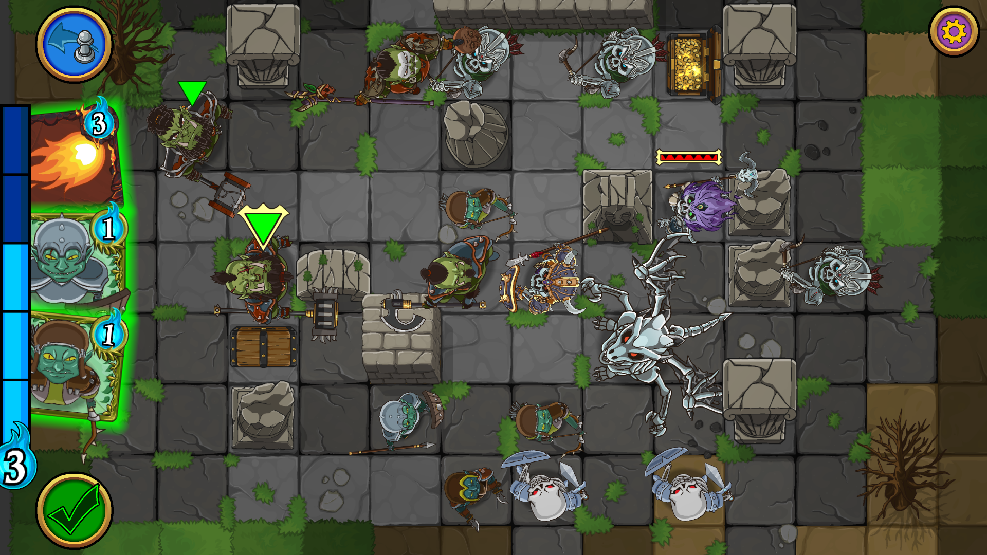
Indeed, so help me out here. Without changing the character/environment art, what can I change about the screenshot images to make a better impression? UI style, larger maps, etc? Here's an example of bigger map. Give me some tips, I'll fix it up and repost for you.

summonersFate_templeRuinsOrcsVsSkeletons.png
 

ERYFKRAD

Barbarian
Patron
Joined
Sep 25, 2012
Messages
29,829
Strap Yourselves In Serpent in the Staglands Shadorwun: Hong Kong Pillars of Eternity 2: Deadfire Steve gets a Kidney but I don't even get a tag. Pathfinder: Wrath I'm very into cock and ball torture I helped put crap in Monomyth
The buttons stick out to me at first sight. How about shoving them into a panel, so I am offered an unobstructed view of the field as in that buttonless screenshot above, and I can open the panel to access the button I want.

Also the way those buggers keep staring up is weird, MAKE 'EM STOP.

Edit: It's the larger size of the UI, the bar on the side etc., that screams mobile game, on the phone that makes sense, on a pc, not so much. How feasible would it be for you to reskin the UI at least for the PC?
 

thesheeep

Arcane
Patron
Joined
Mar 16, 2007
Messages
10,098
Location
Tampere, Finland
Codex 2012 Strap Yourselves In Codex Year of the Donut Codex+ Now Streaming! Serpent in the Staglands Dead State Divinity: Original Sin Torment: Tides of Numenera Codex USB, 2014 Shadorwun: Hong Kong Divinity: Original Sin 2 BattleTech Bubbles In Memoria A Beautifully Desolate Campaign Pillars of Eternity 2: Deadfire Pathfinder: Kingmaker Steve gets a Kidney but I don't even get a tag. Pathfinder: Wrath I'm very into cock and ball torture I helped put crap in Monomyth
I knew something was weird about the faces, but yeah... they are all staring at you.
Now I will not be able to unsee that :lol:

About the UI: For almost all games it is usual to have all (or almost all) of the UI elements in the bottom or top. If it all fits in the bottom, have it all there (though some games make some exceptions for things like a minimap or showing resourced).
I haven't really analyzed it deeply, but I would say:
Anything that you interact with often and that is mandatory goes to the bottom and is nicely framed (for example, Total War: Warhammer).
"Misc" information (like resources, turn order, etc.) or rare interactions go to the sides or the top. For example, my first impression was that your UI screenshot was showing some kind of turn order.

Also, make everything smaller. MUCH smaller. That "end turn" (I assume?) button takes like 10% of the screen height and the mana (?) bar more than half of it.

Look at how small most elements are here, for comparison:
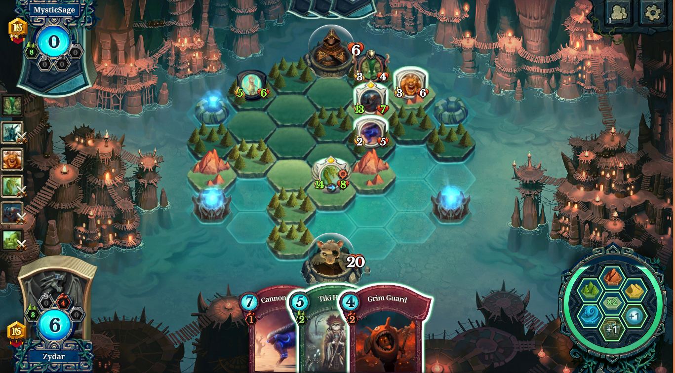
3ad796ef197fc97b849e9c7b9061148170c8879e.png
Only the cards themselves are somewhat big.
The end turn button becomes visible where those land/mana icons are (once you used them, since that is mandatory), so it doesn't even obstruct the view all the time.
To the left is the history of recent actions.

Come to think of it, Faeria seems at least somewhat similar to your game and IMO has a pretty great UI.
 
Joined
Jul 4, 2014
Messages
1,563
Yeah, UI reskin is probably the best bandaid for mobile looks.

Good-looking topdown graphics are hard to pull off, but if you tilt the angle even just a bit (like with trees and other props here) the number of required animation frames increases massively so I can see why people do try to make it work.

I could actually imagine getting used to the People Who Stare Up if everything else works. Probably not that different from No Legs Battle Brothers.
 

RossD20Studios

Literate
Joined
Oct 29, 2017
Messages
20
Location
Salt Lake City, UT
The buttons stick out to me at first sight. How about shoving them into a panel, so I am offered an unobstructed view of the field as in that buttonless screenshot above, and I can open the panel to access the button I want.
It's the larger size of the UI, the bar on the side etc., that screams mobile game, on the phone that makes sense, on a pc, not so much. How feasible would it be for you to reskin the UI at least for the PC?
For almost all games it is usual to have all (or almost all) of the UI elements in the bottom or top. If it all fits in the bottom, have it all there (though some games make some exceptions for things like a minimap or showing resourced).
I haven't really analyzed it deeply, but I would say:
Anything that you interact with often and that is mandatory goes to the bottom and is nicely framed (for example, Total War: Warhammer).
"Misc" information (like resources, turn order, etc.) or rare interactions go to the sides or the top. For example, my first impression was that your UI screenshot was showing some kind of turn order.
Also, make everything smaller. MUCH smaller. That "end turn" (I assume?) button takes like 10% of the screen height and the mana (?) bar more than half of it.

Thanks so much guys, this is feedback I can run with. Tell you what I'll do- I will create some mockups/layouts and post them back here later today for your feedback. If you think the layout/size/proportions look good, I will take your suggestions and pass them along to my art team to illustrate with game art. In the meantime, if any other thoughts spring to mind, please let me know.

Also the way those buggers keep staring up is weird, MAKE 'EM STOP.
I knew something was weird about the faces, but yeah... they are all staring at you.
Now I will not be able to unsee that :lol:

Hahaha. It's weird, yeah, but it's part our game's unique charm that they look up at you and it's woven into the story why they do. The idea I'm going for is that you're looking into their world as a deity-like figure. To the characters, you are the embodiment of fate and they intently look to "the heavens" to signal they are ready for command. Yeah, it is a little weird, creepy for some, but it's different and helps us stand out. Plus, for a top-down game, it's virtually the only way to connect with your characters.
 

RossD20Studios

Literate
Joined
Oct 29, 2017
Messages
20
Location
Salt Lake City, UT
Yeah, UI reskin is probably the best bandaid for mobile looks.
Good-looking topdown graphics are hard to pull off, but if you tilt the angle even just a bit (like with trees and other props here) the number of required animation frames increases massively so I can see why people do try to make it work.

Nice, see my last post to the folks above. I will mock those up and would love your feedback as well.

I could actually imagine getting used to the People Who Stare Up if everything else works.

There's a great story about the Aeron chair, widely popular in offices today, and how its initial reception was "Awkward..." because it was so outside the box at the time. People got used to it, though, and actually came to love it for its design. That's what I'm hoping for with this mechanic.
 

*-*/\--/\~

Cipher
Joined
Jul 10, 2014
Messages
970
All the characters must have a huge, splitting neck-ache. :D

Turn-based and tile-based sound good, but as other said, the mobile first approach (and looks) will kill it for many players. There is a million games (literally, total number of apps surpassed three million this year) in the play store - and 99% are utter garbage.
 

RossD20Studios

Literate
Joined
Oct 29, 2017
Messages
20
Location
Salt Lake City, UT
All the characters must have a huge, splitting neck-ache. :D

Within the dimension that our characters live in, people and animals are actually born with a specialized joint in their neck that allows them to directly up to the heavens (not unlike how an owl can easily rotate its head around). We thought this would spare the poor little guys ;)

Turn-based and tile-based sound good, but as other said, the mobile first approach (and looks) will kill it for many players. There is a million games (literally, total number of apps surpassed three million this year) in the play store - and 99% are utter garbage.

You're absolutely right. It's an uphill battle for me to gain trust from players that so many other devs have treated so poorly with their approach to games. I hope I can earn your trust and show you that I'm in that 1% of exceptional game quality.
 

*-*/\--/\~

Cipher
Joined
Jul 10, 2014
Messages
970
All the characters must have a huge, splitting neck-ache. :D

Within the dimension that our characters live in, people and animals are actually born with a specialized joint in their neck that allows them to directly up to the heavens (not unlike how an owl can easily rotate its head around). We thought this would spare the poor little guys ;)

Well, players might be turned off by the screenshots and not willing to read your explanation... By the way, doesn't that mean they can't properly see enemies in front of them? :D
(the boss monster should probably be a really flat crab, no one will see him coming)

Turn-based and tile-based sound good, but as other said, the mobile first approach (and looks) will kill it for many players. There is a million games (literally, total number of apps surpassed three million this year) in the play store - and 99% are utter garbage.

You're absolutely right. It's an uphill battle for me to gain trust from players that so many other devs have treated so poorly with their approach to games. I hope I can earn your trust and show you that I'm in that 1% of exceptional game quality.

Maybe you are - but I'm afraid much of your target audience simply ignores mobile devices. I got my first game nearly three decades ago and since then wasted more time and resources on games than a sane person probably should - but I haven't spent a single cent on the mobile market. The freemium money milking and advertisement bombardment just isn't my thing. Also, by designing mobile first, you are greatly limiting yourself in resources and processing power you will have available to run your game - a limitation that simply cannot be avoided.

Naturally, you can succeed despite this, but my humble advice would be to take it as a learning milestone before turning to PC.
 

RossD20Studios

Literate
Joined
Oct 29, 2017
Messages
20
Location
Salt Lake City, UT
Maybe you are - but I'm afraid much of your target audience simply ignores mobile devices. I got my first game nearly three decades ago and since then wasted more time and resources on games than a sane person probably should - but I haven't spent a single cent on the mobile market. The freemium money milking and advertisement bombardment just isn't my thing. Also, by designing mobile first, you are greatly limiting yourself in resources and processing power you will have available to run your game - a limitation that simply cannot be avoided.

Your point here is why I maintain faith that my game can work. Freemium money milking and advertisement bombardment have absolutely destroyed the reputation of mobile games. By virtue of this, I believe a market demand is created that will help us succeed, even in the event that we aren't featured placed. As a player of tactics games who doesn't have the time to boot up a PC and sit uninterrupted playing, I routinely search the app stores, trying to find the "gem" of game that exists, and I've searched through hundreds of pages of apps looking for it. What I hope to offer with Summoners Fate simply does not exist yet, and I believe there are other people searching for it too.

For every 1000 greedy execs seeking to make a quick buck with a diminished product, there is at least one indie developer out there trying to build a product based on quality and longevity. Don't rule us out just because we're on the same platform as them.
 

RossD20Studios

Literate
Joined
Oct 29, 2017
Messages
20
Location
Salt Lake City, UT
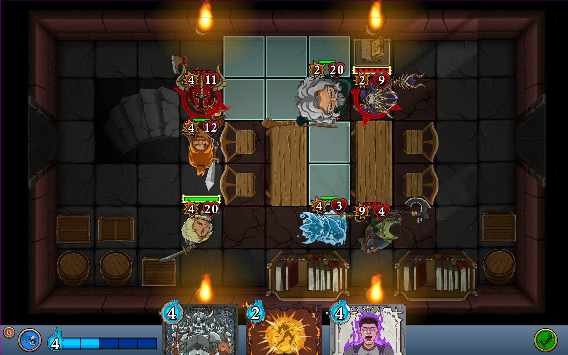
Alright, here's my first attempt with the initial feedback. I'm not the game artist, I'm just trying to get a sense of layout and scale to direct the artist. Please rip this apart and help me refine it.

PCUIMock_v1.png
 

Absinthe

Arcane
Joined
Jan 6, 2012
Messages
4,062
Ha, I wish it was cheap! Actually, I've spent over 18 months working 80+ hours a week making this so far, plus paying all the artists bills. Thanks for the feedback on the buttons - those I can certainly change (right now, it's just my programmer art placeholders).
You sound like you won't be achieving financial success there. Have you asked yourself what price you intend to be selling it for, how much of that money you will get to keep after the various stores/publishers/etc. take their cut, how much you will have to sacrifice to cover the cost of labor, and how much profit you need to make so that the hours you spent on it will have earned you something better than what you would have made if you were to, say, spend all those hours working at McDonalds instead? And did you then work out how many sales you actually need to make your game worthwhile and what kind of general exposure and marketing budget you would require to make it sell properly? Or did you just expect success to happen because you're sure you'll produce a good game and all kinds of people will somehow hear about it (as opposed to being buried among the giant tide of mobile games which normally happens) and it will magically sell great and you'll make lots of money? Because if it's the latter odds are the only success you will be achieving is a nice line of job experience to put on your resume when you apply to a less bankrupt mobile gaming company, and those places are revolving doors.

Success in the mobile market is defined more by figuring out how to define your goals and optimize your workflow so you can achieve a lot in a short amount of time for a low cost and knowing how to reach your sales target for profitability than achieving the mythical mass market success. There's only a minuscule percentage of mobile games that actually achieve some kind of mass market success, and those games aren't indies.

Yeah, I don't think the payment model is a problem per se.
I play quite a few F2P games, as I know others here do.
Path of Exile, Paladins, Faeria (I really loved that one), etc. People generally know F2P can work.
Never heard of the others, but Path of Exile is not exactly a F2P business model. Pretty sure they stay afloat mainly through the sale of stash tabs (which are highly desirable for any loot-whore in a loot-whoring game like that) and beta access keys.

Man, I cannot thank you enough for this feedback! Honestly, I've been a bit puzzled at why I am struggling to gain traction with certain groups and you have helped me understand why our screenshots/art are creating a negative impression of what the game actually is.
Your art style shows you to be a generic trend-chaser and made your game look like a dime-a-dozen mobileshit game. It's like you aimed for mediocrity. The mobile market is primarily fueled through ADD/bored people craving distraction who will not give your game a second glance and your art style practically says that your average mobile market consumer is your target audience. The computer gaming markets have more serious tastes, so advertising yourself as a dime-a-dozen mobile game through your game art is working wonders for discouraging people from taking your project as any kind of worthwhile project. Have you ever heard the saying "clothes make the man"? Art style can also make or break the game when you're in a market where first impressions are everything before someone skips to the next game. Now I'm not a graphics whore here, but people don't need to be graphics whores to judge games negatively when they look like they were made for a lazy mobile market first and foremost because the overwhelming majority of those games are shit, and you did make your game look exactly like them.

Here's my approach: All of the cards in the game are collectible over-time playing the game for free (via single player and/or multiplayer) - there are no "premium" cards that you have to buy with real money, and there are no timer-locked chests. This begs the question - "what's the motivation to ever want to buy cards then?" My answer to that is honestly to provide such a large diversity of cards and strategic options that players who enjoy the game want to help support it and build their collection out directly. I didn't make the game to be competitive and "require" certain cards. In fact, I'm going to do my best to ensure everyone starts with a competitive set of cards off the bat that you can win and continue to win with.
Doesn't sound profitable. Most micro-transaction fueled games rely on essentially gambling mechanics to entice people into wasting excessive amounts of money into getting what they want. Your game sounds like it would reward the players most invested into the game with obtaining everything they want for free while the casuals who are not as invested should fork over money in order to stay competitive. It's not a good business model. You might be wondering how League of Legends does it, but LoL requires years and years of nonstop grinding in order to unlock all the content, so a point is frequently reached where dedicated players start forking over money.
 
Last edited:

RossD20Studios

Literate
Joined
Oct 29, 2017
Messages
20
Location
Salt Lake City, UT
You sound like you won't be achieving financial success there. Have you asked yourself what price you intend to be selling it for, how much of that money you will get to keep after the various stores/publishers/etc. take their cut, how much you will have to sacrifice to cover the cost of labor, and how much profit you need to make so that the hours you spent on it will have earned you something better than what you would have made if you were to, say, spend all those hours working at McDonalds instead? And did you then work out how many sales you actually need to make your game worthwhile and what kind of general exposure and marketing budget you would require to make it sell properly? Or did you just expect success to happen because you're sure you'll produce a good game and all kinds of people will somehow hear about it (as opposed to being buried among the giant tide of mobile games which normally happens) and it will magically sell great and you'll make lots of money? Because if it's the latter odds are the only success you will be achieving is nice line of job experience to put on your resume when you apply to a less bankrupt mobile gaming company, and those places are revolving doors.

Yes, of course I have asked myself these questions. This isn't my first rodeo. My first game, Hero Mages, was a successful indie title (not earth shattering success, mind you, but successful), and when I made that game, I knew absolutely nothing about the game industry. I took time every day to learn after work, putting an additional 40+ hours a week into it on-top of working a full time job. Then, I went to work for EA to meet other developers, marketers and producers and learn from them. I did this for four years before having saved enough and planned enough to create my plan and be able to work full-time on this project for the two and half years it will take to have completed it. You don't just "do" these kinds of things without having put thought into it.

Success in the mobile market is defined more by figuring out how to define your goals and optimize your workflow so you can achieve a lot in a short amount of time for a low cost and knowing how to reach your sales target for profitability than achieving the mythical mass market success. There's only a minuscule percentage of mobile games that actually achieve some kind of mass market success, and those games aren't indies.

I knew this going into it. Year 1 was spent optimizing the work flow, exactly as you describe. If you're curious to learn how I am handling my production, watch this video I made.
Year 2 is tapping into the audience and learning from them so that the product isn't just good, it's exceptional. I hope I can learn from you, too.

Your art style shows you to be a generic trend-chaser and made your game look like a dime-a-dozen mobileshit game. It's like you aimed for mediocrity. The mobile market is primarily fueled through ADD/bored people craving distraction who will not give your game a second glance and your art style practically says that your average mobile market consumer is your target audience. The computer gaming markets have more serious tastes, so advertising yourself as a dime-a-dozen mobile game through your game art is working wonders for discouraging people from taking your project as any kind of worthwhile project. Have you ever heard the saying "clothes make the man"? Art style can also make or break the game when you're in a market where first impressions are everything before someone skips to the next game. Now I'm not a graphics whore here, but people don't need to be graphics whores to judge games negatively when they look like they were made for a lazy mobile market first and foremost because the overwhelming majority of those games are shit, and you did make your game look exactly like them.

On this, I whole-heartily disagree. First, there isn't a single game on the market that looks like ours. We chose top-down deliberate to re-create the feel of a tabletop miniature board game. We chose to have the characters look-up deliberately so that player would make a connection with the character's eyes instead of the top of a skull. We chose the vector based art style so that the graphics scale to any resolution or DPI. Try looking at our game on a 27 inch 4K gaming monitor. You won't see any pixelation, just clean, iconic characters.

I think it's totally fair to say you don't like the style. It's not for everyone and I am cool with that. But I can't agree with you that it's in any way cheap, dime-a-dozen, or generic. If you can show me one game that has all of the attributes I just described, I would absolutely love to see it.

Doesn't sound profitable. Most micro-transaction fueled games rely on essentially gambling mechanics to entice people into wasting excessive amounts of money into getting what they want. Your game sounds like it would reward the players most invested into the game with obtaining everything they want for free while the casuals who are not as invested should fork over money in order to stay competitive. It's not a good business model. You might be wondering how League of Legends does it, but LoL requires years and years of nonstop grinding in order to unlock all the content, so a point is frequently reached where dedicated players start forking over money.

Most micro-transaction fueled games rely on essentially gambling mechanics...

Yes, I absolutely agree with that statement. That's exactly why mobile games have a bad reputation. But "most" doesn't mean "all". I am not a AAA corporation that requires 20% of the market share to survive. I'll take a crumb, and a crumb of the total mobile revenue is more than enough for an indie developer to have a very successful life.

Thanks for the feedback, I appreciate it. It's never a bad thing to test an indie dev's resolve, because you've gotta be practically invincible to make it in the game industry. Do you have any feedback on the UI mock I put together? Any examples/comps you think would compliment our character/world style well? Again, I know that's not the style for you, but I'd appreciate your input.
 

As an Amazon Associate, rpgcodex.net earns from qualifying purchases.
Back
Top Bottom