Putting the 'role' back in role-playing games since 2002.
Donate to Codex
Good Old Games
  • Welcome to rpgcodex.net, a site dedicated to discussing computer based role-playing games in a free and open fashion. We're less strict than other forums, but please refer to the rules.

    "This message is awaiting moderator approval": All new users must pass through our moderation queue before they will be able to post normally. Until your account has "passed" your posts will only be visible to yourself (and moderators) until they are approved. Give us a week to get around to approving / deleting / ignoring your mundane opinion on crap before hassling us about it. Once you have passed the moderation period (think of it as a test), you will be able to post normally, just like all the other retards.

Summoners Fate

thesheeep

Arcane
Patron
Joined
Mar 16, 2007
Messages
10,119
Location
Tampere, Finland
Codex 2012 Strap Yourselves In Codex Year of the Donut Codex+ Now Streaming! Serpent in the Staglands Dead State Divinity: Original Sin Torment: Tides of Numenera Codex USB, 2014 Shadorwun: Hong Kong Divinity: Original Sin 2 BattleTech Bubbles In Memoria A Beautifully Desolate Campaign Pillars of Eternity 2: Deadfire Pathfinder: Kingmaker Steve gets a Kidney but I don't even get a tag. Pathfinder: Wrath I'm very into cock and ball torture I helped put crap in Monomyth
Alright, here's my first attempt with the initial feedback. I'm not the game artist, I'm just trying to get a sense of layout and scale to direct the artist. Please rip this apart and help me refine it.

PCUIMock_v1.png
Already much better, I'd say.
The space to the right of the cards seems awfully empty - is 3 the maximum amount of cards?
 

*-*/\--/\~

Cipher
Joined
Jul 10, 2014
Messages
984
Alright, here's my first attempt with the initial feedback. I'm not the game artist, I'm just trying to get a sense of layout and scale to direct the artist. Please rip this apart and help me refine it.

PCUIMock_v1.png

The scale is much better now for a PC version, though the perspective is off in couple of items. Look at the door and imagine two of them in adjacent tiles, they would cut into each other. The barrels look like they are toppling, the two bookshelves look like we are viewing each from a different spot... disregard this if they are just placeholders.

By the way, have you played Warhammer Quest ?
 

RossD20Studios

Literate
Joined
Oct 29, 2017
Messages
20
Location
Salt Lake City, UT
Already much better, I'd say.
The space to the right of the cards seems awfully empty - is 3 the maximum amount of cards?

Thank you for pushing me on this, I owe you one for bringing this to my attention and I do think this looks much better for PC. Yeah, I'm troubled by that empty space on the right as well, not quite sure what to do about that yet. Do you think it would help to condense the mana to a Diablo style "orb" instead of a horizontal bar, then maybe shift the menu/undo button over to the right with end turn? Maybe make the buttons square and configure them in a rectangle? I'm not entirely sure...

Three cards is the current max (it is possible to go over 3 with special abilities), but for the most part, the player will always have 3 cards in their hand since you draw back to three cards after you end your turn. I wanted to avoid the "top decking" problem often experienced in MtG or Hearthstone, and so far I've found it is more fun to always have a choice of cards rather than a single card in late game.


The scale is much better now for a PC version, though the perspective is off in couple of items. Look at the door and imagine two of them in adjacent tiles, they would cut into each other. The barrels look like they are toppling, the two bookshelves look like we are viewing each from a different spot... disregard this if they are just placeholders.

By the way, have you played Warhammer Quest ?

Thank you! I owe you a lot as well for the feedback and push. I don't mind hard criticism, especially when it drives improvement.

Indeed, I've played Warhammer Quest all the way through, as well as the original board game on which it is based. Excellent graphics, easy to get into, and very engaging until you get to the upper levels and it starts to feel slow and repetitive. Once my characters hit max level, I didn't feel there was any more growth and that's why I stopped playing.

Perspective: When I was working on the designs for our top-down, I used several games as a cross-section comparison. Warhammer Quest was definitely a prominent example. Legend of Zelda, Link to the Past, was another. I also considered isometric perspective, but dropped it (because it was not at all intuitive to command units with the skewed angle nor was this perspective conducive to easily readable directional facing, which is important for many tactics, like "backstab" or "shield block").

Let me show you some screenshots and share some of my thought process on how we landed with perspective:

Warhammer Quest

Here are two screenshots that I think show the strengths and weakness of their perspective:

WarhammerQuest01.jpg


This first screenshot is a "best case" example. The game uses 3D graphics but camera is fixed at bird's eye (similar to ours). Creatures like the spiders look gorgeous, and the floor textures and lighting VFX are excellent.


YwgNtW-kcau-geutOSDnJNz3Qe-1016ET4k18u1IfPxACI5uLdtdKPfM28mrE4BN6P0g=h310-rw

But look what happens here at smaller scale and with humanoid characters like Orcs and Goblins. Personally, I have a hard time distinguishing what is happening here. The UI doesn't clearly indicate important things without "digging" through menus (like the attack strength and life of the enemies relative to each other). All I can see is a health bar relative to a specific character - but does that life bar take 1 hit, 2 hits, or 5 hits to deplete? Also, I'm missing all of the detail on these characters as all I can see is the top of their heads. All of the cool features of the character in their face are not visible. If you asked me to find the archer in this scene, it would take several seconds to process it and identify him.


Legend of Zelda - Link to the Past

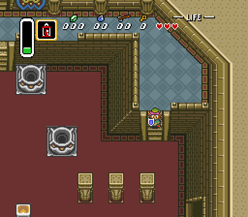
The staple classic of the SNES era, I love this game because it conveys so much with so little.

Legend_of_Zelda-A_Link_to_the_Past_%28SNES%29_26.png

The perspective is entirely incorrect (from a true 3D perspective) but after playing only a few minutes, my brain becomes comfortable with it. By having the character on a slanted perspective, I can connect better with him - I see his face, his eyes, etc. The walls offer some depth. The contrast/colors allow me to easily recognize where my character is and what is on the screen.

Legend_of_Zelda-A_Link_to_the_Past_%28SNES%29_11.png

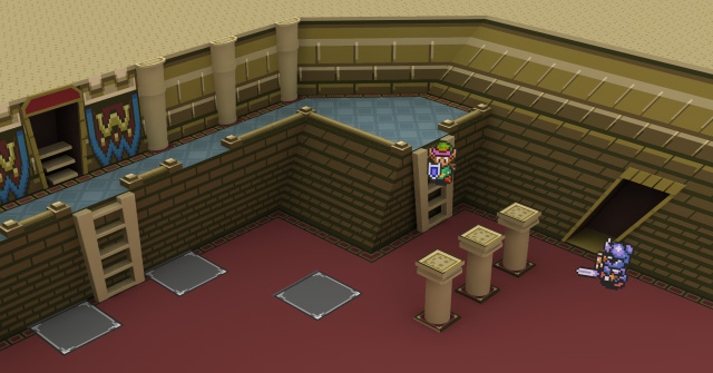
There are absolutely problems with the perspective creating unnatural possibilities in the 3D world. In fact, this guy here clearly shows you in his article about it.

ZeldaAngle2.jpg

Yikes, Zelda is not pretty in the 3D world!

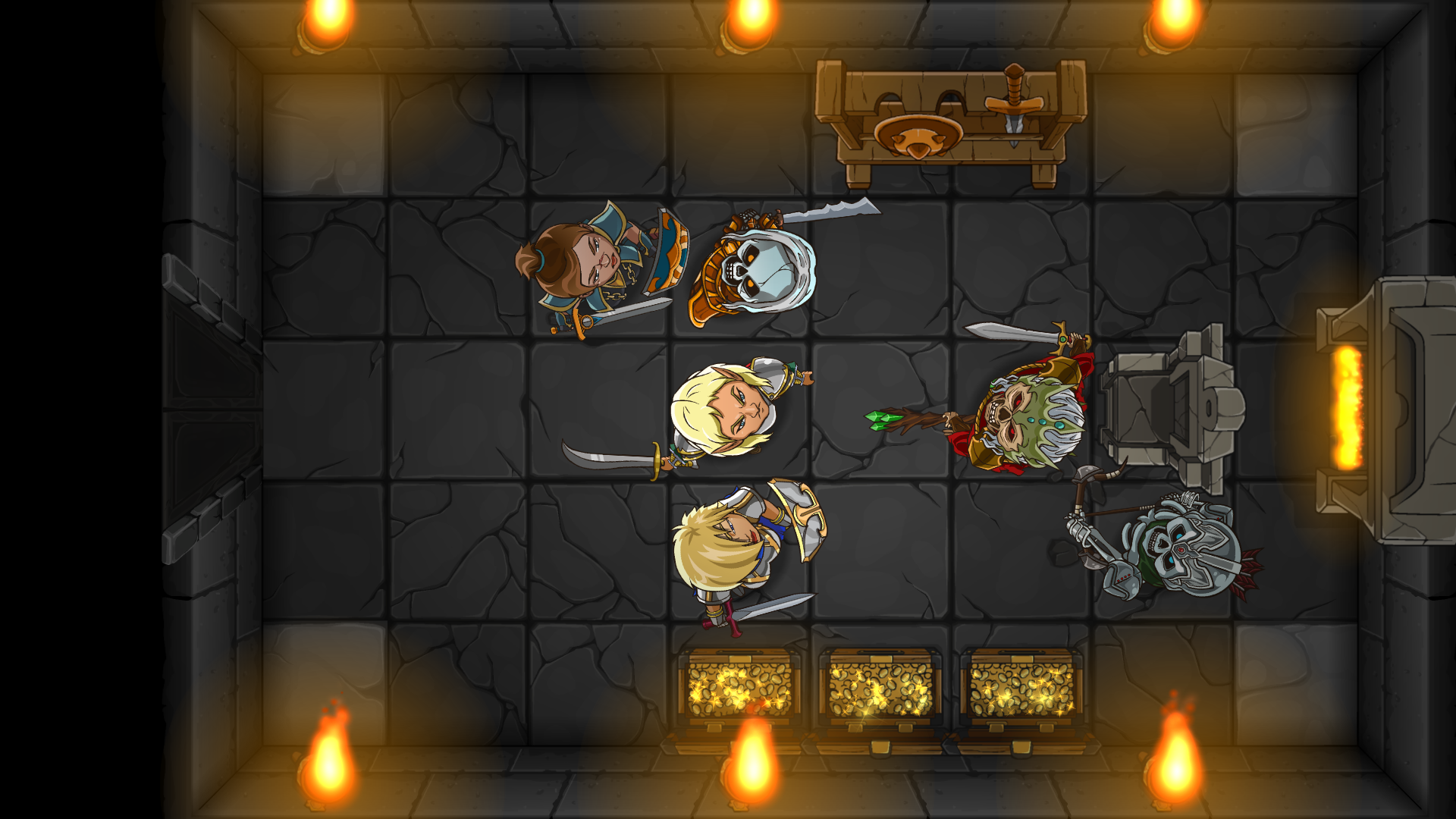
Another look at Summoners Fate

TrailerScreenB.png

Ok, now let's take another look at Summoners Fate and you can start to see why I've made some of the decisions I have about the perspective. First, rendering a Zelda style side-view sprite didn't work for us for a few reasons. First, you have to draw each perspective, limiting the ability to freely rotate the character (which is important if you want to denote accurate facing for an archer shooting at an angle that isn't a perfect 90 or 45 degree increment). Second, the cost to develop animations for a side-view character is 3-4 times more expensive and demands over 20 times more file size and GPU memory. Third, transitions for a side view character do not blend naturally for high resolution graphics due to uncanny valley effect. It works great for a 16Bit game, due to the low frame count, but when you're running 60FPS, it's noticeably awkward.

I chose 2D over 3D for several reasons. Artistically, I think 2D has more power than 3D to bring out the unique identity of each character, even at small scale. Even characters that are similar in appearance (the Elf Fighter mage and the Paladin) can be quickly identified at a glance. When the characters aren't looking up at you, it's still possible to see their eyes and expression (important for maintaining connection with them). 2D vector in particular scales much better: at 4K resolution, these characters only look better, while high resolutions of 3D model show all the flaws (low poly textures, pixelation, seams, flaws in the mesh mapping, etc.). In 10 years from now, Summoners Fate will still have a classic look (because the art is a style choice) but 3D games will look very dated by comparison to modern standards.

The other major reasons for 2D are development cost, file size, and performance demands. I don't think indies should attempt building 3D games (unless you have personal expertise with 3D modeling) because costs are over 10X that of 2D games for the initial art alone and multitudes more cost and time to optimize and polish.

Ok, now let me be honest about the flaws and problems. Absolutely, many of the items have an unnatural perspective (including the characters themselves) and would not translate to an accurate 3D representation. These include things like the barrels, chests, doors, etc. The torches are also a little weird, but they "felt" better to me having the flames always point up because using a natural perspective looks very awkward and the brain processes fire as flowing up. Another major challenge I have with our perspective is z-index (layering of items on top of each other). Generally, I can get away with things on bottom of screen layering on top of things higher on the screen, but in many cases, this creates weirdness, like a dragon's foot layering above a character's face.

With some of my thought process shared here, how do you feel about my design choices? Would you rather play a game with absolute realism to perspective, or, do you think there is some value in "breaking the rules" a bit in order to emphasis some key details (such as character expression)? I am genuinely curious as the visual style and perspective is something I have wrestled with for a long time and also the top reason why I had to push the release date out roughly another year from my initial estimates.
 

JarlFrank

I like Thief THIS much
Patron
Joined
Jan 4, 2007
Messages
34,797
Location
KA.DINGIR.RA.KI
Steve gets a Kidney but I don't even get a tag.
Can we zoom out to make the battlefields and characters look a little less huge on the screen? My main gripe with the look is the scale, and it's also what looks the most "mobile game" about it, the way it's ridiculously far zoomed-in.

This also leads to very small battlefields which naturally restricts tactical depth since there's not too much maneuvering you can do in a shoebox-sized level.
 

RossD20Studios

Literate
Joined
Oct 29, 2017
Messages
20
Location
Salt Lake City, UT
Can we zoom out to make the battlefields and characters look a little less huge on the screen? My main gripe with the look is the scale, and it's also what looks the most "mobile game" about it, the way it's ridiculously far zoomed-in.

This also leads to very small battlefields which naturally restricts tactical depth since there's not too much maneuvering you can do in a shoebox-sized level.

Oh of course! The levels scale/zoom based to fill the screen based on the size of room being entered. So a larger grid naturally zooms out, smaller room zooms in. See the temple ruins screenshot from an earlier post (ignore the UI on it, that is definitely oversize as you described).

Re: Small room size - There's intent with the room sizes that's not entirely obvious until you start playing. I'll give some context on that.


hm_4players.jpg

This screenshot here is from my first game, Hero Mages. Hero Mages was originally designed as a tabletop board game that I converted to a PC browser based game. The ideal grid size for a 2 vs. 2 battle was 13 x 11 tiles.

For Summoners Fate, the idea was to create a tabletop board game style RPG dungeon crawl experience (similar to the Hero Quest board game or how you would use a hand drawn grid to play D&D). Since the game focuses on 1 room encounter at a time, I tested a variety of dimensions for the "typical room" (5x7, 5x8, 5x9, etc.) Initially, players were concerned about the size of the map for the same reason you mentioned above (tactical maneuvering). However, for 1v1 battle, what I've discovered so far in play testing is that the larger grid space results mostly in longer play time without actually adding more tactical depth.

Reason being is the players naturally position their units within combat range, so only a fraction of the board (roughly 1 quarter) is actually used, while the rest of the board is wasted space. You've got this zoomed out board, but you're only looking at a fraction of it. That's why we zoomed in - to keep greater focus on the battle. This also helps with things like UI and stats. Because you're zoomed in, you can things like the power/health of each character more easily.

Playtime increased with larger boards because you're spending time advancing your units. Now, there is some level of tactical depth with moving/advancing across distance. The challenge with it, though, is that it isn't very fun when you have to repeat positioning your units at the beginning of each battle over and over again. I play a lot of real time strategy. Dawn of War and Starcraft are my favorites. Probably the most frustrating part of playing those games is that the first 10 minutes of the game is exactly the same each time. It's always about starting your resource chain, scouting for positions, building your initial army, etc. Time and again, I wish I could "skip" the beginning and get right to the good stuff - the actual battle encounter with my opponent. Hence, another reason for the smaller room.

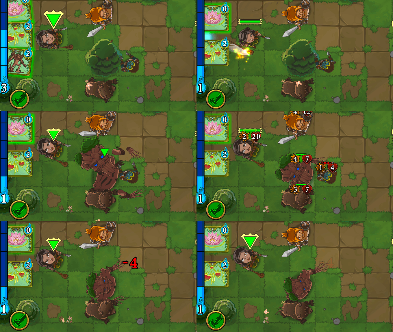
So, how do we get more tactical depth in a smaller space? We maximize the tactical impact of each element on the board. Environment, for example, plays a larger role. You have to consider things like the type of terrain, line of sight, obstacles, which can all have different impacts to movement or even cause damage. Cards directly can directly affect environment. For example:


TransformTreeIntoTreant.gif

You can cast spells to transform trees into Treants. You can also transform rocks into earth elementals or lava into fire elementals.


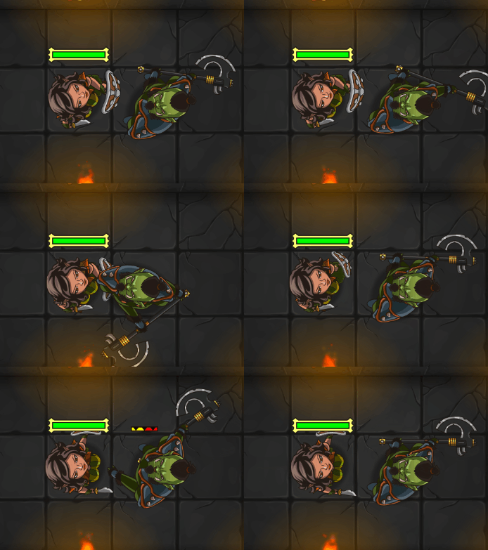
ShieldBlock.gif

Directional facing makes a huge difference to combat (another reason why you need the larger scale - so you can clearly read the directional facing of your character as this affects abilities such as shield block, which can block physical damage on the front and side arc, but is vulnerable to the rear. Attacks to the rear of a unit also prevent that enemy from counter attacking.


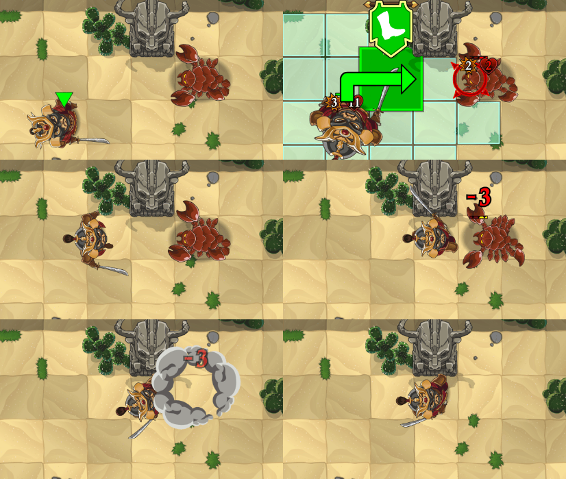
SamuraiKillsScorpion.gif

Movement pathing is another form of tactical depth. The path you choose to move can result in different outcomes, such as springing or avoiding a trap. The direction you move also determines your characters end facing state.

So, what we lack for depth in terms of traversing space, we make up for in a variety of dense mechanics that are part of "the good stuff" (unique combat decisions vs. repetition advancing). Variety of card choices adds considerably to this. You have over 400 cards to pick from to form your deck, each resulting in a very different strategic experience. You never have to spend time building your base the same way each time to start the game, you start the game immediately with unique decisions to make as soon as you are battling.

Our tactical combat is designed to be quick and gratifying, condensing the thrill of a 30-40 minute average battle in other games down to 3 minutes. We do this intentionally because there is an additional layer of strategy on top of the individual tactics battles:


roomtransition.gif

Dungeon rooms seamlessly connect. When you complete a battle, you carry everything you have from the previous battle over to the next room (which could be a battle, a treasure room, a series of traps, etc.) This adds a layer of strategic resource management to the tactics genre where you need to consider not only the choices that will win an individual 3 minute fight, but whether or not choosing to use or reserve a resource will be most effective for surviving the dungeon at large.

The hardest part I've had so far with Summoners Fate is explaining what it is from the screenshots. Some folks think this is just another clone of existing shovel ware games on mobile. But it is not. A lot of thought and consideration has gone into representing the core elements that make tactics games enjoyable, and our team has worked really hard to innovate and make something new that pushes the genre forward. While some elements may scream mobile, I'm not intending to isolate PC gamers by making the game cross platform, I'm attempting to bring more gamers together because ultimately, it's who you play games with that has the biggest impact on a fun experience.

Please keep sharing your comments and feedback - the more I understand how you are perceiving the game, the better I can adapt it to better represent your needs.
 

thesheeep

Arcane
Patron
Joined
Mar 16, 2007
Messages
10,119
Location
Tampere, Finland
Codex 2012 Strap Yourselves In Codex Year of the Donut Codex+ Now Streaming! Serpent in the Staglands Dead State Divinity: Original Sin Torment: Tides of Numenera Codex USB, 2014 Shadorwun: Hong Kong Divinity: Original Sin 2 BattleTech Bubbles In Memoria A Beautifully Desolate Campaign Pillars of Eternity 2: Deadfire Pathfinder: Kingmaker Steve gets a Kidney but I don't even get a tag. Pathfinder: Wrath I'm very into cock and ball torture I helped put crap in Monomyth
I wouldn't zoom in THAT much for smaller rooms, maybe.
Having characters be that big on a big screen (with that perspective) is very unusual.
Maybe just zoom in until a certain extent - I honestly think having a certain black (or otherwise) border is better than weirdly large characters.

Remember, you not only have to deal with resolutions up to 4K but also different monitor sizes.
On my monitor, for example that throne room image, every tile is like 3x3cm big. That's MUCH larger than in any other game.

Of course, you should just allow the player to zoom in and out anyway.
 

ERYFKRAD

Barbarian
Patron
Joined
Sep 25, 2012
Messages
30,151
Strap Yourselves In Serpent in the Staglands Shadorwun: Hong Kong Pillars of Eternity 2: Deadfire Steve gets a Kidney but I don't even get a tag. Pathfinder: Wrath I'm very into cock and ball torture I helped put crap in Monomyth
All the screenshots I've seen so far are of your battles in action, maybe have a few shots displaying dungeon size, dungeon traversal etc. And if you have non-combat events happening, maybe show them too.
 

Mazisky

Magister
Joined
Mar 8, 2015
Messages
2,082
Location
Rome, IT
The game looks pretty cool, i didn't expect that late 2018 release tho. I thought it was almost completed judging by videos\screens.

Also, i'm happy to see already a good amount of scenery varations, in games like this environment variety is important (only dark dungeons is boring), so keeping a 50\50 between outdoors and indoors would be nice. Also you can add some night-only maps
 

JarlFrank

I like Thief THIS much
Patron
Joined
Jan 4, 2007
Messages
34,797
Location
KA.DINGIR.RA.KI
Steve gets a Kidney but I don't even get a tag.
Can we zoom out to make the battlefields and characters look a little less huge on the screen? My main gripe with the look is the scale, and it's also what looks the most "mobile game" about it, the way it's ridiculously far zoomed-in.

This also leads to very small battlefields which naturally restricts tactical depth since there's not too much maneuvering you can do in a shoebox-sized level.

Oh of course! The levels scale/zoom based to fill the screen based on the size of room being entered. So a larger grid naturally zooms out, smaller room zooms in. See the temple ruins screenshot from an earlier post (ignore the UI on it, that is definitely oversize as you described).

Re: Small room size - There's intent with the room sizes that's not entirely obvious until you start playing. I'll give some context on that.


hm_4players.jpg

This screenshot here is from my first game, Hero Mages. Hero Mages was originally designed as a tabletop board game that I converted to a PC browser based game. The ideal grid size for a 2 vs. 2 battle was 13 x 11 tiles.

Okay, my impression of this screen compared to those of your new game:

it looks much, much, much more appealing to me. Especially the interface and the nice character art at the right, that's some quality character art. And the zoom level is much nicer too. Overall, a much more PC-style interface than your new game.

If the PC version has that level of zoomout and that interface, and maybe some nice character art like this one, I'd definitely give it a buy. It looks visually pleasing overall. The new one is wayyyy too zoomed in and has a much worse interface.

If you could maybe make some changes to the PC version so it looks more like this, while keeping the mobile version as it is now, your chances of attracting the PC gaming crowd rise dramatically.
 

*-*/\--/\~

Cipher
Joined
Jul 10, 2014
Messages
984
YwgNtW-kcau-geutOSDnJNz3Qe-1016ET4k18u1IfPxACI5uLdtdKPfM28mrE4BN6P0g=h310-rw

But look what happens here at smaller scale and with humanoid characters like Orcs and Goblins. Personally, I have a hard time distinguishing what is happening here. The UI doesn't clearly indicate important things without "digging" through menus (like the attack strength and life of the enemies relative to each other). All I can see is a health bar relative to a specific character - but does that life bar take 1 hit, 2 hits, or 5 hits to deplete? Also, I'm missing all of the detail on these characters as all I can see is the top of their heads. All of the cool features of the character in their face are not visible. If you asked me to find the archer in this scene, it would take several seconds to process it and identify him.

Much of what you describe can be solved by the UI (numerical hp displays in said hp bars, for example) and knowledge the player acquires quite fast (i.e. how many hits an enemy can take, as you mentioned). Regarding the archer, remember that players are not suddenly dropped in the scene you posted, but arrive at it after at least a couple of minutes of play - they already know who is who. Agree that it would be better to tilt the camera slightly so we can see more of the characters - guess that was avoided for performance reasons on mobile.

Another look at Summoners Fate

Ok, now let's take another look at Summoners Fate and you can start to see why I've made some of the decisions I have about the perspective. First, rendering a Zelda style side-view sprite didn't work for us for a few reasons. First, you have to draw each perspective, limiting the ability to freely rotate the character (which is important if you want to denote accurate facing for an archer shooting at an angle that isn't a perfect 90 or 45 degree increment). Second, the cost to develop animations for a side-view character is 3-4 times more expensive and demands over 20 times more file size and GPU memory. Third, transitions for a side view character do not blend naturally for high resolution graphics due to uncanny valley effect. It works great for a 16Bit game, due to the low frame count, but when you're running 60FPS, it's noticeably awkward.

Why would a side-view character be so much more demanding? It's still just a bunch of sprites, few png images with instructions for the animator whether top down or side. By the way, do you use some tool like Spine for the animations? I like your style much more than Zelda style perspective mix though.

I chose 2D over 3D for several reasons. Artistically, I think 2D has more power than 3D to bring out the unique identity of each character, even at small scale. Even characters that are similar in appearance (the Elf Fighter mage and the Paladin) can be quickly identified at a glance. When the characters aren't looking up at you, it's still possible to see their eyes and expression (important for maintaining connection with them). 2D vector in particular scales much better: at 4K resolution, these characters only look better, while high resolutions of 3D model show all the flaws (low poly textures, pixelation, seams, flaws in the mesh mapping, etc.). In 10 years from now, Summoners Fate will still have a classic look (because the art is a style choice) but 3D games will look very dated by comparison to modern standards.
I definitely agree that 2D ages much better than 3D if done well. Not sure about the rest, but that may be just my aversion to all things cartoony. :D

The other major reasons for 2D are development cost, file size, and performance demands. I don't think indies should attempt building 3D games (unless you have personal expertise with 3D modeling) because costs are over 10X that of 2D games for the initial art alone and multitudes more cost and time to optimize and polish.

I don't think it is THAT much difficult to go 3D in terms of development, there are many tools and asset packs (like this) that can help you significantly if they fit your chosen art style. The main problem with 3D on mobiles is the performance - last year I was hired to make some 3D assets for a mobile game and the parameters set by the art lead reminded me of what I faced in Unreal... two decades ago. So I kinda agree there.

Ok, now let me be honest about the flaws and problems. Absolutely, many of the items have an unnatural perspective (including the characters themselves) and would not translate to an accurate 3D representation. These include things like the barrels, chests, doors, etc. The torches are also a little weird, but they "felt" better to me having the flames always point up because using a natural perspective looks very awkward and the brain processes fire as flowing up. Another major challenge I have with our perspective is z-index (layering of items on top of each other). Generally, I can get away with things on bottom of screen layering on top of things higher on the screen, but in many cases, this creates weirdness, like a dragon's foot layering above a character's face.

With some of my thought process shared here, how do you feel about my design choices? Would you rather play a game with absolute realism to perspective, or, do you think there is some value in "breaking the rules" a bit in order to emphasis some key details (such as character expression)? I am genuinely curious as the visual style and perspective is something I have wrestled with for a long time and also the top reason why I had to push the release date out roughly another year from my initial estimates.
If I wanted absolute realism, I could do the unthinkable stuff like.... go outside. :D That said, it seems a little weird to have some items that show perspective strongly and then place them in different positions on the game field. Most games either develop some "universal", ortographic-like perspective (like you did in Hero Mages or like you are doing now with the boxes - they show some perspective, but not enough to do weird stuff like cut into adjacent items) for the items or try to have some workaround (for example, divide the play area in quarters and flip the assets according to their position to have a semblance of perspective). Overall, if you keep it consistent (and maybe adjust a couple of the worst offenders like the dooooooooooor), players will be quite forgiving graphics-wise as long as they enjoy rest of the game.
 

kintake

Savant
Joined
Jul 14, 2017
Messages
239
Location
Norway
All the characters looking up at the player instantly reminded me of Valhalla and the lord of infinity for the amiga.
OVsjBUu.jpg

+1 for that.
 

Absinthe

Arcane
Joined
Jan 6, 2012
Messages
4,062
The first thing I want to say is that my post wasn't an attempt to test your resolve. I was mostly testing your foresight, and unsubtly encouraging you to plan that out properly if you haven't already. Among the people who visit our boards to hawk their own productions, some of them are so amateur as to fail to realize these basics to financial success. Others less so. And some are outright industry veterans.

When it comes to the graphics, you're welcome to disagree with me but that frankly doesn't matter. You were asking why your screenshots and art seemed to create a negative impression, so I explained the sorts of negative impressions they make. Vector based art and cell-shaded art seems to be a staple of flash games and mobile games by my impression, and those things don't sound like good PC games. Most PC gamers scoff at consolization. If cellphonization can be called a thing, it's much worse. And that's the sort of impression the phone-style interface and graphics create. Maybe not to everyone, of course, but I'm pretty sure the people who have negative impressions tend to have that sort of impression.

However you want to make your profit in the market, go ahead, but I think you'd do better with a plain old "free demo now go play the full version" thing than pushing microtransactions. Then again if this is a game that sells itself on the online community, maybe you need the free players just to populate the game to make it attractive enough to paying consumers. Dunno. Good luck with that. I'm a bit old-fashioned, like most people on this site.

Thank you for pushing me on this, I owe you one for bringing this to my attention and I do think this looks much better for PC. Yeah, I'm troubled by that empty space on the right as well, not quite sure what to do about that yet. Do you think it would help to condense the mana to a Diablo style "orb" instead of a horizontal bar, then maybe shift the menu/undo button over to the right with end turn? Maybe make the buttons square and configure them in a rectangle? I'm not entirely sure...
I'm not sure how well a diablo style orb works if your game cares a lot about specific mana points, but feel free to give it a try if you want. From an interface perspective, a mana orb is not particularly useful but it does give more of a serious game impression which your game needs, but you'll have to do it in a way that stays useful and informative, rather than simply pretty-looking.
 
Last edited:

RossD20Studios

Literate
Joined
Oct 29, 2017
Messages
20
Location
Salt Lake City, UT
The first thing I want to say is that my post wasn't an attempt to test your resolve. I was mostly testing your foresight, and unsubtly encouraging you to plan that out properly if you haven't already.

Absinthe, I just wanted to clarify I've got no hard feelings toward you and sincerely appreciate the time and thought you put into your feedback. Sometimes it's hard to interpret the tone on the other end reading a post, and I want you to know that I very much respect what you have to say.

To everyone here - thank you so much for the awesome feedback and comments. I have been reading them and I am still working on a PC specific UI interface with the features you've requested: smaller zoom, more panels/detailed information on the sides, much smaller buttons, and more. When I have the new mockups ready, I will post again for further feedback.

In the meantime, I am excited to share this "First Look" of the gameplay itself and how the game currently appears on all of the supported devices. I hope this helps give a better impression of what the game feels like from a tactics/mechanics perspective and also shows that we do in fact have a unique concept with our combination of cards/tactics.


Absinthe

Arcane
Joined
Jan 6, 2012
Messages
4,062
Absinthe, I just wanted to clarify I've got no hard feelings toward you and sincerely appreciate the time and thought you put into your feedback. Sometimes it's hard to interpret the tone on the other end reading a post, and I want you to know that I very much respect what you have to say.
I wouldn't worry about that. This is the RPG Codex. The site pretty much thrives on people giving unvarnished, critical opinions and analysis. A lot of harsh opinions tend to be shared around here without people taking it personally. The only reason I wrote that stuff wasn't because I was worried about hard feelings, but because you seemed to be misinterpreting my post. Thanks for the compliment, though.
 

RossD20Studios

Literate
Joined
Oct 29, 2017
Messages
20
Location
Salt Lake City, UT
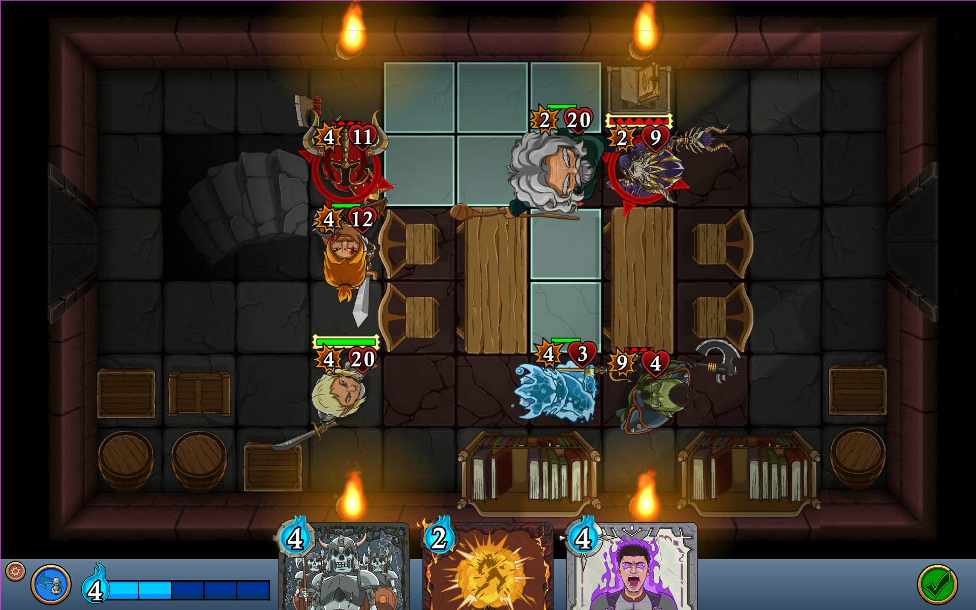
Hey everyone! While I haven't yet got the smaller PC buttons/layout implemented in the engine yet, I was able to implement your suggestion of larger size map. Here's a recording of me playing on the PC. Let me know what you think.


thesheeep

Arcane
Patron
Joined
Mar 16, 2007
Messages
10,119
Location
Tampere, Finland
Codex 2012 Strap Yourselves In Codex Year of the Donut Codex+ Now Streaming! Serpent in the Staglands Dead State Divinity: Original Sin Torment: Tides of Numenera Codex USB, 2014 Shadorwun: Hong Kong Divinity: Original Sin 2 BattleTech Bubbles In Memoria A Beautifully Desolate Campaign Pillars of Eternity 2: Deadfire Pathfinder: Kingmaker Steve gets a Kidney but I don't even get a tag. Pathfinder: Wrath I'm very into cock and ball torture I helped put crap in Monomyth
I would say it definitely looks better than before. No longer feels like one third of the screen is taken up by a single character ;)
Of course, still all those really large UI things.... but as you said, that is not yet changed.
 

RossD20Studios

Literate
Joined
Oct 29, 2017
Messages
20
Location
Salt Lake City, UT
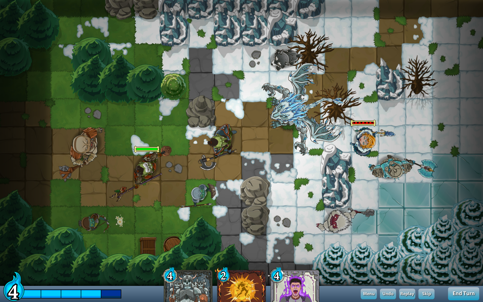
Here's my second UI mock-up attempt. I've increased the playable grid space to 9x14, further reduced the UI size, and balanced the left and right sides by unwrapping the multi function buttons to reveal their other states up front (ex: replay and skip). Circular style is replaced with rectangles to better fit the interface. The non-playable grid area is shadowed around the edges. This is just a layout mock to show scale and placement. Artistically, I'm thinking it might be cool to have the blue UI bar itself be made out of stone, perhaps vegetation wrapped or inset with gold trim. The mana bar would need the mana symbol itself incased in some sort of decorative texture (perhaps a circular extension of the stone/ruins itself) and something to make the bar look more like glass tube/alchemy. I still like the idea of symbolic buttons (vs. text) for the four secondary functions - better for localization and artistically more interesting. End turn button - up for debate - that could be text since it's the most important function. Behind the cards, it might be nice to have some kind of decorative radial arc extending above the bar. There's room to support more cards here as well (for abilities that allow you to draw beyond three) by arranging them in a fan. Thoughts?

PCUIMock2.png
 

*-*/\--/\~

Cipher
Joined
Jul 10, 2014
Messages
984
:greatjob:

Though I noticed the #skeleton #undead in the previous screenshot, which some players may regard as non-fantasy, immersion ruining description. Also, those blue flames on top of the cards seem to be trimmed a little in the last screenshot?
 

RossD20Studios

Literate
Joined
Oct 29, 2017
Messages
20
Location
Salt Lake City, UT
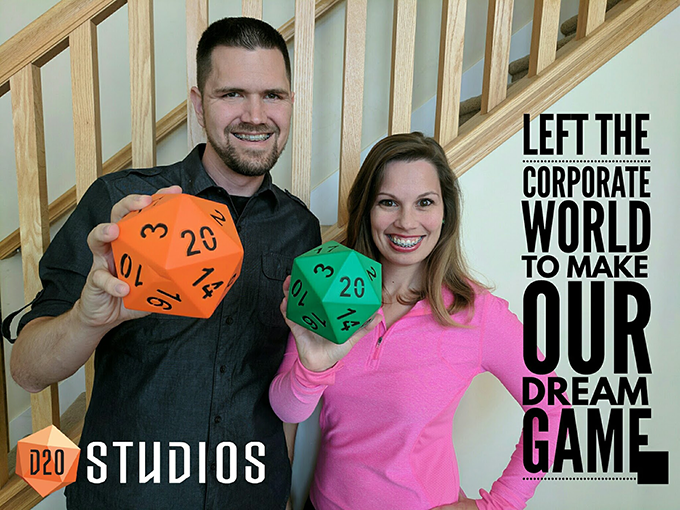
Thanks again for the continuing support and feedback, everyone! Duly noted. So today I'm sharing a photo of myself and my wife, Kelly, who also works everyday with me developing the game and communicating with our players.

rossAndKellyD20Studios_680.png

Kelly and I work both work 80+ hours a week developing Summoners Fate together

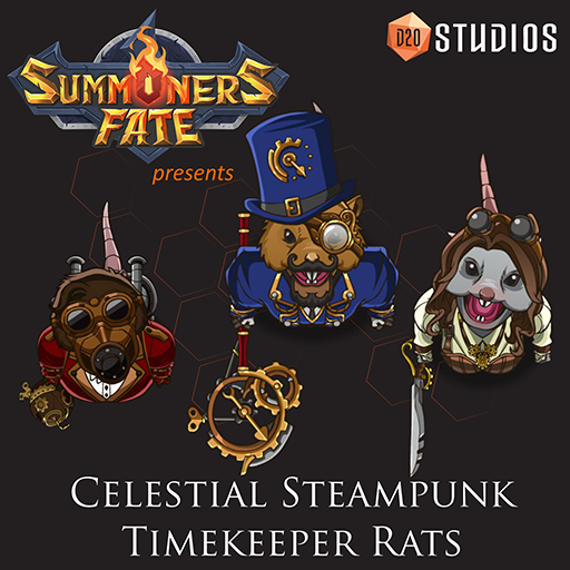
One of the great benefits of working together with Kelly is her unique perspective and creativity. When considering the possibilities for creatures to live within our fantasy world, humanoid rats naturally came to mind. When I shared my initial ideas for the typical "mutant sewer rat" with her, she responded "Boring! That's been done before and isn't very original or exiting. How about we turn it around like this..." And from that conversation, the Celestial Steampunk Timekeeper Rats were born.

Control Time with Steampunk Celestial Timekeeper Rats
Kelly turned the concept of ragged, filthy rats on its head with her idea of clean, sophisticated and intelligent rats garbed in Victorian-era style clothing and decked out with clockwork steampunk gadgety. These rats are aligned with the forces of good and the celestial order. And they have the power to control time.

celestialSteampunkTimekeeperRats_512x512.png

Above are the initial characters Kelly designed in the series. From left to right, we have the Time Bombardier, a ranged unit that can throw "time bombs" that damage and slow enemy movement, the Time Keeper, a powerful Summoner with the power to cast Celestial Time Spells, and the Time Warrior, a cunning melee fighter with hyper speed and lightning reflexes.

timeCards.png

Here is a selection of some of the Celestial Time spells we've created so far. Time manipulation mechanics such as these are one of many unique innovations we aim to bring to the tactics and CCG genres.

Let me know what you think ;)
 

RossD20Studios

Literate
Joined
Oct 29, 2017
Messages
20
Location
Salt Lake City, UT
Absinthe, I just wanted to clarify I've got no hard feelings toward you and sincerely appreciate the time and thought you put into your feedback. Sometimes it's hard to interpret the tone on the other end reading a post, and I want you to know that I very much respect what you have to say.
I wouldn't worry about that. This is the RPG Codex. The site pretty much thrives on people giving unvarnished, critical opinions and analysis. A lot of harsh opinions tend to be shared around here without people taking it personally. The only reason I wrote that stuff wasn't because I was worried about hard feelings, but because you seemed to be misinterpreting my post. Thanks for the compliment, though.

Hi again, Absinthe! I recently did an interview with Seth Burn for the Anime Herald. It's probably the most in depth interview I've ever done, and I wanted to call it to your attention because it answers many of the questions you raised about my motivations and thought process behind the game and business model. Please give it a look and let me know your honest feedback: https://www.animeherald.com/intervi...ners-fate-anime-herald-talks-ross-przybylski/
 

d1nolore

Savant
Joined
May 31, 2017
Messages
721
Here's my second UI mock-up attempt. I've increased the playable grid space to 9x14, further reduced the UI size, and balanced the left and right sides by unwrapping the multi function buttons to reveal their other states up front (ex: replay and skip). Circular style is replaced with rectangles to better fit the interface. The non-playable grid area is shadowed around the edges. This is just a layout mock to show scale and placement. Artistically, I'm thinking it might be cool to have the blue UI bar itself be made out of stone, perhaps vegetation wrapped or inset with gold trim. The mana bar would need the mana symbol itself incased in some sort of decorative texture (perhaps a circular extension of the stone/ruins itself) and something to make the bar look more like glass tube/alchemy. I still like the idea of symbolic buttons (vs. text) for the four secondary functions - better for localization and artistically more interesting. End turn button - up for debate - that could be text since it's the most important function. Behind the cards, it might be nice to have some kind of decorative radial arc extending above the bar. There's room to support more cards here as well (for abilities that allow you to draw beyond three) by arranging them in a fan. Thoughts?

PCUIMock2.png

Looking much better. The large map looks way more appealing to play, I'd use large map screenshots for your promotional shots.
 

pakoito

Arcane
Patron
Joined
Jun 7, 2012
Messages
3,174
Hey everyone! While I haven't yet got the smaller PC buttons/layout implemented in the engine yet, I was able to implement your suggestion of larger size map. Here's a recording of me playing on the PC. Let me know what you think.


If I had just one request, you need a better font for your alert dialogs and damage popups. The current one is as generic as it comes. I'm not asking to go fully fantasy font or anything, just finding something that stands out a bit better.
 

Acrux

Arcane
Joined
Jul 1, 2019
Messages
1,489
This is now in Steam early access.

Watching some gameplay videos, it looks like they've made some improvements. I'm on the fence about it, though.
 

As an Amazon Associate, rpgcodex.net earns from qualifying purchases.
Back
Top Bottom