PlayerEmers
Educated
I feel like there is something off about the looks of the game.
It reminds me of:

And this:
https://www.reddit.com/r/CompanyOfHeroes/comments/vxx28h/art_problem_of_coh_3/
And also this:
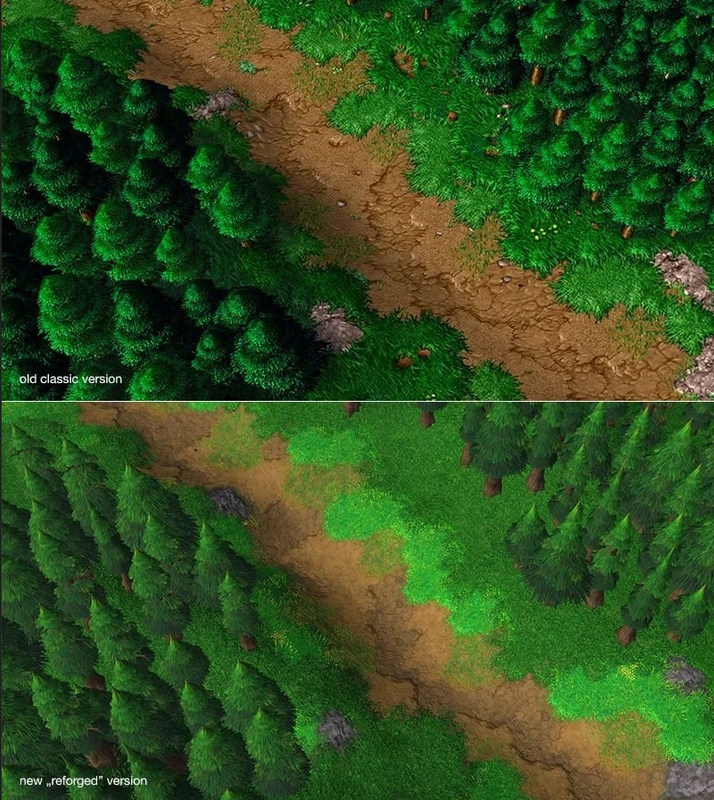
I'm no expert and I'm not even sure what feels off on the screenshots of Swordhaven, but I have the gut feeling that it was something to do with the balance of 4 axis: colors/contrast/saturation/brightness. Its something worth of discussion within the atom team and here on the codex.