Putting the 'role' back in role-playing games since 2002.
Donate to Codex
Good Old Games
  • Welcome to rpgcodex.net, a site dedicated to discussing computer based role-playing games in a free and open fashion. We're less strict than other forums, but please refer to the rules.

    "This message is awaiting moderator approval": All new users must pass through our moderation queue before they will be able to post normally. Until your account has "passed" your posts will only be visible to yourself (and moderators) until they are approved. Give us a week to get around to approving / deleting / ignoring your mundane opinion on crap before hassling us about it. Once you have passed the moderation period (think of it as a test), you will be able to post normally, just like all the other retards.

KickStarter System Shock 1 Remake by Nightdive Studios

Bad Sector

Arcane
Patron
Joined
Mar 25, 2012
Messages
2,334
Insert Title Here RPG Wokedex Codex Year of the Donut Codex+ Now Streaming! Steve gets a Kidney but I don't even get a tag.
It feels more like a maze than how you'd actually design a space station. Compare it to Talos I in Prey (acknowledging tech constraints of course).. even the Von Braun was far better.

I think System Shock 1's (and this remake's) space station is closer to how you'd actually design a space station, at least based on the actual space stations we have made so far. For example if you check International Space Station interior photos you'd notice that it is pretty much all rectangular-ish corridors with "walls" filled from top to bottom with "tech stuff". That looks much closer to SS1 than something like Prey's Talos I (which IMO looks closer to a high class hotel/resort at times :-P though of course the game has a touch of stylization on it that the System Shock games didn't have).
 

Venser

Magister
Joined
Aug 8, 2015
Messages
1,896
Location
dm6
Is it a time limit demo? Cause at one point every single enemy on the Citadel station was suddenly after me for no apparent reason and wherever I went the game was spawning more enemies. In the end they killed me while I was healing inside the pod.
Can anyone confirm it's timed?

Here are some things I noticed:
  • They added animations for waking up, healing and picking up Sparq. Despite some of the replies here, I like it. The only reason it's annoying is because at the start of the game you pick up 3 objects with the animation but that won't ever happen again throughout the game.
  • The levels are much brighter and the game is optimized better (duh). It still doesn't look half as good as the super old Unity demo IMO.
  • They added different looking mutants (naked, clothed, clothed with hair) for some variety.
  • You can now inflict damage on the corpses like in the Unity demo but you'll still hear the clunk noise as if you're hitting a metal. Same goes for hitting a glass or anything else. You still clip through destroyed robot unfortunately.
  • Pipe becomes bloody after you kill enemies
  • Climbing down the ladders is disorienting
  • You have stamina of a Covid patient so you can't run around for long
  • Melee combat is still terrible and animation for dying mutants is weird. They get launch sideways just before your last hit connects and it's not even the direction you were hitting them from.

Also what's up with the 451 disappearing from the wall as you get further away? I thought it's got something to do with texture loading but that's the only time in the game I've noticed it

 
Last edited:

Lemming42

Arcane
Joined
Nov 4, 2012
Messages
6,806
Location
The Satellite Of Love
Citadel feels like a real place to me. Every level has a logical purpose and a reasonably clear layout - the reactor is in the centre of the reactor level, for example, with many maintenance access doors leading to it. The groves are located at each end of level six, the maintenance deck acts as a connecting corridor to other parts of the station, the radio atennas on the engineering deck are reached through a central hub, the medical deck is divided into four quadrants, etc. Of course there's a few abstract parts (what the FUCK is that maze full of exploding robots for on the bridge???) but by and large it feels believable enough.

It's visually great too with the colour coded levels and things like lab equipment all over the research deck, vending machines and luxury carpets on the executive deck, giant Star Trek TNG style hangars on the flight deck...
 

Venser

Magister
Joined
Aug 8, 2015
Messages
1,896
Location
dm6
There's no denying the old Unity demo looked better and more atmospheric.

Unity:

HDRN6lg.jpg


Unreal Demo V2:

jp11A3V.png
 
Last edited:
Joined
Oct 10, 2014
Messages
917
Codex 2014 PC RPG Website of the Year, 2015 Codex 2016 - The Age of Grimoire Make the Codex Great Again! Grab the Codex by the pussy Insert Title Here RPG Wokedex Strap Yourselves In Codex USB, 2014 Shadorwun: Hong Kong Steve gets a Kidney but I don't even get a tag. I helped put crap in Monomyth
Yeah, we should never improve upon anything.
Cramming your game chock full of boring, shitty animations is not an improvment, you fucking dimwit.

When remaking SS2 we should carry over shittily implemented damage types and hard skill reqs for stuff like firing a pistol when typical toddler in thirdworldian shithole can fire assault rifle.
I said it before and I'll say it again: Only retards care about realism in video games, listening to them will be to the detriment of the game. Thanks for proving my point, I guess.

There is nothing stopping you from just firing up the original System Shock.
No shit, Sherlock! The real question is why I should fire up the remake instead (other than going "Oooohhh!" and "Aaaahhh!" at those super-immersive first person animations).
 
Last edited:

kangaxx

Arbiter
Joined
Jan 26, 2020
Messages
1,670
Location
atop a flaming horse
I think System Shock 1's (and this remake's) space station is closer to how you'd actually design a space station, at least based on the actual space stations we have made so far. For example if you check International Space Station interior photos you'd notice that it is pretty much all rectangular-ish corridors with "walls" filled from top to bottom with "tech stuff". That looks much closer to SS1 than something like Prey's Talos I (which IMO looks closer to a high class hotel/resort at times :-P though of course the game has a touch of stylization on it that the System Shock games didn't have).

You do have a point if we're talking about where things are at the moment. My thinking is that both of those two games are set in future worlds where people walk around huge, mass-inhabited space stations without space suits, with gravity, with shops/rec areas etc. In short, tech has advanced to the point where the designers can now afford to take human preference into account when designing the living space. In some ways they're meant to be like resorts (or maybe big offices in space)!
 

Curratum

Guest
From Discord they say hit reaction anims for enemies exist but not included in the current version, probably will be patched in soon. Similar for ladder anim I think. And iirc physics will be enabled to some objects later in development.

Like when? Summer of 2021?
 

Bad Sector

Arcane
Patron
Joined
Mar 25, 2012
Messages
2,334
Insert Title Here RPG Wokedex Codex Year of the Donut Codex+ Now Streaming! Steve gets a Kidney but I don't even get a tag.
The only reason it's annoying is because at the start of the game you pick up 3 objects with the animation but that won't ever happen again throughout the game.

FWIW you can pick up another item while the animation is playing and it switches to the other animation immediately. The animations slow down your movement a bit but they do not lock you in place and you can pick up all the items immediately without waiting for every single animation to finish.

You do have a point if we're talking about where things are at the moment. My thinking is that both of those two games are set in future worlds where people walk around huge, mass-inhabited space stations without space suits, with gravity, with shops/rec areas etc.

You are right that this could be a thing and SS2 does follow more that idea, however the more claustrophobic SS1-like approach is also something you can see in -e.g.- some sci-fi movies, so i think it is also a valid possibility for a futuristic space station. You can also see a similar approach in later games where they didn't have the technology limitations of SS1: the design of Ishimura in Dead Space is mainly tight corridors and while there are some open spaces (...and areas where you are in space :-P), i think overall it is closer to the SS1 style than the SS2 style (at least from what i remember - and confirmed with a quick Google image search - it has been a few years since i played DS1).
 

Zombra

An iron rock in the river of blood and evil
Patron
Joined
Jan 12, 2004
Messages
11,842
Location
Black Goat Woods !@#*%&^
Make the Codex Great Again! RPG Wokedex Strap Yourselves In Codex Year of the Donut Codex+ Now Streaming! Enjoy the Revolution! Another revolution around the sun that is. Serpent in the Staglands Shadorwun: Hong Kong Divinity: Original Sin 2 BattleTech Pillars of Eternity 2: Deadfire Pathfinder: Kingmaker Steve gets a Kidney but I don't even get a tag. I'm very into cock and ball torture I helped put crap in Monomyth
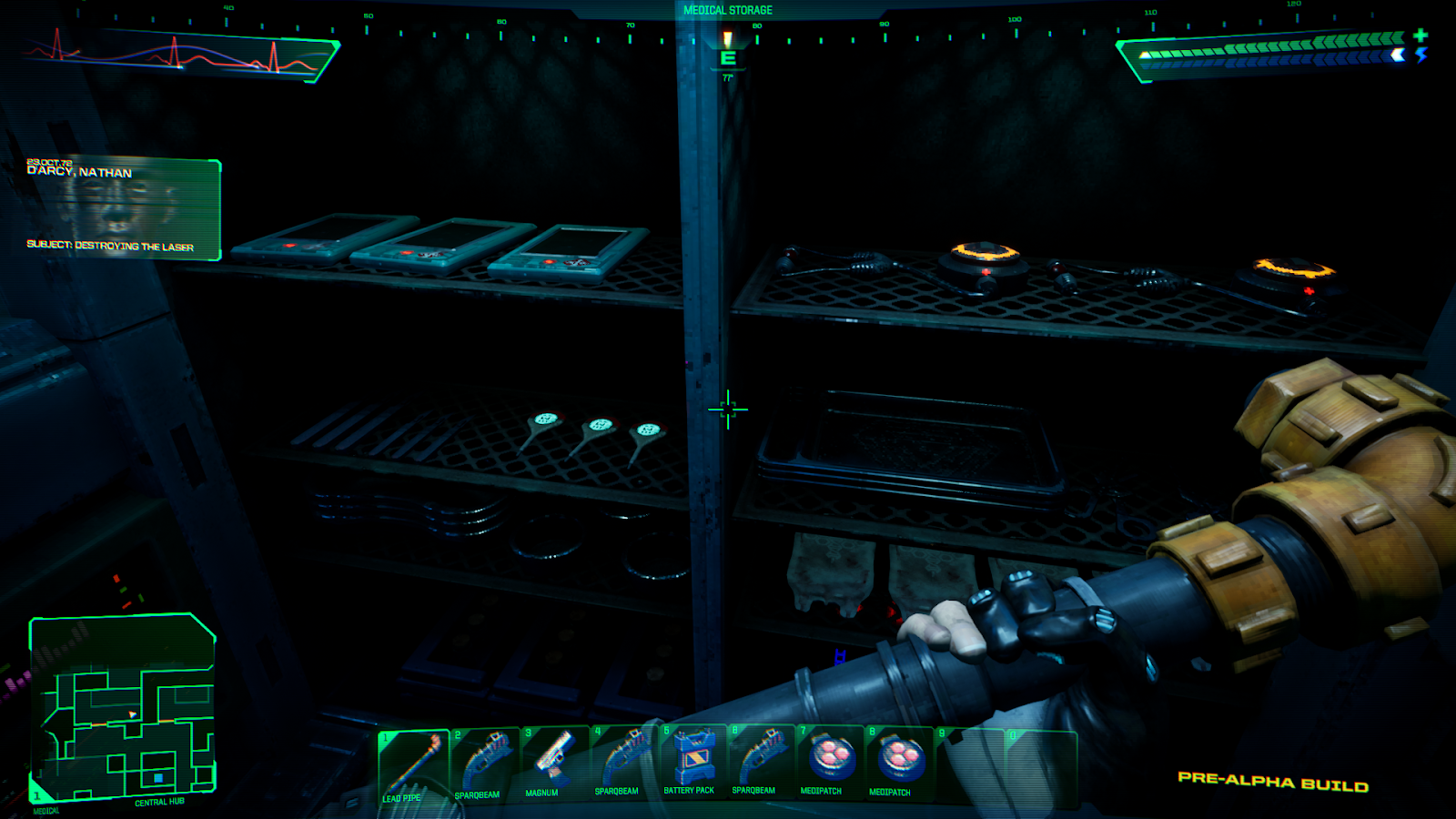
- It isn't always easy to tell the difference between environmental decoration and interactive objects. Especially bad for people who don't know the layout from the original... it will mean a lot of fruitless right clicking.
Ugh, this is bad to hear. I just had a huge fight about games with too much detail. Definitely not a fan of cluttered environments.
 

Venser

Magister
Joined
Aug 8, 2015
Messages
1,896
Location
dm6
Yeah I noticed that too. Most of these objects on shelf look like you should be able to pick them up but they're all decoration.

487390_20191213231425_1.png
 

randir14

Augur
Joined
Mar 15, 2012
Messages
760
I like it, most things are an improvement over the December demo. Performance is unacceptable but it's alpha so I assume they haven't done much optimization. One thing I don't like is the new enemy spawn system. For example I used a grenade to kill a group of zombies, and after I entered and exited a room they were all alive again. I guess it was an attempt to surprise the player but it felt very unnatural.
 

gurugeorge

Arcane
Patron
Joined
Aug 3, 2019
Messages
7,902
Location
London, UK
Strap Yourselves In
I'm not having any trouble distinguishing interactables from fairy lights and gewgaws. But mind you, I played the heck out of the game years ago and it's semi-burned into my brain, so it might be different for a new player. But I think they've done a decent job of showing "pointers" to useful things. And non-interactables that look like things on shelves but are just decorative are notably desaturated, so that's clear. It's just a case of refinement, I don't think there's anything terribly wrong with how they're doing it.
 

DraQ

Arcane
Joined
Oct 24, 2007
Messages
32,828
Location
Chrząszczyżewoszyce, powiat Łękołody
I dislike gun models. I applaud how for example the minipistol and sparq try to reflect original design, but they need work. Minipistol looks bleh, and sparq has worse effects and look than in old demo.
I also think effects in general and some parts of use of lighting are worse than in the Unity demo.
Finally, grenade throwing sucks.

Other than that it's definitely promising and seems very faithful.

BTW, can someone explain to me how would one is supposed to physically interface with cyberspace link? It bugged me in the original and it bugs me now.
 

Bad Sector

Arcane
Patron
Joined
Mar 25, 2012
Messages
2,334
Insert Title Here RPG Wokedex Codex Year of the Donut Codex+ Now Streaming! Steve gets a Kidney but I don't even get a tag.
Yeah I noticed that too. Most of these objects on shelf look like you should be able to pick them up but they're all decoration.

I'm more annoyed that they are glued in place, this is what prompted me to suggest that more objects should be physics enabled.

As for identifying objects you can interact with, perhaps Deus Ex HR/MD's approach of outlining such objects could work (though i'd leave out the objects that only exist to be thrown around). Even better instead of having the outlines visible all the time, they could use a key to show them like done in, e.g. (IIRC) NWN1 where you can have a key to highlight all the objects you can interact with only when you find some particular place hard to read.

BTW, can someone explain to me how would one is supposed to physically interface with cyberspace link? It bugged me in the original and it bugs me now.

Perhaps they'll show us with an animation :-P

(i guess you are meant to put your head between those "prongs")
 

Semiurge

Cipher
Joined
Apr 11, 2020
Messages
7,674
Location
Asp Hole
Yeah I noticed that too. Most of these objects on shelf look like you should be able to pick them up but they're all decoration.

487390_20191213231425_1.png

The cards that you need here look just like the rest of the crap. Interactive objects had a rectangle around them though when looked at, the remake of 1 has no such indicators then?

System-Shock-2-small-197.jpg
 
Last edited:

DemonKing

Arcane
Joined
Dec 5, 2003
Messages
6,574
The level design is pretty poor - assets are reused so often that it's easy to get completely lost because one corridor looks just like another and they wind and twist around in a way that makes no sense for a space station. Not sure if this is due to a slavish recreation of the original design or just amateur hour.
 

Venser

Magister
Joined
Aug 8, 2015
Messages
1,896
Location
dm6
BTW has anyone yet received their physical copy of System Shock Enhanced Edition from Limited Run games? Cause I still haven't gotten mine.
 

kangaxx

Arbiter
Joined
Jan 26, 2020
Messages
1,670
Location
atop a flaming horse
The level design is pretty poor - assets are reused so often that it's easy to get completely lost because one corridor looks just like another and they wind and twist around in a way that makes no sense for a space station. Not sure if this is due to a slavish recreation of the original design or just amateur hour.

I haven't played Shock 1 in a long time, but from memory it's pretty much the same as the original.
 

Venser

Magister
Joined
Aug 8, 2015
Messages
1,896
Location
dm6
This is what happens if you press M1 in a healing pod. At first I thought it's a punching animation but then I realized the hand movement is the same as if he's attacking with a (missing) pipe.


Venser

Magister
Joined
Aug 8, 2015
Messages
1,896
Location
dm6
Is it a time limit demo? Cause at one point every single enemy on the Citadel station was suddenly after me for no apparent reason and wherever I went the game was spawning more enemies. In the end they killed me while I was healing inside the pod.
Can anyone confirm it's timed?

Just beat the demo and nothing weird happened this time. Not that much was improved compared to the older demo. It's still horribly optimized. I started my run at 70FPS and I was at average 20FPS by the end of the playthrough. The gunplay feels terrible. All of the weapons lack any feedback and half of the time I'm not sure if I hit something or not. Mini pistol is the only gun that doesn't feel completely useless.
 
Last edited:

Nyast

Cipher
Joined
Jan 12, 2014
Messages
609
- I haven't played Shock 1 for ages and the level design hasn't stood the test of time very well IMO. It feels more like a maze than how you'd actually design a space station.

The level design is indeed very old school. Personally I treat this game as a dungeon crawler. Do that and suddenly everything clicks together.
 

As an Amazon Associate, rpgcodex.net earns from qualifying purchases.
Back
Top Bottom