Putting the 'role' back in role-playing games since 2002.
Donate to Codex
Good Old Games
  • Welcome to rpgcodex.net, a site dedicated to discussing computer based role-playing games in a free and open fashion. We're less strict than other forums, but please refer to the rules.

    "This message is awaiting moderator approval": All new users must pass through our moderation queue before they will be able to post normally. Until your account has "passed" your posts will only be visible to yourself (and moderators) until they are approved. Give us a week to get around to approving / deleting / ignoring your mundane opinion on crap before hassling us about it. Once you have passed the moderation period (think of it as a test), you will be able to post normally, just like all the other retards.

Vapourware That Which Sleeps - Vaporware Strategy RP

KingDinosaurGames

King Dinosaur Games
Patron
Developer
Joined
Aug 6, 2014
Messages
143
Location
Austin
Shadorwun: Hong Kong
Ho... lee....... shit...............
I may never program again.

qkbe4EA.png
 

Destroid

Arcane
Joined
May 9, 2007
Messages
16,628
Location
Australia
Prosper for official TWS artist!

EDIT: Off to a great start, looks like you will make your goal with plenty to spare.
 

agris

Arcane
Patron
Joined
Apr 16, 2004
Messages
6,924
Just backed for beta access. I have to echo some others' thoughts regarding the anime-style art seeming really out of place- it was jarring in an otherwise good kickstarter video (I liked the cough during "PLAGUE", heh). Also, the JRPG hearts for health don't fit with the game's style.
TmOhEv7.jpg
Anyway, good luck! I'll be tempted to raise it depending on how close we get to procedurally generated maps.

One question though- of all the art assets you're considering upgrading (and some definitely need improvement over others), are you considering the map? I think an 'illuminated' map (or just a darker color palette, it's so light), even if not in the most Gaudy of style, would better fit the mythos you're working with. Just a thought.

Double edit: I think you should make some of the text on your KS page less technical. I like it, but others might have a hard time grasping your meaning (and you'll need them to hit that 53K :P). These items in particular stood out as needing a re-write:

Endless Simulation - A plethora of engine changes to enhance the simulation aspect of That Which Sleeps. By reducing dependencies on fundamental assumptions of the engine we can make the world and AI more independent, and the benefits of these changes flow down into the modding world.

Procedural Generation - Genealogical generation of a sprite based map that will itself be used as a basis for a dynamically created scenario. Instead of making decisions "after the fact" with our current Scenario Generation, you will observe a world as the cultures start as tribes and push forward into a civilized state. Use your limited power to interfere at key moments and alter the shape of the world and its peoples. Choose to begin your game at any moment in the world's development, and do what you do best.
TBH, all the stretch goals could use a readability pass. It's totally accurate and understandable (to a certain crowd), but I'm worried that not all grand strategy gamers will get your points.
 
Last edited:

Galdred

Studio Draconis
Patron
Developer
Joined
May 6, 2011
Messages
4,489
Location
Middle Empire
Steve gets a Kidney but I don't even get a tag.
Pledged!
Concerning the map, are you using a drawn map(with a map building software?), or a tileset with an editor?
 
Self-Ejected

Ulminati

Kamelåså!
Patron
Joined
Jun 18, 2010
Messages
20,317
Location
DiNMRK
AFAIK the current map is a static asset made with campaign cartographer. Procedurally generated tileset maps are at the 53k stretch goal. According to kicktraq they're trending towards 82k. So here's hopwing
 

KingDinosaurGames

King Dinosaur Games
Patron
Developer
Joined
Aug 6, 2014
Messages
143
Location
Austin
Shadorwun: Hong Kong
Just backed for beta access. I have to echo some others' thoughts regarding the anime-style art seeming really out of place- it was jarring in an otherwise good kickstarter video (I liked the cough during "PLAGUE", heh). Also, the JRPG hearts for health don't fit with the game's style.Anyway, good luck! I'll be tempted to raise it depending on how close we get to procedurally generated maps.

One question though- of all the art assets you're considering upgrading (and some definitely need improvement over others), are you considering the map? I think an 'illuminated' map (or just a darker color palette, it's so light), even if not in the most Gaudy of style, would better fit the mythos you're working with. Just a thought.

Double edit: I think you should make some of the text on your KS page less technical. I like it, but others might have a hard time grasping your meaning (and you'll need them to hit that 53K :P). These items in particular stood out as needing a re-write:

Endless Simulation - A plethora of engine changes to enhance the simulation aspect of That Which Sleeps. By reducing dependencies on fundamental assumptions of the engine we can make the world and AI more independent, and the benefits of these changes flow down into the modding world.

Procedural Generation - Genealogical generation of a sprite based map that will itself be used as a basis for a dynamically created scenario. Instead of making decisions "after the fact" with our current Scenario Generation, you will observe a world as the cultures start as tribes and push forward into a civilized state. Use your limited power to interfere at key moments and alter the shape of the world and its peoples. Choose to begin your game at any moment in the world's development, and do what you do best.
TBH, all the stretch goals could use a readability pass. It's totally accurate and understandable (to a certain crowd), but I'm worried that not all grand strategy gamers will get your points.

Yep, the Anime art is meant to go - it was an affordable placeholder that also would have sufficed if we were forced to go live with a failed kickstarter ( we would have used just the headshot and darkened/blurred it to try for a more fitting aesthetic). The benefit of the anime art was that it was so absurdly cheap, as in the price of a large pizza, we had enough to for every single possible hero that ever could spawn to have a unique image. Our intention is to get portraits like you see for agents, but obviously not one for each - we'll be targeting class based portraits so you can easily identify at a glance what your opposition is on the map or on the battlefield.

You don't like the hearts? Interesting, I actually thought they fit in well - does anyone else dislike them?

Upgrading the map is unfortunately expensive - I get what you're saying about maybe just changing the tone of the map itself and we may be able to do something "fiddly" there but anything that involves actual modification is out of the question without significant stretch goals. If we reach Procedural Generation the budget would then allow us to get an authentic painter style map, with a fantastic dark aesthetic.... I really would love to have that happen especially considering all of the backers could be involved in selecting from concept art and approach.

On that note though I am pretty happy with how Campaign Cartographer has worked out - we can spit out new campaign maps that look decent very quickly. If you followed our logs earlier we talked about how we spent 6 months on trying to create different styles, we had this interesting abstract style that was creating by replicating GIMP features inside the engine to reflect changing weather patterns and climates, the problem was it was simply too high level and no 2D drawing looked natural on it, though the effects we could create showing "Corruption" and "Darkness" were incredible.

I'll do a second pass on the stretch goals, I could probably write paragraphs about them because they're all pretty exciting. We ALSO are thinking about posting some of our POCs for those as an update considering how fast we're racing towards our regular goal. That might be helpful, though as a POC they're pretty technical.

KingDinosaurGames said:
We will be offering a DRM-Free version through the Humblestore, though you lose access to our Steamworks support for modding (this will not impact using scenarios as they load from the folder structure) but we have some great features planned. I thought we put it out there explicitly but looks like we forgot - I'll add it to the FAQ we're compiling. Thanks for the heads up!

I am hoping for a little clarification on this statement. How necessary is steamworks support for modding? Will it be possible to distribute mods without using steamworks? Do any of the mod tools require steamworks in order to function? Will mods that are available through steamworks have a non-steam method of being distributed or will they only be accessible via steam?

I am more than a little wary due to the quoted kickstarter comment as more than a few game development kickstarters have stated that they are DRM-free in order to gain additional pledges from people who do not want a steam version of the game but steam was the only distribution channel the game developers cared about and any non steam distribution was not fully supported by the developer and was basically a gimped version of the game(either lacking modding support, multiplayer functionality, and/or reduced technical support and support for game updates/patches) but they were still sold at the same price.

If you are treating steam as your primary distribution channel and not fully supporting the game via DRM free distribution channels then please be up-front about it and/or make sure the prices of different versions reflect the amount of support that version of the game can expect from the developers. My preference would be that you would fully support the non-steam version but from your comment it seems that you have already decided not to do this.

The game is built from the bottom up to be fully mod-friendly and configurable, meaning it is entirely data driven, supports override folders, checks on start for new additions, scans for manifest.xml files on hitting certain points of the game to get real-time data. This is all a part of the engine, steam or not - for instance when you click on start game the engine checks the Scenarios folder, finds all sub folders, checks for manifest files, reads off the manifest data, then produces your possible results in game. This is the paradigm that the game, outside of steam or anything else, that is, as far as I am concerned, the selling point re: modding.

All you need to do is put that folder in that spot, and you have your scenario running - easy as that. We would never handicap the game's functionality for a particular distribution source.

So what's the next level after that? Curation - curation is always a question when you have user created content. How do people get access to mods, scenarios, and game modes? Generally that answer, if the game is successful, is handled by the community itself - rarely do you see game sites hosting their own mods (especially with all the copyright information you guys are going to shove in there). So that's the general solution, but there is also another solution inside of Steam, Steamworks. Steamworks let's people post up their mods and rate them, it's actually worse than fan created sites and forums at curation but it certainly is more convenient for a lot of people since it's right there in the browser.

So in that case it's a direct replacement. What additional functionality are we adding that you will lose if you don't have Steam? Steamworks will keep that mod up to date for you, without having to redownload from a site, and we are also going to let you auto-upload from the editor. Two nice functions, but not really game breaking.

Honestly, if a game was released on one platform without multiplayer or mod support.... that has to be grounds for legal action right? Have any examples of that kind of huge bait and switch, I'm actually interested to know who would do something like that.
 

Galdred

Studio Draconis
Patron
Developer
Joined
May 6, 2011
Messages
4,489
Location
Middle Empire
Steve gets a Kidney but I don't even get a tag.
On that note though I am pretty happy with how Campaign Cartographer has worked out - we can spit out new campaign maps that look decent very quickly. If you followed our logs earlier we talked about how we spent 6 months on trying to create different styles, we had this interesting abstract style that was creating by replicating GIMP features inside the engine to reflect changing weather patterns and climates, the problem was it was simply too high level and no 2D drawing looked natural on it, though the effects we could create showing "Corruption" and "Darkness" were incredible.
I was wondering exactly that indeed, as I am using Campaign cartographer for the overland map in my game at the moment, and the style seemed familiar. Did you build your own tilesheet for it?
 

KingDinosaurGames

King Dinosaur Games
Patron
Developer
Joined
Aug 6, 2014
Messages
143
Location
Austin
Shadorwun: Hong Kong
On that note though I am pretty happy with how Campaign Cartographer has worked out - we can spit out new campaign maps that look decent very quickly. If you followed our logs earlier we talked about how we spent 6 months on trying to create different styles, we had this interesting abstract style that was creating by replicating GIMP features inside the engine to reflect changing weather patterns and climates, the problem was it was simply too high level and no 2D drawing looked natural on it, though the effects we could create showing "Corruption" and "Darkness" were incredible.
I was wondering exactly that indeed, as I am using Campaign cartographer for the overland map in my game at the moment, and the style seemed familiar. Did you build your own tilesheet for it?

We bought one of the Annuals, the Jon Robert's Overland style, to use - it fit the theme the best in our opinion.

As for those cases, wow I had no idea - pretty absurd that a company would do that. I guess it's understandable if it comes from a licensing perspective, because who knows when they even got those random rules - but no excuse for the rest. We certainly would never stop supporting a version of the game while still supporting another.
 

Shannow

Waster of Time
Joined
Sep 15, 2006
Messages
6,386
Location
Finnegan's Wake
Yep, the Anime art is meant to go - it was an affordable placeholder that also would have sufficed if we were forced to go live with a failed kickstarter ( we would have used just the headshot and darkened/blurred it to try for a more fitting aesthetic). The benefit of the anime art was that it was so absurdly cheap, as in the price of a large pizza, we had enough to for every single possible hero that ever could spawn to have a unique image. Our intention is to get portraits like you see for agents, but obviously not one for each - we'll be targeting class based portraits so you can easily identify at a glance what your opposition is on the map or on the battlefield.

You don't like the hearts? Interesting, I actually thought they fit in well - does anyone else dislike them?
It's probably not viable/ artistically wanted: But heroes being faggy anime-style and minions/monsters/etc being more westernly gothic styled (eg. Disciples) sound kinda cool. Would make me want to corrupt and destroy them even more...
I don't mind the hearts. But my last game with hearts was probably Zelda. Perhaps a simple bar with gothic embellishments? (Diablo-style?)

Honestly, if a game was released on one platform without multiplayer or mod support.... that has to be grounds for legal action right? Have any examples of that kind of huge bait and switch, I'm actually interested to know who would do something like that.
You just want to know how it's done. Admit it!
While I rarely take the corporate side, the majority of darkpatriot's examples were badly communicated, revoked after protest or really forced by the IP owner/publisher. The devs didn't really set out to scam us tinfoil nuts. And my butt hurts neither in the case of SRR nor in the case of Div:OS.
Just make sure that any disadvantage from not using STEAM is clearly stated beforehand. (And try to get onto GoG. I'm sure That Which Sleeps would fit right in with their portfolio and I don't want to set up a new account at another site /lazy bastard./
I also believe that GoG has a significant following in the tinfoil-community so it also might be a solid business decision.
 

KingDinosaurGames

King Dinosaur Games
Patron
Developer
Joined
Aug 6, 2014
Messages
143
Location
Austin
Shadorwun: Hong Kong
It's probably not viable/ artistically wanted: But heroes being faggy anime-style and minions/monsters/etc being more westernly gothic styled (eg. Disciples) sound kinda cool. Would make me want to corrupt and destroy them even more...
I don't mind the hearts. But my last game with hearts was probably Zelda. Perhaps a simple bar with gothic embellishments? (Diablo-style?)

I really did enjoy smiting those anime looking heroes, all chipper and excited about doing good. Our original, original, original intention was to fully recreate a FFVI style - with your characters being fully rendered bosses and then the heroes being their classic tiny pixel versions. A great spin on the old interpretation, but when we moved to having the characters also appear on the map the transition was too unnatural. Also, it was a novelty that wore thin.

I don't like bars because the math is so critical at such low numbers, we're talking about a situation where every attack can equal or exceed your life total and battles often come down to one life. Though bars do look better, maybe a bar with number overlay might work.

I also believe that GoG has a significant following in the tinfoil-community so it also might be a solid business decision.

Thanks for this info, we are authorized with Humble Store right now but I'll drop a line over to GoG and see if we can get up there as well.
 

agris

Arcane
Patron
Joined
Apr 16, 2004
Messages
6,924
KingDinosaurGames Thanks for the reply. I probably came off as overly negative, but that's the nature of criticism. I like the game a lot, these are just the aspects I would change.

Someone else mentioned the hearts reminded them of Zelda and that's the same vibe I got. You've got a dilemma in how to quickly and concisely show health, in a small amount of screen-space such as right-side of that image I spoiler'd. My thought would be an illustrated anatomical heart, and if the blue is mind/mental (is it?) an illustrated anatomical brain. The red/blue scheme can still be applied to those.

A bar is harder to convey the info as concisely in, because you have to compare heights, the discrete icons are nice because it's just a matter of 4 > 3, etc. If you're thinking about a bar, let me point you to what Vampire: Bloodlines used

PdmC86e.jpg


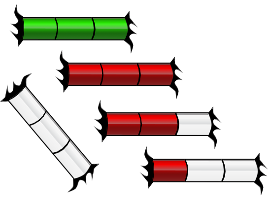
The bit of animation that the blood had was really nice, it fills from the bottom up, and you could add clearer gradations to it so we can see at a glance how many 'units' of health we have. Each unit could be marked by an embellishment that pinches in. Like these, but vertical:

e0af5518.png


enemy_health_bar_preview.png


6229555_orig.png
 

KingDinosaurGames

King Dinosaur Games
Patron
Developer
Joined
Aug 6, 2014
Messages
143
Location
Austin
Shadorwun: Hong Kong
KingDinosaurGames Thanks for the reply. I probably came off as overly negative, but that's the nature of criticism. I like the game a lot, these are just the aspects I would change.

Someone else mentioned the hearts reminded them of Zelda and that's the same vibe I got. You've got a dilemma in how to quickly and concisely show health, in a small amount of screen-space such as right-side of that image I spoiler'd. My thought would be an illustrated anatomical heart, and if the blue is mind/mental (is it?) an illustrated anatomical brain. The red/blue scheme can still be applied to those.

A bar is harder to convey the info as concisely in, because you have to compare heights, the discrete icons are nice because it's just a matter of 4 > 3, etc. If you're thinking about a bar, let me point you to what Vampire: Bloodlines used

PdmC86e.jpg


The bit of animation that the blood had was really nice, it fills from the bottom up, and you could add clearer gradations to it so we can see at a glance how many 'units' of health we have. Each unit could be marked by an embellishment that pinches in. Like these, but vertical:
e0af5518.png


enemy_health_bar_preview.png


6229555_orig.png

You have my attention,

I think the lines indicating actual numbers would work, and then altering the height of the bar is actually a better transition because I can adjust the color at the same time to indicate status change, I'm always looking for more ways to express conditions outside of icons.

We're in a "feature lock" right now as we move towards the demo but I am going to run this by the testers and see what the consensus is, I think it's worth trying at the very least - fairly straightforward to do.

Also you mentioned Bloodlines, bonus credibility points to your idea. Pretty much if someone says "Vampire: Bloodlines, Space Station 13, King of Dragon Pass" I would make any changes they recommend.
 

agris

Arcane
Patron
Joined
Apr 16, 2004
Messages
6,924
Cool, glad it helped. Yea, Vampire is great. I need to replay it, it's been almost five years now. I'm still waiting for Wesp to stick a fork in his unofficial patches so that I can experience the definitive version.
 

agris

Arcane
Patron
Joined
Apr 16, 2004
Messages
6,924
That certainly could be true, but if the bar were just a continuous representation of what icons show, i.e. segmented into definitive units, then the point is moot. Except for the UI consistency point, which I could concede. It sounds like the health bar could also encompass other info though, like status effects.
 

Galdred

Studio Draconis
Patron
Developer
Joined
May 6, 2011
Messages
4,489
Location
Middle Empire
Steve gets a Kidney but I don't even get a tag.
Age-of-Wonders-2-Review-7.jpg
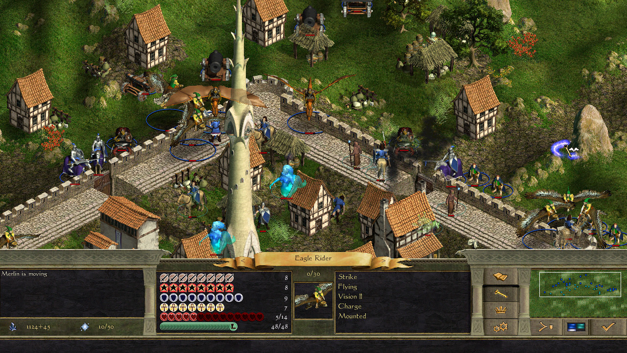
Age of Wonders use hearts for life too. I don't remember anyone having an issue with that.you could go with a blood drop, though, if the heart bothers you. But I think it would be a very bad idea to replace the hearts with a bar, if the usual numbers are pretty small : that would only make the whole UI more confusing (the idea is to give accurate feedback, not to make things harder to understand). The main reason why Western RPG use bar is hit point inflation : displaying 214 heart icons would be somewhat confusing.
A number display can work too (5/8), but you can use both at the same time, as the icons make the health level immediately visible.
 

KingDinosaurGames

King Dinosaur Games
Patron
Developer
Joined
Aug 6, 2014
Messages
143
Location
Austin
Shadorwun: Hong Kong
I am very interested to see what kind of consensus you guys come to - anything that saves testing time is great by me.

However, let me tell you what interested me with the idea of health bars:

1) I can have the bar a consistent height at all times next to the icon, but simply mark it by increments to indicate how many "points" of health they have. Simplifies the GUI

2) I can increase width to give a general impression of toughness

3) I can alter the color of the blood to show physical condition (I love anything that simply tweens a value to indicate things, easy to code, easy to alter, and easy to make data-driven)

4) I can "shatter" the glass to show someone in a wounded state (not actually animate a shatter just have it look slightly cracked)

What are the major downsides?

1) Lack of consistency in other areas of the game where health, loss/gain life, and even deaths rely on an icon

2) May not be intuitive to someone looking over the battle screen

3) Possibly requires an art asset we don't currently have

That being said, I do like the hearts and think they work (we tried a lot of alternatives before settling on this system) - and who knows how any of these ideas would actually play out once implemented. A consistent height may be difficult for the player to discern toughness "at a glance" but making it dynamic based on max health introduces its own set of concerns with max values - as usual any change presents itself with a lot of implications for the system. The good thing is this wouldn't take more than an hour to code into place and run through some tests so it generally makes it on the "to test" list.
 

Luka-boy

Arcane
Joined
Sep 24, 2014
Messages
1,684
Location
Asspain
How about keeping the heart icons for the sake of simplicity, just making them creepier-looking? Simply making them look like human hearts instead of cartoony ones would fit the theme much better (It could evoke imagery of human sacrifices) while keeping it simple.
 
Self-Ejected

Ulminati

Kamelåså!
Patron
Joined
Jun 18, 2010
Messages
20,317
Location
DiNMRK
Values as bars are only a good thing when we're talking hundreds of points. For relatively small pools like health, icons are better. You could still color-code them (green for poisoned?) if you really wanted to. But I'd prefer status effects to be conveyed with a bar of icons or the like for readability.

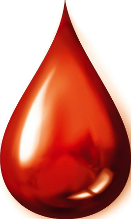
In lieu of hearts, drops of blood could look slightly more evil. A smaller version of something like this:

Blood-drop.jpg


For additional feedback, you could have an application effect whenever a resource/status is gained/lost. For a loss, the icon representing the status scales up to become an application effect. For gain, the application effect plays on the portrait, then scales down and moves to the applicable status bar or resource tracker.

In the case of health, you could have an appropriate number of blood drops move to the portrait and scale up a bit, then turn into a blood splatter like this while an appropriate sound plays:

blut_tropfend.jpg


Then have the application effect fade. It would only take a second or two, but it would telegraph to the player what resource was lost and how much of it.


For a status like poison, you could have a green skull flash over the portrait of whoever was poisoned (that seems to be the classic poison effect), then have the poison skull icon scale down and move into a status effect tray next to the icon.
 
Last edited:

Galdred

Studio Draconis
Patron
Developer
Joined
May 6, 2011
Messages
4,489
Location
Middle Empire
Steve gets a Kidney but I don't even get a tag.
I pretty much agree with everything Ulminati have said : blood drops are a bit more readable than biological hearts (especially if you want them in 16*16), and the status infos are better conveyed by icons.
 

Malakal

Arcane
Glory to Ukraine
Joined
Nov 14, 2009
Messages
10,651
Location
Poland
Blood drops would be fine but really, if you want hearts just make them less pony pink and more gruesome dark red and they would be fine too. Seems like a nitpick to me.
 

agris

Arcane
Patron
Joined
Apr 16, 2004
Messages
6,924
It definitely is a nitpick on my part, but a consistent visual theme is important to set the mood of the game. The blood drops, anatomical hearts or just the less-anime looking hearts in age of wonders 3 are all a better alternative to Zelda hearts.
 
Last edited:

As an Amazon Associate, rpgcodex.net earns from qualifying purchases.
Back
Top Bottom