Putting the 'role' back in role-playing games since 2002.
Donate to Codex
Good Old Games
  • Welcome to rpgcodex.net, a site dedicated to discussing computer based role-playing games in a free and open fashion. We're less strict than other forums, but please refer to the rules.

    "This message is awaiting moderator approval": All new users must pass through our moderation queue before they will be able to post normally. Until your account has "passed" your posts will only be visible to yourself (and moderators) until they are approved. Give us a week to get around to approving / deleting / ignoring your mundane opinion on crap before hassling us about it. Once you have passed the moderation period (think of it as a test), you will be able to post normally, just like all the other retards.

The cRPG UI thread (Wiz-clones agenda thread)

Dorateen

Arcane
Joined
Aug 30, 2012
Messages
4,435
Location
The Crystal Mist Mountains
ss_8022ecc86a11e950b8567423730553704e709859.jpg
ss_1224dc18b9aa61d9ab0df7382ca4966d76b87589.jpg
ss_cec97e5181b99204b15ee80bbfb235c8a211553d.jpg

Thanks. Now I want an update on Sovereign.
 

Sigourn

uooh afficionado
Joined
Feb 6, 2016
Messages
5,767
Imagine my surprise when I found out

- I thought this thread was about pretty UIs, and it wasn't.
- I have actually posted in this thread before, and didn't remember.
- I've been here for two years already.

Anyhow, it would be nice if people contributed good looking and unique UIs. Anything about them, really, be it inventory, character, even notes you find, etc.
 

deama

Prophet
Joined
May 13, 2013
Messages
5,144
Location
UK
You fucks, this is what a real UI looks like!
ingame_16x9.png
Simple, unintrusive, makes sense where it's placed; fucking nice.
 
Last edited:

Zed Duke of Banville

Dungeon Master
Patron
Joined
Oct 3, 2015
Messages
13,347
Anyhow, it would be nice if people contributed good looking and unique UIs. Anything about them, really, be it inventory, character, even notes you find, etc.
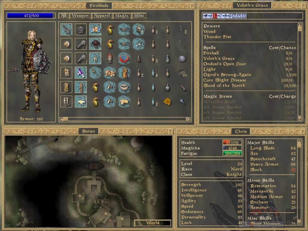
Aside from Dungeon Master, which I have already mentioned in this thread, I think the only real stand-out for CRPG UI design is Morrowind, which used four simple but elegant windowed screens to convey almost all necessary information. The game is paused when right-clicking the mouse and the screens appear, allowing the player to interact with them and even move and resize each of them separately. By default, in the bottom-left corner is an inventory screen showing your character and a list of inventory items. Hovering the cursor over an item results in information about the item appearing, and you can easily grab armor/weapons/clothing and drop it on your character to have it equipped, consume a potion by dropping it on your character, etc. In the bottom-right corner is the magic screen, listing all spells known to your character, and allowing you to select a spell to cast, power to trigger, or magic item to use. The upper-right corner is the map, and can be switched from a local map to a world map by clicking on it. In the upper-left corner is the statistics screen, showing your character's attribute scores, skill scores, and other critical information.

The screenshot below is from Mobygames and doesn't quite do the UI justice (note also that the windows have been moved around from their default positions):

26818-the-elder-scrolls-iii-morrowind-windows-screenshot-inventory.jpg
 
Last edited:

Sigourn

uooh afficionado
Joined
Feb 6, 2016
Messages
5,767
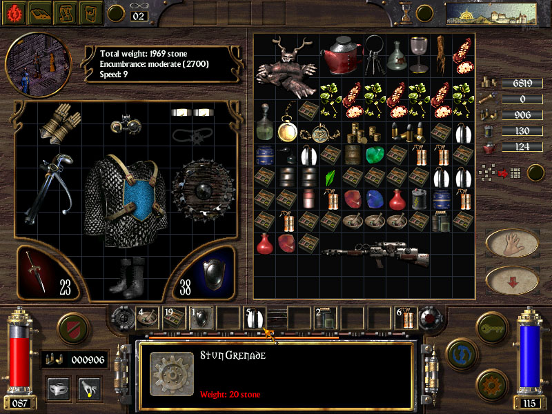
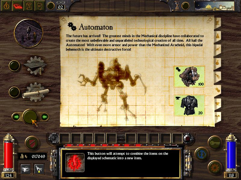
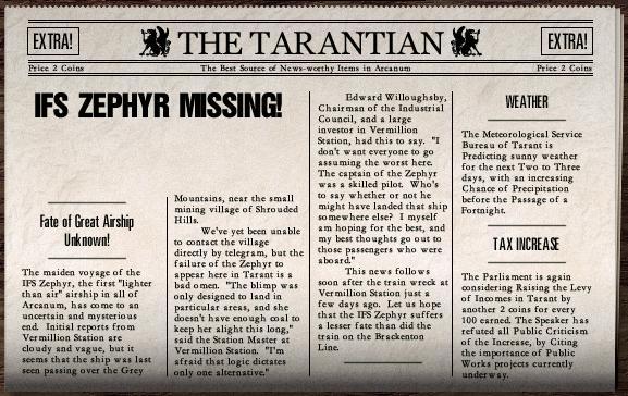
Zed Duke of Banville That's not really what I meant, so let me post some examples.

arcanum-16.png

p1_2029195_36a1091d.jpg

arcanum-10.png

latest

latest


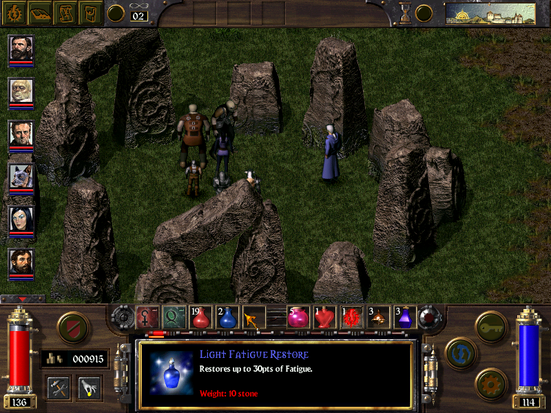
It's a game that really managed to nail its aesthetic on almost every aspect of the game. Both the main interface, the item icons, the crafting schematics, the world map (much more "map" like as opposed to the "Google Maps" representation of Fallout). Even the newspaper. Many RPGs have books (and Arcanum is no different), but just how many have newspapers with a newspaper screen to boot?

Even back when I disliked Arcanum I still thought it had brilliant art direction. It's unsurprising that Boyarsky worked on Fallout before (my other pick for best interface aesthetic in an RPG, ever).
 

JarlFrank

I like Thief THIS much
Patron
Joined
Jan 4, 2007
Messages
34,677
Location
KA.DINGIR.RA.KI
Steve gets a Kidney but I don't even get a tag.
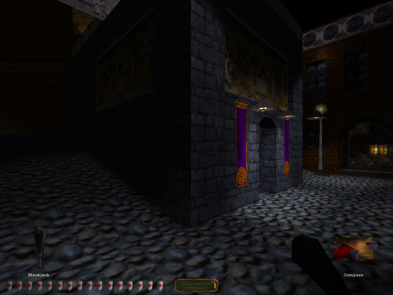
It's not an RPG, but damn does Thief have a simple and elegant UI:

ingame_4x3.png


Also agree with the Morrowind post above. In first/third person game view, you have barely any UI elements on the screen. They're tucked into the corners and tell you what you need to know, like your health, stamina, mana, and current magic effects. That's all.
When you open your inventory/character screen, you get a whole lot of information in resizeable windows, very good UI functionality and pretty intuitive too.
That's how UIs should be. Unintrusive when you're in the main game screen, and full of information and options when you're in the appropriate screens (like map, inventory, character info, etc).

I also really liked the Infinity Engine interface back in the day, for its aestethics and great useability.
 

JarlFrank

I like Thief THIS much
Patron
Joined
Jan 4, 2007
Messages
34,677
Location
KA.DINGIR.RA.KI
Steve gets a Kidney but I don't even get a tag.
Also, I prefer using the mouse in blobbers over having to use hotkeys for everything, thank you very much.

Games that didn't have mouse control didn't have it because mice weren't really a thing yet back in the early 80s.
For today, not having mouse control is unacceptable.

I love Dwarf Fortress in theory, but it's always a chore to learn the navigation of the menus via keyboard hotkeys every time I get into it. Mouse control would make it SO much better.

Of course, I sometimes just press the "i" button on my keyboard to get into the inventory rather than click it with the mouse, but not always. Most of the time I do use the mouse.

So the ideal interface for a modern RPG is: mouse-driven with keyboard shortcuts that can be used if you want to.
But mouse is a must in any RPG.
 

Cross

Arcane
Joined
Oct 14, 2017
Messages
3,040
Aside from Dungeon Master, which I have already mentioned in this thread, I think the only real stand-out for CRPG UI design is Morrowind, which used four simple but elegant windowed screens to convey almost all necessary information.
The only stand-out? Morrowind's interface is fine, but there are plenty of examples of more efficient UI design.

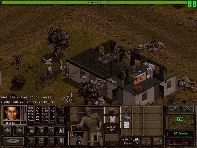
Jagged Alliance 2 shows you everything you need to know not just about a single character, but an entire party of characters using a fraction of the screen space:

21_1.jpg


For an action-RPG, the Ultima Underworld style of interface design is the superior choice, Arx Fatalis being its final iteration:

U5dtJeKzqzQNyHvGB7xz782FSmfkYMo_1680x8400


Another thing both of these interfaces have over Morrowind is that they allow for direct interaction with the game world.
 

vonAchdorf

Arcane
Joined
Sep 20, 2014
Messages
13,465
Another thing both of these interfaces have over Morrowind is that they allow for direct interaction with the game world.

Direct interaction with the game world sounds cool in concept, but it's a fine line between "immersion" and unwieldiness.
 
Self-Ejected

Lilura

RPG Codex Dragon Lady
Joined
Feb 13, 2013
Messages
5,274
Here is some of my criticism:

User Interface Evolution.


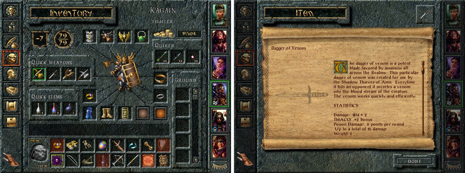
Part I: : The Infinity Engine UI - BioWare: Baldur's Gate & Baldur's Gate II

inventory.jpg


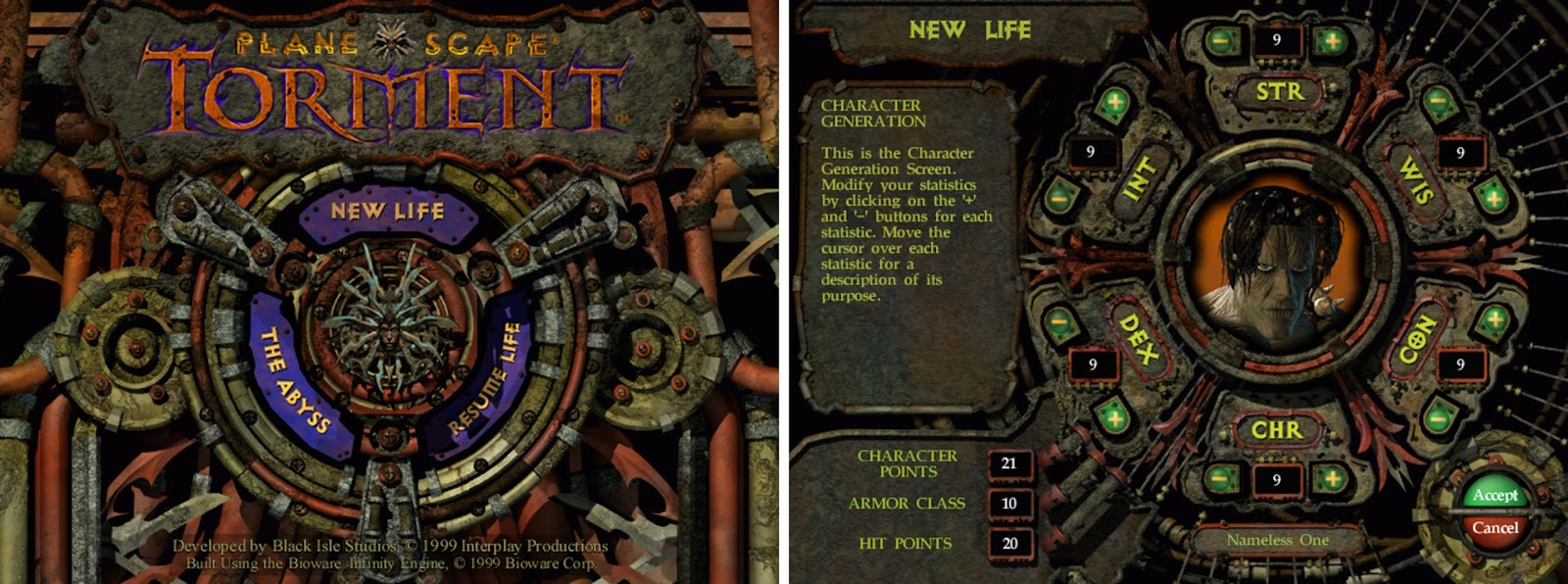
Part II: The Infinity Engine UI - Black Isle: Planescape: Torment, Icewind Dale & Icewind Dale II

pst%2Btitle%2Bchargen.jpg


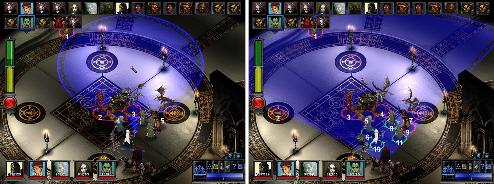
Part III: The Odd Ones Out: Pool of Radiance: Ruins of Myth Drannor & The Temple of Elemental Evil

spell%2Btarget.jpg


I've also covered Fallout and Jagged Alliance 2 UIs.
 

aweigh

Arcane
Joined
Aug 23, 2005
Messages
18,180
Location
Florida
When I first made this thread I was in the midst of a turn-based blobber high. It was the first time in years I had enjoyed an RPG so everything about Wizardry was a revelation to me. I didn't really want to talk about RPG UI's, I wanted to talk about Wizardry and Elminage and other Wiz-clones.

As far as mouse and keyboard is concerned I think the mouse is good for games that require dual-axis control. An example of good mouse usage in a Wiz-clone would be Paper Sorcerer which utilizes the mouse for mouse-look (X and Y dual axis movement) and for interacting with objects in the game world.

A bad example of mouse usage in a blobber would be StarCrawlers with its lack of hotkeys and mandatory drag-and-drop method of selecting battle commands. You can't just click on a battle command in StarCrawlers, you have to keep the LMB depressed and move it which as an act becomes unbelievably tiresome.

Turn-based blobbers without dual-axis usually utilizes some form of menu which can be clicked on or navigated with WASD; I can't think of a way to revolutionize this or a partciular need to do so either. If you need to select a command, and you can both click on it and press a key for it, where else is there to go from there?

EDIT: For the person above with the bad memory don't feel too bad... I didn't even remember making this thread!
 
Last edited:

octavius

Arcane
Patron
Joined
Aug 4, 2007
Messages
19,810
Location
Bjørgvin
Also, I prefer using the mouse in blobbers over having to use hotkeys for everything, thank you very much.

Games that didn't have mouse control didn't have it because mice weren't really a thing yet back in the early 80s.
For today, not having mouse control is unacceptable.

Keys are much faster than mouse, at least in older blobbers.
 

JarlFrank

I like Thief THIS much
Patron
Joined
Jan 4, 2007
Messages
34,677
Location
KA.DINGIR.RA.KI
Steve gets a Kidney but I don't even get a tag.
Also, I prefer using the mouse in blobbers over having to use hotkeys for everything, thank you very much.

Games that didn't have mouse control didn't have it because mice weren't really a thing yet back in the early 80s.
For today, not having mouse control is unacceptable.

Keys are much faster than mouse, at least in older blobbers.

But also a bit more cumbersome to get acquainted with than just clicking on the option you see on the screen.

That's why having mouse control + keyboard shortcuts is the ideal interface, allowing everyone to play the game the way it's most comfortable for him.
 

Efe

Magister
Joined
Dec 27, 2015
Messages
2,606
eye tracking + keyboard would be wonderful for blobbers
 

Doctor Sbaitso

SO, TELL ME ABOUT YOUR PROBLEMS.
Patron
Joined
Oct 22, 2013
Messages
3,351
Codex 2013 Codex 2014 PC RPG Website of the Year, 2015 Grab the Codex by the pussy Serpent in the Staglands
Limitations breed goo design. When the options are keyboard use, devs spend more time making logical key layout for comfort and efficiency.
Also, I prefer using the mouse in blobbers over having to use hotkeys for everything, thank you very much.

Games that didn't have mouse control didn't have it because mice weren't really a thing yet back in the early 80s.
For today, not having mouse control is unacceptable.

Keys are much faster than mouse, at least in older blobbers.

But also a bit more cumbersome to get acquainted with than just clicking on the option you see on the screen.

That's why having mouse control + user configurable keyboard shortcuts is the ideal interface, allowing everyone to play the game the way it's most comfortable for him.

FTFY and agreed.
 

The Avatar

Pseudodragon Studios
Developer
Joined
Jan 15, 2016
Messages
336
Location
The United States of America
I find that the best UI's are the ones that you don't notice so much. It's not that there's anything inherently wrong with the highly textured skeuomorphic style of UI design, but it can be distracting when done wrong. Planescape Torment strikes me as a particularly egregious example of UI done wrong, with it's rather unpleasant, busy, and noisy rusted look- and functionless elements that just take up space. Baldur's Gate 2 was a significant improvement in that regard. Not perfect, but much cleaner and aesthetically pleasing.
 

Zed Duke of Banville

Dungeon Master
Patron
Joined
Oct 3, 2015
Messages
13,347
Zed Duke of Banville That's not really what I meant, so let me post some examples.

arcanum-16.png

p1_2029195_36a1091d.jpg

arcanum-10.png

latest

latest


It's a game that really managed to nail its aesthetic on almost every aspect of the game. Both the main interface, the item icons, the crafting schematics, the world map (much more "map" like as opposed to the "Google Maps" representation of Fallout). Even the newspaper. Many RPGs have books (and Arcanum is no different), but just how many have newspapers with a newspaper screen to boot?

Even back when I disliked Arcanum I still thought it had brilliant art direction. It's unsurprising that Boyarsky worked on Fallout before (my other pick for best interface aesthetic in an RPG, ever).
The purpose of the user interface is to provide for quick and convenient access to all necessary information and modifications. There isn't anything intrinsically wrong with the UI also bolstering the visual aesthetic of a game, but this shouldn't get in the way of the UI's functionality.

The only stand-out? Morrowind's interface is fine, but there are plenty of examples of more efficient UI design.

Jagged Alliance 2 shows you everything you need to know not just about a single character, but an entire party of characters using a fraction of the screen space:

21_1.jpg


For an action-RPG, the Ultima Underworld style of interface design is the superior choice, Arx Fatalis being its final iteration:

U5dtJeKzqzQNyHvGB7xz782FSmfkYMo_1680x8400


Another thing both of these interfaces have over Morrowind is that they allow for direct interaction with the game world.
I think that Dungeon Master and Morrowind are the two standouts in CRPG interface design, though Jagged Alliance 2 is perhaps a stand-out for squad-based tactics games. :M

As for Ultima Underworld: The Stygian Abyss, the UI clearly derived from Dungeon Master's UI, and just as with Dungeon Master it's intended to provide quick access to inventory in real-time. The key difference between Dungeon Master and Underworld is that the former is party-based and has a UI to match, whereas Underworld reduced the party to a single character and made changes accordingly, though the resulting UI is rather clunky relative to that found in Dungeon Master. Morrowind (as with Arena and Daggerfall before it) is different in that only a small amount of critical information is provided unobtrusively at the bottom of the screen while engaged in combat or exploration, but you can at any time pause the game by turning on the four main UI screens (pictured in my earlier post), which provides access to inventory and so forth at the player's leisure.
 

Doctor Sbaitso

SO, TELL ME ABOUT YOUR PROBLEMS.
Patron
Joined
Oct 22, 2013
Messages
3,351
Codex 2013 Codex 2014 PC RPG Website of the Year, 2015 Grab the Codex by the pussy Serpent in the Staglands
Inventory access, item interaction within inventory (combining, crafting) and inventory item interaction with the game world without pausing the game is clearly more difficult to do. It also opens up all sorts of gameplay and mechanics possibilities.

For real time games these elements have to place this design above those that do not, irrespective of aesthetics. With Arx Liberatis installed, Arx Fatalis is I think the most evolved inventory UI I have seen.
 

As an Amazon Associate, rpgcodex.net earns from qualifying purchases.
Back
Top Bottom