Putting the 'role' back in role-playing games since 2002.
Donate to Codex
Good Old Games
  • Welcome to rpgcodex.net, a site dedicated to discussing computer based role-playing games in a free and open fashion. We're less strict than other forums, but please refer to the rules.

    "This message is awaiting moderator approval": All new users must pass through our moderation queue before they will be able to post normally. Until your account has "passed" your posts will only be visible to yourself (and moderators) until they are approved. Give us a week to get around to approving / deleting / ignoring your mundane opinion on crap before hassling us about it. Once you have passed the moderation period (think of it as a test), you will be able to post normally, just like all the other retards.

the interface/solid HUD threaaaad

agris

Arcane
Patron
Joined
Apr 16, 2004
Messages
6,917
That looks really good, I hope something like it gets implemented. If you can, share your *.psd files with kaz in an effort to get him considering it and mocking it up in-game asap. 16:10, 16:9 and 4:3 versions.

My only concern is the tree texture running up the left and right sides. It looks alright, but the IE games did a good job of clearing the left and right sides completely when you minimized those panels.

edit: I also agree with Sensuki about replacing the group money count with a 'select all' button. You could place the group money to the right of the 'loot bag' that is above the quickslot items.
 

Grotesque

±¼ ¯\_(ツ)_/¯
Patron
Vatnik
Joined
Apr 16, 2012
Messages
9,315
Divinity: Original Sin Divinity: Original Sin 2
Grotesque Your newest version is so massively superior to the currently existing solid UI, I hope OE seriously considers it.

My only concern is: what does it look like when you minimize the left vertical bar? This is the classic way some of us played the IE games, with the reverse-L interface.


How can you do this in Baldur's Gate 1 & 2?
 

agris

Arcane
Patron
Joined
Apr 16, 2004
Messages
6,917
Y and U toggle the respective left/right bars, I believe. It might be a IWD/BG2/PST feature, it's been a while since I played non-tutu/BWP BG1. In BG2 and IWD, there is also a small tab at the top of both of the bars you can click to hide them.
 

Grotesque

±¼ ¯\_(ツ)_/¯
Patron
Vatnik
Joined
Apr 16, 2012
Messages
9,315
Divinity: Original Sin Divinity: Original Sin 2
That looks really good, I hope something like it gets implemented. If you can, share your *.psd files with kaz in an effort to get him considering it and mocking it up in-game asap. 16:10, 16:9 and 4:3 versions.

My only concern is the tree texture running up the left and right sides. It looks alright, but the IE games did a good job of clearing the left and right sides completely when you minimized those panels.

edit: I also agree with Sensuki about replacing the group money count with a 'select all' button. You could place the group money to the right of the 'loot bag' that is above the quickslot items.

mmoney.png


I like money being near the inventory icon but now the space under the buttons feels too empty.
I must invent a button :)
 

Sensuki

Arcane
Joined
Oct 26, 2012
Messages
9,826
Location
New North Korea
Codex 2014 Serpent in the Staglands Shadorwun: Hong Kong A Beautifully Desolate Campaign
The spell buttons should probably also be on the bottom of the spell bar UI, not the top.

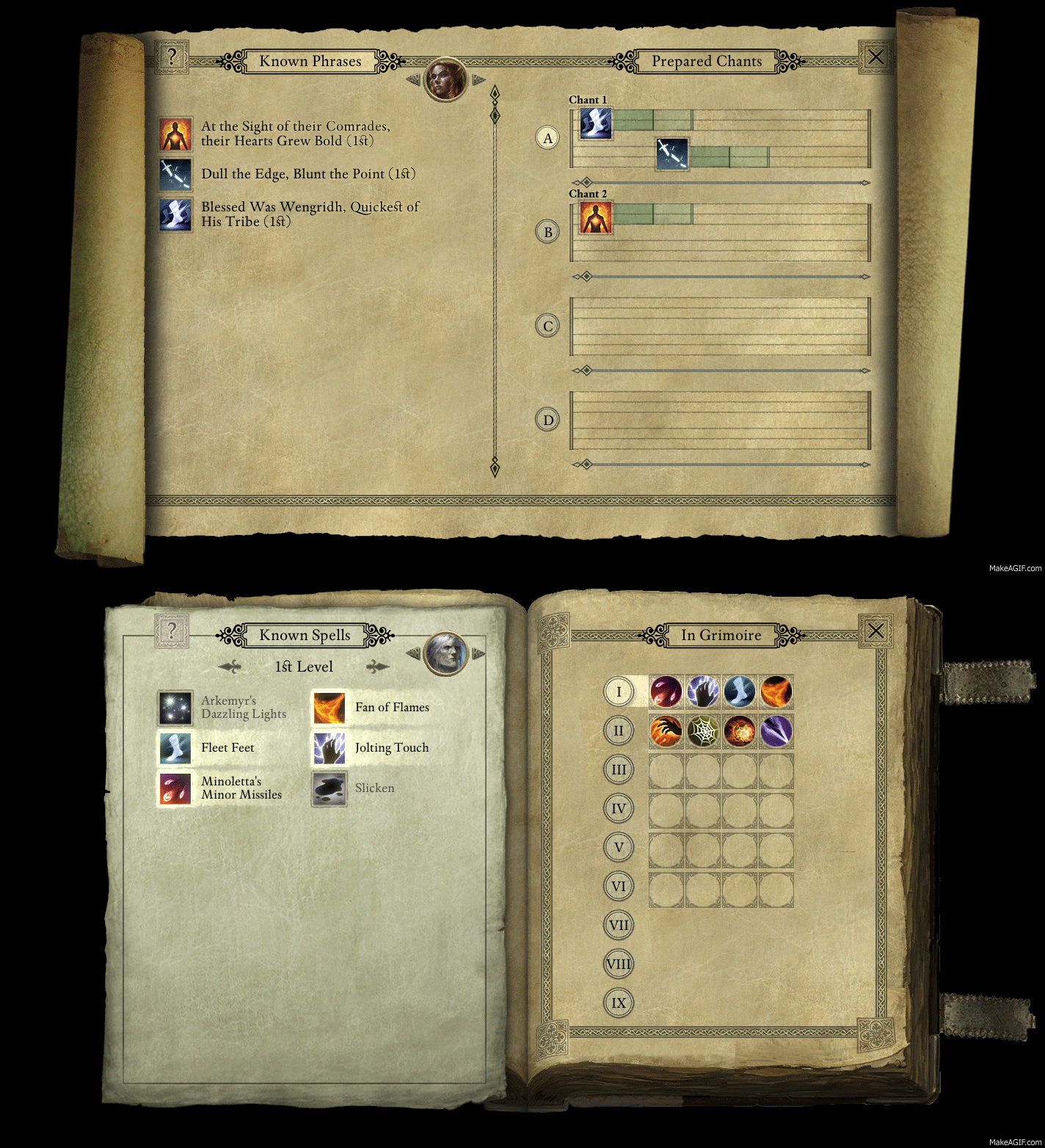
Chanter Chants and Grimoire Book use the same UI, so they could be the same thing (I've asked Obsidian to combine them on the forums).
 

Grotesque

±¼ ¯\_(ツ)_/¯
Patron
Vatnik
Joined
Apr 16, 2012
Messages
9,315
Divinity: Original Sin Divinity: Original Sin 2
The spell buttons should probably also be on the bottom of the spell bar UI, not the top.

Chanter Chants and Grimoire Book use the same UI, so they could be the same thing (I've asked Obsidian to combine them on the forums).


Chants and grimoire do not use the same interface.

The spell bar is first so it would be close to the spell level button selector, more intuitive this way.
 

Sensuki

Arcane
Joined
Oct 26, 2012
Messages
9,826
Location
New North Korea
Codex 2014 Serpent in the Staglands Shadorwun: Hong Kong A Beautifully Desolate Campaign
Chants and grimoire do not use the same interface.

They do, they use the same spell book. Grimoires now have some extra floating page shit. I made a report in the bug forums asking if they could combine them through the use of the new character switching circle portrait in the Grimoire, where if you switch to a Chanter it displays the chant menu / make them compatible.

It's dumb to have 2 separate UIs for that.
 

Grotesque

±¼ ¯\_(ツ)_/¯
Patron
Vatnik
Joined
Apr 16, 2012
Messages
9,315
Divinity: Original Sin Divinity: Original Sin 2
Chants and grimoire do not use the same interface.

Chants and grimoire do not use the same interface.

They do, they use the same spell book. Grimoires now have some extra floating page shit. I made a report in the bug forums asking if they could combine them through the use of the new character switching circle portrait in the Grimoire, where if you switch to a Chanter it displays the chant menu / make them compatible.

It's dumb to have 2 separate UIs for that.


It's dumb to have 2 separate UIs for that.


in the prepared chants section you can queue up to 10 chants.

and that "extra floating page shit" it's called design variation.

they can increase the said variation by not using a book contour/ background but a scroll

maybe I could make a post on this matter
 

Athelas

Arcane
Joined
Jun 24, 2013
Messages
4,502
That makes sense, you're putting your known spells in a different grimoire after all.
 

ushas

Savant
Joined
Jan 5, 2015
Messages
550
A nice idea to use components from the loading screen. It even look thematically fitting the game... :salute:

Because my only concern is about usability of the combat log, I decided to thank you by trying to add something to the discussion, aka a tiny variation of the design.

So the question is, how it would look like with a wider combat log and/or with bigger fonts?

For examples, how it may feel, see the rough mock-ups below. To accomplish that, a few decisions have been made:

- erased the second weapon set (a player usually use a keybinding for the switch? And besides, those with more sets would have to scroll anyway);
- What is the X button, a cancel? (moved to the left area);
- On the right side there is one column less; (not sure whether a good decision)
- The chanter sheet is erased too (as the chanter book and the grimoire would share the same UI?);
- Added a bigger font variation for the comparison.

The combat log can be resized just by adding the space from the left, but then it would be more obvious that it's not centered...

What do you think, Grotesque and others, about some of the changes?

Original:
mmoney_png.jpg


Wider combat log:
mmoney1a.jpg


Wider combat log with bigger fonts:
mmoney1b.jpg


The same with another switching off of the left side area:
(though it feels slightly off to me)
mmoney2a.jpg


mmoney2b.jpg
 
Last edited:

Grotesque

±¼ ¯\_(ツ)_/¯
Patron
Vatnik
Joined
Apr 16, 2012
Messages
9,315
Divinity: Original Sin Divinity: Original Sin 2
A nice idea to use components from the loading screen. It even look thematically fitting the game... :salute:

Because my only concern is about usability of the combat log, I decided to thank you by trying to add something to the discussion, aka a tiny variation of the design.

"The chanter sheet is erased too (as the chanter book and the grimoire would share the same UI?)"

chanter and wizard do not share the same UI.
the grimoire and the parchment icons can change depending on the selected class so it would occupy less space but you still need 9 slots under (priest has 9 spells at lvl 1)

one slot in weapon sets could represent a set (they way it's implemented now: if you have weapon and shield, only weapon shows)

increasing the font size would only negate the increase of the log. not a good idea in my opinion

so the only space available to increase the log would be from reducing the shown sets number but then the log would not be centered anymore
 

ushas

Savant
Joined
Jan 5, 2015
Messages
550
"The chanter sheet is erased too (as the chanter book and the grimoire would share the same UI?)"

chanter and wizard do not share the same UI.
the grimoire and the parchment icons can change depending on the selected class so it would occupy less space but you still need 9 slots under (priest has 9 spells at lvl 1)

one slot in weapon sets could represent a set (they way it's implemented now: if you have weapon and shield, only weapon shows)

increasing the font size would only negate the increase of the log. not a good idea in my opinion

so the only space available to increase the log would be from reducing the shown sets number but then the log would not be centered anymore

Thanks for clarifying.
The game provides an option to change the font size. So the design should probably count with that? I wanted to show the bigger font on purpose, simple because people will use it. And in that case the wider combat log will be handy. Not the other way around.

The other option may be to make right side with abilities optionally resizeable, so for a cleric one can use the arrows.
 

Grunker

RPG Codex Ghost
Patron
Joined
Oct 19, 2009
Messages
27,744
Location
Copenhagen
Aight. Now we're at something I'd actually install. Keeping working your magics and make a mod, bros :salute:
 

As an Amazon Associate, rpgcodex.net earns from qualifying purchases.
Back
Top Bottom