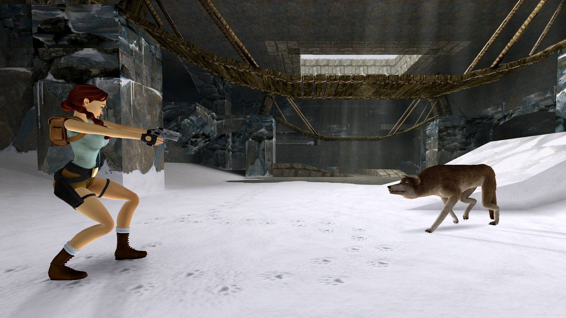
increased draw distance


graphics whores cannot help themselves.
I've said it before/we already discussed, but:
1. Adds a horror element. You never know what is gonna come at you in the darkness beyond. When that T-rex comes stomping into view, pants be pooped, and leaves you without a great deal of reaction time. It's very oppressive, and it is always there, no ifs or buts. It cannot be replicated with lighting changes.
2. level design, enemy placement etc is designed around limited draw distance. For example, it's not often you see ceilings because of this, so devs never had to bother detailing them. Removing it will highlight this.
3. Adds to illusion of scale. Maps feel bigger than they really are.
4. Atmosphere++
Stop fucking desecrating my cherished classics you soulless, talentless cunts! What's left at this point besides re
mastertarding lesser-known games now?
Increasing draw makes sense in games with skill-based (manual targeting) ranged combat, or hell, in games with highly detailed beautiful environments, neither of which is TR. I didn't mind (as much) when nightdive increased the distance in the Turok remasters, there's actually a benefit and a point to it (though I had to mod enemy AI and placements to account for that - they did not), but Tomb Raider this can only lead to decline.
Draw distance aside, visually this looks like shit and worse than the original. Look at that T-rex lol.
Reminds me of:
I wonder about the gameplay. I am all for gameplay changes but most of these soulless decline remasters do it completely wrong, usually just add casual options and call it a day. Severe decline and desecration of gaming history and art. I can't be too triggered when Anniversary already butchered the classic though.
It's a matter of taste, of course, some people will prefer the new one. To me it just looks jarring though. It's like when they used to go back and colourise old black and white movies - it looks weird, it feels like you're kind of watching a fake version, and in the end you just watch the black and white version because it actually looks better.
Nah, it's a matter of people not knowing what's good for them, and being unable to parse decline from incline due to a lack of experience and understanding.


