Boleskine
Arcane
- Joined
- Sep 12, 2013
- Messages
- 4,045
https://adventuregamers.com/articles/view/33670
A Look at Graphics: Establishing the Scene
Written by Ben Chandler — September 25, 2017
An important element of the graphic adventure game is to make sure that scenery is practical and playable. It has to serve a purpose: it's the backdrop on which the action happens, it's the board on which the pieces are placed by the designer, and this means that things have to be clear, visible and laid out neatly. A lot of the time this can limit an artist in what angles they can use, what framing they can use, and what distance they can use, because there's a fairly specific range of each in which adventure games – especially 2D ones – can work. One way to add variety, however, is the use of establishing shots to break up the scenery, and to show off parts of the world we couldn't normally see.
(Click any image for a larger version)
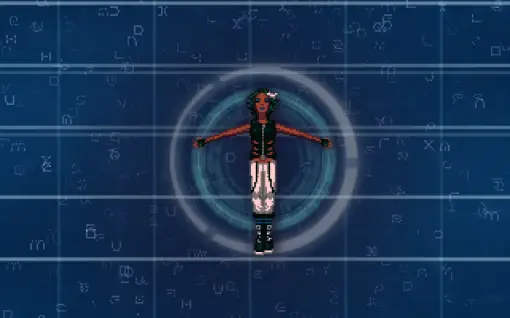
One example is this scene from the very beginning of Technobabylon. Here we're establishing an era, a level of technology, and an idea of purity/oneness of the figure. A lack of scenery cements the idea that we're viewing cyberspace, in a more “pure” form than the simulated environment that follows, and the focus is centred entirely on the character, who's delivering a monologue. This is a very simple composition that uses well-known symbols to deliver the idea of cyberspace to the players, and establish the tone of the game.
Another example we had fun with was this ruined cathedral from Sharlight. Due to the limits of 2D adventures, we couldn't show the door of the cathedral as well as the imposing size of the building in a single static shot. The solution here was to begin the shot at the very top of the cathedral, with a fairly strong angle that gives a sense of looking upwards, which then becomes less and less pronounced as the shot pans down to the bottom of the scene. This creates a sense of scale that informs players of the height of the structure, and allows them to see the wreck of the plane sticking out of it, and then drops the shot down into a form that we can actually play, without having to use a separate shot.
For the beginning of Unavowed, we're using this skyline both to set the location (the Empire State Building serves as something of a geographic icon) and the tone (the threatening red sky, looming with ominous clouds, suggests danger). Having bold colour in a shot like this really helps to develop the mood early on, preparing players for the story before the first line is spoken, a sort of visual appetiser for things to come.
One of my all-time favourite establishing shots is this scrolling panorama from Full Throttle. Starting from the sky, and rolling down, we get a great sense of distance through the perspective of the clouds and the canyon, which then slowly pulls our attention to the main focus of the scene (and, indeed, the game) – the road. This is a great opening shot to a road adventure, which leads directly into the first animated cutscene, and is a clever use of the limited technology of the time to emulate something of a cinematic camera pan.
Another fun use of a cinematic idea in an establishing shot is in this opening scene from Kyrandia 2, where we see parts of the land disappearing, creating the mystery that we'll be investigating throughout the course of the game. Here the angled horizon line – known as 'Dutch Angle' in cinema – helps to create a more dynamic, intense shot. The energy that this sort of angle brings to the scene makes what would otherwise be a fairly standard scene in terms of content quite arresting and engaging. It's a great way to grab the player's attention at the very beginning of a game and get them interested in the exposition you're trying to deliver.
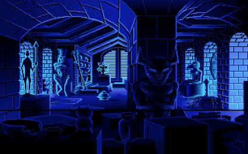
Speaking of grabbing the player's attention, a fantastic example of setting the tone of a game well is the very beginning of Indiana Jones and the Fate of Atlantis. The setup is fairly simple: Indy is searching for an item among the college's collected artefacts. Rather than presenting this as a dull warehouse or storeroom, however, the artists used the designs of cultural relics and some bold, moody lighting to make it seem like he's exploring some ancient, forgotten temple. This immediately creates a wonderful mood, getting us into the idea of an adventure to exotic lands before we even leave campus.
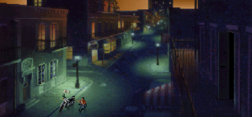
Another great use of lighting is in this shot from Gabriel Knight, in which we see the street and morning sky. A paper boy cycling past helps us to understand that it's dawn, rather than dusk, and the presence of Gabriel's motorcycle helps draw our eye to the front of this shot, but most of all the fantastic combination of orange sky and greenish-blue streetlights lends the scene a fantastic atmosphere. This is a very common combination of lighting colours, and it's easy to appreciate how it became so popular for the mood it can create.
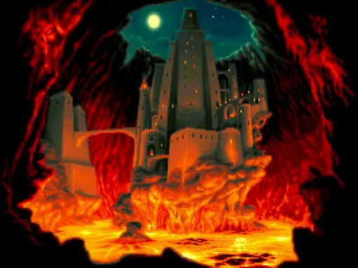
This potent colour combination can be seen again in this establishing shot from Simon the Sorcerer 2, where we're shown a full view of a castle, lit by eerie moonlight from above and blazing lava from below. I particularly like how the lines of the castle feel warped and distorted here, in an almost fisheye effect, which helps to enhance the sense of scale and looming feel of the castle. This exaggerated low camera angle really gives a powerful sense of the size of the location and the mood being established before the camera moves to a much closer, more practical shot.
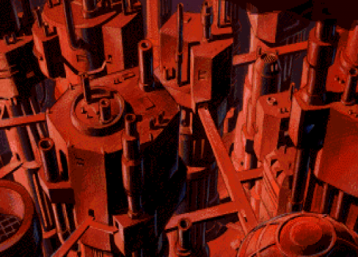
Beneath a Steel Sky uses another great angle in this backdrop, in which we see a helicopter fly past and crash. Much like the Kyrandia 2 scene, the angles here create an intensity not present in more straightforward compositions, and though this type of perspective wouldn't be practical in the playable part of the game, it works perfectly here to establish the setting that we crash into and begin our adventure, and is one of the few chances the artists had to sell the idea of a tall city before things flatten out to allow players to start to walk around.
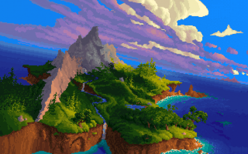
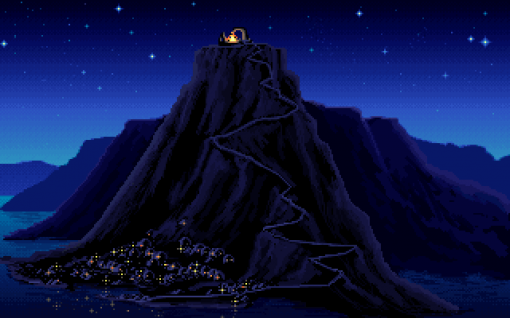
Similarly, this opening shot from The Secret of Monkey Island is one of the few moments in which the game's artists could convey any sort of height for the Melee Island setting. Seen above from the map screen, or from most of the section's playable locations, the island seems fairly flat. Only in this establishing shot is a real sense of verticality given to the area. Something I particularly like here is the distortion of scale in order to direct the player: here the fire and the arch at the top of the hill are disproportionately large and bright compared to the town and buildings nestled below it, but in exaggerating their size and brightness, the artist has drawn our eye to this location, which leads directly to the following scene in which we move to the close-up.
One particularly novel establishing shot – of sorts – is at the beginning of Broken Age, in which we have the option to choose between our two protagonists, each shown in their own worlds. The lovely symmetry of this dual shot is captivating, and suggestive of two individuals living in very different situations, but in some way connected to each other. Especially beautiful is the way that selecting one's preferred starting point seamlessly pans the shot to whichever side we've chosen, showing more of the background. This transitions from a shot that was initially about the characters into one that shows off more of the setting – whichever one we’ve chosen – making it play to both the foreground and background details at the same time.
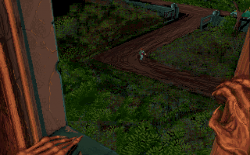
Both foreground and background are equally important in this establishing shot from the introduction of Alone in the Dark, in which we see our main character walking up the path, as seen from the vantage point of someone we can't quite see, but whose hands alone create a chilling atmosphere. This is a wonderfully suggestive composition – placing equal emphasis on foreground and background to tell a story and establish a mood in a very clever way. The emphasis is helped especially by the warm lighting on the foreground details, contrasting beautifully against the dark green of the yard, and really bringing the hands to our attention.
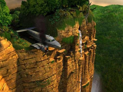
Establishing shots are a powerful tool that have been used by many artists in the genre. They help give a sense of scale, of atmosphere and tension before the game zooms into the more practical, playable parts. Their impact on the experience should not be underestimated – it comes down to the old adage urging us to show, rather than tell. It's one thing to inform the player that they're trapped in a crashed plane, teetering over the edge of a cliff, as in the start of Broken Sword 3. Before we get to escaping that plane, however, the designers show us exactly what the situation is, and in doing so, establish our location, our problem, and our atmosphere, all in a single shot. That's the power of establishing shots, and that's why they're such a valuable element of adventure games.
Ben Chandler is an acclaimed adventure game artist and designer who now works with Wadjet Eye. If you enjoy his freelance article series at Adventure Gamers, we encourage you to check out his equally insightful blog about art in games.





![The Year of Incline [2014] Codex 2014](/forums/smiles/campaign_tags/campaign_incline2014.png)


