Latelistener
Arcane
- Joined
- May 25, 2016
- Messages
- 2,631
There is no need to be upset.
It was known long ago that it is a console-oriented RPG.
It was known long ago that it is a console-oriented RPG.

For example, he says the player's first attack against an enemy should always hit.

Many action-RPGs are better without stats at all, though. If you watch the talk, it doesn't sound so much like he wants to "hide" numbers but take them away and replace them with something more discrete/number. The geometric shape system he talks about (he uses triangles in his example) divides character attributes into "Good", "OK" and "Yucky", not a whole spectrum of behind-the-scenes numbers.
He also mentions perks during the talk, but says he doesn't like when you have an overwhelming selection of them to choose from all at once.
The numbers are there behind the scenes (you can't program with shapes), you just can't see what it is.
I guess it doesn't really matter if the numbers only go from 1-5 but it does with larger amounts.


Many action games are better without stats at all

To whom is Fallout 1 overwhelming? How retarded do you have to be not to get some simple stats and skills? I guess such a faggot would die if he tried to play Underrail, instant mind blown! Better put warning labels on non-accessible games for these dorito manboons, millions of lives are at risk!
I am not sure what that "first attack always hits" principle means in the context of an action-RPG where he also says aiming is determined by player skill anyway.
Fuck, all the old developers got brain rot
Where's your messiah now, Codex?...There are no saints in heaven. There are no saints on earth. There are no ghosts in heaven. There are no ghosts on earth. There are no gods in heaven. There are no gods on earth....First MCA, then Tim Cain. Where is your god now?


That's a developmental fallacy. I remember all the 90tie games when they thought doing everything with little intuitive icons would be better than text buttons. Turns out most of those icons where never as intuitive as simple text buttons (e.g. a disk for saving doesn't make sense for kids these days). I wager that the shapes would confuse our gameplaying dumb nut audience far more than plain numbers
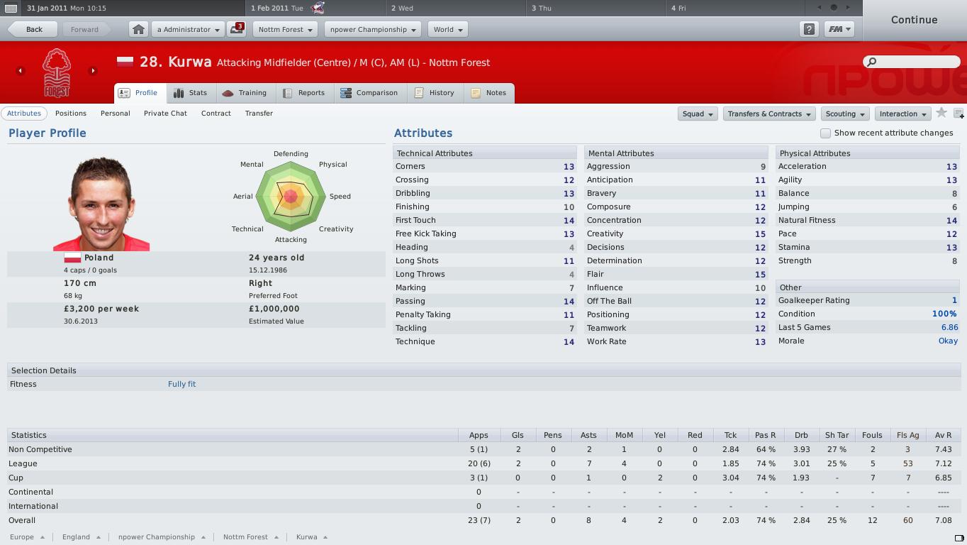
He's experimenting with creating a completely numberless character system that uses geometric shapes to visualize attributes.

That's a developmental fallacy. I remember all the 90tie games when they thought doing everything with little intuitive icons would be better than text buttons. Turns out most of those icons where never as intuitive as simple text buttons (e.g. a disk for saving doesn't make sense for kids these days). I wager that the shapes would confuse our gameplaying dumb nut audience far more than plain numbers
That's not what he's doing here.
He's trying to streamline information by repackaging it in a visual style he thinks it's easier to fathom, which I think is a fallacy. It's not

That's a developmental fallacy. I remember all the 90tie games when they thought doing everything with little intuitive icons would be better than text buttons. Turns out most of those icons where never as intuitive as simple text buttons (e.g. a disk for saving doesn't make sense for kids these days). I wager that the shapes would confuse our gameplaying dumb nut audience far more than plain numbers
That's not what he's doing here.

Fuck, all the old developers got brain rot


7 ways to try to hide you are making an RPG for people that don't like RPGs.
That's a fucking gimmick at most. "It's gonna change a whole genre!" hur durr radial charts and shit.That's a developmental fallacy. I remember all the 90tie games when they thought doing everything with little intuitive icons would be better than text buttons. Turns out most of those icons where never as intuitive as simple text buttons (e.g. a disk for saving doesn't make sense for kids these days). I wager that the shapes would confuse our gameplaying dumb nut audience far more than plain numbers
That's not what he's doing here.
He's trying to streamline information by repackaging it in a visual style he thinks it's easier to fathom, which I think is a fallacy. It's not
I think it's a fallacy when it's a one-to-one replacement of a text label with a shape. Not when you're creating a fundamanentallly new way of organizing the information for which a geometric shape is the most natural means of visualizing.
Is it dumbed down? Yes, probably. Less intuitive? I don't think so.


