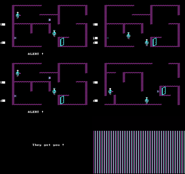
wtf is this fucking "lol hipster retrostuff those graphics are ugly make something better pls" bullshit, I thought this was the fucking Codex where classical oldschool RPG gaming is held in high regard
This looks good. I didn't even play the 80s RPGs back when they were fresh (mostly because I was born in 1988 and was introduced to gaming by my dad in the early 90s when I was 3 years old, so all pre-1990 games passed me by), but this looks appealing to me because there just seems to be so much love for the genre and era put into it. This isn't "let's cash in on the pixel nostalgia" retro, this is "we fucking love oldschool and want games like that back" retro.
And did you even read the feature list? "Just some dumb archaic game" my ass. Secret locations? Large bestiary? Fucking choice and consequence? That's more than most modern RPGs offer.
I, for one, get a very positive vibe from this.
Anyone who bashes this for the archaic graphics should hand in their Codexer card.
Did you even read that I mentioned the presentation and NOT the features? Redding is teh hard for Krauts it seems.
Anyway, fuck off with shit arguments. Choice and Consequence as a 'feature' in a RPG? Next you'll be singing the praises of Romance options! So apart from shit graphics, you also welcome shit features in shit graphics? Let me guess, the static one colour icon of the villager will turn from red to blue when you choose to keep the sword of buttfucking instead of giving it back? Cool story bro.
I'm exaggerating of course, but you miss the point. I wasn't complaining about the features but the presentation. There's no need to make it look like shit just to fill some perceived nostalgia. You think this will sell in any way to keep these guys active beyond this? If they have something decent, then present it decently. Shit minimalist graphics don't make things 'cool' and what is the point of 'C&C' when its presented in such a rudimentary way? I've news for you:there were much better looking games than this even in C64 era!Just aping Ultima IV doesn't make this game a classic of the ages. Problem here is they are trying to put modern RPG sensibilities in a presentation that isn't really that good in conveying what they are trying to do. Games in the past used other assets that I mentioned like maps, lore books, journals in order to flesh out what couldn't be presented.They didn't do it just for the fun of it. This game won't have physical additions like that, so will have to rely purely on the graphics to convey information and I don't think it's the right way to go about it. At least if they went with with 1990 256 colour EGA/VGA style, it would be exponentially better(Ultima 6,Wiz 6).
Hell, take Underrail. It's not a pretty game, looks more primitive than Fallout and even Vogels recent efforts, YET there's enough graphical fidelity to provide oodles of immersion and ability to present a detailed world that HELPS the game. It's nothing to do with graphic whoring!
Oh and you're a Thief fan....why play it in 3D? Why not play a 4 colour, 2D version? Why sell out to the next gen?
By your reasoning, you should play this instead of Thief. Why don't you? Oh, what's that, because it looks like shit and is limited compared to what Thief with its late 90's engine can do and present?


 (((Gottlieb)))


![Glory to Codexia! [2012] Codex 2012](/forums/smiles/campaign_tags/campaign_slushfund2012.png)


