Putting the 'role' back in role-playing games since 2002.
Donate to Codex
Good Old Games
  • Welcome to rpgcodex.net, a site dedicated to discussing computer based role-playing games in a free and open fashion. We're less strict than other forums, but please refer to the rules.

    "This message is awaiting moderator approval": All new users must pass through our moderation queue before they will be able to post normally. Until your account has "passed" your posts will only be visible to yourself (and moderators) until they are approved. Give us a week to get around to approving / deleting / ignoring your mundane opinion on crap before hassling us about it. Once you have passed the moderation period (think of it as a test), you will be able to post normally, just like all the other retards.

KickStarter We need more buttons

Self-Ejected

Zizka

Self-Ejected
Joined
Jan 15, 2020
Messages
429
It wouldn’t blink at all. It would only show the ”pushed“ version on the user’s end as the buttons panel is being displayed if that makes sense.

How about instead of big red circle make an empty circle and cramp inside 4 or 9 as tiny as possible the most prominent buttons.
I personally think buttons should appear under each post as before. Having to click a button to bring up a menu is a step backward in my opinion (but necessary, I hear).
 

Twiglard

Poland Stronk
Patron
Staff Member
Joined
Aug 6, 2014
Messages
7,534
Location
Poland
Strap Yourselves In Codex Year of the Donut
I personally think buttons should appear under each post as before. Having to click a button to bring up a menu is a step backward in my opinion (but necessary, I hear).
It actually can be enabled back in XF2.
 

GhostCow

Balanced Gamer
Patron
Joined
Jan 2, 2020
Messages
4,000
I pretty sure having the buttons hidden saves bandwidth or cpu cycles or something. I like it better this way anyway. It was a huge waste of space
 

agris

Arcane
Patron
Joined
Apr 16, 2004
Messages
6,949
In order to improve the doughnut button, it should be upgraded in functionality to be more like Clippy, the old Microsoft assistant in word/excel. While you are busy writing a post it should pop up and give advice on spelling mistakes and formatting. It should also recommend which buttons you use to tag peoples' posts with.

DarkUnderlord can this please be your next forum project
 

ERYFKRAD

Barbarian
Patron
Joined
Sep 25, 2012
Messages
30,147
Strap Yourselves In Serpent in the Staglands Shadorwun: Hong Kong Pillars of Eternity 2: Deadfire Steve gets a Kidney but I don't even get a tag. Pathfinder: Wrath I'm very into cock and ball torture I helped put crap in Monomyth
In order to improve the doughnut button, it should be upgraded in functionality to be more like Clippy, the old Microsoft assistant in word/excel. While you are busy writing a post it should pop up and give advice on spelling mistakes and formatting. It should also recommend which buttons you use to tag peoples' posts with.

DarkUnderlord can this please be your next forum project
What you want quest markers next boyo?
 

CyberWhale

Arcane
Glory to Ukraine
Joined
Mar 26, 2013
Messages
6,772
Location
Fortress of Solitude
DarkUnderlord we need a button where you are laughing at someone else's expense. I currently use
rating_lulz.gif
for both funny remakes and laughing at someone, but TBH this is probably too subtle for Codex dwelling autists. Something like this
PrBejJ9.gif
but preferably more lively.

EDIT: There was a great one that drinks water and then spits it out while laughing, but I'm unable to find it ATM.
 
Last edited:

Semiurge

Cipher
Joined
Apr 11, 2020
Messages
7,780
Location
Asp Hole
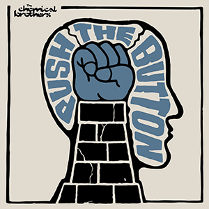
Push the button!

The-Chemical-Brothers-Push-the-Button-album-cover.png


The bottom-right brofist definitely needs to be replaced with something, to better reflect the new nesting of buttons within.
Personally, I'd remove 'Brofist' because it's not representative (it's a button for all ratings). I made this:
p4O8lTn.png

I also made a second version for once it's been clicked/pressed:
VEpCXgr.png


In action:
be4yYkJ.gif


We could therefore replace the text "Brofist" and the "brofist" icon with something which is more representative (a button for buttons).

Just make "button" black and white. Red does not play well with the blue-gray backgrounds.
 
Self-Ejected

Zizka

Self-Ejected
Joined
Jan 15, 2020
Messages
429
I doubt it would good in black and white. Still, at the moment, to have “brofist” represent ratings is shoddy design to me. “Brofist” is a rating itself, it shouldn’t stand for a whole category.

What icon could obviously represent ratings without having the write “ratings” to keep things uncluttered? A scale? Something RPG-themed would be great but I have no idea.
 

Sharpedge

Prophet
Joined
Sep 14, 2018
Messages
1,061
In order to improve the doughnut button, it should be upgraded in functionality to be more like Clippy, the old Microsoft assistant in word/excel. While you are busy writing a post it should pop up and give advice on spelling mistakes and formatting. It should also recommend which buttons you use to tag peoples' posts with.

DarkUnderlord can this please be your next forum project
What you want quest markers next boyo?
The 'Dex is currently complaining about its durability system (the change from the old layout to this one), so clearly adding quest markers is the next logical step to placate the current users.
 

agris

Arcane
Patron
Joined
Apr 16, 2004
Messages
6,949
In order to improve the doughnut button, it should be upgraded in functionality to be more like Clippy, the old Microsoft assistant in word/excel. While you are busy writing a post it should pop up and give advice on spelling mistakes and formatting. It should also recommend which buttons you use to tag peoples' posts with.

DarkUnderlord can this please be your next forum project
What you want quest markers next boyo?
The 'Dex is currently complaining about its durability system (the change from the old layout to this one), so clearly adding quest markers is the next logical step to placate the current users.

it makes me irrationally happy to imagine the sanity-fraying impact of something like a deranged Donut-clippy providing un-asked for RPGcodex cultural sensitivity tips to all users with accounts less than 3 years old
 
Self-Ejected

Zizka

Self-Ejected
Joined
Jan 15, 2020
Messages
429
Rename it to Ratings and put an RPGCodex troll face next to it.

Ok, I tried to make a few versions for the ratings icon. I managed to make it 32x32 by changing 'rating' to 'rate'. I thought about adding the devil tail poking from behind the sign but didn't want it to be too busy. The icon could go right next to +quote, without the need to add text at all (since the icon says everything). I've used this as the reference:

sPAR2wu.png

A.
GKdCohx.gif

Best version in my opinion although the animation might be too much for some.

B.
rWgL51x.png

Static.

C.
W9BS8dI.png


D.
QYgfq28.png


E.
FZj7AuS.png


F.
lj0pasz.png


G.
n94Qlyy.png
 

As an Amazon Associate, rpgcodex.net earns from qualifying purchases.
Back
Top Bottom