- Joined
- Aug 10, 2017
- Messages
- 6,183
It's a conspiracy.I love how the parrot got fucked by the transition BUT the donut came out fine and unscathed. This can only be the worst possible timeline.
It's a conspiracy.I love how the parrot got fucked by the transition BUT the donut came out fine and unscathed. This can only be the worst possible timeline.
Well, that’s fair but I’ve been tasked with making Fallout related with « citation needed ». What would you do? Because I don’t have any ideas.Takes up far too much space to say far too little.
Well, that’s fair but I’ve been tasked with making Fallout related with « citation needed ». What would you do? Because I don’t have any ideas.


What Peachcurl said but perhaps something like searching a book?Well, that’s fair but I’ve been tasked with making Fallout related with « citation needed ». What would you do? Because I don’t have any ideas.


Come on, these are pretty damn straightforward.Makes you think
Cool Story Bro
WTF am I reading
Facepalm / Retarded
Yes, it could work. since you guys seem to have ideas: I was requested to make Fallout themed variations of the following:
Green: done
Yellow: in progress
Brofist
Yes / thumbs up / agree
No / thumbs down / disagree
Thanks
Citation Needed
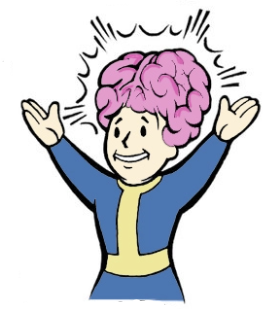
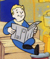
Informative / Interesting / Makes you think
Cool Story Bro
WTF am I reading
Facepalm / Retarded
So if you have ideas for those, let me know. Providing Vault Boy references of what you mean would help as well. I’m sure some of you are more aware of what Vault Boy can represent throughout all games and various perks.
Facepalm:
Retadred:
Each of these are very similar, but just a few degrees different. And I think the original buttons for each of them weren't quite on-point with the buttons use and meaning.Informative / Interesting / Makes you think





But we already have the Donut button.We definitely need a "Rape" -button.
You sure? If you click the brofist, it should open a list of all available buttons. (only if you click it a second time will you actually rate "brofist")Since we switched to the new board/forum, I lost all my buttons except for Brofist. So... big downgrade so far.
The bottom-right brofist definitely needs to be replaced with something, to better reflect the new nesting of buttons within.

But: consider that whatever button is placed there, it will be the fastest to use. Which is kinda nice for brofist. Although, I'm sure funny would also work, I suspect it is by far the most frequently used one?The bottom-right brofist definitely needs to be replaced with something, to better reflect the new nesting of buttons within.
You can use asshole slurping in a wholesome, yet non-consensual manner.But we already have the Donut button.
You can use asshole slurping in a wholesome, yet non-consensual manner.

Personally, I'd remove 'Brofist' because it's not representative (it's a button for all ratings). I made this:The bottom-right brofist definitely needs to be replaced with something, to better reflect the new nesting of buttons within.


Personally, I'd remove 'Brofist' because it's not representative (it's a button for all ratings). I made this:

I also made a second version for once it's been clicked/pressed:

In action:

We could therefore replace the text "Brofist" and the "brofist" icon with something which is more representative (a button for buttons).


