The Process
STEP 1. UNDERSTAND SOURCE MATERIAL (OR START WITH THE WHY)
We're lucky Archmage Rises is inspired by Pen&Paper RPGs because there is a wealth of source material to draw from. This step isn't "feature X in system Y is cool, let's chuck it in". That's a recipe for disaster. It's deep thought about
WHY in that system X is cool. What emotions does it elicit? How does the player feel specifically, is it: smart, powerful, clever, wise, in control, pushin-it, etc? How can we get
that feeling into
our game.
This step is also based on already having done the research: hundreds of hours of playing and reading a variety of sources. This step is about
already knowing something exists that I want, not finding it anew.
New ideas are no good because they haven't simmered long enough. It's like making Chicken Stock. The ingredients have to boil under low heat for a long long time, then you have something potent and delicious. You have the
essence, and that is what we are shooting for: essence.
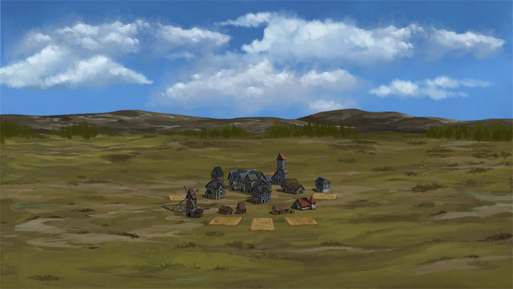
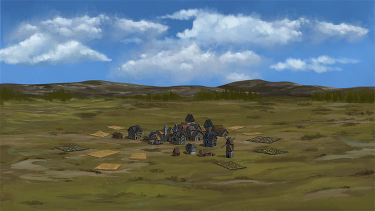
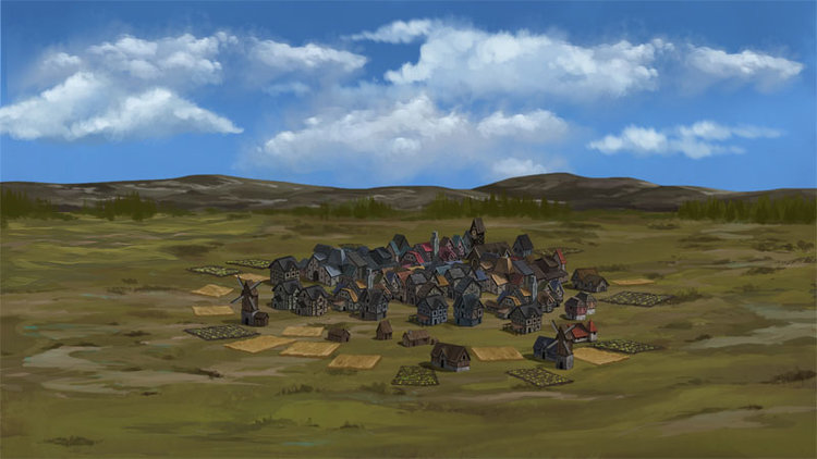
For purposes of example let's use what I was working on this week: Land ownership and management. Why? Because I think it is compelling to earn property in the world. That is a cornerstone of a medieval world. I think it helps ground and expand the experience of "being there". It also provides another entirely different revenue source of gold.
STEP 2. ANALYZE OTHER’S SOLUTIONS
Now that you have a why, it's time to dive into what everyone else has done. This will give you several things:
- How something that actually works works
- Possible new ideas on implementation you may not have thought of
- Problems/considerations you hadn't thought of. For instance, the reference game doesn't have to do what you want to do well. If you don't like it you have to know why you don't like it.
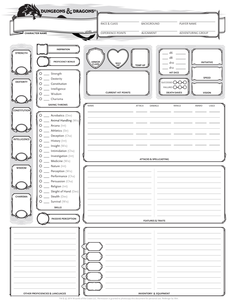
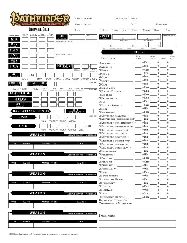
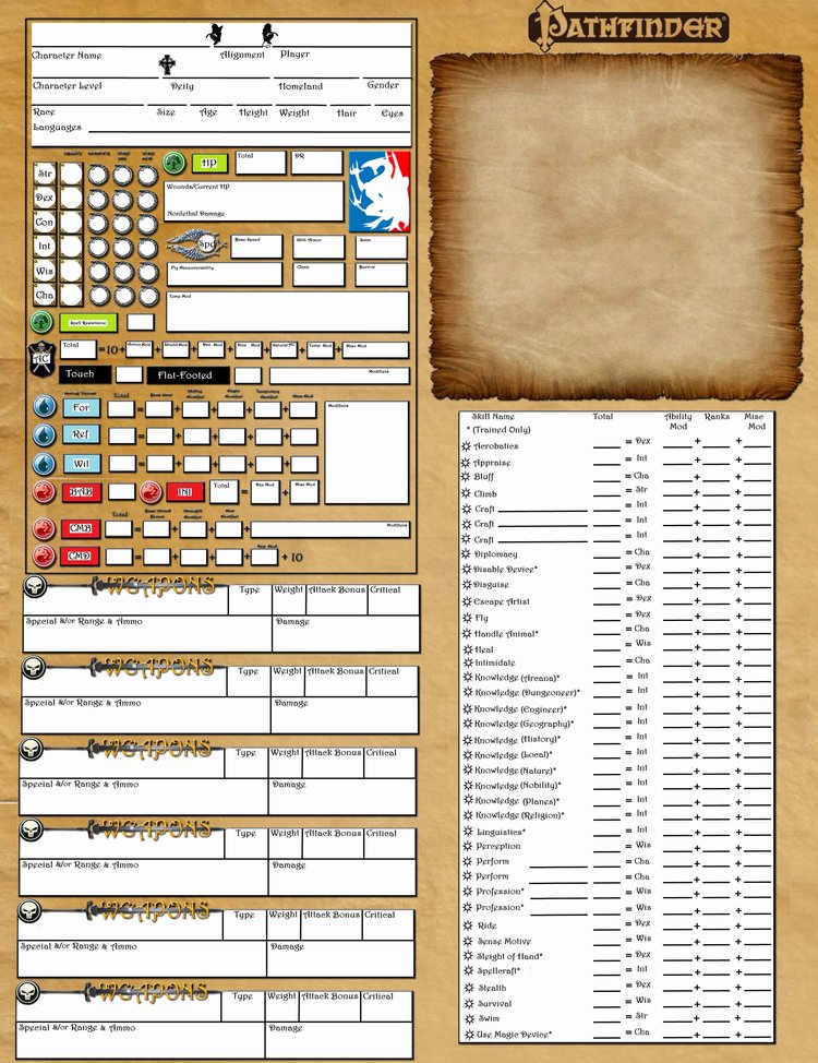
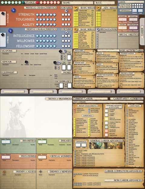
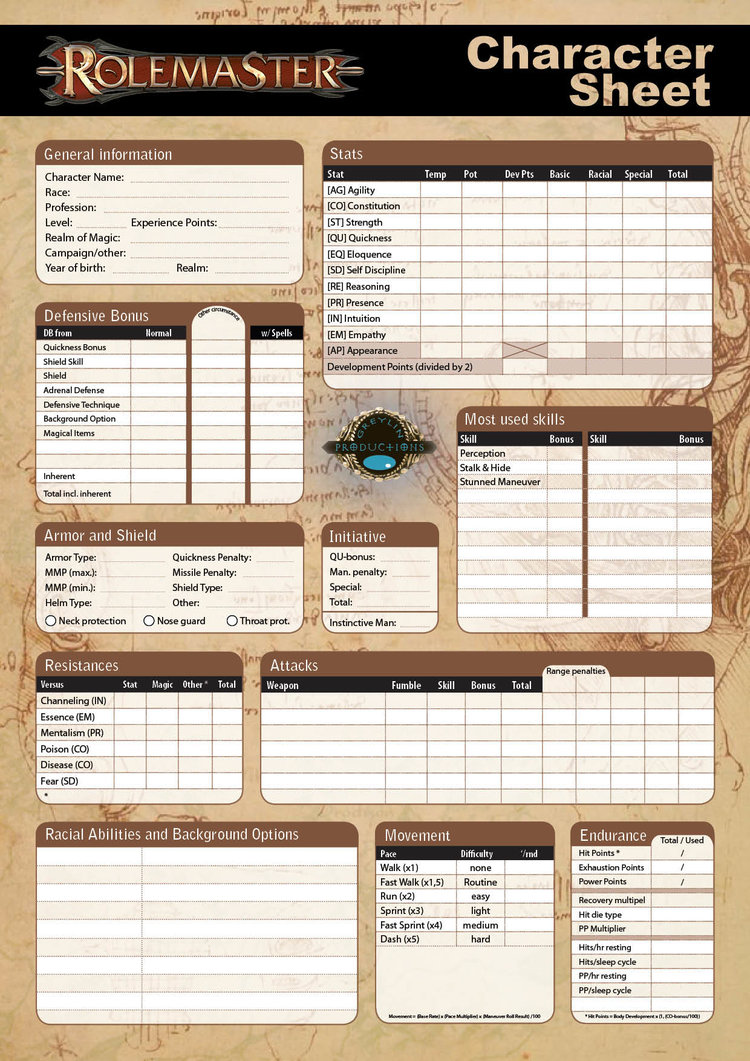
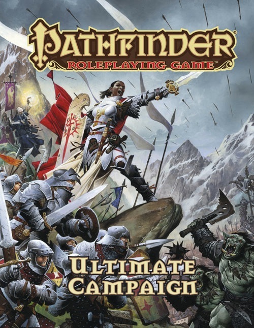
In our case D&D, Pathfinder, D20 have rules for land ownership especially in
A Magical Medieval Society. Computer games like
Pirates and
Pillars of Eternity have land ownership in them. So does Sid's lesser known game
Colonization. I don't like Pillars implementation, I really like Pirates but wish there was more.
STEP 3. BRAINSTORM ALONE FOR 25 MINS
I accidentally follow the
Pomdoro Technique without even knowing it. If you struggle to come up with ideas, or conversely struggle with too many ideas, I find this technique very helpful to get stuff done; to move forward.
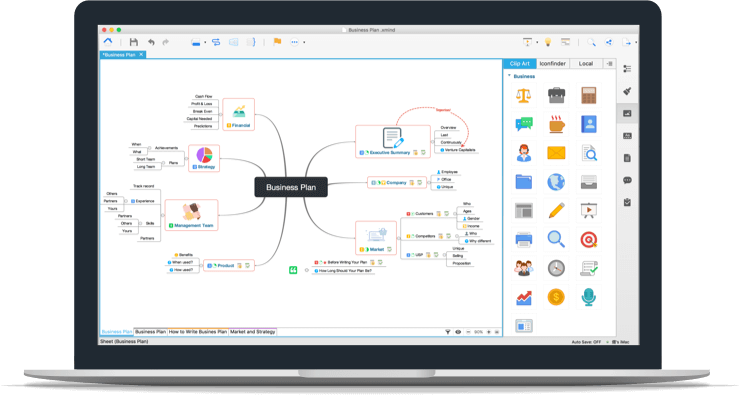
Spend 25 minutes brainstorming everything you can think of that would be awesome to have in the game. Do it in your tool of choice, whatever is fastest and presents the least barriers. For some it may be a yellow pad of paper, or notepad, I prefer
XMind cuz it's easy and free.
25 minutes is long enough that you can get a "good think" in, 5 mins is useless. Yet it is short enough in that it creates "good stress" (yes there is such a thing). It forces you to get the core idea down and nothing more, because time is ticking away!
Oh, and the best way to brainstorm is to do it alone first, then compare notes with others. Much more productive.
At the end of my brainstorm I had a list of features. Here are just some:
- assignment of workers
- workers and slaves vary
- races of captured slaves matter
- spells to terraform
- spells to enhance worker productivity
- seasons matter
- different kinds of land behave differently, some random some steady income
- short/long term considerations - chopping down forests for immediate cash but becomes Waste
It doesn’t matter how long/short your list is. Whatever you got is what you got. Your subconscious has provided you with what is
really important to you. If your list is pathetically short, you now have a clue this feature isn’t as good as you thought or you don’t love it enough. Go back to Step 1 and repeat or abandon.
I call this list of
stuff a feature list even though that is confusing since they are sub-features of a single feature. Hope it makes sense.
STEP 4. WRITE OUT CONCISE RULES
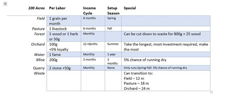
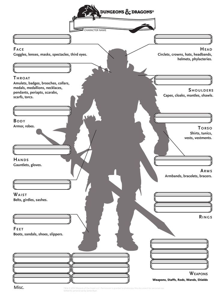
This is a bit like the old time software technique of writing pseudo code. The point is it forces you to think logically about your feature list. For instance “seasons matter”. Ok how exactly? What land types are affected by what seasons? Be as specific as you can. Text in Word is 83x cheaper than code or graphics, this is the place to iterate, drop, revise as much as you can.
In my land ownership I made a table in word and wrote out all the land types I wanted. It included gem mines, flax fields, marble quarries, sheep pastures, and livestock pens. Unfortunately none of that made the final cut and it makes me sad right now to write them here again. I loved those ideas, but once I saw my table I knew it was too complicated for the player to care the difference between planting cotton, flax, food, etc. But I persisted and kept it all in there for the next step.
Don't study this too hard, it's all going to change.
" id="yui_3_17_2_1_1496672195900_182" style="line-height: 0; text-align: center; position: relative; overflow: hidden; padding-bottom: 292.641px;">
Don't study this too hard, it's all going to change.
STEP 5. VISUALIZE IT (IN A MOCKUP)
Time to
see what your new feature will look like with a mockup. Hurray for Programmer Art! Also known in the industry as “greyboxing”. You want to see your feature idea in 2d/3d space. It’s very easy to write “drag and drop workers on land” but when you suddenly have to show all the different land types on the screen (icons? Text? Lists?) and different kinds of workers (hirelings, slaves, constructs) important questions come up:
Where do I put the list of workers available?
How can I immediately know a land is being worked or not? (tooltip is not a sufficient answer. I’m looking at you Paradox!)
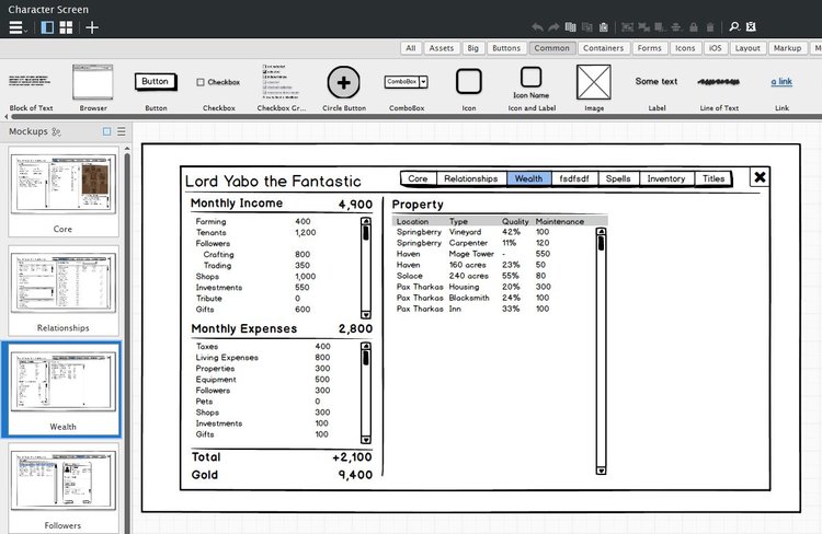
Tons of problems come out of this step. Those 34 land types I thought were so great? Ya they don’t fit on a screen in any comprehensible way. Trust me, I tried.

To make fast easy to modify mockups I use Balsamiq 3. The guys at Balsamiq live and breathe software mockups: They even provide recipes on their website so you can make a quick dinner and get back to designing mockups. Awesome!
It's ugly and horrible, but it's a start!
" id="yui_3_17_2_1_1496672195900_199" style="line-height: 0; text-align: center; position: relative; overflow: hidden; padding-bottom: 455.719px;">
It's ugly and horrible, but it's a start!
When your terrible lopsided, crammed, ugly mock up is done it’s time for the next step.
STEP 6. THROW IT AWAY, START OVER
In the classic 60’s book
Mythical Man Month about software dev, Fred Brooks states:
“You build one to throw away.
— Fred Brooks
Modern thought, like that of Lean Startup, says essentially the same thing: fail fast, validate learning, pivot, move forward.
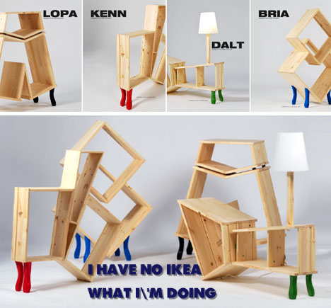
The principle is the first time you do something you make tons of mistakes you wouldn’t repeat. This is why I always build my Ikea furniture twice (unintentionally I assure you). The learning from doing is invaluable. The second version of everything is always better than the first. So let’s jump right to V2 and forget about V1 forever. I miss you copper and gem mines!
I don’t find it necessary to re-brainstorm but maybe you do. I don’t like bad ideas to cross contaminate good new ideas, so I start with a fresh page in Word and a new blank mockup in Balsamiq. I also try not to refer to the previous work because if I can’t remember it it clearly wasn’t very important to me. It’s a little trick I use to filter the ideas and strive for essence.
Remember Edison and the light bulb filament? You now know what doesn’t work. So gather up all that validated learning you just got and make a super awesome V2. Or V3, V4, etc.
STEP 7. PRESENT FIRST DRAFT(V2) FOR FEEDBACK
Now you’ve got rules and mockup you are proud of. Could it be better? No! Because you sweat and toiled over it and it is perfection incarnate.
Now show it to the team (or just one team member depending on confidence level) and they’ll tell you everything that is wrong with it:
- Our tech doesn’t support that
- It’ll take too long to implement this
- It’s ugly
- It’s confusing
- It’s overly complex/simple
What a bunch of jerks! If only they knew everything you knew
then they’d see how clearly awesome it is.
But they don’t know what you know. And neither does the player.
This is why their feedback is more right than wrong. If people who are actively working on the game, who know it better than any reviewer or player ever will, “don’t get it” then they’ve done you a great service and saved you from making a colossal mistake.
“Seek First to Understand, Then to be Understood
— Habit #5 Stephen R. Covey
Never defend: seek to understand. If someone says it is too complex ask why questions until you get something actionable. Perhaps the font is too small, or the list box shows 20 items when if it was only 8 at first it would be more easily assimilated. If they say they don’t like something provide them with “what I was trying to do here was X…” That’s not defending yourself, that is sharing your goal and maybe they can how suggest how you could better achieve that same goal.
STEP 8. REVISE, ITERATE, REVISE AGAIN
When you get back to your workstation, and after you stop crying, take allllllll that wonderful feedback and make V3 or V4 or V10. Keep to your initial vision but achieve it by solving the problems they pointed out. This is easier said than done which is why I simply wrote the above sentence and didn’t provide a picture.
 STEP 9. PRESENT V3 TO EXPANDED TEAM
You worked through the feedback problems and now you have something you’re proud of, again. And truth be told, this version
is better than the previous one. You wouldn’t have gone this extra mile if you hadn’t been pushed so hard. Now that I think of it, I should probably thank them for their criticism and helping forge me into a better designer. Come to think of it, this really is a great team we’ve got here!
Nah! It will only encourage them to be more critical next time. Plus acknowledging their efforts makes it that much harder to take all the credit once it is released. Best to keep these mature thoughts to yourself.

Present v3 to the same person and maybe some others. See if there are more holes that can be poked in it. Maybe it’s bulletproof, or maybe you missed a few.
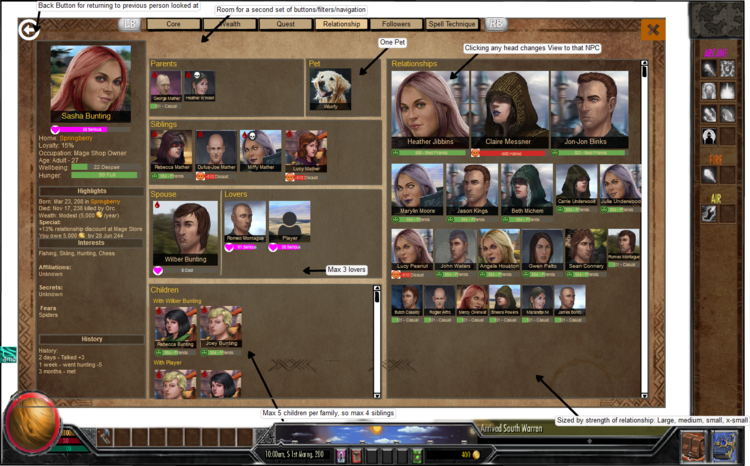
V4 mock up of the Relationship screen. We'll see what happens at step 11.
" id="yui_3_17_2_1_1496672195900_233" style="line-height: 0; text-align: center; position: relative; overflow: hidden; padding-bottom: 434.469px;">
V4 mock up of the Relationship screen. We'll see what happens at step 11.
STEP 10. REVISE, ITERATE, REVISE AGAIN
Inevitably something will come out of showing others that can be improved. Your lucky if it is only minor tweaks.
STEP 11. SEND IT TO ART FOR AESTHETICS
It’s solid enough for a prototype. It’s time to see how it will actually look in game with the right colors, backgrounds, UI, buttons, etc.
Goodbye programmer art!
STEP 12. FINAL TEAM REVIEW
When the final mockup is done, it’s time to review with the team. The artist may have found problems he/she didn’t realize until actually working with it. Revise as necessary, usually there aren’t big changes here.
STEP 13. ASSIGN TASK FOR CONSTRUCTION
With a solid mock up showing what the feature should look like in game, and concise rules explaining functionality and limitations, it’s time to let the real work begin.
Wait, what?!
Yep, this was all just preparatory work to have an actionable task for someone to do on the game. In SCRUM you’d call it a Story. Now the hard work of seeing how it
plays in the game, and seeing if it matches the feeling/experience you were trying to get at in step 1.
If not, well time to iterate! Yeehaw, isn’t game dev awesome?! Of course it is! But certainly not for the faint of heart.
For the last couple features put into production it has been about 40 hours of work including my time and the teams.
The process above is how we do things. It means we aren’t doing art or coding on something until it is V3+ which I think saves us time; we are building only solid vetted ideas. All the ideas that died along the way probably weren’t worth doing anyway. It’s a bit like the sperm and the egg, many start the race but only one makes it to construction. Construction is it's own magical process.
And with that awkward illustration, I’ll bid adieu!



![Glory to Codexia! [2012] Codex 2012](/forums/smiles/campaign_tags/campaign_slushfund2012.png)


