-
Welcome to rpgcodex.net, a site dedicated to discussing computer based role-playing games in a free and open fashion. We're less strict than other forums, but please refer to the rules.
"This message is awaiting moderator approval": All new users must pass through our moderation queue before they will be able to post normally. Until your account has "passed" your posts will only be visible to yourself (and moderators) until they are approved. Give us a week to get around to approving / deleting / ignoring your mundane opinion on crap before hassling us about it. Once you have passed the moderation period (think of it as a test), you will be able to post normally, just like all the other retards.
You are using an out of date browser. It may not display this or other websites correctly.
You should upgrade or use an alternative browser.
You should upgrade or use an alternative browser.
Broken Roads - turn-based Australian post-apocalyptic RPG with "unique morality system"
- Thread starter LESS T_T
- Start date
- Joined
- Jan 28, 2011
- Messages
- 100,644


https://www.brokenroadsgame.com/dev-blog/the-how-and-why-of-creating-broken-roads-visual-target
THE HOW AND WHY OF CREATING BROKEN ROADS’ VISUAL TARGET
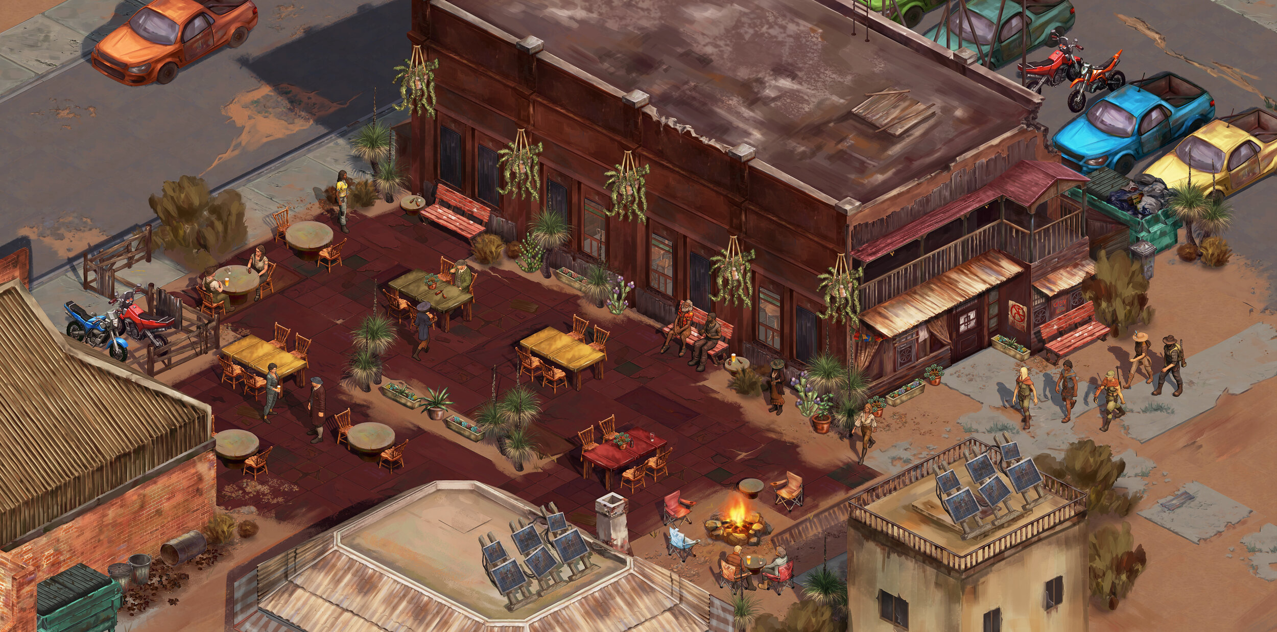
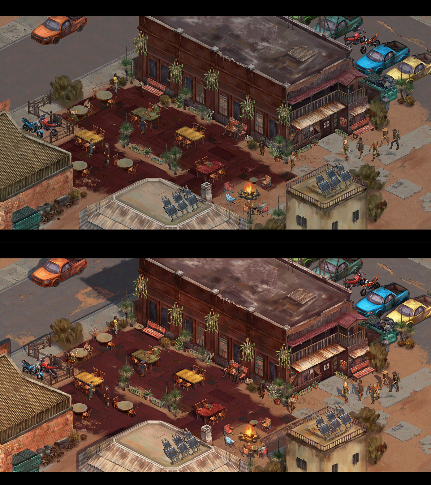
From the outset, we always wanted Broken Roads to have the feel of a “playable artwork”, and have actively worked towards the goal of maintaining a painterly style throughout. The image above was created by our Art Director and Lead Concept Artist Kerstin Evans to define the visual target for Broken Roads. Kerstin explains the how and why of making this image in the blog below.
As Art Director, it’s my job to define the visual style of the game, and also guide the rest of the team towards that goal. In order to do this, I needed to create a visual target: a piece of concept art that shows what the finished product is meant to look like. The responsibility of creating a visual target image does not fall entirely on the concept artist’s shoulders. The concept artist must consult with each department to understand the existing challenges that the whole team must overcome to achieve the visual target. This consultation process is essential to discovering what is and what is not possible when factoring in restrictions of budget, time, and team skill. Thus, the visual target image is not only an artistic measuring stick, but also something that can realistically be aimed at for production of the entire game.
In the beginning, we just had the portrait of my character Ally to guide the team. It could only get us so far. The team managed to make lots of props, characters and VFX that closely resembled what we wanted for the game’s art style. Once the team had done all we could do, the next step was the visual target.
My goal in creating the visual target was to show the style of the game, but also of the mood and liveliness of the world as well. Our levels are quite large, so I needed to choose my location wisely. In true Aussie fashion, I picked the beer garden scene.
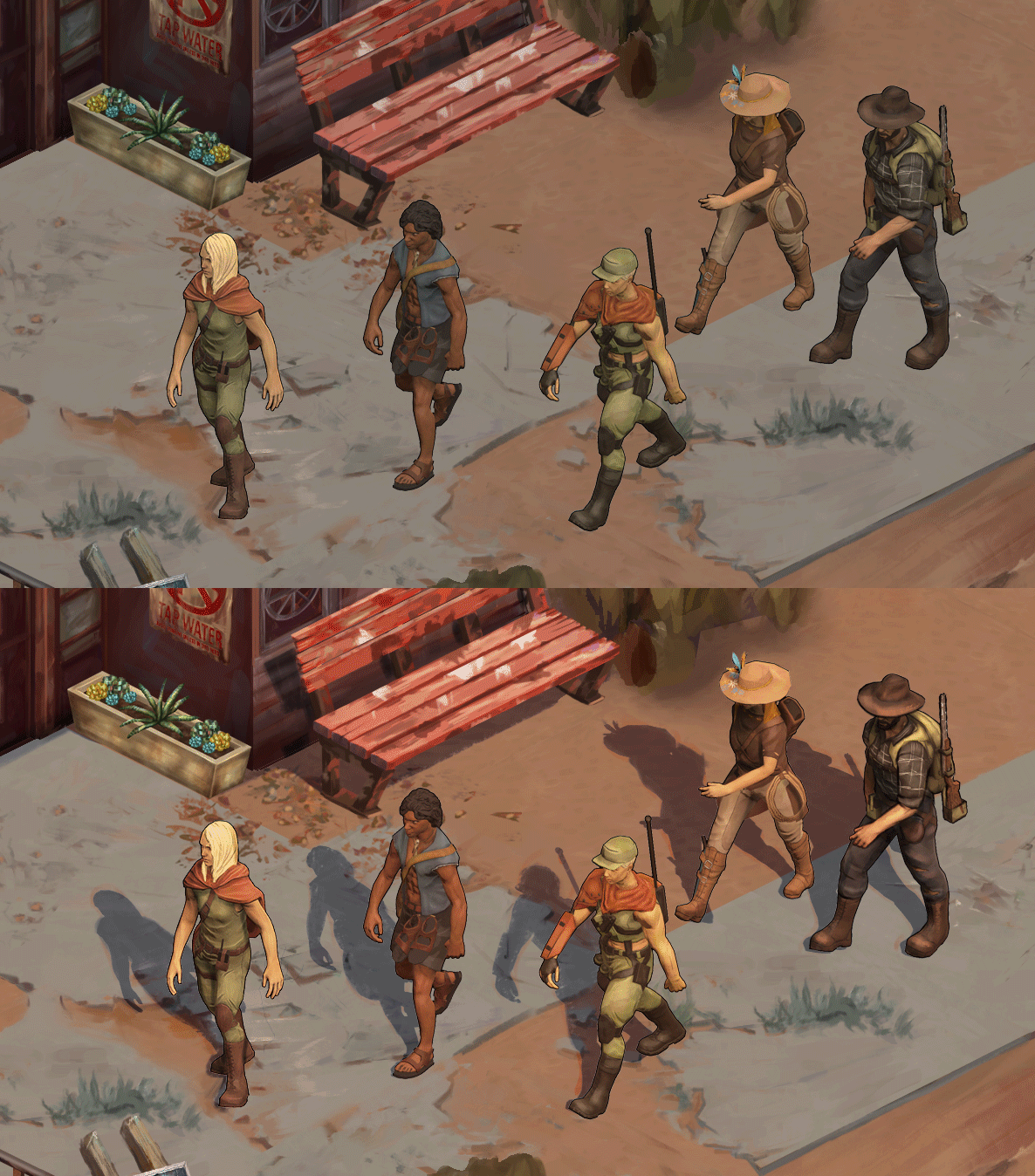
So, how does this image get created? Ryan Gee, our VFX artist sent me renders of a few of our favourite characters, posed in action. Then, I cropped our level design image for this scene down to the ratio I needed. This ratio is reflective of our in-game zoom level. When viewed at 100% pixels, the image is closest to our in-game zoom level. Fitting the image to the screen shows you what our minimum zoom would be. This helped me determine how much detail could actually be seen in-game, and stopped me from putting too much detail in.
Once I had my characters and my base crop of the level, it was up to me to paint, paint, paint! I want to reiterate that the purpose of this image is to be a practical visual guide, not to be a perfect illustration. I painted in the sun lighting for the overall scene, touched up characters (internal line-work and render style) and added some VFX suggestions such as glow from the campfire.
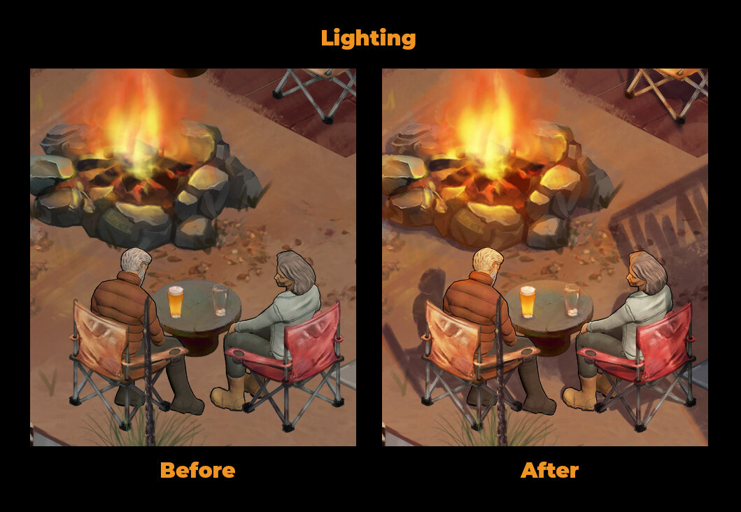
To achieve a more organic look, I place “decals” over the hard edges and the monotonous repeated patterns of the tiled ground. These decals vary from simple chunks of brush strokes to unique, detailed, organically painted areas of ground (e.g. tuft of grass, cracks in concrete or a group of pebbles). Sometimes I take parts of the ground tiles and piece them together to make something entirely new. Much of this work happened in a separate file from this concept art. You can see the before and after below from another section of the level. Note that this section does not have any lighting painted into it, except for some occlusion to define the form of the ground. The placement of the props also move slightly to best fit the ground layer.
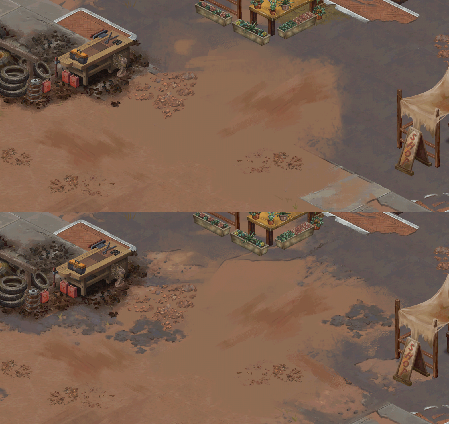
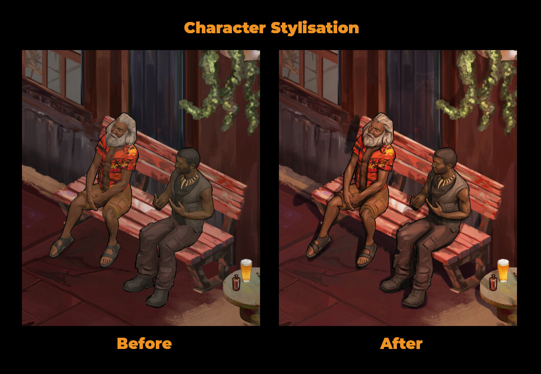
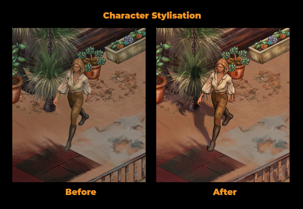
Once these decals are placed, I then do a last check for any areas that could use some more stylisation. At this stage, it’s all hand painted work. My edits range from simple decal-like brush strokes to more detailed work on the ground tiles themselves, making the world look more worn down and post-apocalyptic.
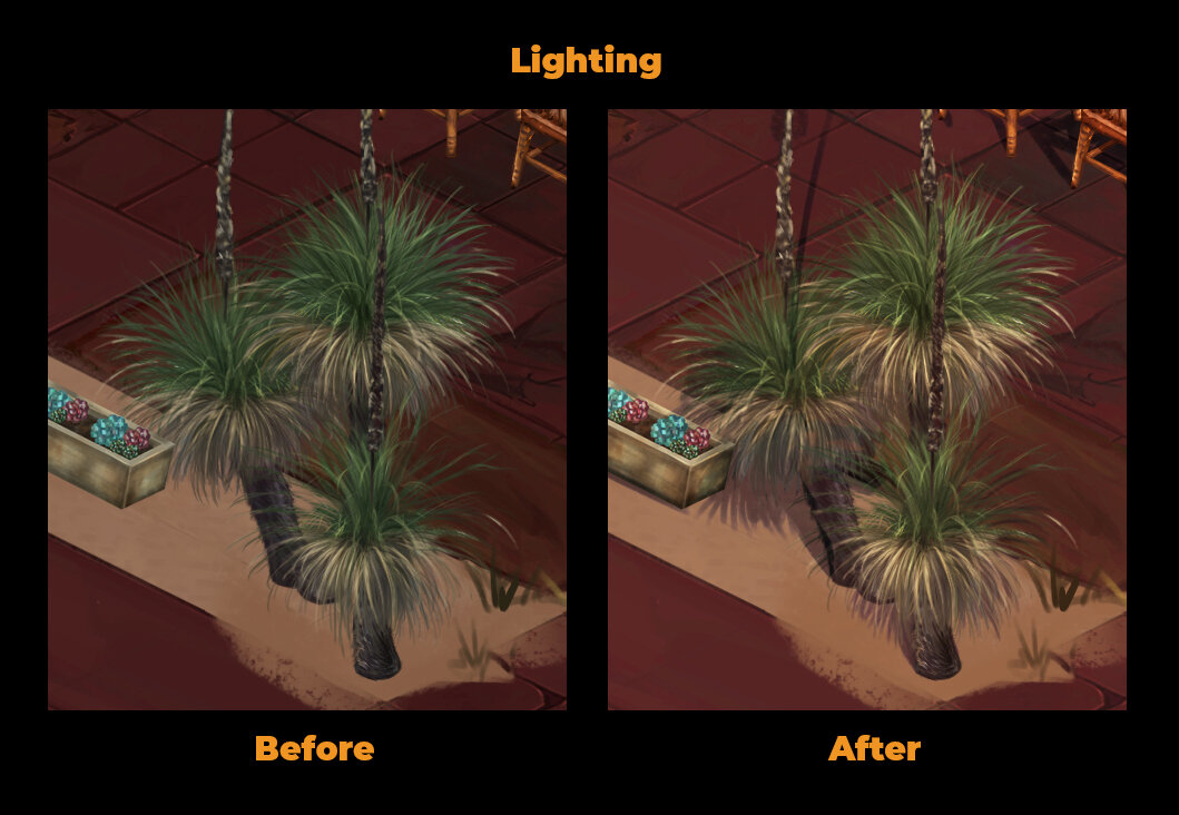
Sounds simple, right? This is all thanks to our skilled artists and tech team. Before I even started on the visual target concept art, our team went through months of trial and error to see if we could hope to emulate the target style in the first place. The paint over went so smoothly because I had a fantastic base to work with and our team had defined how much further we should aim to take the style.
The great news is that we are very, very close to reaching our visual target in game. Reaching our visual target is not something that should be rushed. Art takes take time and requires evaluation at each milestone. I’m so proud that our team has reached this milestone, and that we are at a point where we could create this visual target image to help us reach the finish line.
Wasn't Colin McComb responsible for the mess that was Tides of Numanuma?
Well, Numanuma wasn't a BAD game, it just wasn't a good game. I liked it more than Tyranny and certainly more than Deadfire.
luj1
You're all shills

They don't need post-processing, they need an art director. Funny little misguided studio.
Last edited:
deadfire is a MUCH better game than numeneraWasn't Colin McComb responsible for the mess that was Tides of Numanuma?
Well, Numanuma wasn't a BAD game, it just wasn't a good game. I liked it more than Tyranny and certainly more than Deadfire.
Curratum
Guest
deadfire is a MUCH better game than numeneraWasn't Colin McComb responsible for the mess that was Tides of Numanuma?
Well, Numanuma wasn't a BAD game, it just wasn't a good game. I liked it more than Tyranny and certainly more than Deadfire.
Is it though? I actually played some of Numenera (spoiler - it was shit) but I never played any Dreadfire because I could not sit through 2-minute loading times every time you fart and simply deleted it.
Deadfire is a fucking disaster.
I've completed it in 40 hours that felt like forever and I hate it, I hate it so much.
numenera is probably the shittiest combat system i have ever played. deadfire's problem for me is more of a nitpick of the overall combat system, and a big flaw in story progression and how scenario is done.
numenera's peak is imo better than deadfire's but it's only really a small segment of the game, compared to deadfire's generally better quality in everything. the haters just follow the bandwagons.
numenera's peak is imo better than deadfire's but it's only really a small segment of the game, compared to deadfire's generally better quality in everything. the haters just follow the bandwagons.
deadfire's generally better quality in everything
you don't fucking understand anything about art
deadfire's generally better quality in everything
you don't fucking understand anything about art
ok boy
Curratum
Guest
No, really, how did you sit through the loading times on Dreadfire?
The shitty initial combat on the tiny screen with the two ships takes around 80 seconds to load. A Steam friend told me it gets a lot worse later on with larger cities. Fuck this, seriously. Never want to touch this pile of shit again.
The shitty initial combat on the tiny screen with the two ships takes around 80 seconds to load. A Steam friend told me it gets a lot worse later on with larger cities. Fuck this, seriously. Never want to touch this pile of shit again.
No, really, how did you sit through the loading times on Dreadfire?
I think I was reading book from my phone.
i never have really problem with deadfire's loading time. it was much better than PoE 1. maybe your PC is shitty.
deadfire combat system highlight:
+ quite variable, the classes hybrid can be fun and while some of the spells/skills are copy-paste of DnD skills (minoletta's magic missile, fireball) etc, some are fun like conjuration mage can be a viable mage/melee hybrid with conjurable weapons etc.
- basically how buff timing is calculated using real time seconds instead of /round (kingmaker reminded me how much better /round system is) is overall micro management and autistic timing-accurate clicking that this cause
loot:
+basically good over the board, maybe with some flaws or 2. decent variety of unique effects weapons/soul bound weapons and armor. i always love the concept and the execution vary from good (the talking sword is great) to meh
+dungeons are decently cool, encounters vary but generally more thought out than PoE even pathfinder kingmaker (which is utter shit in encounter design 70% of the time with some brilliant moments)
graphics is still the best looking iso 2.5D in the world.
story structure is my least favorite part. instead of creating an open-ended goal like fallout 1 that give you a a reason to explore around the world they create linear story type sense of urgency that doesn't bode well with the rest of the pirate theme (IRONICALLY fallout's story structure makes wandering around the wasteland AND retain sense of urgency due to the cleverly thought time limit) . if one thing i wish they could change is this. an open ended goal like "chasing ukaizo" and detached from overall's watcher story and god shit will make deadfire a better game. it's curiousity driven instead of urgency driven that works better for linear games instead of exploration based games.
numenera:
-pool system is just unbalanced mess
-combat are awful, slow, overall shit. every encounter of this game is shit.
-quest and story content quality generally are decent. some of the best including the ant people questline in the first city, and the latter part (in the fleshy beast belly or whatever the name is) god, but the quality is super inconsistent especially with that awful second act that could easily be cut from the game.
-somehow loading time is better.
edit: this has yet turned into deadfire discussion. the curse is real
Darth Canoli
Arcane
edit: this has yet turned into deadfire discussion. the curse is real
Tell me about it, imagine if you were baited into reading your message thinking there were real news about Broken Roads...
GrafvonMoltke
Shoutbox Purity League

Will I be able to loot cheese?
- Joined
- Jan 28, 2011
- Messages
- 100,644


https://www.gamasutra.com/view/pres...nd_prealpha_showreel_go_live_for_gamescom.php
Torquay, Australia, August 26, 2020 – Drop Bear Bytes today launched the Steam page for their upcoming isometric RPG, Broken Roads.
As part of their gamescom announcements, the Australian indie studio released a new pre-alpha showreel as well as range of their latest screenshot to tease the progress the game has made since its announcement last year.
"I’m incredibly proud of the leaps and bounds the team have made since we revealed Broken Roads,” says Craig Ritchie, Founder & Game Director of Drop Bear Bytes, “and the way the community has reacted to date is really encouraging! We’ve had our heads down working on a range of new characters, locations, quests and game features and it’s great to share a little of that for everyone at gamescom. We’ll have more to share on our dev blog and over social media throughout the event.”
Wishlist Broken Roads on Steam at https://store.steampowered.com/app/1403440/Broken_Roads/ and view the pre-alpha showreel at https://www.youtube.com/watch?v=5lV3QQ6OLCs
Broken Roads is set in a ravaged future Australia and presents players with an original alignment system: the Moral Compass. This unique take on morality presents a 360-degree view of all ethical and philosophical decisions a character can make, as well as their available moral traits. A character’s philosophical leaning will affect all areas of the game, from dialogue and companion reactions through to quest resolution and combat.
Broken Roads is in development for PC, Switch, PS4 and Xbox One, and is scheduled for release in late 2021.
Join the Drop Bear Bytes discord at https://discord.gg/W9UZzrk
Follow on Twitter at https://twitter.com/dropbearbytes
Follow on Instagram at https://www.instagram.com/dropbearbytes/
Broken Roads’ reveal trailer (October 2019) can be found at https://youtu.be/1szow-dCPzc
fantadomat
Arcane


Is there a release date in sight?
Darth Canoli
Arcane
Three posts above, the steam links says late 2021...


![The Year of Incline [2014] Codex 2014](/forums/smiles/campaign_tags/campaign_incline2014.png)


