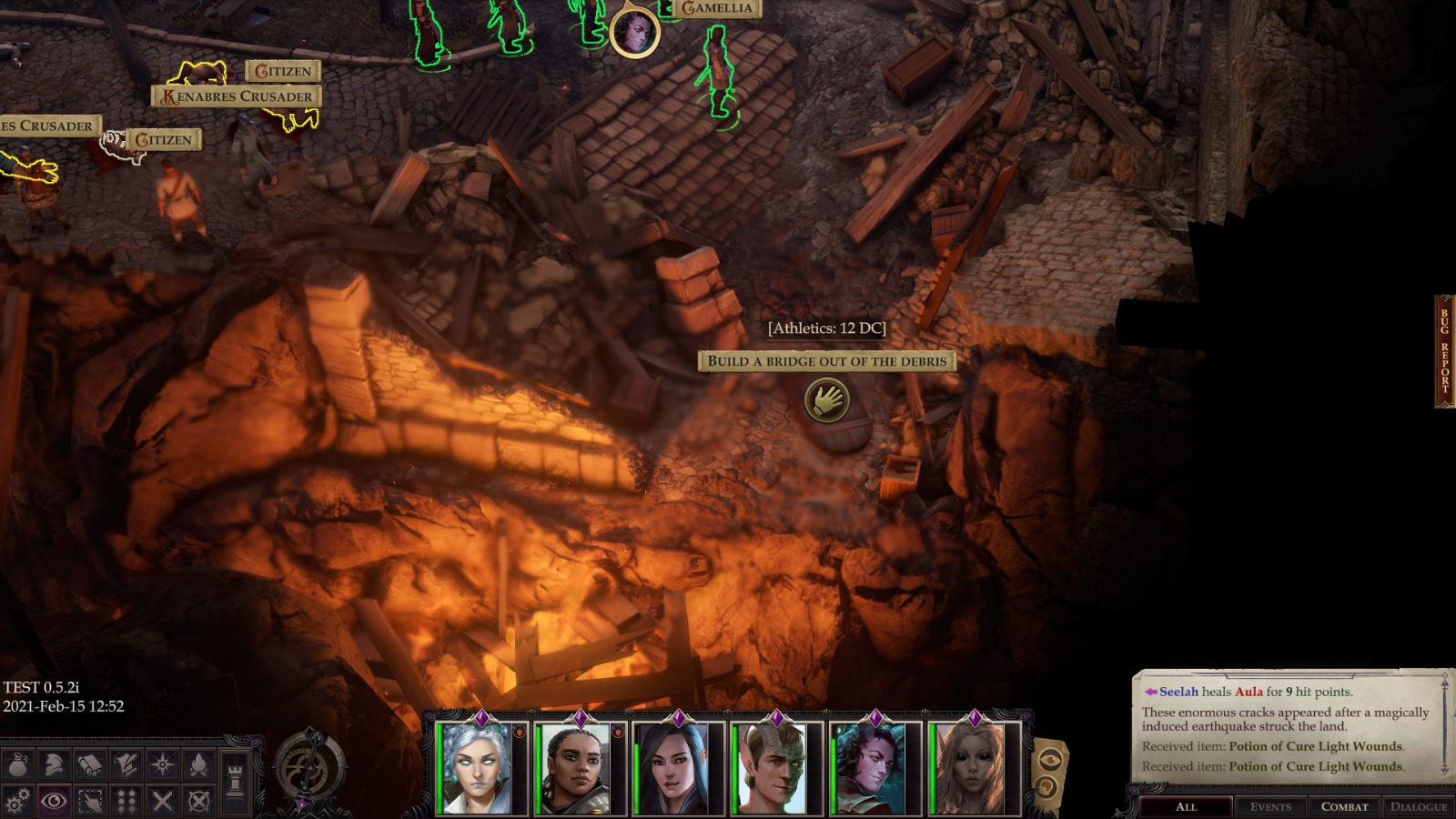
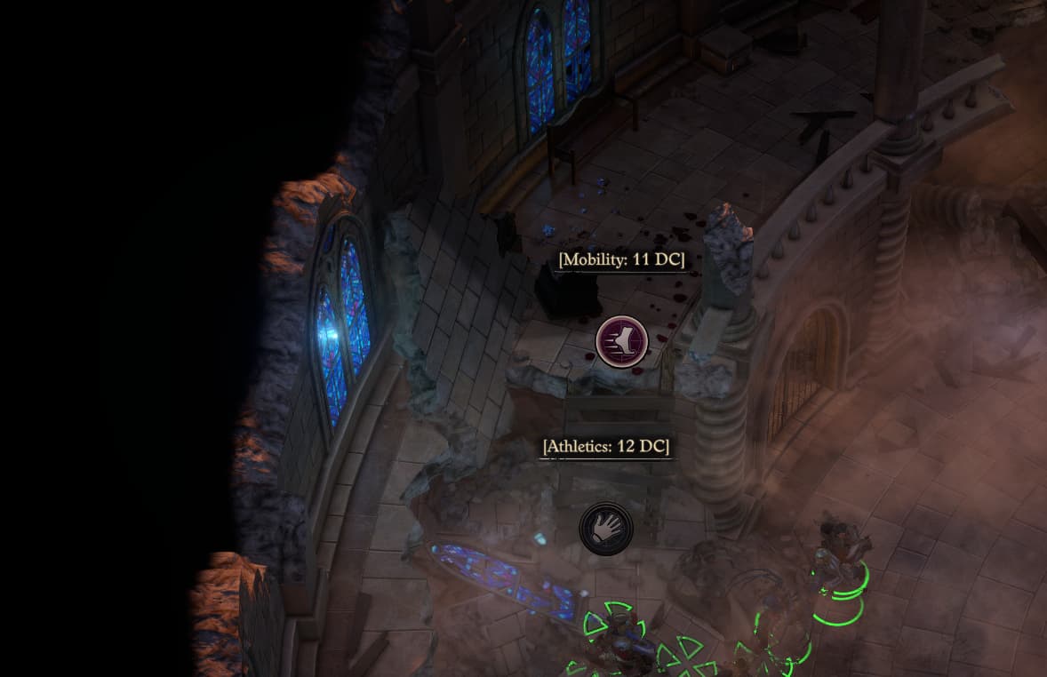
Modern games have a higher graphic fidelity so quickly ascertaining what is interactable will be a lot harder than in older games. Compare Fallout 2 to Wrath of the Righteous. Wrath is littered with decorative objects, particle effects, and poor contrast. All of that makes it harder to direct the player's eyes towards any one direction unless the camera automatically moves there or some big icon hovers over it. Additionally Wrath has a fully rotatable camera so you cannot guarantee what direction the player is even looking in. Fallout 2 doesn't have these problems as that games simply graphics make it easier for the player to notice each individual item. This is simply a case of visual clarity and graphics advancement ruining game design.
Yes, graphics advancement is what ruins game design in this case. But not visual clarity.
Visual clarity is
higher in older games. Much higher. Whenever I play a Thief or Quake map, I can easily recognize everything at a glance. Even in modern fan-made maps that up the detail a lot, it's easy to spot what's interactable and what isn't.
One reason is the lack of flashy effects. Modern games love to put bloom and HDR and depth of field and whatever the fuck else into the game which just serves to wash out the textures and blur the models so it's harder to actually discern the objects in the environment.
Another reason is that modern level designers just lost the ability to create natural signposting due to over-reliance on artificial signposting. If you compare the older entries in a series to the newer ones, you will clearly see how level design has declined.
Let's take Tomb Raider for example, because right now I'm replaying the first game and having a blast. While the original Tomb Raider's 3D architecture was rather primitive, with areas being made up of equally-sized square blocks, this restriction also came with incredible visual clarity and was combined with a universal physics system that applied to everything equally. If a ledge was within Lara's reach, she could grab it. No exceptions. If you look at your surroundings and see a place that looks like you can get to it... you can probably get to it, as long as it is within jumping distance of your current position. Everything was reliable and followed the same rules so navigation through the levels is easy as long as you're observant.
But in the modern Tomb Raider reboots, this no longer applies. Sometimes, a place looks like it's accessible but isn't because even though the ledge is within reach of Lara's hands, she can't grab onto it because... it's not a grabbable ledge, for some reason. Instead, only ledges that have a white texture on them are reliably grabbable. Why? Just because, lol. The games went from a natural level design where every single piece of the environment followed the exact same rules to artificial level design where a lot of the landscape is decorative and can't be interacted with, so the interactive pieces of the landscape have to be color coded in order to guide the player.
Same thing with rope arrows in the original Thief games vs that horrendous Thi4f reboot from 2014. In the originals, rope arrows could stick in any wooden surface. Ceiling made of wood? Rope arrow sticks. Window ledge made of wood? Rope arrow sticks. The rule is simple and universal, and if a level designer wants to hide a secret area that's only accessible with a rope arrow, all he has to do is place a wooden surface nearby and then the player can come to the conclusion of using a rope arrow there by himself. Not so in the reboot. No, the devs of the reboot decided that players would be able to break their levels if given such a powerful navigation tool (lol) so they restricted rope arrows to specific spots. Those spots are clearly marked with artificially popping out textures. You can no longer use them on any wooden surface, only on those that are specifically signposted as ROPE ARROW SPOTS with an extremely artificial visual cue.
One of the few modern games that works well without any markers or artificial signposts are Dishonored and Dishonored 2. Deactivate ALL the artificial handholding interface elements, and you won't even notice they were ever there. The games feel like they were designed to be played without those markers, and they work extremely well that way. You always know where to go because you goals are clear. You always know where you can climb up because you can climb up pretty much anywhere... just like in the original Tomb Raider games, your mobility is not restricted by anything artificial. Every surface in the game follows the same rules. Any ledge can be mantled up, any surface can be stood on if you manage to get there. Exploration is natural because it is not crippled by artificial restrictions, and no artificial signposting is required because the environment itself already tells you everything you need to know. If you can see it, you can interact with it, because everything is interactable.
Going back to isometric RPGs - Fallout, while not having intricate systemic design that covers everything with a universal physics engine like immersive sims do, has one thing that few other RPGs have: a skilldex that lets you pick skills and apply them to any object you see in the world. No exceptions. If you can click it, you can try to use a skill on it. That system is reminiscent of point and click adventure interfaces, specifically Lucas Arts adventures. In Lucas Arts adventures, you have a row of verbs at the bottom which you use to interact with the world. Open, close, take, talk to, look at, push, pull, give, use. Wow, that's a lot of useful verbs. Meanwhile, most RPGs just have contextual button clicks: you click on something interactable and there's a default action tied to that click. You click on an NPC, you talk to them. You click on a door, you open it. You click on loot, you pick it up. Etc. And while that's all you need to do in 99% of cases, it definitely makes other environmental interactions that don't use the generic standard action more difficult to present to the player naturally. That's why games like Pathfinder have to do shit like "Click here to do [specific adventure game style solution]". They don't have a system to handle skill and item interactions with environment objects. Fallout does have such a system: the skilldex, which allows you to use ANY skill on ANY object in the environment. An NPC is hurt and needs help? Most RPGs will make healing him either an action that's selected as a dialogue choice when you talk to him, or will add a special unique one-off interaction button to heal him. In Fallout, you just select your doctor skill and use it on the NPC.
If you want players to be able to come to their own conclusions and find their own solutions, you need to give them an interface and game rules that allow for it. If you can use any skill on any object in the world, players will be able to experiment a lot more and you won't have to add specific one-off interaction prompts that only work in one place and then never appear again. If you design your levels in a natural way where every surface behaves in the same consistent way, you won't have to place artificial signposting like white ledges and shit, because the environment itself gives you enough navigational information to get through it.


