Putting the 'role' back in role-playing games since 2002.
Donate to Codex
Good Old Games
  • Welcome to rpgcodex.net, a site dedicated to discussing computer based role-playing games in a free and open fashion. We're less strict than other forums, but please refer to the rules.

    "This message is awaiting moderator approval": All new users must pass through our moderation queue before they will be able to post normally. Until your account has "passed" your posts will only be visible to yourself (and moderators) until they are approved. Give us a week to get around to approving / deleting / ignoring your mundane opinion on crap before hassling us about it. Once you have passed the moderation period (think of it as a test), you will be able to post normally, just like all the other retards.

Game News First work in progress screenshot of Wasteland 2 revealed

Brother None

inXile Entertainment
Developer
Joined
Jul 11, 2004
Messages
5,673
Minimal efforts with textures and details is what I am seeing.

Do you understand what "alpha" means? Possibly retarded, indeed.

Brother None do you know if it will be possible for characters to take cover behind those debris?
Dunno.

Though it's worth noting F:Tactics is among the inspirations for this game's combat system, along with the likes of Jagged Alliance and Silent Storm, of course. The presence of ladders and cover makes me speculate they might well be used. Just speculation, though.

Probably like shit without at least a hidden grid.

Who knows. Personally I strongly prefer visual grids in my TB games. Worth a topic on WL2 forums, perhaps.
 

dibens

as seen on shoutbox
Patron
Joined
Dec 4, 2011
Messages
2,629
Alright you "graphics too cartoonyylolo" popamole fucks! GTFO of this thread!!!

GAMEPLAY MOTHERFUCKER! GAMEPLAY!!
 

FeelTheRads

Arcane
Joined
Apr 18, 2008
Messages
13,716
Alright you "graphics too cartoonyylolo"l popamole fucks! GTFO of this thread!!!

GAMEPLAY MOTHERFUCKER! GAMEPLAY!!

OK.

From that screenshot I can tell about the gameplay that.... you'll have several people in your party. Good?

Now can we get back to what that screenshot shows, which is graphics?
 

dibens

as seen on shoutbox
Patron
Joined
Dec 4, 2011
Messages
2,629
Alright you "graphics too cartoonyylolo"l popamole fucks! GTFO of this thread!!!

GAMEPLAY MOTHERFUCKER! GAMEPLAY!!

OK.

From that screenshot I can tell about the gameplay that.... you'll have several people in your party. Good?

Now can we get back to what that screenshot shows, which is graphics?


Graphics are shit, of course. Too much color. IS this some kind of WoW clone lololo?
 

Captain Shrek

Guest
Minimal efforts with textures and details is what I am seeing.

Do you understand what "alpha" means? Possibly retarded, indeed.

Brother None do you know if it will be possible for characters to take cover behind those debris?
Dunno.

Though it's worth noting F:Tactics is among the inspirations for this game's combat system, along with the likes of Jagged Alliance and Silent Storm, of course. The presence of ladders and cover makes me speculate they might well be used. Just speculation, though.

Probably like shit without at least a hidden grid.

Who knows. Personally I strongly prefer visual grids in my TB games. Worth a topic on WL2 forums, perhaps.

23jqt1f.jpg


Look. Honestly I want to see this game as successful as possible of course. But if there are concerns they are best addressed before it is too late.
 

Gwendo

Augur
Joined
Aug 22, 2004
Messages
990
It looks like a TellTale game, zoomed out. Or even the new XCom that will be released this year. A somewhat "cartoony" style, with saturated colours and, ffs, a green river with green fumes.

I guess that a decent colour filter could fix this, though. Nothing to worry.
 

sgc_meltdown

Arcane
Joined
May 8, 2003
Messages
6,000
Another take. This time I left the colors alone and just messed around with luminosity and lighting.

6f42176d.jpg


With that I think the main cause of complaints are having color spots that overtake texture visibility and clarity, which gives the colors the feel of a lighting overlay and not as part of the textures.

The textures exemplify this with their current lack of detail. Remember that I say this not because I want more detailed textures, but that's how these factors are working against each other.

take this screenshot from the sherwood game for example:
ss_54222454b1c2cd92d0c5eb1b0f4afe054c62d652.1920x1080.jpg


Because of the strong and crisp scene detailing the presentation doesn't get lost or overpowered in the equally strong colors. Balance. The result: Very pretty stuff.
 

FeelTheRads

Arcane
Joined
Apr 18, 2008
Messages
13,716
Leaving aside Tactics which I guess is too "grim dark" for the "colors = art and original" crowd, here's a low-poly game which has color and doesn't make your eyes burst into flames:
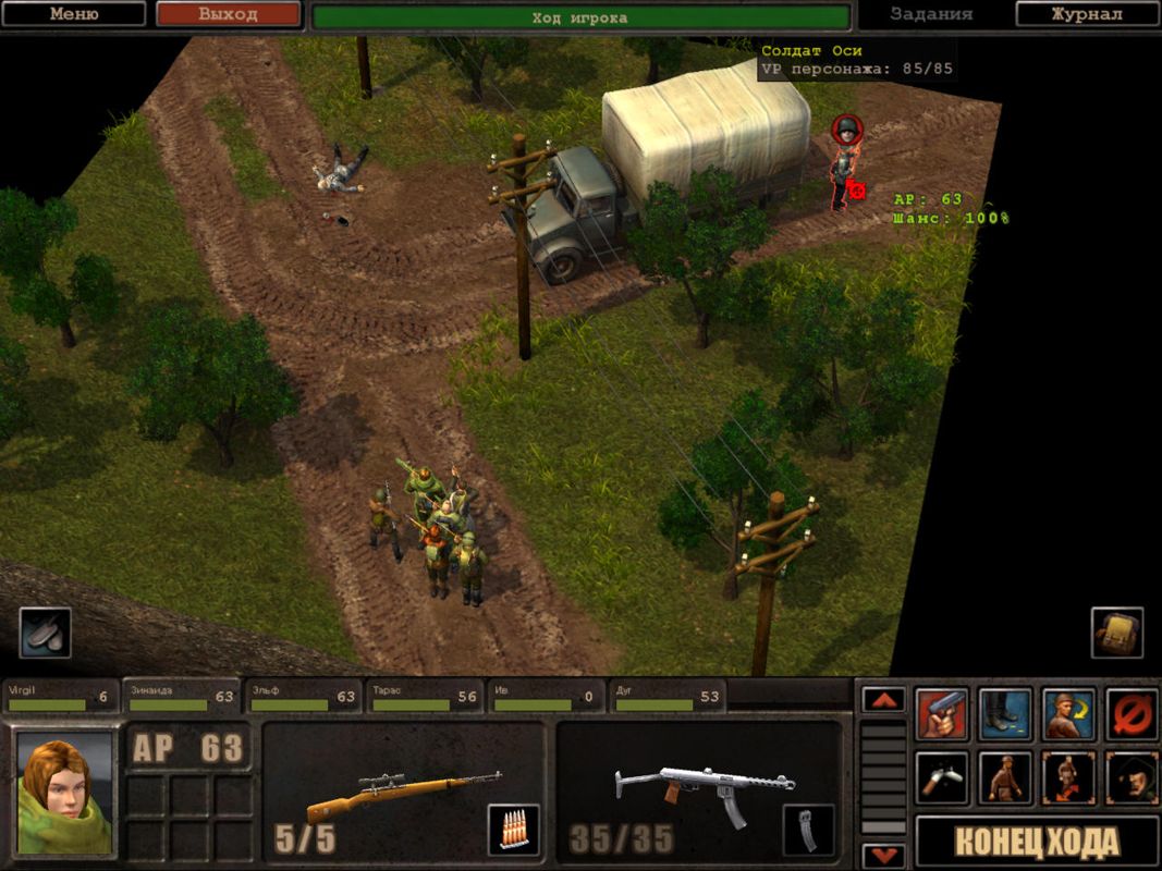
208682-s2-silent-storm-windows-screenshot-one-of-the-random-encounters.jpg


An "artist" knows where and how to use colors. And honestly, the palette is fine in that image without the maxed out saturation.
 

VonVentrue

Cipher
Patron
Joined
Jul 16, 2007
Messages
814
Location
HPCE
Divinity: Original Sin Wasteland 2
the whole "desaturation needed, not dark or gritty enough" attitude on display here is simply ludicruous, to say the least.

"hurr colors that means it's art"

Of course. And once again we learn that there's only two options: that or grim dark. There can't be anything in between.
And then the same fucktards laugh at World Of Warcraft or Facebook games for being overly colored.

You certainly seem to be keen on using hyperboles as foundations for your arguments...

"Hurr durr it's not gray, brown and gritty, so it's enough to draw comparisons to WoW's art style!"

See? Posting nonsensical bullshit is fun!
 

FeelTheRads

Arcane
Joined
Apr 18, 2008
Messages
13,716
You certainly seem to be keen on using hyperboles as foundations for your arguments...

"Hurr durr it's not gray, brown and gritty, so it's enough to draw comparisons to WoW's art style!"

See? Posting nonsensical bullshit is fun!

I'm sorry, you're right. Your "desaturation needed, not dark or gritty enough" jab was much more level headed. Because if I don't like that I obviously want "piss filter" and "grim dark".
 

Twinkle

Liturgist
Joined
Sep 14, 2009
Messages
1,426
Location
Lands of Entitlement
Looks surprisingly good, especially considering such an early stage of development. Oversaturation is definitely a problem, not because "too cartoony", but due to it taking away details. They have more than enough time to tweak overall palette, though.

have as much detail as say something like Fallout 3

3D Failouts are some of the ugliest shit I laid my eyes upon. Keep that crap away from Wasteland.
 

Outlander

Custom Tags Are For Fags.
Patron
Joined
Nov 18, 2011
Messages
4,542
Location
Valley of Mines
Divinity: Original Sin Wasteland 2 Steve gets a Kidney but I don't even get a tag.
There's no point in complaining about other people's complaints. Some will like it, some will not, big fucking surprise.

For me the art looks a tad too cartoonish and the colors a over saturated, but anyway I'm more interested in how it will play.
 

Gwendo

Augur
Joined
Aug 22, 2004
Messages
990
Ignore some "artifacts" due to poor amateurish photoshop editing, but I would prefer to play with this color palette:

G6nFA.jpg
 

Tolknaz

Augur
Patron
Joined
Dec 21, 2008
Messages
479
Location
Estonia
Divinity: Original Sin Project: Eternity Torment: Tides of Numenera Wasteland 2
3D Failouts are some of the ugliest shit I laid my eyes upon. Keep that crap away from Wasteland.
I was talking about the amount of detail, not aesthetics, since that was what cpt. obvious was complaining about. As for aesthetics, NO Fallouts should be taken as a direct inspiration for the graphics in my opinion. The graphics in the original were obviously too sparse to convey this, but did anyone actually read any of the text descriptions etc? I always got more of a comic book, over the top vibe from this game. Fallouts were much more serious.
 

Stabwound

Arcane
Joined
Dec 17, 2008
Messages
3,240
The original shot looks too cartoony, but some of the altered ones look pretty damn good.

I think this is going in the right direction other than the color palette itself, which isn't hard for them to change.
 

Radisshu

Prophet
Joined
Jul 16, 2007
Messages
5,623
Let me be the first.........


ohohoooh ehehehehe hahahahahh h


LOOKS LIKE TOTAL SHIT, i can't believe you tards are fapping over this cartoon-flash-80's kiddie show shit. Can't believe Fargo would botch this one so bad.


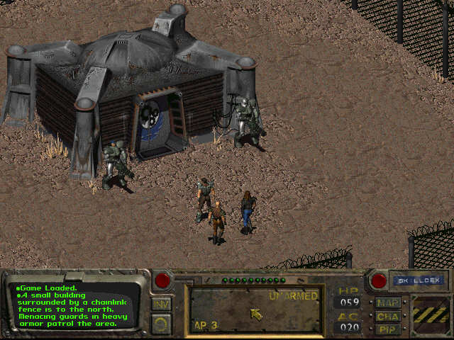
fallout.jpg


Colors bitch, colors. Since when the fuckin wasteland shines like dog balls on the sun?


I WANT TO SEE APOLOGISTS DEFENDING W2 BECAUSE THEY HAVE FAITH AND SPEND JEWGOLDZ ON FARGO :lol:. THE TRUTH IS YOU WILL GET FACEBOOK INTEGRATED INTO THE RANGER-COMM AND SHINY WASTELAND WITH PG 3 RATING OLOLOLOLO. YOU WILL ALL WAKE UP IN 2 MONTHS WITH A FAT COCK IN YOUR MOUTH AND A SIGN OVER YOUR HEAD 'LOOSERS'.


BUTTHURT MUST FLOW.
It's Wasteland, you stupid fucker, not Fallout.
 
Repressed Homosexual
Joined
Mar 29, 2010
Messages
18,011
Location
Ottawa, Can.
With that I think the main cause of complaints are having color spots that overtake texture visibility and clarity, which gives the colors the feel of a lighting overlay and not as part of the textures.

The textures exemplify this with their current lack of detail. Remember that I say this not because I want more detailed textures, but that's how these factors are working against each other.

take this screenshot from the sherwood game for example:
ss_54222454b1c2cd92d0c5eb1b0f4afe054c62d652.1920x1080.jpg


Because of the strong and crisp scene detailing the presentation doesn't get lost or overpowered in the equally strong colors. Balance. The result: Very pretty stuff.

Pretty much exactly what I was about to say.

It still looks decent, but there's room for improvement, especially in regards to color saturation.
 
Joined
May 6, 2009
Messages
1,876,730
Location
Glass Fields, Ruins of Old Iran
I wish FTR's balls would just drop already, this brattish confrontational attitude abut everything and everyone is annoying as hell

This does not compute. Are they specifically targeting iOS first and PC second, With this setup it sure looks that way. Minimal efforts with textures and details is what I am seeing.

Looks fine for a barebones "this is the feel we're going for" first screen, I think. Filling the screen with little things would be more impressive, but eye candy shouldn't be a priority at this stage.
 
Joined
May 2, 2012
Messages
532
I must confess I'm not a huge fan of the 'bright' look either but as others have already said the proof of the pudding will be in how Wasteland 2 plays.

As a vaguely-related aside, the game that nailed the future wasteland look for me? None other than:

MCG6.jpg


Still an all-time favorite. I wish they'd stick it on GOG.

[Edit: And approximately 30 seconds later the Wasteland 2 look is beginning to grow on me on further perusal of the screenshot.]
 

ghostdog

Arcane
Patron
Joined
Dec 31, 2007
Messages
11,158
With some desaturation it will look ok. We knew from the start that this wasn't going to be 2D ( :( ) and given the small amount of development time, I don't think anybody was expecting anything special visually.
 

mbpopolano24

Arbiter
Joined
Feb 26, 2012
Messages
183
Characters are too small... looks like shit.... I am asking for a refund....:rpgcodex:
 

As an Amazon Associate, rpgcodex.net earns from qualifying purchases.
Back
Top Bottom