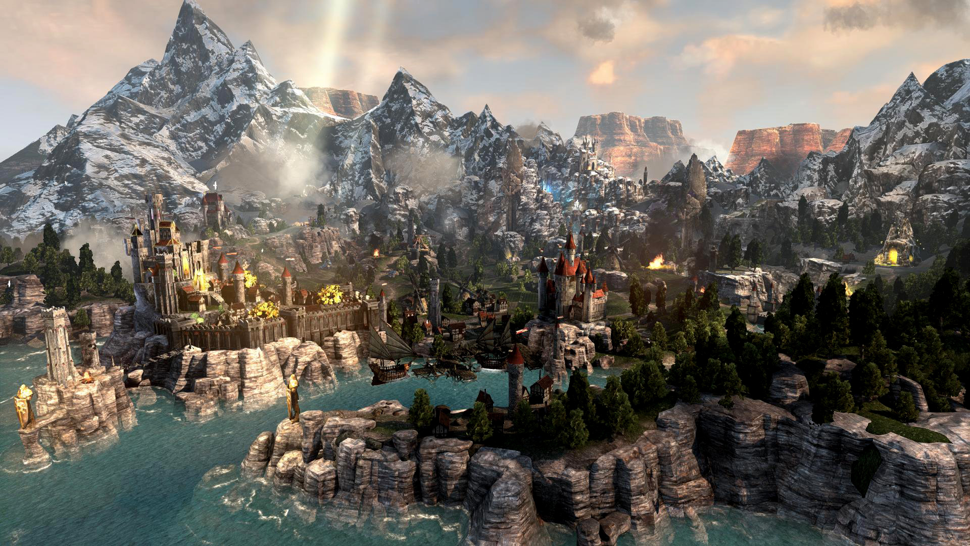
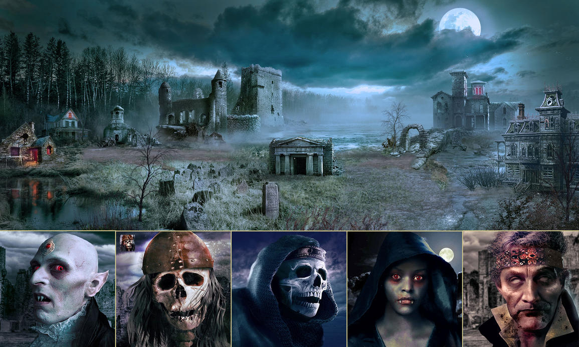
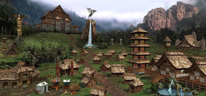
There, classic Rampart next to that homoerotic shit is the perfect representation of what magnitude of rape HoMM had to endure over the years.
"since the discussion thread is pretty much on fire right now with people flaming people for weird reasons i've decided to analyze why H3 does a much better job with presenting their towns then h7 does. buckle up.
Let's start with the current hot-topic, Rampart/sylvan.
this is H3 rampart. How is this picture composed and why do people find it one of the better town screens? well, look at the composition of the picture. first of all, colours. what colours are there and how are they used? it isn't a rainbow or explosion of different colours, but rather it's a collection of earthy browns and greens with some earthy gold and white thrown in. Colours chosen are harmonious with each other, they work together and they don't clash. With subdued browns and greens, there are no strong reds or blues to distract the eye and attention is guided through lighting and objects instead.
there is also the placement and shape of buildings and terrain that helps in making the screen memorable. There are six zones*: left and right fore- mid and backgrounds separated by the pegasus dwelling between left/right and mage guild/tavern for fore/midground and grail/homestead for mid/background. This means every building can be put in any of these zones and navigating becomes easier. Centaurs? left foreground. castle? Left background. Unicorns? right background.
*can be made into 9 zones if you add a central column between pegasus and mage-guild
Where buildings are situated on this grid also impacts what they look like with small, unassuming dwellings and buildings being put in front or in the middle and large, noticeable (literal) mountains being put in the background where their size won't get in the way since they're further away yet retain a large and imposing feel. For example, the dragon dwelling is a huge building, massive even but doesn't take up much space at all since it's in the background. It's still huge and has some impressive presence despite being the same size as the stables. Speaking of the stables, it was put in the front making it larger than it otherwise would be, allowing us to see it notice it easily despite being a rather small and unassuming building and this is fine. We know it's not a huge building while we know the cliffs are massive due to the different locations in relation to the viewer.
The heroes 7 sylvan does none of that.
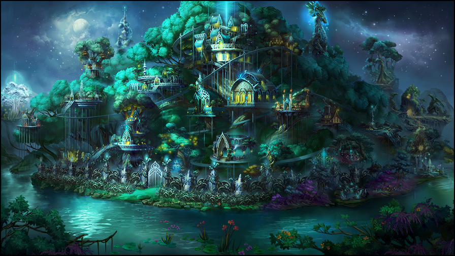
This is not an ugly picture, quite the contrary it's rather pretty. However it's also a giant mess. First of all, what is the primary colours used here? It's teal and while there isn't any strong red, there is plenty of vibrant yellows that distracts the eye, making the picture hard to really focus on. The yellows are too strong and bright with relation to the rest of the rather dark and subdued hues of the screen. The eyes can't focus on one thing at a time but are constantly moving around the different splats of yellow and bright, glowing teal around. There is also no real effort put into guiding the eye through lighting since the brightest part is the moon away from where you should want the player to look.
Building placement is even more of a giant mess. Remember how H3 had the town divided up in different zones? H7 has all the towns in one, big pile with no real dividing. Everything is in that big, teal lump in the middle. The buildings are also all rounded/oval in shape and take up just as much space with no regard for importance or impact of the buildings. in fact, the dragon dwelling is a small platform in the background with a shallow, glowing cave the size of the hunting lodge, taking distance in mind. can you guess where you get treants? It's not the big, white tree to the left, it's the big, normal tree to the right that's a bit behind the rest of the stuff. Foreground doesn't fare much better since there pretty much isn't one, it's all in thhe background meaning every building looks small and unassuming, not helped by every building being designed small and unassuming in the first place.
it's a dysfunctional, pretty mess.
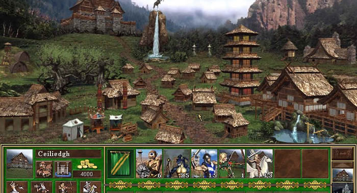
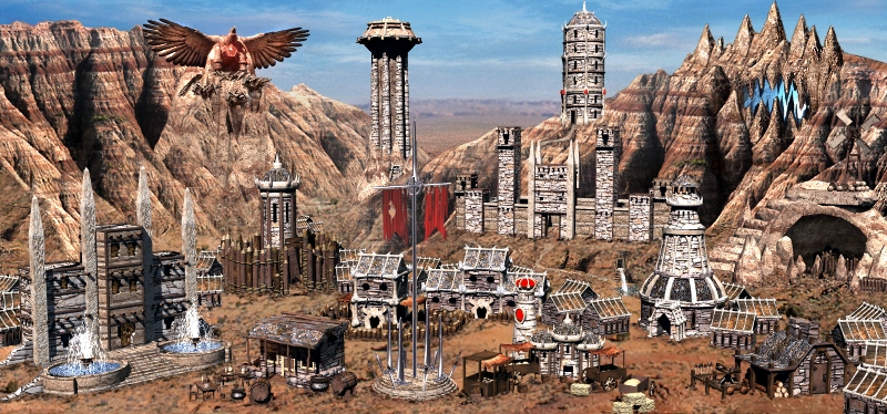
I'd like to bring forth the best (factually i might add) town screen in the franchise: H3 stronghold:
Bright browns and beiges, clear foreground with smaller, unassuming buildings, background with grand, architectural achievements and use of lighting and shapes to lead the eye to dwellings and buildings without being distracting.
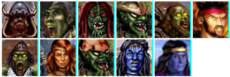
Compare it to the H7 stronghold and try to see what that one gets wrong" -
kiryu133


