Putting the 'role' back in role-playing games since 2002.
Donate to Codex
Good Old Games
  • Welcome to rpgcodex.net, a site dedicated to discussing computer based role-playing games in a free and open fashion. We're less strict than other forums, but please refer to the rules.

    "This message is awaiting moderator approval": All new users must pass through our moderation queue before they will be able to post normally. Until your account has "passed" your posts will only be visible to yourself (and moderators) until they are approved. Give us a week to get around to approving / deleting / ignoring your mundane opinion on crap before hassling us about it. Once you have passed the moderation period (think of it as a test), you will be able to post normally, just like all the other retards.

KickStarter Mechajammer (formerly Copper Dreams) - cyberpunk RPG from Whalenought Studios

SausageInYourFace

Codexian Sausage
Patron
Joined
Dec 28, 2013
Messages
3,858
Location
In your face
Divinity: Original Sin 2 BattleTech Bubbles In Memoria A Beautifully Desolate Campaign Pillars of Eternity 2: Deadfire Steve gets a Kidney but I don't even get a tag. My team has the sexiest and deadliest waifus you can recruit. Pathfinder: Wrath
It's still a shit analogy. Not everyone feels the same way about the importance of the visual style, while I doubt you'd find many who'd be satisfied with art deco Mona Lisa as long as the frame is solid. Did you really back it for the visuals only?

Dude, you really wanna nail me down on the accuracy of this fucking Mona Lisa analogy while pretending you don't get the gist of my argument? I made a couple of posts now, if you don't get, I can't express myself more clearly.
 

Merlkir

Arcane
Developer
Joined
Oct 12, 2008
Messages
1,216
It's not even just colours vs. drab for me, I'm confused about the game's tone.

Originally it looked like Deus Ex, or Syndicate. Now it's...what? Borderlands? That style could be used for cyberpunk, sure, but the screenshots really have ALL the colours. Not a single moody dark street to be seen, it's ALL neon. Is the game funnier now?

I'm just not seeing the conspiracy and opression and techno despair.
 

Strange Fellow

Peculiar
Patron
Joined
Jun 21, 2018
Messages
4,259
Steve gets a Kidney but I don't even get a tag.
Alright, take it easy SausageInYourFace . I'm surprised at how many people here feel so betrayed by a change to an indie game's graphics, but that's your prerogative.

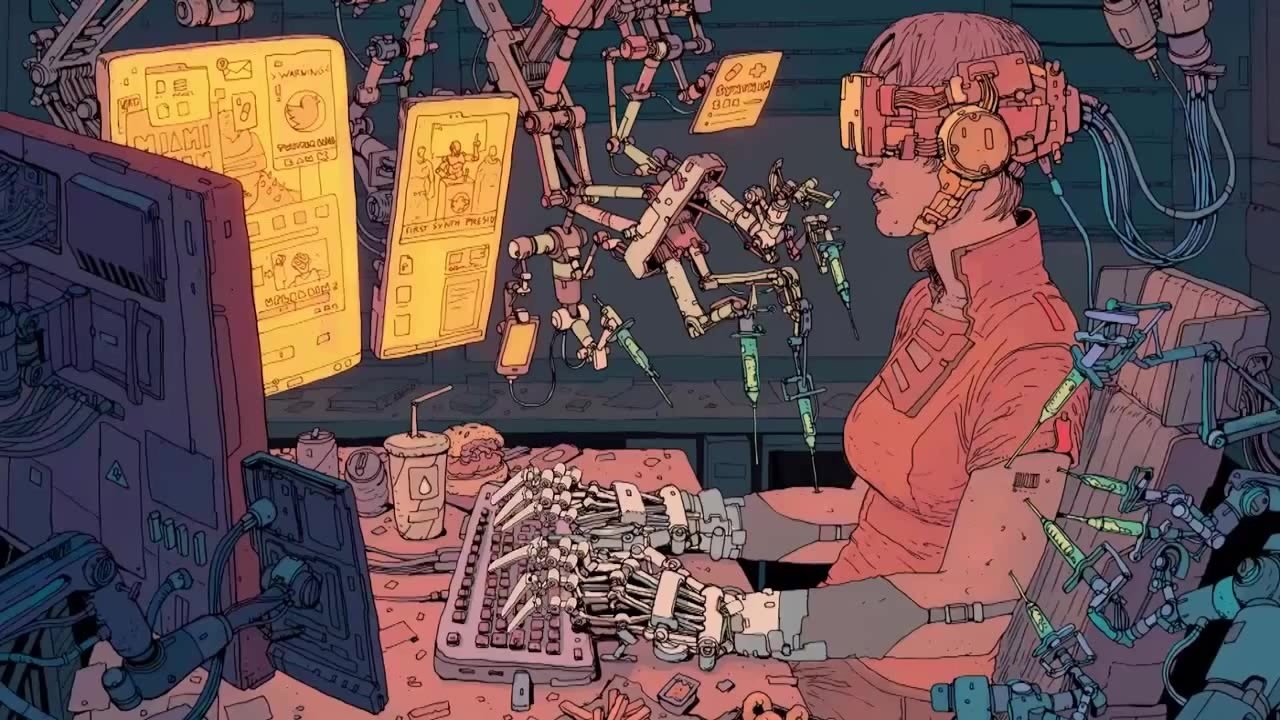
^It reminds me of those visually busy narrative-focussed comics I'd read when I was a kid. People have posted pictures in this thread. Maybe I'd be more upset if I didn't think it looks good.

I just googled these, don't know what they're from, but stuff like this:
big_1471519061_image.jpg

6042769-img_9022.jpg

FoolishWigglyIndochinesetiger-size_restricted.gif

\/ and that one
 
Last edited:

The Fish

Arcane
Joined
Feb 25, 2014
Messages
1,216

A style like this won't be well realised in 3D any time soon but if they really want to go for this look then they need to be more strict with their colour palette. There's too much bright saturated green and red, and the controllable character in the gifs was too dark. They should stick to one dominant hue and be far more careful when adding saturated colours. If they want variance then they should make different locations differently coloured but keep each individual area limited to two or three colours, even if it makes the NPCs look like doppelgangers. Of course this might all create problems with readability but whatever.
 
Last edited:

buffalo bill

Arcane
Joined
Dec 8, 2016
Messages
1,072
I just googled these, don't know what they're from, but stuff like this:
big_1471519061_image.jpg

6042769-img_9022.jpg

FoolishWigglyIndochinesetiger-size_restricted.gif

\/ and that one
Not 100% sure about the first two, but I'd guess Hard Boiled and Moebius. Third is definitely Akira.

BTW, the art in Hard Boiled was inspiration for art in the original Fallout. I'd say the new Copper Dreams gfx gets closer to the images in Hard Boiled than Fallout did, except maybe for the excellent death animations of course.

Here's one that's definitely from Hard Boiled:
4b0b8d6c26b29eea7b99ca6ad8bd06a8.jpg
 

Lacrymas

Arcane
Joined
Sep 23, 2015
Messages
18,917
Pathfinder: Wrath
Fundamentally changing aspects of the game after it has been kickstarted sets a bad precedent. What's stopping them changing whatever they want now? It's not really about who likes it or not, that is always going to be divisive on all topics ever. Some people like to say that the aesthetic is not a fundamental thing, but it is. Like it has been pointed out, it sets the tone. Was there never a concrete tone or any writing done before this? Or is the writing and tone not going to change, regardless of the aesthetic being a bad LSD trip? If the tone is indeed going to change, now we've changed 2 fundamental things about the game. If the original idea was dystopian corporate espionage or whatever, but is now a high camp satire alla Evil Genius (it kinda looks like it actually, just worse), it's starting to be a bit like a middle finger to backers, if it wasn't already.
 

gaussgunner

Arcane
Joined
Jul 22, 2015
Messages
6,159
Location
ХУДШИЕ США
They've changed more than the art style and tone. They've been dicking around with respawn mechanics, combat mechanics, basic movement mechanics, hitpointless wound systems, extra cyber limbs. But at least it's still cyberpunk.
 

gaussgunner

Arcane
Joined
Jul 22, 2015
Messages
6,159
Location
ХУДШИЕ США
I agree completely. Not only are these late design changes unfair to backers, they're simply irresponsible.

Are you a backer? Let's take this discussion to the backer forums.

Fuck no. Not even once. This bullshit happens more often than not on Kickstarters.

Maybe they don't have a legally enforceable obligation to deliver what they promised. But they should, unless they want to work at Starbucks for the rest of their lives.
 

Hobo Elf

Arcane
Joined
Feb 17, 2009
Messages
14,163
Location
Platypus Planet
I was probably one of the few people who actually liked the PS1 aesthetic. This new style is kinda cool too, but it's weird that they're still changing the aesthetic for their game and not really communicating about it to their backers. Reading the past few pages it seems like this game is still in some kind of development hell as they aren't able to figure out what they want this to be both aesthetically or mechanically. Glad I didn't back it.
 

grimace

Arcane
Joined
Jan 17, 2015
Messages
2,104
Reading the past few pages it seems like this game is still in some kind of development hell as they aren't able to figure out what they want this to be both aesthetically or mechanically.

Shit posters gonna shit post.

Best to read the Kickstarter update for yourself. The design element that has been improving with each iteration is the visual aesthetic.

The PS1 visual aesthetic was proof of concept for the gameplay.
 

Lacrymas

Arcane
Joined
Sep 23, 2015
Messages
18,917
Pathfinder: Wrath
I just googled these, don't know what they're from, but stuff like this:
big_1471519061_image.jpg

6042769-img_9022.jpg

Except these have 2-3 predominant colors and not the entire rainbow and all its shades with the saturation set at maxxorzzz. They also aren't neon, but washed out and have harsher lines between objects. I don't care much that they've changed it (even though I backed it for other reasons), but it does indeed look terrible and not aesthetically justifiable on its own.
 

Grauken

Arcane
Joined
Mar 22, 2013
Messages
13,335
Reading the past few pages it seems like this game is still in some kind of development hell as they aren't able to figure out what they want this to be both aesthetically or mechanically.

Shit posters gonna shit post.

Best to read the Kickstarter update for yourself. The design element that has been improving with each iteration is the visual aesthetic.

The PS1 visual aesthetic was proof of concept for the gameplay.

I don't give a shit about their process. They asked for money to make Copper Dream. Now they make LSD Trip. Not what I gave them money for
 

ArchAngel

Arcane
Joined
Mar 16, 2015
Messages
21,592
Reading the past few pages it seems like this game is still in some kind of development hell as they aren't able to figure out what they want this to be both aesthetically or mechanically.

Shit posters gonna shit post.

Best to read the Kickstarter update for yourself. The design element that has been improving with each iteration is the visual aesthetic.

The PS1 visual aesthetic was proof of concept for the gameplay.

I don't give a shit about their process. They asked for money to make Copper Dream. Now they make LSD Trip. Not what I gave them money for
LSD Dream. It is still part of the game you KSed :P
 

Merlkir

Arcane
Developer
Joined
Oct 12, 2008
Messages
1,216
I'm ok with changes, I'm not attached to the Deux Ex Lite look, but I:

1) want to know if they're in trouble
2) want to generally know what the game is now (as I said, I'm a bit lost in the iterations)
 

gaussgunner

Arcane
Joined
Jul 22, 2015
Messages
6,159
Location
ХУДШИЕ США
I love it how non backers are telling us backers how we should feel. Why don't you just fuck off?

Dude. I'm just a fan saying how *I* feel. Don't tell me I have to prepay for vaporware for my opinion to count. I will buy this game whenever they finish it, IF they finish it and I like the final product.

I don't know if the devs listen to non-backers but I've seen them in this thread. They should know that there are people like me waiting to give them our money if they deliver a good game and not a goddamn modern art project. But whatever they do I have no hard feelings against them, unlike you backers suckers.

Suckers for kickstarter. Worst thing ever.
 

ArchAngel

Arcane
Joined
Mar 16, 2015
Messages
21,592
I love it how non backers are telling us backers how we should feel. Why don't you just fuck off?

Dude. I'm just a fan saying how *I* feel. Don't tell me I have to prepay for vaporware for my opinion to count. I will buy this game whenever they finish it, IF they finish it and I like the final product.

I don't know if the devs listen to non-backers but I've seen them in this thread. They should know that there are people like me waiting to give them our money if they deliver a good game and not a goddamn modern art project. But whatever they do I have no hard feelings against them, unlike you backers suckers.

Suckers for kickstarter. Worst thing ever.
You and others did more than just say how you feel. Non backers have zero right to complain how the game was pitched and changed during these years. All you can really rightfully comment on is how it is now and what you want from it at release.
 

Fenix

Arcane
Vatnik
Joined
Jul 18, 2015
Messages
6,636
Location
Russia atchoum!
My ONLY concern is if I'll get a headache from playing it, like it was in Dark Souls...
How big strain on the eyes will be?
The rest didn't really matter.
 

grimace

Arcane
Joined
Jan 17, 2015
Messages
2,104
May 12, 2016 Project launched


We’re so excited to be back on Kickstarter with our new game, Copper Dreams! It's an isometric, party-based, turn-based, pen-and-paper-inspired game in a dystopian cyberpunk setting. Think an isometric Escape from New York, or Deus Ex.


[Personal note - does not explicitly state this is the art style.]

https://www.kickstarter.com/projects/1649838104/copper-dreams


Art Style & Lighting System
79d83024e2d9268031115627c8049c4b_original.png

While the art is still in alpha, we've been adjusting it to look better from our higher-up perspective. We didn't have a style in mind for Copper Dreams when we started with it, the ruleset began everything, but we knew we needed it to be 3d early on due to how combat functioned within the environment and how we wanted exploration to work.

We originally had 2d models on the 3d background which was neat but caused a visual ordering nightmare and looked out of place as we added more tangible lighting. We opted for what we knew and had a low texture pixel art style for the models. This is what we had shown during the Kickstarter campaign.

As we put more levels together we were finding the distance of the camera and the low-texture sizes wasn't working well together. Due to the nature of the unfiltered textures, the distance caused jittery effects as the camera moved, which was disorienting and obnoxious. As a result we moved toward a slightly more smoothed out style that wouldn't be a distraction on gameplay. The pixel art style was also hampering design decisions like how intricate models could be or how effects should look with it — it was essentially creating problems with where we were trying to take the art.

https://www.kickstarter.com/projects/1649838104/copper-dreams/posts/1716283

"We didn't have a style in mind for Copper Dreams when we started with it"
Oct 23 2016


Grotesque

±¼ ¯\_(ツ)_/¯
Patron
Vatnik
Joined
Apr 16, 2012
Messages
9,415
Divinity: Original Sin Divinity: Original Sin 2
"Heya!

Here, this our game we want you to back on kickstarter.

You can't play any demo, the mechanics are still in development... but don't fret!!
This is how the game looks like and read some backstory to get a feel of the game and make some kind of semi-informed decision when I am sure you'll spend money on it!

What you say? You've read me saying that this art style is not set in stone?
You've got that right! You're one scrutinous motherfucker!
We didn't have/had a style in mind for the game when we start/started with it.

We also don't have a release date for ya but be sure that all that time will be invested in NOT changing the art style more than 7 (seven) times.
Thank you for your attention and now go and hit that pledge button with confidence!"


-- The next kickstarted game that has this kind of rhetoric has a sure pledge from me because imbeciles on rpgcodex told me so... :)
 
Last edited:

As an Amazon Associate, rpgcodex.net earns from qualifying purchases.
Back
Top Bottom