-
Welcome to rpgcodex.net, a site dedicated to discussing computer based role-playing games in a free and open fashion. We're less strict than other forums, but please refer to the rules.
"This message is awaiting moderator approval": All new users must pass through our moderation queue before they will be able to post normally. Until your account has "passed" your posts will only be visible to yourself (and moderators) until they are approved. Give us a week to get around to approving / deleting / ignoring your mundane opinion on crap before hassling us about it. Once you have passed the moderation period (think of it as a test), you will be able to post normally, just like all the other retards.
You are using an out of date browser. It may not display this or other websites correctly.
You should upgrade or use an alternative browser.
You should upgrade or use an alternative browser.
KickStarter Scorn - another Giger influenced horror game released after long developement
- Thread starter Baron Dupek
- Start date
-
- Tags
- bootleg alienz existenz
Zariusz
Liturgist
This game is clearly unfinished, artbook gives so much light about lore and lots of cut content for example at least two removed levels, Tower and Blasted Labyrinth.
- Joined
- Nov 14, 2020
- Messages
- 2,162

I was reading the last couple of pages...
Actually playing the game and as someone who's been influenced by Giger since my teen years, I was ready to shit on some of the usual youtube-watchers...
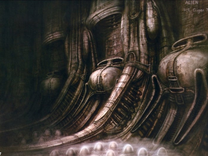
First of all, it's all Giger. No Beskinski, Beksinski had a completely different style.
But... The game is all just aesthetics.
They've replicated Giger to a T, but the substance is missing. The otherworldliness of the art is buried in shitty gameplay design and presentation.
It's hard to describe because Giger's work of art is so monumental, it's impossible to translate. I suppose the makers of Scorn had a different vision.
Stasis+Cayne did it better.
Tormentum was almost perfect. And those games were just approximations of the artstyle.
The first puzzle with the pods in Scorn has an unfathomably shit design.
That's how far I've gotten. I don't know if I want to go any farther. It's made me sad.
luj1
You're all shills

Here's where I object to making a whole game look like HR Giger's stuff. I really liked the guy's style but you if you look at Alien there's a point to it. Not everything looks Gigeresque, in fact most does not, only the alien and strange things do. But when you make your entire game use the style (and worse, make the protag a part of it too) it stops being alien and becomes the norm, the mundane, the overused.
in that vid only the rocks and astronaut suits dont have a giger aesthetic
toughasnails
Guest
But the rest of the movie, the spaceship and especially the routine of its crew shown early on, have a deliberately technical and mundane look. That only accents the utter otherness of the brief glimpse of the alien vessel and makes the alien creature strike you as all the more alien in contrast to the humans and their technical environment.
That movie is such a stroke of genius.
Rean
From what I saw of the second chapter, whish is set in deserty exterior, it contains some clearly Beskinski inspired environments...
As for Tormentum, it's visually great but the story is p "normal" so to say to the point that it didn't really need its particular visuals to tell it. I have the same same problem with the first Dark Seed where the writing and Giger's art don't really need each other, in fact the former takes away from the later. You have utterly otherworldly grotesque environments in the alien world but then the game given p trite SF explanation of them. Add some p typical p&c adventure humor on top of it to make it even worse. The story doesn't need the visuals, the visuals suffer from the story.
Last edited by a moderator:
Zariusz
Liturgist
toughasnails
Guest
I think I wrote this much earlier in the thread but I get the impression that they spent most of this time hunting for investors. Looks like in the end they had to gather what they already had into much more scaled down game in order to actually actually release something.This game is clearly unfinished, artbook gives so much light about lore and lots of cut content for example at least two removed levels, Tower and Blasted Labyrinth.
Black
Arcane
- Joined
- May 8, 2007
- Messages
- 1,873,138
Here's where I object to making a whole game look like HR Giger's stuff. I really liked the guy's style but you if you look at Alien there's a point to it. Not everything looks Gigeresque, in fact most does not, only the alien and strange things do. But when you make your entire game use the style (and worse, make the protag a part of it too) it stops being alien and becomes the norm, the mundane, the overused.
in that vid only the rocks and astronaut suits dont have a giger aesthetic
Because that happens on the alien ship. Most of Alien isn't Giger.
don_tomaso
Liturgist
- Joined
- Jan 9, 2006
- Messages
- 292
That might be the most annoying youtuber I've ever watched, holy shit.
Dayyālu
Arcane
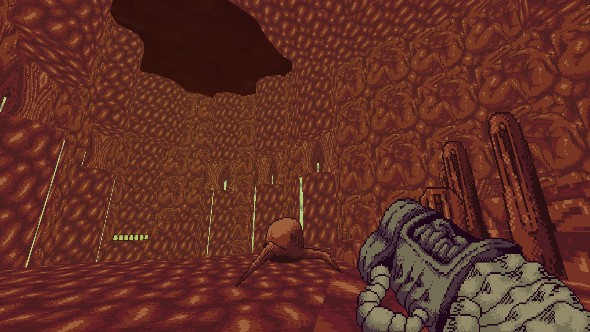
For eight years of development this doesn't look like much. A pal of mine recommended it to me because I like "weird things" but .... seriously, bar the fidelity the same concept was done by some random guy on the Doom mods Shrine I&II.
I can appreciate the art direction (and there are games that live merely by being pretty) but you'll have to check if a guy with a toaster didn't run your same idea years ago with better gameplay.


And the basic Doom gameplay works fine, even if Shrine isn't the best of the lot. Scorn's artbook looks great tho, hope someone uploads it somewhere.
I can appreciate the art direction (and there are games that live merely by being pretty) but you'll have to check if a guy with a toaster didn't run your same idea years ago with better gameplay.


And the basic Doom gameplay works fine, even if Shrine isn't the best of the lot. Scorn's artbook looks great tho, hope someone uploads it somewhere.
toughasnails
Guest
I'm reading the artbook now. The Tower actually appears visually and conceptually more interesting than the Crater the thematic similarity with which was supposedly the reason why it was scrapped (although I imagine the Crater was also much easier to realize).This game is clearly unfinished, artbook gives so much light about lore and lots of cut content for example at least two removed levels, Tower and Blasted Labyrinth.
El Presidente
Arcane
Game's total garbage, who would've thought that... except for all who played/watched the demo they released years ago and the written was 100% already on the wall back then that this was 100% visuals and 0% substance. Whoever thought the final game would drastically change from that demo isn't paying attention to the game industry.
Watch the longplay on youtube, game's 2h long, shorter than many movies. The ending is completely retarded.
Watch the longplay on youtube, game's 2h long, shorter than many movies. The ending is completely retarded.
- Joined
- Nov 14, 2020
- Messages
- 2,162

From what I saw of the second chapter, whish is set in deserty exterior, it contains some clearly Beskinski inspired environments...
Maybe. I didn't get that far.
I got rid of the game, it seems to be Youtube-review fodder, not the stuff of nightmares it could have been. Not what I was expecting.
I have the same same problem with the first Dark Seed where the writing and Giger's art don't really need each other, in fact the former takes away from the later. You have utterly otherworldly grotesque environments in the alien world but then the game given p trite SF explanation of them. Add some p typical p&c adventure humor on top of it to make it even worse. The story doesn't need the visuals, the visuals suffer from the story.
Ah, yes, forgot about Dark Seed. That game's an insult to Giger, honestly. Cyberdreams should have been too ashamed to put that out, those fucking clowns.
On a more positive note, I'll say that the music in Scorn is top fucking notch. This Aethek guy came out of nowhere, it's some Bosnian apparently? A great honor to be included alongside the likes of Lustmord.
Tagging my dark ambient bro/pro composer infidel.
Check out this awesomeness (11:50 Encapsulated is my fav):
luj1
You're all shills

drone ambient isnt that hard to make
toughasnails
Guest
Good one is. Problem is that so much of it is made to for people to listen in the background rather than for itself (see the ungodly number of hours of drone/ambient compilations and all the streams on yt explicitly advertising itself as something to listen to while working, studying, driving and so on).drone ambient isnt that hard to make
luj1
You're all shills

Good one is. Problem is that so much of it is made to for people to listen in the background rather than for itself (see the ungodly number of hours of drone/ambient compilations and all the streams on yt explicitly advertising itself as something to listen to while working, studying, driving and so on).drone ambient isnt that hard to make
Brian Eno comes to mind
RaggleFraggle
Ask me about VTM
- Joined
- Mar 23, 2022
- Messages
- 1,445
They did rebuild 90% of the game in 2019 or so. The 2017 demo bears only mild resemblance to the final version of that level. Yes, the artbook explains that they had to cut out around two and a half levels during development and damn does it show. The first four acts adhere fairly close to the concept art shown in the book (even accounting for the rebuild), but act 5 clearly suffers from them having to rush it and condense what they had planned to basically half a level from what was intended to be three levels. I find it very frustrating.
Because key content was cut, the end result is that the intended themes of the game, like humanity's relationship with technology, completely go over everyone's heads. None of the story analyses I've seen hit anywhere close to what the artbook explains. They're all surface level and uniformly claim the game is a metaphor for death by childbirth, completing ignoring all the obvious industrial and religious elements. So obviously the devs failed at conveying their intended message. Not surprising, since they were extremely ambitious for what was a new studio's first game.
I think they should have cut out Act 3, and maybe Act 4, in order to focus on the levels they cut because those are obviously much more interesting. Acts 3 and 4 feel like they were only added to provide combat so that the game wasn't dismissed as a "walking simulator", even though classic survival horror combat is outdated af and only alienates most players.
I think a conventional narrative involving dialogue and narration would have massively detracted from the atmosphere of Scorn, but unfortunately it's mandatory nowadays. I guarantee that if a narrator was outright telling players what to think and how to play, along with an in-game map and quest markers telling you where to go, then this game would have a much higher rating even if the combat was still as bad as it was. Heck, if they had just cut out combat entirely and advertised it as a walking simulator then it would probably have a much higher rating. But hindsight is 20/20
According to their website, they're looking for new hires to keep working on Scorn and develop a new IP. I imagine the mixed reception to Scorn is going to make them reevaluate their priorities. If they're smart, they'll release patches that fix the problems (e.g. adding a narrator to tell players what to think and how to play, remove the combat or make it work like CoD) and reintroduce the cut content through free DLC.
RaggleFraggle
Ask me about VTM
- Joined
- Mar 23, 2022
- Messages
- 1,445
It does have shooter elements. They’re easily the worst part of the game and should’ve been removed. A pure walking simulator would ironically have been a better product. Devs shouldn’t be afraid of the walking simulator moniker. Just make a meaty Myst… Cyst? Whatever. Just drop any pretension of combat or enemies and just make a pure adventure puzzle game with art for players to enjoy.Should've just made it a balls to the wall shooter instead of another walking simulator mixed with puzzles.
If the game was a pure shooter, then it would’ve been a complete waste of the premise. It’s supposed to be a gory allegory for humanity’s relationship with technology. Combat is completely unnecessary.
Mary Sue Leigh
Erudite
Basically this
toughasnails
Guest
Eh the violence, either metaphorical or quite literal violence against man and wider nature, is part of that relationship.
If the game was a pure shooter, then it would’ve been a complete waste of the premise. It’s supposed to be a gory allegory for humanity’s relationship with technology. Combat is completely unnecessary.
I can at least see where they tried to go with the combat, making it so slow and viscerally unpleasant (like those finishers where you jam your weapon into creature's throat and slowly, painfully rip its head and kick it away).
RaggleFraggle
Ask me about VTM
- Joined
- Mar 23, 2022
- Messages
- 1,445
I know, but the game already has plenty of that without needing to have combat. The Scorn civilization destroyed their world, exploited their own people for fuel and body parts, tried to achieve higher states of consciousness through Hellraiser-style experiments...Eh the violence, either metaphorical or quite literal violence against man and wider nature, is part of that relationship.
Furthermore, they had to cut out most of the planned second half and rush to the end because they wasted their budget on rebuilding the combat levels (referred to in the artbook as "The Crater") to be bigger and better looking because they were flush with cash after attracting investors. I'll bet Ebb is really regretting that decision now.
I don't really care that the combat is horrible. I avoided monsters as much as possible because I understand what a survival horror is. I'm angry because they blew their budget on it and had to sacrifice the other more interesting areas and mechanics they had planned, such as being able to inhabit a variety of "shells" in the "Polis" (city level) to solve various puzzles, ride tram lines, and turn into a psychedelic tentacle monster that gets to ascend to higher consciousness. Instead we got hours of walking through identical corridors trying to avoid walking acid-spitting tumors.
Lyric Suite
Converting to Islam
- Joined
- Mar 23, 2006
- Messages
- 58,293
So how many of those art fag psuedo-games do we have now? I remember Agony, and i think there was another one too (no, not Succubus, another from a different company that also had knewl art but non-existent gameplay).
Seems to me those people need to learn heavily in one direction. If you gonna have a shooter, go heavily on the shooting. If you want some puzzle/survival/adventure type of game, go there. This trend of stopping half-way so that you end up with mediocre shooting, mediocre puzzles, mediocre walking simulator etc can't just go on indefinitely, can it? It's like they think the art will be sufficient on its own to carry the game but it doesn't seem to work out that way for them.
Seems to me those people need to learn heavily in one direction. If you gonna have a shooter, go heavily on the shooting. If you want some puzzle/survival/adventure type of game, go there. This trend of stopping half-way so that you end up with mediocre shooting, mediocre puzzles, mediocre walking simulator etc can't just go on indefinitely, can it? It's like they think the art will be sufficient on its own to carry the game but it doesn't seem to work out that way for them.


