Putting the 'role' back in role-playing games since 2002.
Donate to Codex
Good Old Games
  • Welcome to rpgcodex.net, a site dedicated to discussing computer based role-playing games in a free and open fashion. We're less strict than other forums, but please refer to the rules.

    "This message is awaiting moderator approval": All new users must pass through our moderation queue before they will be able to post normally. Until your account has "passed" your posts will only be visible to yourself (and moderators) until they are approved. Give us a week to get around to approving / deleting / ignoring your mundane opinion on crap before hassling us about it. Once you have passed the moderation period (think of it as a test), you will be able to post normally, just like all the other retards.

KickStarter Serpent in the Staglands Pre-Release Thread

Whalenought_Joe

Whalenought Studios
Developer
Joined
Apr 11, 2014
Messages
215
Location
Nosgoth
ushas Thanks for the suggestions and mockup! I'll throw the link Hannah's way and we'll see how it goes, we had issues with some serif fonts when we were first looking due to their width and our constrained space — the game feed's limited size in particular. Good thoughts though, we'll try to find some thinner serifs and see how they look.

We got caught up in some city questing and the end-game scenario, but are getting back to finishing up 2.0 material for the next few days, so it should be out this week. To put the font in some new perspective, here's what it looks like with the now solid background on the game feed:
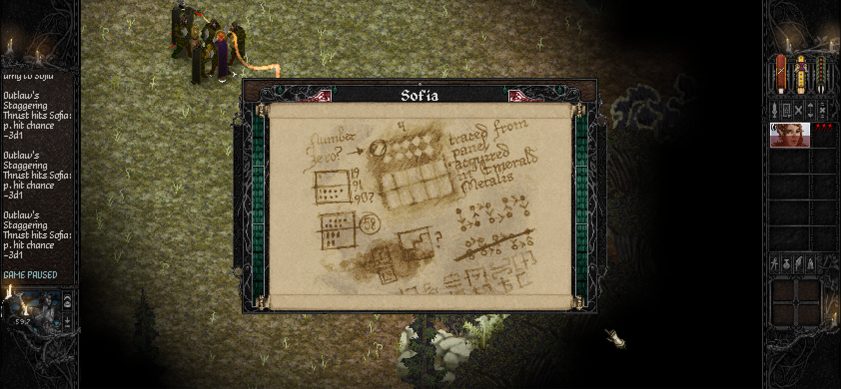
web_09_L.png


We think the solid background helped a bit. We also got manual-resizing working with the autoscaling, so it will pop to 100%,200% or 300% depending on how large you drag it.
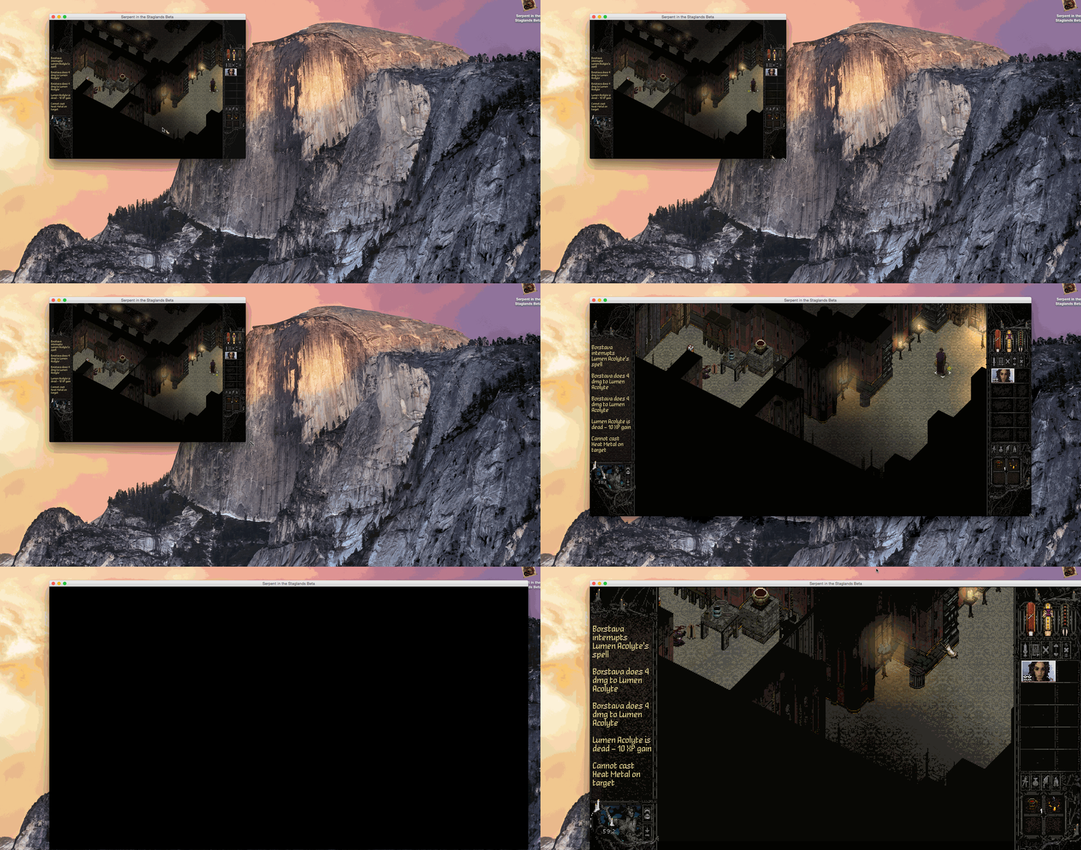
ScalingResolutions.gif


Should fit all screen sizes now without any graphical issues. We had some more info on new 2.0 HUD stuff in a Steam update here:
http://steamcommunity.com/games/335120/announcements/detail/126434068062759379

Do people who backed via the Codex fundraiser get the Beta as well? I am asking because a friend of mine needs to know.

PM me your email and we'll add you to the email list going out for 2.0!
 

ushas

Savant
Joined
Jan 5, 2015
Messages
550
Thanks for the update! The text with solid background looks good.
Definitely didn't want to imply, that you have to change the font completely. It was just for an inspiration. Besides, I take you are making your own font for the game. Which is great.

Just two small points:
-- maybe some adjustments for a text breathing if possible.
(but I don't know how, as one pixel gap between tall letters may look too tiny and two pixel gap too wide...)
-- "ri" looks exactly as "n" (except the dot above i) -> can be confusing.

Btw. It's interesting, both PoE and SitS going completely different directions for the UI layout.
 

Whalenought_Joe

Whalenought Studios
Developer
Joined
Apr 11, 2014
Messages
215
Location
Nosgoth
Thanks for the update! The text with solid background looks good.
Definitely didn't want to imply, that you have to change the font completely. It was just for an inspiration. Besides, I take you are making your own font for the game. Which is great.

Just two small points:
-- maybe some adjustments for a text breathing if possible.
(but I don't know how, as one pixel gap between tall letters may look too tiny and two pixel gap too wide...)
-- "ri" looks exactly as "n" (except the dot above i) -> can be confusing.

Btw. It's interesting, both PoE and SitS going completely different directions for the UI layout.

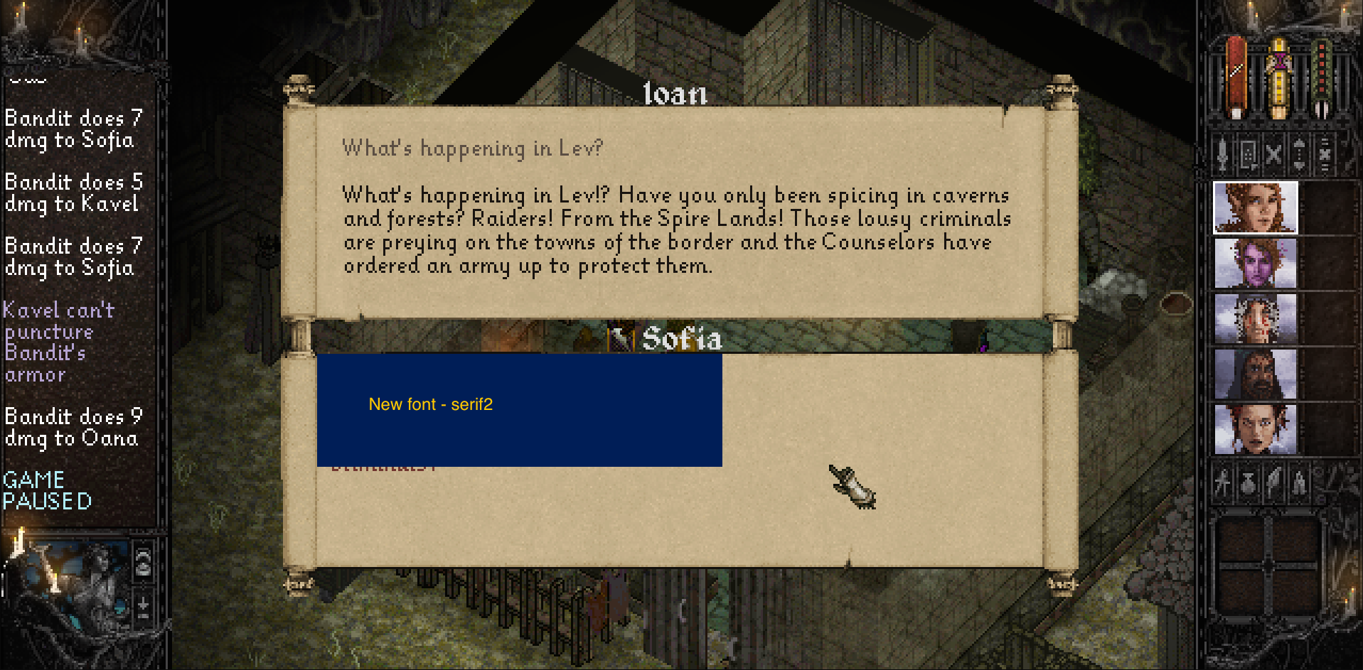
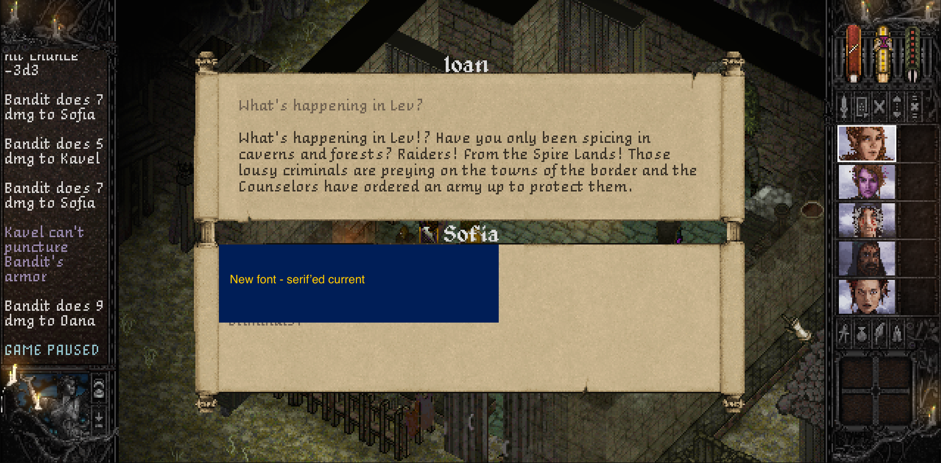
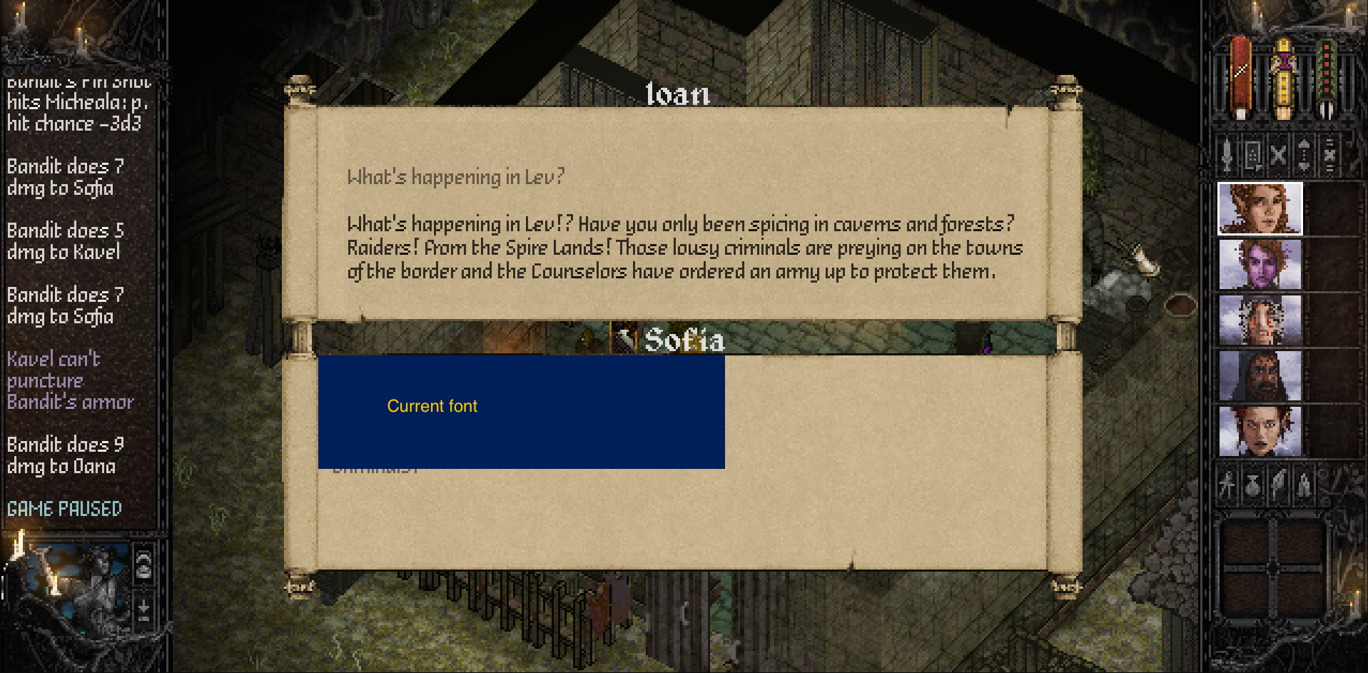
Thanks for the continued help! Attached below are the pictures we sent you earlier. If possible we'd like to see what a consensus is on the text by the prestigious folks here if anyone here has opinions, as the two of us glued to our computers this past year get used to any font we put in pretty quickly. Merlkir you mentioned the font being problematic too, let us know if any of these new options are a step in the right direction. We've included our current one, an updated current with some serifs, and two new ones we found that are a bit wider but more legible. Some work better in the game feed than others, but we'd like whatever we go with to be the same as used for dialogue/menu text.

font1.png

font2.png

font3.png

font4.png
 

Luka-boy

Arcane
Joined
Sep 24, 2014
Messages
1,688
Location
Asspain
I like serif'ed current the most.

Normal serif is probably the easiest one to read, but it isn't as stylish.
 
Self-Ejected

Bubbles

I'm forever blowing
Joined
Aug 7, 2013
Messages
7,817
Serif'ed current looks like a good compromise to me. Serif2 looks too "modern" in the log while the first serif just looks ugly to me.
 

Doctor Sbaitso

SO, TELL ME ABOUT YOUR PROBLEMS.
Patron
Joined
Oct 22, 2013
Messages
3,351
Codex 2013 Codex 2014 PC RPG Website of the Year, 2015 Grab the Codex by the pussy Serpent in the Staglands
serif2 as first choice and and serified current as second choice for me.

In general, if you plan to support multiple aspect ratios and scaling, anti aliasing can have a positive impact.
 

roshan

Arcane
Joined
Apr 7, 2004
Messages
2,499
I like Serif'ed current, easiest of all to read. Serif 2 and the current font are ok. Serif 1 is quite difficult to read though.
 

Zed

Codex Staff
Patron
Staff Member
Joined
Oct 21, 2002
Messages
17,068
Codex USB, 2014
Serif'd current, but I would prefer a straight capital L. I find it more stylized and attractive than serif2, while not being less readable (which is usually the case with stylized fonts in sizes 1-10).

Current font might be better for combat log tho? Looks like it can fill more lines.


The first one, Serif, looks like a print font (like a newpaper font like Times New Roman). Serif2 is too inconsistent – the Ws and Rs sticks out in particular.
 
Last edited:

dukeofwhales

Cipher
Joined
Nov 13, 2013
Messages
423
I like serif2 the most also - but I have no issue reading any of them.

My issue with fonts is all any content provided in all caps - the pixel font and the inherent lack of differences in uppercase letter shape can make anything more than a word or two of content a chore to read.


Things like the inventory text here might be better in lowercase?

IHcY4HZ.gif
 
Last edited:

Zed

Codex Staff
Patron
Staff Member
Joined
Oct 21, 2002
Messages
17,068
Codex USB, 2014
A probable reason why it's all caps is because caps are a lot easier to read in small sizes, and thus allows for more text in smaller areas.

That inventory text box seems to just hit the right size where all caps is advantageous. Not sure though.
I've done several bitmap fonts by hand (lovely hobby) and some lower-case letters are impossible to make readable at small sizes.

It is a little tiring on the eyes to read all caps though, as is switching between reading all caps and "normal" text.
 

Whalenought_Joe

Whalenought Studios
Developer
Joined
Apr 11, 2014
Messages
215
Location
Nosgoth
Serif'd current, but I would prefer a straight capital L. I find it more stylized and attractive than serif2, while not being less readable (which is usually the case with stylized fonts in sizes 1-10).

Current font might be better for combat log tho? Looks like it can fill more lines.


The first one, Serif, looks like a print font (like a newpaper font like Times New Roman). Serif2 is too inconsistent. The Ws and Rs sticks out in particular.

They are similar enough where we may be able to use the two versions of the font, but the noticeable differences might make it a bit jarring. The tighter kerning on the updated serif looks pretty messy unfortunately, but we're only missing out on a line and a half on the game feed with it.

serif2 as first choice and and serified current as second choice for me.

In general, if you plan to support multiple aspect ratios and scaling, anti aliasing can have a positive impact.

Definitely, however the tech we implemented was optimized for scaling the art dimensions perfectly across any size/aspect ratio without any distortion, not the resolution itself, it was kind of a tradeoff there. So more zooming and reshaping the camera bounds than scaling, like blowing up a DOS game. We played around with aliasing and sub pixel rendering on fonts but they all look like a blurry mess at any size that wasn't the smallest unfortunately, I think a few pages back I went into some detail on that.

I like serif2 the most also - but I have no issue reading any of them so.

My issue with fonts is all any content provided in all caps

Agreed, that was the start of all the font changing I think. Since the update that tiny font only exists for individual numbers, like stat number fields. The new one is a little larger so involves a bit more scrolling, but as you say is much easier on the eyes.
 

Zed

Codex Staff
Patron
Staff Member
Joined
Oct 21, 2002
Messages
17,068
Codex USB, 2014
I don't think anyone would strongly oppose any font, but perhaps it would be possible to make an option for what font to use?
 

sser

Arcane
Developer
Joined
Mar 10, 2011
Messages
1,866,881
I liked the first option best. The blurriness/pixelation of the other texts hurts my eyes, but that's probably cause I read too fast.

By the way, I use Georgia font when writing if anyone gives a fuck. It's a pretty nice font for the eyes.
 

ushas

Savant
Joined
Jan 5, 2015
Messages
550
Serif'd current (style + readibility synergy)
current (~fitting pointy fantasy style)
serif2 (conversation is easy to read)
serif (typewriter)

Although, not having problem with any of the fonts, so others provide more valuable input.

I agree with Zed. As you already spent time thinking and implementing different fonts -- perhaps you will consider for the final game to let players choose from a game menu an alternative font. Eg. current and Serif'd current look both already working naturally judging from screenshots. Serifes need some more spacing work, not sure if worth an effort.
 

Photokoi

Learned
Joined
Apr 1, 2014
Messages
114
I liked the first option best. The blurriness/pixelation of the other texts hurts my eyes, but that's probably cause I read too fast.

By the way, I use Georgia font when writing if anyone gives a fuck. It's a pretty nice font for the eyes.
Verdana ftw.
And the font is fine, I think in the end it's just instinctual which one fits better. Plus, I don't think the average consumer (myself) would be so nitpicky.
 

Got bored and left

Guest
Yeah, Serif 2 and Serif'd current are probably best, though it's really hard for me to decide which one I like more. And all of them are totally fine, I think.
 

norolim

Arcane
Joined
Nov 21, 2012
Messages
1,012
Location
Pawland
Serif'ed current closely followed by serif 2. Although, I would probably go with serif 2, because it's a bit tighter than serif'ed.
 

As an Amazon Associate, rpgcodex.net earns from qualifying purchases.
Back
Top Bottom