Putting the 'role' back in role-playing games since 2002.
Donate to Codex
Good Old Games
  • Welcome to rpgcodex.net, a site dedicated to discussing computer based role-playing games in a free and open fashion. We're less strict than other forums, but please refer to the rules.

    "This message is awaiting moderator approval": All new users must pass through our moderation queue before they will be able to post normally. Until your account has "passed" your posts will only be visible to yourself (and moderators) until they are approved. Give us a week to get around to approving / deleting / ignoring your mundane opinion on crap before hassling us about it. Once you have passed the moderation period (think of it as a test), you will be able to post normally, just like all the other retards.

Development Info The Outer Worlds Panel at PAX West 2019 - Come to Halcyon Trailer

Joined
Jan 14, 2018
Messages
50,754
Codex Year of the Donut
It's probably a bit challenging to create any sort of non-contrived "early modern-themed" science fiction setting that doesn't feel at least a bit 1950s-ish because there are crucial elements of modern mass society that don't really exist before that period. For example, how do you do a late 19th century-themed television advertisement? It doesn't make sense for BioShock Infinite-style 30 second kinetoscope animations to still be in use in the actual far future.
 

Duraframe300

Arcane
Joined
Dec 21, 2010
Messages
6,395
Problem is that "I can't believe it's Not Fallout/Skyrim" is what AAA RPGs are now and Cainarsky are ultimately mainstream AAA game developers. So they're just going to pursue their old creative interests in terms of the new AAA structures of the genre.
For me the lesson is that developers who did an interesting and innovative game when they did it for fun will not be "the same developers" when they are working to make the maximum amount of bucks.

While certainly a lot of things are subdued, and I *understand* your argument in a way. Here's the thing as I already said in the other thread:

That's Cainarsky. They have released two settings before this. Fallout and Arcanum. And while those two settings are as different as you can be in their basic idea. Even they were still unmistakingly from the same people and reminded of them. The first time I played Arcanum, before I even KNEW/gave a shit about anything about Black Isle, Troika, Tim and Leonard I constantly thought. *Hey, this is like/similiar* to Fallout.

And the basic idea for Outer Worlds is already a lot closer to Fallout than Arcanum was. Just from the time period alone.

So, you were never going to get anything different and I don't think its fair, at least in this case, to blame Tim and Leonard. Thats how they are, thats their style and some creators just have a distinct style. You will also notice that in how they approach development together, they constantly refrence how and why they compliment each other. Their insistance on *dark humor* as well for example.

What you want would require completly different people in the first place. Not Tim, not Leonard. Someone else with different interests, but the same ability. And sadly that says more about the gaming industry than it says about Cainarsky.
 

AwesomeButton

Proud owner of BG 3: Day of Swen's Tentacle
Patron
Joined
Nov 23, 2014
Messages
17,106
Location
At large
PC RPG Website of the Year, 2015 Make the Codex Great Again! Grab the Codex by the pussy Insert Title Here RPG Wokedex Divinity: Original Sin 2 A Beautifully Desolate Campaign Pillars of Eternity 2: Deadfire Steve gets a Kidney but I don't even get a tag. Pathfinder: Wrath
So, you were never going to get anything different and I don't think its fair, at least in this case, to blame Tim and Leonard. Thats how they are, thats their style and some creators just have a distinct style.
I respect them for their creativity, but that's what I think suffers in this project, I know, I haven't seen it in action yet, and I may be wrong, hopefully I'm wrong!

From what I've seen, I can't make a firm decision if this game will be "been there done that" like the nuFallout/TES games, or it will carry that originality that we associate with Cainarsky.
 

AwesomeButton

Proud owner of BG 3: Day of Swen's Tentacle
Patron
Joined
Nov 23, 2014
Messages
17,106
Location
At large
PC RPG Website of the Year, 2015 Make the Codex Great Again! Grab the Codex by the pussy Insert Title Here RPG Wokedex Divinity: Original Sin 2 A Beautifully Desolate Campaign Pillars of Eternity 2: Deadfire Steve gets a Kidney but I don't even get a tag. Pathfinder: Wrath
It's probably a bit challenging to create any sort of non-contrived "early modern-themed" science fiction setting that doesn't feel at least a bit 1950s-ish because there are crucial elements of modern mass society that don't really exist before that period. For example, how do you do a late 19th century-themed television advertisement? It doesn't make sense for BioShock Infinite-style 30 second kinetoscope animations to still be in use in the actual far future.

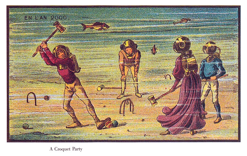
Easy as pie, the style could have been different, if they wanted:
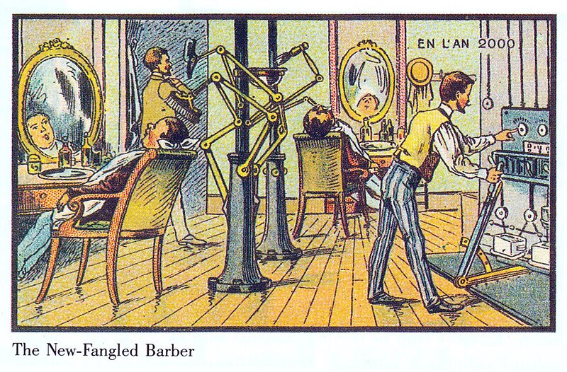
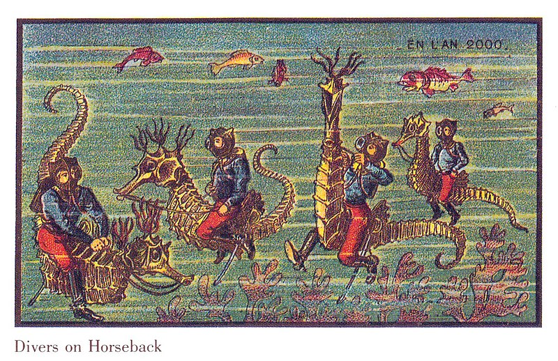
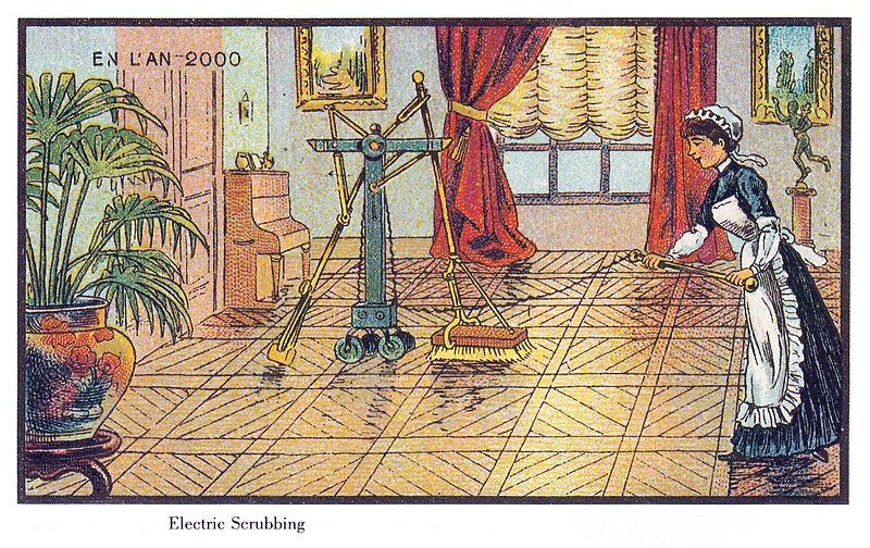
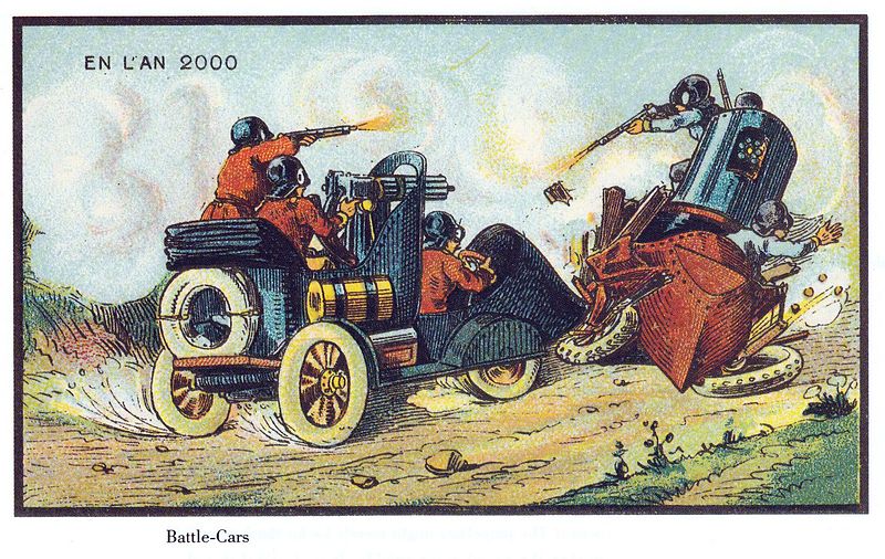
https://publicdomainreview.org/collections/france-in-the-year-2000-1899-1910/

A 19th-Century Vision of the Year 2000


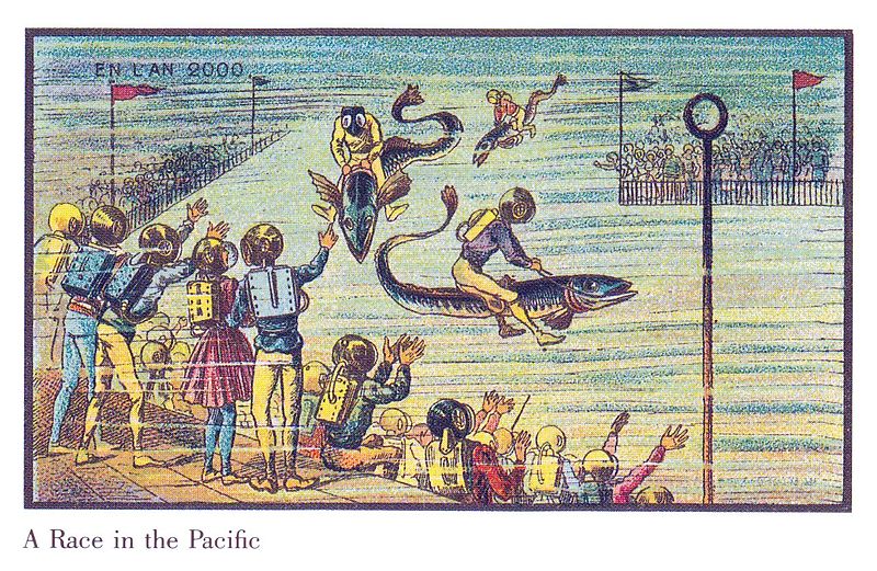
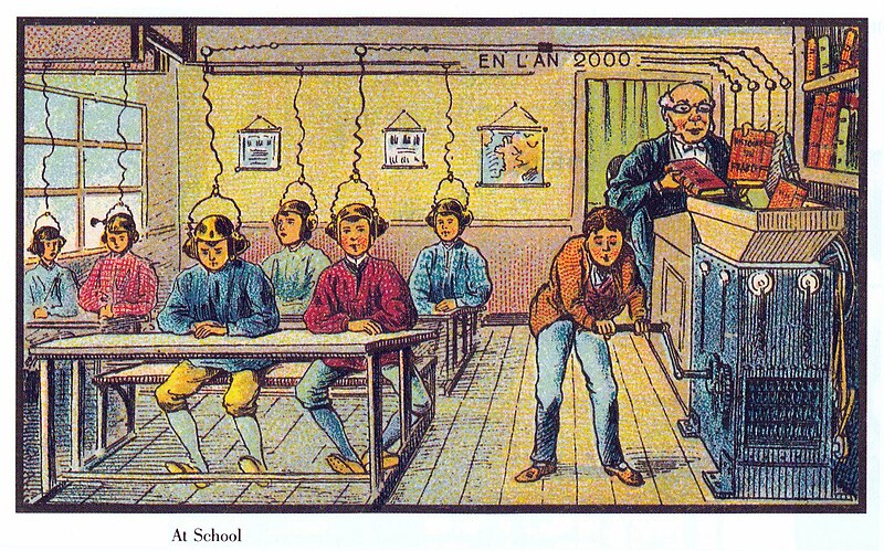
A series of futuristic pictures by Jean-Marc Côté and other artists issued in France in 1899, 1900, 1901 and 1910. Originally in the form of paper cards enclosed in cigarette/cigar boxes and, later, as postcards, the images depicted the world as it was imagined to be like in the then distant year of 2000. As is so often the case their predictions fell some way off the mark, failing to go far enough in thinking outside the confines of their current technological milieu (hence the ubiquity of propellors, not to mention the distinctly 19th-century dress).

There are at least 87 cards known that were authored by various French artists, the first series being produced for the 1900 World Exhibition in Paris. Due to financial difficulties the cards by Jean-Marc Côté were never actually distributed and only came to light many years later after the science-fiction author Isaac Asimov chanced upon a set and published them in 1986, with accompanying commentary, in the book Futuredays: A Nineteenth Century Vision of the Year 2000.


source.png

Housed at: Wikimedia Commons

rights.png
Underlying Work:No Known Copyright| Digital Copy:PD Wikimedia
download.png

Download: Right click on image or see source for higher res versions


800px-France_in_XXI_Century._Barber.jpg


800px-France_in_XXI_Century._Air_battle.jpg


800px-France_in_XXI_Century._Air_cab.jpg


800px-France_in_XXI_Century._Air_firemens.jpg


800px-France_in_XXI_Century._Air_postman.jpg


800px-France_in_XXI_Century._Divers.jpg


800px-France_in_XXI_Century._Electric_scrubbing.jpg


800px-France_in_XXI_Century._Fishing.jpg


800px-France_in_XXI_Century._Flying_police.jpg


800px-France_in_XXI_Century._Furmer.jpg


800px-France_in_XXI_Century._Helicopter.jpg


800px-France_in_XXI_Century._Intencive_breeding.jpg


800px-France_in_XXI_Century._Lacest_fashion.jpg


800px-France_in_XXI_Century._Little_robbers.jpg


800px-France_in_XXI_Century._Race_in_Pacific.jpg


800px-France_in_XXI_Century._Robot_orchestra.jpg


800px-France_in_XXI_Century._Rolling_house.jpg


800px-France_in_XXI_Century._School.jpg


800px-France_in_XXI_Century._Toilette_madame.jpg


800px-France_in_XXI_Century._War_cars.jpg


800px-France_in_XXI_Century._War_plane.jpg


800px-France_in_XXI_Century._Water_croquet.jpg


800px-France_in_XXI_Century._Whale_bus.jpg
 

Tigranes

Arcane
Joined
Jan 8, 2009
Messages
10,350
It's probably a bit challenging to create any sort of non-contrived "early modern-themed" science fiction setting that doesn't feel at least a bit 1950s-ish because there are crucial elements of modern mass society that don't really exist before that period. For example, how do you do a late 19th century-themed television advertisement? It doesn't make sense for BioShock Infinite-style 30 second kinetoscope animations to still be in use in the actual far future.

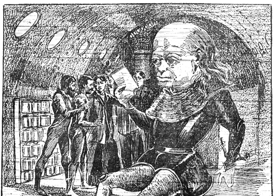
While some of this is true, this shouldn't be oversold. 19th century & early 20th century periodicals have fantastic and hilarious ads that you could use. And folks in that period were already worried, exasperated, and amused by the over-the-top, baseless, ubiquitous nature of advertising. Here's a c1899 French illustration that satirically predicted what advertising might be like in the future:

GvEiAtb.png


Victorian sale of chemical 'medicine', which often ranted about Far Eastern mystics endorsing their mercury mix or something, is easily evocative of even modern day morons buying vampiric mist sprays off goop. Here's a relatively harmless one about Cocaine for kids, and actually an American one:

image.jpg


And I've already posted Mucha, who came to dominate our memories of what fin-de-siecle Paris physically looked like all over the streets, not just in the pages.

More generally, Look at Cote's postcards that AwesomeButton posted. I have copies of these in my bookshelf, as Asimov published them in a small book called Futuredays. Look at, say, the postcard on educating kids through some kind of electric magnetism. It bears all the imprints of the later 19th century fascination with electricity as a possible medium for telepathy, but you can also see it could easily feature in a mid-century cybernetic fantasy about information processing.

So of course there are many echoes and continuities between 1890s and 1950s America, especially in terms of technological fantasies, corporate power-building, and the burgeoning consumer society. So no matter what they did, this was always going to be evocative of Fallout. But what they didn't need to do was have half of your trailer look like it could be in a Fallout mod, have your run & gun gameplay entirely copied from Bethesda games and nuFallouts, and have your environmental assets look more or less like a bombastic version of Fallout with some horrible colour vomit thrown in.
 

Duraframe300

Arcane
Joined
Dec 21, 2010
Messages
6,395
Well, all of those illustrations you guys just posted scream futuristic for the turn of the century.

None of those scream anything space-faring futuristic though. At least not with some serious self and re-interpreation.
Which granted could make for an interesting art-style. But a veeeery involved one involving lots of hard work without anything for a team to really work off on. That was probably out of scope when you have everything else to do as well. (I mean even on Fallout and Arcanum they didn't do remotly that much like they would have to do here)

Otherwise I think they did a decent job on the advertisments at least.

So, can't say I fully agree on your examples.

Would definitly be a great question for Boyarsky though. Petioning Tigranes interviewing Boyarsky.
 
Last edited:

Tigranes

Arcane
Joined
Jan 8, 2009
Messages
10,350
These are all about broad-brush sketches. When a French illustrator draws life in the year 2000 for the World Exhibition in Paris, he's depicting a future with a fairly wide range of styles. When a hypothetical video game uses it as inspiration, it also isn't limited by exactly what they say, but how they thought about the future from the vantage point of their time. This is of course what Fallout does so well with the 1950's. It drew on how the 50's thought of the future, including what that reveals about their own time - and then it added many of its own twists and extrapolations onto it.

This is also, of course, very subjective, with heavy doses of what looks 'cool' to me and what doesn't. So I'm more than happy to have disagreement. There are indeed areas of Outer Worlds that excite me as "oh god this is a 1880s East Coast company transposed into space" - I just want a lot more of it.

It certainly would be fun to hear more from Boyarsky about where he went to for source material, and what he had in mind bringing it all together.

Addendum: we must remember that fantasies about outer space was already popular in the late 19th/early 20th century: the War of the Worlds was only one of many in the period. This was a natural extension of a longer 19th century pattern re. Jules Verne and others. As railroads spanned continents and adventurers sought the Arctic, there was a massive sense of adventure and frontier, but also an acute anxiety that the world was running out of exciting unknowns. So from the Arctic to the deep seas of Nemo to air to space, there was a massive fascination with the newest mysterious frontier to fight and conquer and have cool adventures in. (This argument is made properly in Rosalind Williams' The Triumph of Human Empire.)
Here's a martian prison from 1890s:
003f616f-a8f3-4f1d-a471-31bebb898663.png


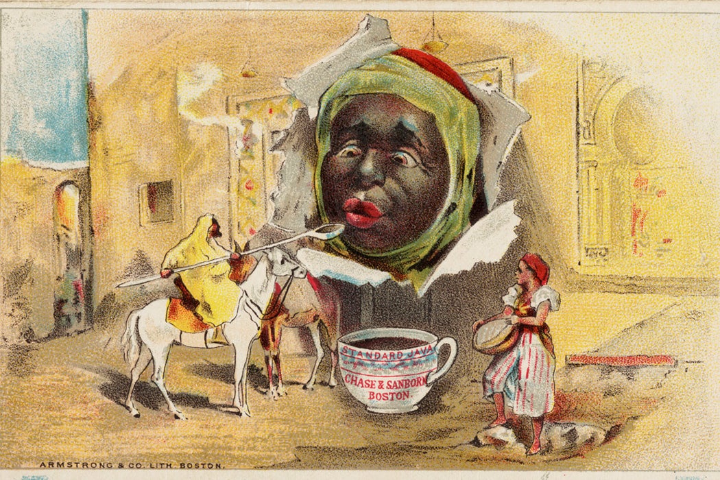
E.g. think about how many ads back then tried to convey a sense of the exotic - here is the mystical substance brewed by Negroes of the Congo, or whatever - to try and excite the white purchasers. This was a pattern as old as colonialism of course, but it would be interesting to consider how that would transpose onto settlers in alien planets advertising lizard soup or whatever.

racism_of_19th_century_advertisements_3.jpg
 
Last edited:

Fenix

Arcane
Vatnik
Joined
Jul 18, 2015
Messages
6,546
Location
Russia atchoum!
When you see that many females on the panel

who looks exactly like how characters looks in game, you understand that they are just translated into product of their creativity how they are living.
Too bad it's sjw scum, sexual deviations and soyboys all over the place - in other words, Cucklifornia.

Also I saw no man there, where the fuck is TK and LB? If those who talking are those who working on the game - yeah, whatever GIRLS, and good luck with resounding success that certainly awaits you.

They made violence seem harmless. What is the fun in that?

That's to dull empathy, same as in Tom&Jerry cartoons. Stab, cut, kill with fun and joy!
 
Last edited:

Fenix

Arcane
Vatnik
Joined
Jul 18, 2015
Messages
6,546
Location
Russia atchoum!
What I really dislike is the coloring post-effect. Looks... bad. I can't pinpoint it, but what they went for doesn't create a nice looking picture, but a mix of over-saturation and high contrast that pushes me away visually.

Belive it or not, I guess it's something tighed to hormones level in devs blood - too much soy for men, too much testosterone for supposd women, as you can see on conference.
I guess that could lead to a very bizzary tastes in everything.
And this is only partially a joke.

For me the lesson is that developers who did an interesting and innovative game when they did it for fun will not be "the same developers" when they are working to make the maximum amount of bucks.

They just got old dude. Oldsters want comfortable rocking chair, warm blanket and warm cup of chocolate. I can't blame them for that. But I won't sing hosanna for that either.
 
Last edited:

Duraframe300

Arcane
Joined
Dec 21, 2010
Messages
6,395
Anyway, I'm just glad that I apparently have lower excpectations and I most likely get what I want from it.

I'm sad for FP (But expected and came to terms with it after how much Tim and Leonard appreaciated how Bethesda brought the Fallout world visually into 3D), I'm sad for the systems (They could do MUCH more, Fallout was a more standard system for a reason, but Arcanum was soooo appropriate for the setting, even if execution sucked) and I do have grievances with the visuals (I'm ok with the artstyle even if I do agree there could have been more, my grievances are more on the technical side).

Overall, I'm ok with it, though. And I'm especially glad that its still visibly a Cainarsky game. Not a tryhard re-interpretation like Pillars, Torment, or whatever InXile has pumped out so far.
 

passerby

Arcane
Joined
Nov 16, 2016
Messages
2,788
I never really care about graphics if at least the gameplay or narrative is good, but looking at this just brings memories about bad trips I had when I was experimenting with LSD and Esctacy when I was still in school. It looks like puke and looking at its colour palette makes me feel some sort of sea sickness, with dizziness and nausea.

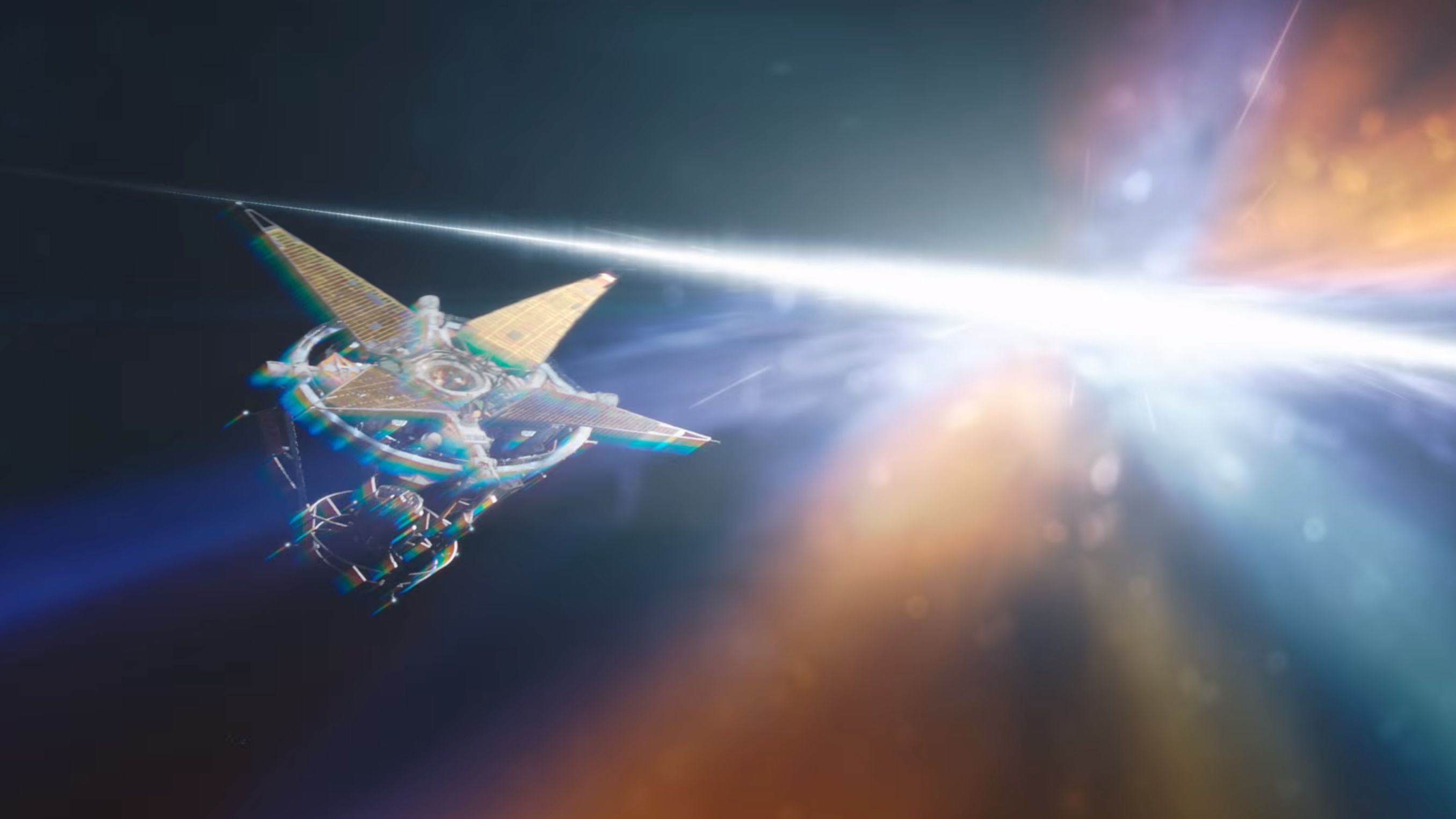
It's called chromatic aberration, current gen bloom equivalent, causes awful blur and very unnatural color shifts, a very intense use in this case, worst I've seen outside of indie trash, or some retarded enb presets.

Hope there will be an option to turn it off on PC.
 
Joined
Jan 14, 2018
Messages
50,754
Codex Year of the Donut
I never really care about graphics if at least the gameplay or narrative is good, but looking at this just brings memories about bad trips I had when I was experimenting with LSD and Esctacy when I was still in school. It looks like puke and looking at its colour palette makes me feel some sort of sea sickness, with dizziness and nausea.

It's called chromatic aberration, current gen bloom equivalent, causes awful blur and very unnatural color shifts, a very intense use in this case, worst I've seen outside of indie trash, or some retarded enb presets.

Hope there will be an option to turn it off on PC.
I could understand the bloom(and it looks good when done tastefully, you don't even notice it's there), but chromatic aberration is just retarded. It's an image defect, it has no reason to be in basically any game sans very specific ones where it fits the narrative created by the game.
 

FreeKaner

Prophet of the Dumpsterfire
Joined
Mar 28, 2015
Messages
6,942
Location
Devlet-i ʿAlīye-i ʿErdogānīye
I never really care about graphics if at least the gameplay or narrative is good, but looking at this just brings memories about bad trips I had when I was experimenting with LSD and Esctacy when I was still in school. It looks like puke and looking at its colour palette makes me feel some sort of sea sickness, with dizziness and nausea.

It's called chromatic aberration, current gen bloom equivalent, causes awful blur and very unnatural color shifts, a very intense use in this case, worst I've seen outside of indie trash, or some retarded enb presets.

Hope there will be an option to turn it off on PC.
I could understand the bloom(and it looks good when done tastefully, you don't even notice it's there), but chromatic aberration is just retarded. It's an image defect, it has no reason to be in basically any game sans very specific ones where it fits the narrative created by the game.

A lot of post-processing effects were initially done to mask bad texture quality and resolution in general, now they are done as "cinematic effects". I love turning them off.
 
Joined
May 31, 2018
Messages
2,863
Location
The Present
It's probably a bit challenging to create any sort of non-contrived "early modern-themed" science fiction setting that doesn't feel at least a bit 1950s-ish because there are crucial elements of modern mass society that don't really exist before that period. For example, how do you do a late 19th century-themed television advertisement? It doesn't make sense for BioShock Infinite-style 30 second kinetoscope animations to still be in use in the actual far future.
You have to step away from exclusively using visual media and go into old radio shows. Mix that with animation from the 1910s, and you'll come up with some authentic.
 

Markman

da Blitz master
Patron
Joined
Dec 31, 2002
Messages
3,737
Location
Sthlm, Swe
Serpent in the Staglands Codex USB, 2014 Shadorwun: Hong Kong
Besides the game itself looking like a Skyrim mod it might turn out decent if they stick to the basic shooter elements.

Cool themed but man, its like they traveled 10 years back in time for those gfx.
 

AwesomeButton

Proud owner of BG 3: Day of Swen's Tentacle
Patron
Joined
Nov 23, 2014
Messages
17,106
Location
At large
PC RPG Website of the Year, 2015 Make the Codex Great Again! Grab the Codex by the pussy Insert Title Here RPG Wokedex Divinity: Original Sin 2 A Beautifully Desolate Campaign Pillars of Eternity 2: Deadfire Steve gets a Kidney but I don't even get a tag. Pathfinder: Wrath
This is also, of course, very subjective, with heavy doses of what looks 'cool' to me and what doesn't. So I'm more than happy to have disagreement. There are indeed areas of Outer Worlds that excite me as "oh god this is a 1880s East Coast company transposed into space" - I just want a lot more of it.
This is what mean too.

From all the gameplay I've seen so far, ToW doesn't look like what was advertised stylistically. What I remember being advertised was particularly "Robber Barons era", "Turn-of-the-century", "late Victorian" visual style. What I've seen instead has almost always been closer to Fallout 3/4 interiors, except for one piece of a mission in a big city they showed once, where they did almost only combat.

It seem like with regards to costumes and architecture, they've gone for something more realistic than what actual late 19th century people were imagining for the far future, and the end result is that it looks "more Fallout" than late 19th century.

Let's not even start talking about how people's clothes and hairstyles look, especially the women.

Of course, this is a rant by someone with very little knowledge of the game who knows as much as the next person about history of architecture or interior design. So, let's hope I'm very wrong when the game comes out. But experience shows that I'm usually not very wrong when judging from what developers show before release.
 

Deleted Member 22431

Guest
That's to dull empathy, same as in Tom&Jerry cartoons. Stab, cut, kill with fun and joy!

I disagree. You can shoot and take the heart out of your opponent and this will not feel like the real article. We know this since the first Mortal Kombat. I think they made violence even gamier for political reasons. They probably don't want to induce people to be violent so they took precautions to remove straight good oldfashioned violence.
 

Trashos

Arcane
Joined
Dec 28, 2015
Messages
3,413
I do not know how many of you guys have watched the recent (2018) horror film "Hereditary", a masterpiece of our times. One of the things that allowed it to be a masterpiece is that it did not constrain itself with stupid cultural fashions. There are no blue-haired heroic women, there are no one-dimensional male villains that deserve to have their balls cut off. Fundamentally, there is artistic vision, and a desire to create something that will be discussed and be blowing people's heads off (...) for decades to come, irrespective of the mysterious ways that culture moves. This movie will not look silly any time soon.

Here comes TOW in a different medium, led by exceptionally creative people as well. However, they seem to have stepped on traps that the Hereditary creators and contributors didn't, some of which are discussed above. This is my main gripe what what I have seen, not so much the FONV similarities or the art style.

That said, Cainarsky have paid their dues, and I am open to see if they still have anything of substance to offer. They deserve that much.
 
Joined
Dec 4, 2017
Messages
195
Insert Title Here
Not crazy about how the game looks and kinda ambivalent about the humor so far, but still holding on to some hope that the writing will be mostly decent with some flashes of brilliance here and there. Hope I can turn off those "cutscenes" of companion attacks, because they will get old real fast.
 

As an Amazon Associate, rpgcodex.net earns from qualifying purchases.
Back
Top Bottom