[
I've been doing a series of Let's Play videos exploring old adventures, text games and lost design forms from the 1980s Apple IIe and Commodore 64 era. In a time when young men shout over new action games, I will talk softly over strange old ones. Come along on a visitation of a different era that's one part meditations on my childhood, one part adventure game criticism, and one part preservation effort. Bonus: Everyone says the quiet talk, lo-fi handmade feel and keyboard tapping triggers ASMR responses. Please enjoy!]
In honor of Activision’s
revival of the Sierra label, I decided to revisit the 1980 classic
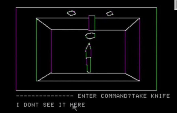
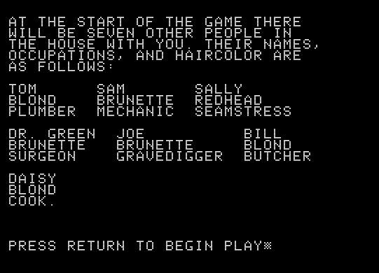
Mystery House, Ken and Roberta Williams’ first “Hi-Res Adventure,” and the first official game by the company that would become Sierra On-Line.
Mystery House is often erroneously celebrated as the “first graphical game”. While computer roleplaying and war games had graphics before this one, it’s true that this is the first adventure game with graphics. It’s fair, then, for a pioneer to have made so many mistakes. Initially, the advent of graphics did not make favorable advances on the text game format, as you’ll see in the playthrough. And that’s not just because of the crudeness and simplicity of age; early text games, like the inspirational “granddaddy”
Colossal Cave (the subject of my “
Gaming Made Me” here a few years back), had terse but incredibly useful prose, where generally every detail mentioned was either relevant or clearly demarcated as atmospheric.
Throughout the early 80s, many graphical text adventures struggled with how to inform the player which elements of the picture they saw were important to their interactions and which ones were merely for visual “richness”. As you’ll see in
a recent Let’s Play here, just two years after
Mystery House,
The Curse of Crowley Manor would do a better job with this design challenge, by denoting “visible objects” in the text interface that could be used or taken whenever the player discovered them.
And while similarly terse,
Crowley had a flair for verbal pacing which made it much creepier and more atmospheric than
Mystery House, which is often a bit awkward and flippant. That occasionally-silly tone gets fleshed out to positive effect in later Sierra games, of course, and you see flashes of it here. You’ll also see
Mystery House forge some blunt approaches to design which would be foundational to later Sierra adventures — a certain willful obtuseness, a meanness, a constant rejection of the player’s intuition that made adventure games more frustrating and therefore last longer.
Mystery House sold unprecedentedly well for its time on release, presumably in part on the novelty of the graphics, and in part on how difficult it was to finish and the perceived value in the time spent trying to solve it. That bluntness didn’t seem to matter to the adventure gamer of the 1980s, a consumer who was satisfied with a hard game that took a long time, even if the difficulty was down to a selectively-intelligent parser and a certain lack of grace rather than to elegantly-designed puzzling and fruitful experimentation.
On a more obscure note, a non-trivial number of games I’ve visited in my Lo-Fi Let’s Play series include shovels and graves. DIG is one of the most crucial verbs, mechanically and tonally, to classic adventures, it seems.


![Have Many Potato [2013] Codex 2013](/forums/smiles/campaign_tags/campaign_potato2013.png)
![The Year of Incline [2014] Codex 2014](/forums/smiles/campaign_tags/campaign_incline2014.png)


![Glory to Codexia! [2012] Codex 2012](/forums/smiles/campaign_tags/campaign_slushfund2012.png)


