Regarding the UI, I wonder how you would like it to look like. I would really appreciate more feedback on this.
I can't save your UI, I'm not a professional designer. I don't want to say it's shit, but it's not
not shit.
It has a great many sins in regards to:
1- information placement
2- color palette
3- readability
Re 1: my suggestion is to group up things by their category and remove all repeating text like "click here to add a character"
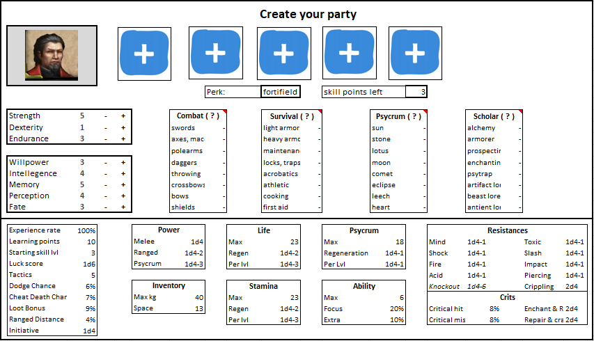
I also have a particular distaste for this:
First, because "plus" should be on the right.
Second, the panel cannot be a button.
And third, because it should either be
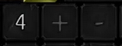
"- 4 +" (POE-style) - buttons exist in the same panel, and the value is in a "deeper" panel
or
4 (+/-) (NWN-style) - the buttons are grouped together in a dedicated space. They don't live in separate panels from each other.
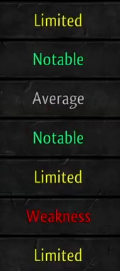
Re color palette: it goes for a dark somber look, but then there's this completely out of place rainbow affair
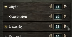
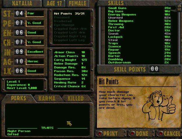
If you insist on using color codes, play around with brightness/saturation. Although to be fair, we have a perfectly serviceable example of this with no color codes:
Also note here that the entire UI can be summed up as: yellow, brown, green, black and some red buttons. All in one style. Nothing blue-related, or any bright happy colors with the exception of lilac.
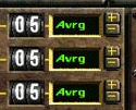
And going back to the +/- buttons again, the NWN-style, see how they don't take up space in this example:
This is visual vomit (both the corner art and the inappropriate high-saturation blue):
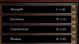
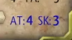
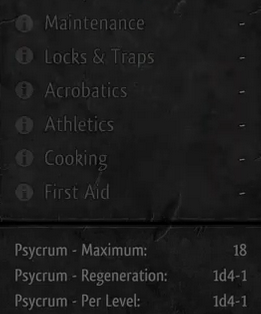
And Re 3: readability. Some stuff is hard to read, other is just unreadable. Talking about this:
Ramp up the contrast:
My best advice is that you hire a professional for the UI. It's not expensive and it's a major part of the game. For very little effort, you get 25% of your game to the next level of quality and polish.