St. Toxic
Arcane
total armor value is missing
Nah, it's there. The 9 with a shield to the right of the char.
total armor value is missing
Oh, I missed it, my bad. Still, there's enough room in the paperdoll part to sneak that it somewhere, for better visibility, as it's one of the most important stats I think.total armor value is missing
Nah, it's there. The 9 with a shield to the right of the char.

Like... heh... console Dragon Age Origins and Dragon Age 2?The biggest problem with list inventories is that you tend to accumulate a lot of "crud" items in them that can't be easily shunted off to the bottom of the grid, or to another tab of the grid, which makes getting to the useful stuff more and more of a pain. This happens even if you have the ability to sort by type, because even within each type there are still plenty of crud items. List inventories could be improved if there was a way to mark certain items (and all further instances of said item) as useless so they don't show up with the good stuff ever.


Like... heh... console Dragon Age Origins and Dragon Age 2?The biggest problem with list inventories is that you tend to accumulate a lot of "crud" items in them that can't be easily shunted off to the bottom of the grid, or to another tab of the grid, which makes getting to the useful stuff more and more of a pain. This happens even if you have the ability to sort by type, because even within each type there are still plenty of crud items. List inventories could be improved if there was a way to mark certain items (and all further instances of said item) as useless so they don't show up with the good stuff ever.

In (console) DA:O and DA2 you can mark items as junk and they'll go into the junk folder.Uh? I'm not talking about useless items categorized by the game designers as "junk".


In (console) DA:O and DA2 you can mark items as junk and they'll go into the junk folder.Uh? I'm not talking about useless items categorized by the game designers as "junk".

It was something added to console DA:O while they were porting it; they couldn't add it to PC DA:O since it had already been feature-locked. All versions of DA2 have it. And I don't believe so.Well, that's nice. Why doesn't the PC version have that? Also, does it affect all further instances of said items?


It was something added to console DA:O while they were porting it; they couldn't add it to PC DA:O since it had already been feature-locked. All versions of DA2 have it. And I don't believe so.Well, that's nice. Why doesn't the PC version have that? Also, does it affect all further instances of said items?
So do lists.

Where is that rule written?So do lists.
"...simultanously on the screen."
Lists only shows part of the characters inventory at any time.
A) depends on how much junk you will be carrying aroundSo do lists.
"...simultanously on the screen."
Lists only shows part of the characters inventory at any time. In Baldur's Gate, for instance, I can see everything at any given time.
i don't care, love it, want to play, what's your problem with inventories people, it's just an inventory.
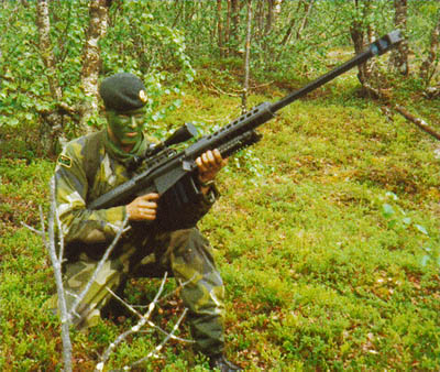
Stylistically, not very good. Functionality seems ok. But I absolutelly hate the Dragon Age style enormous weapons. This fucking sniper rifle looks at least 2,5 meters long (or Lil' Neddy is indeed extremely little). Even the longest antitanks weren't that long.
The weapons seem a little huge on the characters in the inventory screen...
[...]But seriously, 50 cals are fucking huge.


If anything, depictions in popular culture have tended to show sniper rifles as smaller than they typically are.
That's the logical explanation that makes sense, you should be saying it's ugly ANIME/WOW shit made by retarded designers that love huge shoulderpads, to catter the dudebro frat boy audience; only ARMA does weapon models right.All the weapons seem a bit out of proportion. I'm assuming it's due to the isometric viewpoint of the game which means they exaggerate the proportions of stuff so it's easier to see from the iso perspective.


Has anyone posted St. Toxic's latest UI to the Inxile folk yet?


5 pages of codex expertise > 3 months of InXile design?

Also you don't need to freaking toggle button for character/item.


