Putting the 'role' back in role-playing games since 2002.
Donate to Codex
Good Old Games
  • Welcome to rpgcodex.net, a site dedicated to discussing computer based role-playing games in a free and open fashion. We're less strict than other forums, but please refer to the rules.

    "This message is awaiting moderator approval": All new users must pass through our moderation queue before they will be able to post normally. Until your account has "passed" your posts will only be visible to yourself (and moderators) until they are approved. Give us a week to get around to approving / deleting / ignoring your mundane opinion on crap before hassling us about it. Once you have passed the moderation period (think of it as a test), you will be able to post normally, just like all the other retards.

Wasteland Wasteland 2 Pre-Release Discussion Thread [GAME RELEASED, GO TO NEW THREAD]

Zdzisiu

Arcane
Joined
Dec 3, 2009
Messages
3,523
That doesn't look weird? Really?

R28WaeB.jpg


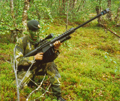
Imagine this character trying to aim with this thing, remember that this is a sniper rifle and bozar was simply a machine gun.

I'm not saying that it is a complet shit, I just think it would be better if this weapon model was around 30% smaller.
 

Roguey

Codex Staff
Staff Member
Sawyerite
Joined
May 29, 2010
Messages
36,751
Imagine this character trying to aim with this thing, remember that this is a sniper rifle and bozar was simply a machine gun.
The Bozar's burst fire was a bug, it was ~supposed~ to be a higher tier sniper rifle. The bugged version was so awesome they left it as is.
 

Infinitron

I post news
Patron
Staff Member
Joined
Jan 28, 2011
Messages
99,674
Codex Year of the Donut Serpent in the Staglands Dead State Divinity: Original Sin Project: Eternity Torment: Tides of Numenera Wasteland 2 Shadorwun: Hong Kong Divinity: Original Sin 2 A Beautifully Desolate Campaign Pillars of Eternity 2: Deadfire Pathfinder: Kingmaker Pathfinder: Wrath I'm very into cock and ball torture I helped put crap in Monomyth
evdk I wish.

But seriously, 50 cals are fucking huge.

sniper_iraq_50cal_800.jpg
specwarnetcom50pic.jpg


If anything, depictions in popular culture have tended to show sniper rifles as smaller than they typically are.
 

TwinkieGorilla

does a good job.
Patron
Joined
Oct 19, 2007
Messages
5,480
Serpent in the Staglands Divinity: Original Sin Torment: Tides of Numenera Wasteland 2 Shadorwun: Hong Kong Divinity: Original Sin 2 BattleTech Pathfinder: Wrath
Ok, seeing it better now. That fucking shitty Dead State note card crap. What is it with these indie devs and fucking note cards?! When the hell was that ever fucking cool ever?! Jesus Christ, man. That's really disappointing, actually.
 

TwinkieGorilla

does a good job.
Patron
Joined
Oct 19, 2007
Messages
5,480
Serpent in the Staglands Divinity: Original Sin Torment: Tides of Numenera Wasteland 2 Shadorwun: Hong Kong Divinity: Original Sin 2 BattleTech Pathfinder: Wrath
There was a horrible trend of '80s educational board games which all had that same idiotic art design and it has never, ever, ever been a good thing.
 

Lady_Error

█▓▒░ ░▒▓█
Patron
Joined
Oct 14, 2012
Messages
1,879,250
Uh, the size of the sniper rifle on the character model is just stupid. It is way too big and looks cartoonish because of that.

Even it were so, Wasteland 2 is supposed to be less serious than even Fallout. Wasteland 1 had quite a lot of humorous and outrageous stuff in it.
 

AN4RCHID

Arcane
Joined
Jan 24, 2013
Messages
4,861
I hate the animation that pops up when you first open it. Give me an option to disable that along with all other superfluous animations.
Seconded; it's really weird looking and distracting, plus doesn't really fit the 80's retro-futurism theme. I would much prefer a fixed embedded screen. It would be cool if you could rotate the character models and zoom in, too.

Otherwise it looks pretty good for usability. I like the idea of the favorites tab. I wonder if there's any way to view the items from all party members at once? If I forget who picked something up I would rather not have to search through all seven inventories individually. Could also just include a search function.
 

FeelTheRads

Arcane
Joined
Apr 18, 2008
Messages
13,716
If they render images for the items anyway, why don't they use them instead of those crappy symbols?

And dumb animations are dumb. Dat electricity animation on the cable... :lol:
 
Self-Ejected

Davaris

Self-Ejected
Developer
Joined
Mar 7, 2005
Messages
6,547
Location
Idiocracy
plus doesn't really fit the 80's retro-futurism theme. I would much prefer a fixed embedded screen. It would be cool if you could rotate the character models and zoom in, too.

Might be an idea if they take a look at images from War Games, among other 1980s movies featuring high tech, hacking and spies. Pop technology back then was chunky plastic, rather than steel. Using a distressed 80s technology style, could be a way for them to forge their own path, instead making it look like Fallout.

Edit:
Actually the best place to go, for computers used in 1980s culture is here:

http://starringthecomputer.com
 
Self-Ejected

Excidium

P. banal
Joined
Aug 14, 2009
Messages
13,696
Location
Third World
Good that they went for a proper list inventory instead of grid. But everything looks way too big. Also, the the character and equipment slots take half the screen, what's the point of having the character model occupy space in the inventory screen when you can see it in detail in the regular game screen?

Horrible inventory overall.

Is it just me or functionality aside, does that inventory look like it's from a console game? :(
It looks like it's made for playing on a 15'' CRT with how cramped it is
 

slackerwizrd

Educated
Patron
Joined
May 19, 2013
Messages
89
Location
Land of Confusion
Serpent in the Staglands Shadorwun: Hong Kong
If they render images for the items anyway, why don't they use them instead of those crappy symbols?

And dumb animations are dumb. Dat electricity animation on the cable... :lol:

Given the mono-color theme for that panel, the rendered images makes little sense unless they redesign that panel like the character screen panel (i.e., make it color instead)

Good that they went for a proper list inventory instead of grid. But everything looks way too big. Also, the the character and equipment slots take half the screen, what's the point of having the character model occupy space in the inventory screen when you can see it in detail in the regular game screen?

Because the only thing more annoying than a cramped inventory screen is having to continuously fiddle with your character's equipped items for "that look."
/equipItem A
/closeInventory
/sigh
/equipItem B
... ad nauseum ...

As for the large panels, they're only being considerate of the aging gamer population.... by old gamers for old gamers.
 

Lady_Error

█▓▒░ ░▒▓█
Patron
Joined
Oct 14, 2012
Messages
1,879,250
The inventory screen does look a bit uninspired right now. Copying Fallout, while at the same time making it look boring with all those yellow cheap looking signs that do not really increase immersion. A retro 80's look might be a good idea.
 

As an Amazon Associate, rpgcodex.net earns from qualifying purchases.
Back
Top Bottom