Putting the 'role' back in role-playing games since 2002.
Donate to Codex
Good Old Games
  • Welcome to rpgcodex.net, a site dedicated to discussing computer based role-playing games in a free and open fashion. We're less strict than other forums, but please refer to the rules.

    "This message is awaiting moderator approval": All new users must pass through our moderation queue before they will be able to post normally. Until your account has "passed" your posts will only be visible to yourself (and moderators) until they are approved. Give us a week to get around to approving / deleting / ignoring your mundane opinion on crap before hassling us about it. Once you have passed the moderation period (think of it as a test), you will be able to post normally, just like all the other retards.

What is good UI design in RPGs?

JarlFrank

I like Thief THIS much
Patron
Joined
Jan 4, 2007
Messages
34,893
Location
KA.DINGIR.RA.KI
Steve gets a Kidney but I don't even get a tag.
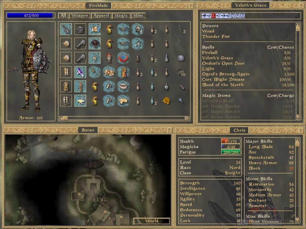
Second, Morrowind from 2002, which had basic information at the bottom of its first-person (or optionally behind-the-shoulder) view but where pressing the right mouse button would instantly pause the game and bring up four windowed menu screens, which could be resized and moved around as desired. The image below is from Mobygames, and the windows have been moved and resized from their defaults, but it demonstrates the separate menus for inventory, magic, the map, and character statistics.
26818-the-elder-scrolls-iii-morrowind-windows-screenshot-inventory.jpg

Morrowind's resizeable and moveable interface windows were such a good interface, and the perfect example of why PC interfaces making full use of mouse and keyboard capabilities are infinitely superior to console interfaces designed around the limitations of a controller.

Morrowind's interface has all the information you need on the screen at the same time. If you want the map to be bigger, you increase its size (in this screenshot it's much larger than the default size, I never increased it beyond its default - but if you want to, you can!). If you want the stat sheet to be bigger, yep, you can resize it too!

It doesn't even need to fill the entire screen:
42437-1-1362194061.gif


This flexibility was great in 2002, but it's even better in 2019 when widescreens are commonplace. With the additional screen real estate given by a widescreen running at 1920x1080, you have more space to rearrange the interface in whichever way you see fit.

And unlike modern RPGs with console interfaces, the amount of clicks you need to get to the thing you want is minimal. Wanna check how high a certain skill is? Wanna select a spell to use? Wanna change your equipment? Right click to open the inventory/stats/spells screen and do what you need to do. It's all on the same screen, not a dozen different menus you have to scroll through.

A PC keyboard has 101 keys. A mouse has 3 buttons, a scroll wheel, and the ability to point and click anywhere on the screen.
A controller has... what, like 4 buttons? 6? And some funny direction pad thing that works kinda like a 360° mouse wheel?

Good interfaces make use of the capabilities of mouse and keyboard. Console interfaces are bad by default.
 
Self-Ejected

Lilura

RPG Codex Dragon Lady
Joined
Feb 13, 2013
Messages
5,274
Jagged Alliance 2 has a powerful, almost OS-like UI with A1 aesthetics. Can't think of a better one in the genre.
 

CryptRat

Arcane
Developer
Joined
Sep 10, 2014
Messages
3,626
Meh, I think Morrowind is a terrible example because it's a single character action game, saying it has a good UI is barely more than saying Doom has a good UI. I'll take complex games with very bad controls any day over single character action games and it's really when you begin controlling multiple characters especially with inventory restrictions, tactical turn-based combat with multiple characters to control, multiple layers (like top down tactical combat with first person travel, various options in shops ...) that it becomes complicated to make a sufferable and somewhat coherent UI. The combat UI in Blade of Destiny is atrocious but I prefer playing that than playing a simplified game.
 
Joined
Jan 4, 2007
Messages
1,387
Location
Australia
Shadorwun: Hong Kong
The Morrowind interface is my favorite, period, because it fit the game like a velvet glove.

One of my pet peeves when it comes to interfaces is how poorly the width of widescreen monitors is used. I prefer the viewport of the game to be square-ish, not "vertically limited". I would absolutely love if a layout where the main panel was docked on the right hand side of the screen was industry standard.
 
Last edited:
Self-Ejected

Lilura

RPG Codex Dragon Lady
Joined
Feb 13, 2013
Messages
5,274
Citing popamole UIs is fucking ridiculous even if it's Deus Ex and System Shock 2 (which have the best popamole UIs).

If you're serious, can Jagged Alliance 2 be topped? No. Handles a party of 18 within loads of modes. There is no comparison outside of grand strategy.
 
Last edited:

Inehresa

Educated
Patron
Joined
Sep 16, 2018
Messages
38
Grab the Codex by the pussy Insert Title Here Steve gets a Kidney but I don't even get a tag.
I'd like to suggest that the "getting-used-to-factor" shouldn't be taken into account as it's more likely indication of overall quality of a game than UI itself. For starters, DF's interface as a whole is atrocious with its control scheme being the pinnacle of bad design, and yet it's disregarded by fans and sadly author too. On the other hand Stygian's UI wasn't as bad but its clunkiness managed to have negative effect on the overall experience.
 

Gibson

Savant
Joined
Jun 23, 2019
Messages
423
I don't like UIs that take up the whole fucking screen - and I don't mean Charsheets/Inventory/Map/Journal
ATM I'm plowing through ToEE with my group of just Dwarves - I know that that Radial menu is getting a ton of hate, but I just like it; when I look at the screen and see only my party on the bottom with the smallish menu on the bottom right corner, the order of moves on the top and that "clock" on the left and nothing else...so clean. I really don't mind doing the extra moves/clicks with the mouse as long as my screen looks clean.

best UI ever, EVER, for my taste is to be found on Endless Legends games from Amplitude studios. that UI ruined all other strategies for me, I can't bare to look at any Civ game after playing Endless Legend; or even worse, that disgusting UI monstrosity that is Age of Wonders 3 where the designer apparently asked "how much fantasy cliche crap you want?, and the leading fag just said "yes".
Paradox strategies also have really good UIs - Stellaris is a "meh"/10 game all in all, but the UI is really really nice.
 
Self-Ejected

Daze

Red Panda Alt
Joined
Dec 10, 2019
Messages
173
1. Everything needs to be understandable and easily accessible. Functions must work as you think they do.
e.g. traveling in JA2 isn't intuitive at all. In other games you would just click on the map. Here you have to go to the column first.

2. The inventory should show enough items at once so that navigation is faster. Fallout and Gothic 1 are bad in that.
You shouldn't have to go through your whole inventory to find one item.

3. No stupid animations if you try to go in another screen. No books opening or smth like that. Also JA2 with the computer.

4. Having (reasonable*) shortcuts for everything. (*if you can't change them)

5. Don't being totally ugly and making stupids sounds. e.g. Geneforge

6. An ui that isn't fullscreen and takes you out of the game so to speak.

That being sad Morrowind had a great UI.
I also think Underrail had a very good one.
What both are laking though (if i remember correctly) are shortcuts for the different categories in the inventory.
I think it would just help to use QWER in underrail or F1-F4 in morrowind for the different types of items.
 
Last edited:

DraQ

Arcane
Joined
Oct 24, 2007
Messages
32,828
Location
Chrząszczyżewoszyce, powiat Łękołody
Second, Morrowind from 2002, which had basic information at the bottom of its first-person (or optionally behind-the-shoulder) view but where pressing the right mouse button would instantly pause the game and bring up four windowed menu screens, which could be resized and moved around as desired. The image below is from Mobygames, and the windows have been moved and resized from their defaults, but it demonstrates the separate menus for inventory, magic, the map, and character statistics.
26818-the-elder-scrolls-iii-morrowind-windows-screenshot-inventory.jpg
You could also toggle individual windows (so no problem, say, resizing them to full screen and tabbing between them if that's what you wanted) pick up and place things in the world from the inventory view or pin individual windows so that they stayed active as exited the inventory (say, you wanted a bigger minimap in the corner of your choosing).

Morrowind's GUI is close to perfection, especially with updated journal (from expansions), it could just use some more annotation of the items in grid.
 

V_K

Arcane
Joined
Nov 3, 2013
Messages
7,714
Location
at a Nowhere near you
Second, Morrowind from 2002, which had basic information at the bottom of its first-person (or optionally behind-the-shoulder) view but where pressing the right mouse button would instantly pause the game and bring up four windowed menu screens, which could be resized and moved around as desired. The image below is from Mobygames, and the windows have been moved and resized from their defaults, but it demonstrates the separate menus for inventory, magic, the map, and character statistics.
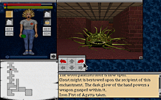
Technically, you could do more or less the same (window resizing and repositioning, and UI composition) already in Legacy: Realm of Terror from 10 years before. Though I admit, it helped that the game had extremely limited inventory space (which, frankly, more RPGs should do).

127054-the-legacy-realm-of-terror-dos-screenshot-it-s-all-cool-tentacle.png


Legacy%20-%20Realms%20Of%20Terror,%20The_8.png


718200-1127330062_00.png


I also think that resizable windows were a staple of Mac RPGs (however few there were).

The interface of Faery Tale Adventure II: Halls of the Dead wasn't quite as elegantly designed as that of Dungeon Master or Morrowind, but it did boast a number of beautiful images contained in a sidebar that could be switched between a few different menus, as seen in the screenshots below:
FTA2 may look nice, but it's dialog UI is the absolute worst ever. Dragging UI icons onto moving NPCs - whoever though that was good UI has probably seen too much Eldritch geometry.
 
Joined
Jan 14, 2018
Messages
50,754
Codex Year of the Donut
Personally not a fan of the blobber UI that shows gear at all times. I don't think it's something so vital that warrants such important screen real estate.
 

Xeon

Augur
Joined
Apr 9, 2013
Messages
1,858
Wasn't Morrowind's UI static or something? I mean unless you install Code Patch iirc, you can't resize or drag the UI.

I think Morrowind like UI looks good if you have big monitor, which I guess it kinda works now since its modern tech for old game kinda of thing or something. But if I played it in small monitor, I probably would hate it, since I like seeing everything without scrolling too much.

Also I am pro listing more than icons kinda of guy since its easier to go thru fast if you have tons of items.
 
Joined
Jan 14, 2018
Messages
50,754
Codex Year of the Donut
V_K I don't see how what I said is controversial
How is seeing what gear you have equipped such an important thing that it needs to be shown all the time? "Ah, forgot I have a +3 sword equipped, better go check it every 2 seconds"?
It's just a waste of screen real estate that could be used for something else. When I want to know what I have equipped I'd rather open the equipment menu.
 

Absinthe

Arcane
Joined
Jan 6, 2012
Messages
4,062
Honestly some of the most painful UIs these days are made by idiots who are into making "clean" and "sleek" interfaces and as a result leave out all kinds of actually useful functions or force people to keep moving from screen to screen to do whatever they want. Instead of making a UI that's helpful and intuitive they make a UI that makes people wonder how the fuck they can get what they want out of it.

The best UI I've ever seen is World of Warcraft. It's simple to pick up, intuitive, has very good modding support, is hyper configurable, and features incredibly deep programmability features in the form of LUA scripts (i.e. WeakAuras). It has everything you could possible want from a UI, and anything you don't like? You can remove it.
WoW's UI is pretty shit, to be honest. The mod support is by far the best part about it and people mod it like crazy whenever they want to do anything. Even run-of-the-mill casuals are used to modding WoW's UI to do whatever.
 

V_K

Arcane
Joined
Nov 3, 2013
Messages
7,714
Location
at a Nowhere near you
How is seeing what gear you have equipped such an important thing that it needs to be shown all the time? "Ah, forgot I have a +3 sword equipped, better go check it every 2 seconds"?
I can't honestly think of a single game that does that. Well, not true - I can think of exactly one single game that does that, Wizards&Warriors. But in a turn-based blobber with a 7-strong party it actually does make total sense to have that information at the ready.
And if you're referring to the Legacy pics above, that's not an equipment screen - that's an inventory screen, and in Legacy it's useful to have it open at all time because many encounters require to use a specific item, and do it fast. Plus the panel conveys other important information, like your hp/sanity level and mental state. I'm not sure whether you can switch it off, but you can most other panels in the game.
 

Gregz

Arcane
Joined
Jul 31, 2011
Messages
9,229
Location
The Desert Wasteland
Honestly some of the most painful UIs these days are made by idiots who are into making "clean" and "sleek" interfaces and as a result leave out all kinds of actually useful functions or force people to keep moving from screen to screen to do whatever they want. Instead of making a UI that's helpful and intuitive they make a UI that makes people wonder how the fuck they can get what they want out of it.

overly simplified is bad yeah, but the standard is to use a 'tree' data structure approach.

Esc key -> (System, Sound, Graphics, Keybinds, etc.) -> granulated details at this level -> advanced options

Inventory management button on UI -> vehicles, bags, specialty containers, holsters (i.e. JA2)


That's a pretty fast/powerful/intuitive route for first time users modifying infrequently changed settings. The ability to keybind any of those settings, or command line alter them, is good for speed/power users who don't want to mouse navigate through the tree thousands of times in a row for more frequent operations, thus, the elegance of WoW's UI.

WoW's UI is pretty shit, to be honest.

A rigorous argument, I stand corrected.
 
Last edited:
Joined
Jan 14, 2018
Messages
50,754
Codex Year of the Donut
Best UI is simple:
Make the UI open source so we can mod it as we see fit.
 

As an Amazon Associate, rpgcodex.net earns from qualifying purchases.
Back
Top Bottom