Putting the 'role' back in role-playing games since 2002.
Donate to Codex
Good Old Games
  • Welcome to rpgcodex.net, a site dedicated to discussing computer based role-playing games in a free and open fashion. We're less strict than other forums, but please refer to the rules.

    "This message is awaiting moderator approval": All new users must pass through our moderation queue before they will be able to post normally. Until your account has "passed" your posts will only be visible to yourself (and moderators) until they are approved. Give us a week to get around to approving / deleting / ignoring your mundane opinion on crap before hassling us about it. Once you have passed the moderation period (think of it as a test), you will be able to post normally, just like all the other retards.

Vapourware Zodiac Legion - X-COM and dungeons

Galdred

Studio Draconis
Patron
Developer
Joined
May 6, 2011
Messages
4,495
Location
Middle Empire
Steve gets a Kidney but I don't even get a tag.

That said, Riot police and fantasy formation combat may be relatively similar: you try to isolate opponents, and count on your superior discipline and teamwork while the opposing horde crashes against your shieldwall, using AoE weapons(tear gas, or even water cannon) to disrupt the opposing formation.
 

Galdred

Studio Draconis
Patron
Developer
Joined
May 6, 2011
Messages
4,495
Location
Middle Empire
Steve gets a Kidney but I don't even get a tag.

Woops, I didn't expect a new Splattercat video now. We were in the middle of overhauling a lot of things, but the new video showcased the traps (that were not present in his first one), and the combat system changed slightly since then (with different support rules for ranged and melee defense), but the main difference was that the AI now actively engages the player, but that results in an empty level later on, so I'll have to re-add some reinforcements at higher alarm levels.
 

agris

Arcane
Patron
Joined
Apr 16, 2004
Messages
6,925
Galdred the demo doesn't handle non-16:9 aspect ratios gracefully. for 16:10, it stretches the image vertically such that circles are distended ovals. for resolutions wider than 1920 px, the world and UI are also left-justified rather than centered, meaning you get a big black bar on only the right side of the screen.

if I remember correctly, the easiest way to fix this for resolutions > 1080p that aren't 16:9 (like 1920x1200, 2560x1600, etc) is to center the game window and letterbox it, so everything is aspect-ratio correct.

edit: your target audio output envelope is also quite low. i don't know how much thought you've given to sound levels, but ~ -3 dB is a good target output. music and SFX sound like like they're between -9 and -15 dB.
 
Last edited:

agris

Arcane
Patron
Joined
Apr 16, 2004
Messages
6,925
Ok, I played through the Iconoclasm mission and have some feedback.

First off - I love the art. The world map, dungeon, characters and the baroque flourishes on the UI are all great. Especially like the little details in the UI hotbar. The music was also appropriate and evocative for the world. I'm into the concept of fielding multiple lances, and the overall strategic aspect of controlling a dynamic map combined with dungeon combat is a fun mix.

I haven't followed the game closely, but I'm curious what your goal is for making an action consume all remaining movement points? If we can move and shoot, so to speak, why can't we shoot and move?

criticisms / critiques / whatever:

  • Wonky handling of non-16:9 resolutions, widths > 1920 px
  • Audio output is too quiet
  • The tooltips for abilities display their cost in Fatigue, yet the tooltips for the resource that is used for abilities is called Stamina. Be rigorous and use consistent language for everything mechanics-related, otherwise you will confuse players.
  • Zooming in combat maps: when using the mouse-wheel, the amount of zoom increments currently allowed are too coarse. Let us have fine control over the zoom by making the zoom increments smaller; roughly 1/4 what it is now. It probably makes sense for the zoom UI button to retain these coarse zoom increments.
  • Pop-up/tutorial/game option windows should isolate mouse input from rest of the game world. You can still scroll the game world, select characters, trigger tooltips etc while there is a popup/tutorial window open.
  • Movement point blobs drawn over portraits in top RHS and under NPC sprites in battle map do not update - only the resource panel does
  • It would be nice if movement point totals updated based on your selected route - before clicking. It's easy to compute the number used/left, but seeing it in real time before committing would be nice.
  • Mission objective popup on start of mission lacks the custom image that is baked into the mission objective popup if you click the "Display mission objectives" button, at least for the "Iconoclasm" scenario
  • The code-base seems... rough. Obvious caching and pulling of resources when mousing over units in Lance Management screen, perceptible delays between clicking UI buttons and new windows appearing.
  • Suggestion: render text and UI elements separate from the game world layer, to enable scaling. You will appreciate this when the game gets in the hands of people playing at greater/lesser resolutions than 1080p
  • Pinned icon: I suggest something more evocative, like an actual pin holding up a piece of cloth. Think of the bullseye emoticon, but with a pin and instead of a dart board, a red handkerchief hanging or something else appropriate for medieval times
  • Flanking / attack support / defensive support icons; consider drawing them on the boundary of the hex-face of the tile they are referencing, for increased at-a-glance clarity. I can mock this up (poorly) if it's unclear
  • More UI autism: why do some values in the Combat Preview Box have text descriptions and a simple number, while others an icon and bar with no text other than the value? I would shift the order of presentation of this information so that the aggregate Total Attack Value is at the top, with the support/flanking contributors under, and likewise the Total Defense Value above the base defense/support values.
  • Line of sight: for (at least) archers, it would be nice to have some indication of what is or isn't line of sight. both what is in your line of sight, and what is in your enemies'
  • Suspicious tiles: it's not clear when a trap is revealed and active, or revealed and disarmed.
  • Closed doors: they don't like to open, unclear if locked or bugged interaction
Finally, one of the help screens mentioned that the attack rolls are based on 20d20, i.e. an attack threshold of 5 needs 5 dice to roll < 5 to be successful. Humans aren't great at percentages, but this seems especially opaque. What does 20d20 get you that 1d20 doesn't? I know you have more fine tuned control with 20d20, i.e. you get sub 1% increments, but is that worth the loss of intuition that 1d20 provides via the 5% increments?
 
Last edited:

Galdred

Studio Draconis
Patron
Developer
Joined
May 6, 2011
Messages
4,495
Location
Middle Empire
Steve gets a Kidney but I don't even get a tag.
Galdred the demo doesn't handle non-16:9 aspect ratios gracefully. for 16:10, it stretches the image vertically such that circles are distended ovals. for resolutions wider than 1920 px, the world and UI are also left-justified rather than centered, meaning you get a big black bar on only the right side of the screen.

if I remember correctly, the easiest way to fix this for resolutions > 1080p that aren't 16:9 (like 1920x1200, 2560x1600, etc) is to center the game window and letterbox it, so everything is aspect-ratio correct.
Thank you for the detailed feedback!
The spash screen is definitely messy in any other aspect ratio. I wonder whether I should use black bands, or crop the image.

How is the UI in game, apart from the first map (I plan zoom it out and center it, so that the whole map window is used).

Ok, I played through the Iconoclasm mission and have some feedback.

First off - I love the art. The world map, dungeon, characters and the baroque flourishes on the UI are all great. Especially like the little details in the UI hotbar. The music was also appropriate and evocative for the world. I'm into the concept of fielding multiple lances, and the overall strategic aspect of controlling a dynamic map combined with dungeon combat is a fun mix.

I haven't followed the game closely, but I'm curious what your goal is for making an action consume all remaining movement points? If we can move and shoot, so to speak, why can't we shoot and move?

I am against shooters being able to spend 90% of their turn aiming, then getting out of LoS for 10% of their AP, and remain out of LoS of the enemies. It is made worse because overwatch doesn't make as much sense with bows than with firearms (you cannot really keep your war bow drawn at the ready for several seconds), so we had to force staying where you shot to make vision symmetrical. But some classes will have options to move afterwards, especially in melee (as you need a disengagement check to pull back anyway).

criticisms / critiques / whatever:

  • Wonky handling of non-16:9 resolutions, widths > 1920 px
  • Suggestion: render text and UI elements separate from the game world layer, to enable scaling. You will appreciate this when the game gets in the hands of people playing at greater/lesser resolutions than 1080p.


I am thinking about adding an option to scale all UI elements by 150, 200, 300, or 400%, but that will require some rewrite and testing

[*]Audio output is too quiet

Was it at max volume in the settings? I could rescale the audio then

[*]The tooltips for abilities display their cost in Fatigue, yet the tooltips for the resource that is used for abilities is called Stamina. Be rigorous and use consistent language for everything mechanics-related, otherwise you will confuse players.
Oops, thank you, that definitely needs to change indeed!

[*]Zooming in combat maps: when using the mouse-wheel, the amount of zoom increments currently allowed are too coarse. Let us have fine control over the zoom by making the zoom increments smaller; roughly 1/4 what it is now. It probably makes sense for the zoom UI button to retain these coarse zoom increments.
The issue is that the pixel art would get really messy at arbitrary zoom factors, so it is only in power of 2 for now. I will test it and see whether it looks "usable" at non integer zoom factors, but I don't think it will work

[*]Pop-up/tutorial/game option windows should isolate mouse input from rest of the game world. You can still scroll the game world, select characters, trigger tooltips etc while there is a popup/tutorial window open..
Yes, I need to freeze commands at these times indeed.

[*]Movement point blobs drawn over portraits in top RHS and under NPC sprites in battle map do not update - only the resource panel does
[*]It would be nice if movement point totals updated based on your selected route - before clicking. It's easy to compute the number used/left, but seeing it in real time before committing would be nice.
The UI elements only display health and stamina, not movement points, but that is a good idea, I should update the movement bar in real time on mouseover

[*]Mission objective popup on start of mission lacks the custom image that is baked into the mission objective popup if you click the "Display mission objectives" button, at least for the "Iconoclasm" scenario
I will fix that, thank you!

[*]The code-base seems... rough. Obvious caching and pulling of resources when mousing over units in Lance Management screen, perceptible delays between clicking UI buttons and new windows appearing.
Ouch, that is true, but there is not much I can do (the game loads all the relevant character sprites at this time. I should probably load it on a load screen instead? It would feel better than doing it "live" I suppose.

[*]Pinned icon: I suggest something more evocative, like an actual pin holding up a piece of cloth. Think of the bullseye emoticon, but with a pin and instead of a dart board, a red handkerchief hanging or something else appropriate for medieval times.
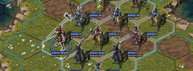
Definitely! The minus is the generic debuff icon. The pinned one is displayed on the character stat bar, but it is not very evocative either:

info_panel.jpg

  • Flanking / attack support / defensive support icons; consider drawing them on the boundary of the hex-face of the tile they are referencing, for increased at-a-glance clarity. I can mock this up (poorly) if it's unclear
1695230579329.png

Like this?


[*]More UI autism: why do some values in the Combat Preview Box have text descriptions and a simple number, while others an icon and bar with no text other than the value? I would shift the order of presentation of this information so that the aggregate Total Attack Value is at the top, with the support/flanking contributors under, and likewise the Total Defense Value above the base defense/support values.
I wanted to make the pictural ones stand out more, and use text for the contextual ones, because they would not always be present, so there would be more icons to memorize. I will defintely shift the value order indeed.
[*]Line of sight: for (at least) archers, it would be nice to have some indication of what is or isn't line of sight. both what is in your line of sight, and what is in your enemies'
It is kind of present, but very unclear. It is the dotted line here (for your archer character):
1695228821331.png

[*]Suspicious tiles: it's not clear when a trap is revealed and active, or revealed and disarmed.
Should we add an icon on the active ones, then?

[*]Closed doors: they don't like to open, unclear if locked or bugged interaction
Some are locked (but not in this map I think), but it might be because the character needed 2 Move points and only had one?
Sometimes, the cursor is bugged and the action is possible even when it says it is not.

Finally, one of the help screens mentioned that the attack rolls are based on 20d20, i.e. an attack threshold of 5 needs 5 dice to roll < 5 to be successful. Humans aren't great at percentages, but this seems especially opaque. What does 20d20 get you that 1d20 doesn't? I know you have more fine tuned control with 20d20, i.e. you get sub 1% increments, but is that worth the loss of intuition that 1d20 provides via the 5% increments?
The game uses a dice pool system (so the dice are not considered individually, but each die is checked against the threshold).
I went with this because I wanted a more gaussian system, in that it is increasingly easier/harder to succeed at tasks that are below/over your skill level.

But it is not as bad as it seems over time. You always have roughly 55%-60% chance of succeeding at a task of your skill level (ie, you have 55% chance of beating defence 5 when you have an attack level of 5). I went with 20D20 because you'd roll on average N successes for a skill of N.
It would probably work better if the dice pool was displayed, though (with a way to highlight the dice that counted as a success), and maybe 12D12 would make it easier to read (but we'd have a narrower range of possible levels then).
Do you think it would be helpful? I had a D20 animation done just for that, but displaying 20 rolled at once might be hard to parse (but it should be possible to make the failures/successes more visible).
 
Last edited:

Galdred

Studio Draconis
Patron
Developer
Joined
May 6, 2011
Messages
4,495
Location
Middle Empire
Steve gets a Kidney but I don't even get a tag.
Galdred What's your primary dice mechanic? Roll XdY, take highest?
It is a dice pool system, with a fixed number of dice, but varying success threshold, so you roll 20 dice, and the ones that match your skill level or above count as successes. You need to get more successes than the difficulty (that was the reason for the 20D20, you'd roll your skill level of successes on average, so you should pass a skill test of your skill level most of the time).
 
Joined
May 31, 2018
Messages
2,849
Location
The Present
Galdred What's your primary dice mechanic? Roll XdY, take highest?
It is a dice pool system, with a fixed number of dice, but varying success threshold, so you roll 20 dice, and the ones that match your skill level or above count as successes. You need to get more successes than the difficulty (that was the reason for the 20D20, you'd roll your skill level of successes on average, so you should pass a skill test of your skill level most of the time).

Thank you. This means that lower skill values are actually better, like THAC0? So if your skill rating is 4 and the challenge rating is 6, you need to roll 6 or more d20 with individual results of 4 or greater? Is success binary, or are there partial successes?
 

Galdred

Studio Draconis
Patron
Developer
Joined
May 6, 2011
Messages
4,495
Location
Middle Empire
Steve gets a Kidney but I don't even get a tag.
Galdred What's your primary dice mechanic? Roll XdY, take highest?
It is a dice pool system, with a fixed number of dice, but varying success threshold, so you roll 20 dice, and the ones that match your skill level or above count as successes. You need to get more successes than the difficulty (that was the reason for the 20D20, you'd roll your skill level of successes on average, so you should pass a skill test of your skill level most of the time).

Thank you. This means that lower skill values are actually better, like THAC0? So if your skill rating is 4 and the challenge rating is 6, you need to roll 6 or more d20 with individual results of 4 or greater? Is success binary, or are there partial successes?
Oh, sorry, I wrote the reverse of the way it works:
You need to score your skill of lower to get a success, so the higher the better (and also hence why you average your skill value on each roll, as you'd get n of 20*20 sided dice score n or less ).

There is some margin of success: critical hits require a few extra successes. Some skills will trigger on margin of failure (like counter attacks or attack of opportunity will trigger if the target fails by more than X). Damage is also slightly increased if you score higher than you needed to.

Lastly, there are prolonged skill checks that can last for several turns, for long actions (like searching a book for a particular clue, lockpicking, or disarming a trap):
These will register each success (minus difficulty), and the action will be counted as completed once you total is over the completion threshold.

For instance, if you send your scout to lockpick, and he has a skill of 5, against a difficulty of 3, every success over 3 will be pooled, and added to his total. Once he gets 3 total pooled successes (over several turns if needed), the lockpicking action is complete. Currently, I don't plan to add "resets" if there are less success rolled than needed in a given attempt, but I will probably add reset on getting stun or something like that.

Also, I need to add some UI progression bar for that because it is even more arcane than the rest. Currently, it is only used for disarming traps, and it is usually faster to just walk around them. I also need to tell the AI to not spend turns trying to disarm its own traps with a skill level of 1...
 

agris

Arcane
Patron
Joined
Apr 16, 2004
Messages
6,925
Galdred the demo doesn't handle non-16:9 aspect ratios gracefully. for 16:10, it stretches the image vertically such that circles are distended ovals. for resolutions wider than 1920 px, the world and UI are also left-justified rather than centered, meaning you get a big black bar on only the right side of the screen.

if I remember correctly, the easiest way to fix this for resolutions > 1080p that aren't 16:9 (like 1920x1200, 2560x1600, etc) is to center the game window and letterbox it, so everything is aspect-ratio correct.
Thank you for the detailed feedback!
The spash screen is definitely messy in any other aspect ratio. I wonder whether I should use black bands, or crop the image.

How is the UI in game, apart from the first map (I plan zoom it out and center it, so that the whole map window is used).
It's functional. The the combat info window that pops-up when you select an enemy to attack is sometimes rendered outside the viewport, so you have to scroll to see it. I also don't really like how you're using so many icons - it comes across as busy -, but that's down to taste. Whatever you settle on for the icons, just be consistent (words + icon, icon only, etc).

[*]Audio output is too quiet

Was it at max volume in the settings? I could rescale the audio then
Yes, everything max. I just confirmed. It's soft relative to other professional apps. Idk how familiar you are with audio editing, but for an example: boot up any major AA/AAA game that you think does audio well while your soundcard's output routed as *input* to your fave audio editing software and capture the mix for ~60 seconds of gameplay. Look at the dynamic range, especially the top level output. I'm guessing it's around ~-3 db, whereas your game's is around -9 or -15. From that, you tweak.

[*]Movement point blobs drawn over portraits in top RHS and under NPC sprites in battle map do not update - only the resource panel does
[*]It would be nice if movement point totals updated based on your selected route - before clicking. It's easy to compute the number used/left, but seeing it in real time before committing would be nice.
The UI elements only display health and stamina, not movement points, but that is a good idea, I should update the movement bar in real time on mouseover
I see, the confusion again lies in terminology. The bottom RH info panel calls stamina points "mp" when mousing over units' orange bar in the top right-hand corner. I took that to mean movement points. Consistency! You can probably get around this (and make potential translation easier) by defining a list of mechanics variables, each one defined as Full and Short name, like varAct.long = "Stamina"; varAct.short = "sp", then in UI elements invoke varAct.long or varAct.short, not rewriting the string every time.

[*]The code-base seems... rough. Obvious caching and pulling of resources when mousing over units in Lance Management screen, perceptible delays between clicking UI buttons and new windows appearing.
Ouch, that is true, but there is not much I can do (the game loads all the relevant character sprites at this time. I should probably load it on a load screen instead? It would feel better than doing it "live" I suppose.
Agreed, give us a loading screen at the start so it doesn't feel laggy in real time.

  • Flanking / attack support / defensive support icons; consider drawing them on the boundary of the hex-face of the tile they are referencing, for increased at-a-glance clarity. I can mock this up (poorly) if it's unclear
View attachment 41337
Like this?
Yep! Same with defensive support icons. You'll have to play with z-layering, but I think directly placing the icon on the relevant hex interface(s) is going to be your cleanest option. More arrows etc will just be confusing.

[*]Suspicious tiles: it's not clear when a trap is revealed and active, or revealed and disarmed.
Should we add an icon on the active ones, then?
I can tell you like icons :D To me, the game is pretty busy with overlays on the combat map already, I would try to avoid adding more icons. You've got a pretty looking game trying to peek out under the layers.

Here's a suggestion: for revealed active traps, make movement routes actively avoid the trap if possible, like I think you do for pathing around enemies' ZoC. If the player's path has to go over the revealed active trap, make the footprint icon red *on the trap hex* itself. For revealed inactive traps, treat it like a normal movement action and don't make the footprints red.

[*]Closed doors: they don't like to open, unclear if locked or bugged interaction
Some are locked (but not in this map I think), but it might be because the character needed 2 Move points and only had one?
Sometimes, the cursor is bugged and the action is possible even when it says it is not.
Feedback here would be nice, whether it's locked or not enough movement points or whatever.

This goes to a larger suggestion: I think the game would benefit from a dedicated info box at the bottom of the screen. It can be tabbed, so that info like attack/defense rolls, messages about locked doors etc appear in a consistent manner. The box could be dynamic though, like the info box in Diablo 1, so that when you have selected an attack and are mousing over the enemy, the attack / defense info box is drawn within that, removing the issue with the box hopping around and sometimes off the screen.

Finally, one of the help screens mentioned that the attack rolls are based on 20d20, i.e. an attack threshold of 5 needs 5 dice to roll < 5 to be successful. Humans aren't great at percentages, but this seems especially opaque. What does 20d20 get you that 1d20 doesn't? I know you have more fine tuned control with 20d20, i.e. you get sub 1% increments, but is that worth the loss of intuition that 1d20 provides via the 5% increments?
The game uses a dice pool system (so the dice are not considered individually, but each die is checked against the threshold).
I went with this because I wanted a more gaussian system, in that it is increasingly easier/harder to succeed at tasks that are below/over your skill level.

But it is not as bad as it seems over time. You always have roughly 55%-60% chance of succeeding at a task of your skill level (ie, you have 55% chance of beating defence 5 when you have an attack level of 5). I went with 20D20 because you'd roll on average N successes for a skill of N.
It would probably work better if the dice pool was displayed, though (with a way to highlight the dice that counted as a success), and maybe 12D12 would make it easier to read (but we'd have a narrower range of possible levels then).
Do you think it would be helpful? I had a D20 animation done just for that, but displaying 20 rolled at once might be hard to parse (but it should be possible to make the failures/successes more visible).
I don't think the animation would help, it may actually add to confusion, but the combat log suggested above would. We could go back and forth on what the benefits of gaussian is vs whatever distribution type a 1d20 is but I don't think that really matters. You like pools, that's fine. My greater point is the player has no relative sense of what an attack threshold of 5 means in terms of chance of success vs a dice pool of 20d20, or 12d12, or any of that. It's cool that you're keeping it rooted in dice and not giving a sterile %, but the side effect of not using an intuitive system like 1d20 is that the player doesn't know if attack score of 5 (or whatever) is good/bad/mid.
 

Galdred

Studio Draconis
Patron
Developer
Joined
May 6, 2011
Messages
4,495
Location
Middle Empire
Steve gets a Kidney but I don't even get a tag.
[*]Audio output is too quiet

Was it at max volume in the settings? I could rescale the audio then
Yes, everything max. I just confirmed. It's soft relative to other professional apps. Idk how familiar you are with audio editing, but for an example: boot up any major AA/AAA game that you think does audio well while your soundcard's output routed as *input* to your fave audio editing software and capture the mix for ~60 seconds of gameplay. Look at the dynamic range, especially the top level output. I'm guessing it's around ~-3 db, whereas your game's is around -9 or -15. From that, you tweak.

Thank you! I'll ask the composer/sound guy to take care of it!

[*]Movement point blobs drawn over portraits in top RHS and under NPC sprites in battle map do not update - only the resource panel does
[*]It would be nice if movement point totals updated based on your selected route - before clicking. It's easy to compute the number used/left, but seeing it in real time before committing would be nice.
The UI elements only display health and stamina, not movement points, but that is a good idea, I should update the movement bar in real time on mouseover
I see, the confusion again lies in terminology. The bottom RH info panel calls stamina points "mp" when mousing over units' orange bar in the top right-hand corner. I took that to mean movement points. Consistency! You can probably get around this (and make potential translation easier) by defining a list of mechanics variables, each one defined as Full and Short name, like varAct.long = "Stamina"; varAct.short = "sp", then in UI elements invoke varAct.long or varAct.short, not rewriting the string every time.
yup, I also need to do that for localization anyway...
[*]Suspicious tiles: it's not clear when a trap is revealed and active, or revealed and disarmed.
Should we add an icon on the active ones, then?
I can tell you like icons :D To me, the game is pretty busy with overlays on the combat map already, I would try to avoid adding more icons. You've got a pretty looking game trying to peek out under the layers.

Here's a suggestion: for revealed active traps, make movement routes actively avoid the trap if possible, like I think you do for pathing around enemies' ZoC. If the player's path has to go over the revealed active trap, make the footprint icon red *on the trap hex* itself. For revealed inactive traps, treat it like a normal movement action and don't make the footprints red.
I think it is already the case, but if you don't have enough movement to go around and reach your destination this round, the pathfinding will make you go through it. What about playing the trap activation on the tile if it is in the path, then?


[*]Closed doors: they don't like to open, unclear if locked or bugged interaction
Some are locked (but not in this map I think), but it might be because the character needed 2 Move points and only had one?
Sometimes, the cursor is bugged and the action is possible even when it says it is not.
Feedback here would be nice, whether it's locked or not enough movement points or whatever.

This goes to a larger suggestion: I think the game would benefit from a dedicated info box at the bottom of the screen. It can be tabbed, so that info like attack/defense rolls, messages about locked doors etc appear in a consistent manner. The box could be dynamic though, like the info box in Diablo 1, so that when you have selected an attack and are mousing over the enemy, the attack / defense info box is drawn within that, removing the issue with the box hopping around and sometimes off the screen.

Oh, you mean an info box the player could move around? Yes, that would definitely be more robust than trying to predict where it would not be in the way.

Finally, one of the help screens mentioned that the attack rolls are based on 20d20, i.e. an attack threshold of 5 needs 5 dice to roll < 5 to be successful. Humans aren't great at percentages, but this seems especially opaque. What does 20d20 get you that 1d20 doesn't? I know you have more fine tuned control with 20d20, i.e. you get sub 1% increments, but is that worth the loss of intuition that 1d20 provides via the 5% increments?
The game uses a dice pool system (so the dice are not considered individually, but each die is checked against the threshold).
I went with this because I wanted a more gaussian system, in that it is increasingly easier/harder to succeed at tasks that are below/over your skill level.

But it is not as bad as it seems over time. You always have roughly 55%-60% chance of succeeding at a task of your skill level (ie, you have 55% chance of beating defence 5 when you have an attack level of 5). I went with 20D20 because you'd roll on average N successes for a skill of N.
It would probably work better if the dice pool was displayed, though (with a way to highlight the dice that counted as a success), and maybe 12D12 would make it easier to read (but we'd have a narrower range of possible levels then).
Do you think it would be helpful? I had a D20 animation done just for that, but displaying 20 rolled at once might be hard to parse (but it should be possible to make the failures/successes more visible).
I don't think the animation would help, it may actually add to confusion, but the combat log suggested above would. We could go back and forth on what the benefits of gaussian is vs whatever distribution type a 1d20 is but I don't think that really matters. You like pools, that's fine. My greater point is the player has no relative sense of what an attack threshold of 5 means in terms of chance of success vs a dice pool of 20d20, or 12d12, or any of that. It's cool that you're keeping it rooted in dice and not giving a sterile %, but the side effect of not using an intuitive system like 1d20 is that the player doesn't know if attack score of 5 (or whatever) is good/bad/mid.

That is a good point. I need to find a way to convey the scale used somewhere.
 

Galdred

Studio Draconis
Patron
Developer
Joined
May 6, 2011
Messages
4,495
Location
Middle Empire
Steve gets a Kidney but I don't even get a tag.
[*]Audio output is too quiet

Was it at max volume in the settings? I could rescale the audio then
Yes, everything max. I just confirmed. It's soft relative to other professional apps. Idk how familiar you are with audio editing, but for an example: boot up any major AA/AAA game that you think does audio well while your soundcard's output routed as *input* to your fave audio editing software and capture the mix for ~60 seconds of gameplay. Look at the dynamic range, especially the top level output. I'm guessing it's around ~-3 db, whereas your game's is around -9 or -15. From that, you tweak.

Thank you! I'll ask the composer/sound guy to take care of it!

Apparently, it was because in this video, the sound was way too loud, so we had to tone it down.


agris

Arcane
Patron
Joined
Apr 16, 2004
Messages
6,925
I think making your game’s volume low to aid production of a video probably indicates the video production pipeline has a problem, not the other way around…
 

Galdred

Studio Draconis
Patron
Developer
Joined
May 6, 2011
Messages
4,495
Location
Middle Empire
Steve gets a Kidney but I don't even get a tag.
I am not sure we had introduced the upcoming creatures here:

https://steamcommunity.com/games/812910/announcements/detail/3833187644582125898

Greetings, Commanders!

Since Turn-Based Carnival has started on Steam, and Zodiac Legion is featured as part of it, we figured it would make for a good occasion to reveal the latest upcoming addition to our bestiary – great, hulking, intimidating, monstrous beasts!

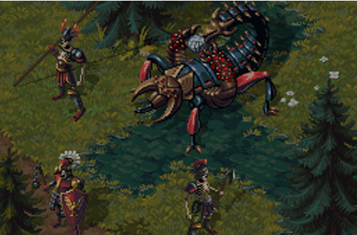
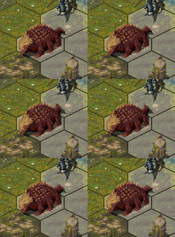
The first one you may already be familiar with, since it’s been lurking in our screenshots and other materials for a while, but we’ve never introduced it properly. The scorpion beast is a living weapons platform employed by the fleshcrafters of the Aegidian League. Heavily armoured and with fearsome pincers to match, it projects a terrifying presence on any battlefield, but its most devastating weapon is its stinger, which is capable of launching magical projectiles over great distances, making the scorpion a natural artillery unit. Zodiac Champions will need to carefully consider how to tackle these abominations – whether to seek shelter from their barrage or approach and be torn to shreds in close combat.

517a9cfcad667ece7596b8818d2bd72719d62956.png


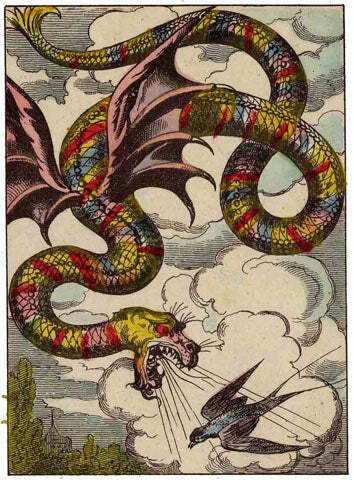
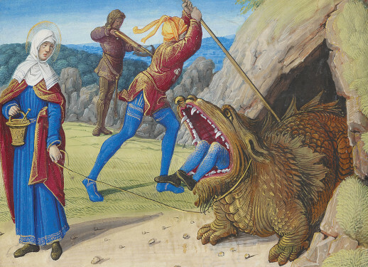
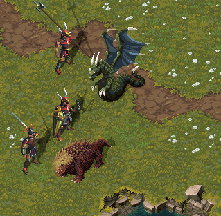
Next there are two very special newcomers. The French region of Provence is known for its chivalric traditions, and so we sought its support in financing the game, and the grant we’ve received has allowed us to make room for two monstrosities from Provençal folklore. The Coulobre and the Tarasque are the first dragons to slither their way into Zodiac Legion. The former is a great winged serpent – slaying it may prove a challenge given its lethal breath and razor-sharp claws. The latter is a lumbering behemoth with a carapace tougher than any steel, and with a strength and ferocity that let it crush its foes even when greatly outnumbered, literally stomping them into the dirt.


7665ece922abb1813e92e3ee86c7f16df224b24f.jpg

c6f68d88b2f45b1b11915833d55f2f0f920ecc75.jpg


e8d59bda96553f005a3c96cc25f73657232daccb.png


It will take all your might and cunning to bring down these dreadful creatures! Standard infantry formations may not save your men from bombardment, deadly sprays and trampling. Only with faith in the stars will your knights emerge victorious.

Until we meet again!

I think making your game’s volume low to aid production of a video probably indicates the video production pipeline has a problem, not the other way around…
Didn't you find the intro music way louder than the rest?
 

Galdred

Studio Draconis
Patron
Developer
Joined
May 6, 2011
Messages
4,495
Location
Middle Empire
Steve gets a Kidney but I don't even get a tag.
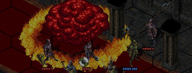
Thank you for posting! As you can see on the screenshot, there are some micro issues to debug with the room connections, and I need to add the creation of active props (doors, teleporters, ...).
The Tarrasque is also getting an upgrade to make it more lore accurate:

455c8bf82d5c734802a23eb1dc0a44c2b81085e4.gif
 

Alienman

Retro-Fascist
Patron
Joined
Sep 10, 2014
Messages
18,146
Location
Mars
Codex 2016 - The Age of Grimoire Make the Codex Great Again! Grab the Codex by the pussy Codex Year of the Donut Shadorwun: Hong Kong Divinity: Original Sin 2 Steve gets a Kidney but I don't even get a tag.
Here is an interview with our own Galdred. You can read down below, or visit my site here!

Welcome to an interview with Alexandre “Galdred” Boureau, the solo developer for Studio Draconis. Galdred is currently working on the X-com-inspired Zodiac Legion, which is showing great promise for the future. So, let’s find out a bit about them, and what Zodiac Legion will bring to the genre!
-----------------------------
Who is Studio Draconis?

I founded Studio Draconis to make Zodiac Legion, and to focus on crunchy tactical and strategy games. It’s a solo dev company, as I work entirely with contractors.

Who is Galdred and what is your background when it comes to creating and playing games? Any stand-out favorites – games that left a lasting impression? I assume X-com is one.

I ended up playing X-COM pretty late, because I kept my Atari 1040 STe way past its prime.

The first games I obsessed over were the tabletop dungeon crawler Heroquest, and its 40K cousin Space Crusade, as well as Laser Squad, so I could say that 1989 was a pretty important year for me, as it was also the time I got my Atari computer to begin with.

I played both Heroquest and Laser Squad briefly in 1990 at my cousins’ home, but I couldn’t find them anymore for several years, so being unable to actually play them again may explain why they were so influential to me.

What drew me to Heroquest was the dungeon crawling experience played out on tabletop. It was also my first game with a persistent campaign that wasn’t a gamebook (I’d read/played the Lone Wolf series before that).

In Laser squad, I fell in love with the tension of the hidden movement of the opponent, and the constant risk of getting one of your characters ambushed around a corner.

Dungeon crawlers and tactical games have been my preferred genres since that time, along with 4X when I discovered Civilization shortly after (it was also one of the last major strategy games to be released on Atari computers, so I spent countless hours on it too).

Heroquest and Space Crusade shortly led me to playing Space Marines (aka large scale 40K with tiny models) with friends during middle school, so I’ve been a 40K early adopter in a way.

I heard friends talk about X-COM, but I didn’t have a PC at that time, so I ended up working on my own “Atari X-COM” version until I went to college, which was also the time I got a PC, and played my first X-COM game: Apocalypse. I played UFO Defense much later, around 2005.

After graduation, I worked as a software engineer for a company producing set-top boxes, while making a few game prototypes during my spare time, but I really wanted to create a game that would combine dungeon crawling and the X-COM geoscape, as this was never attempted before. I took that chance when I had to leave my day job to follow my wife to China.

zodiacinterview1.jpg


Going by Steam, Zodiac Legion is the only game listed under Studio Draconis – that makes me think it’s the studio’s first game, is this true? And if so, what inspired you guys to work together to create this fantasy X-com type of game? Did it start out as a team effort?

Zodiac Legion is indeed the studio’s first game, as well as my first commercial game. I started on my own, and looked for other partners to recruit after I got an early prototype going. After two partnerships fizzled out before taking off, I decided to remain alone in the company, and work with freelancers instead. I was lucky to find reliable long-term partners over the years, because it gave the game some much needed stability in terms of its identity.

Cyangmou and Wolfenoctis, the artists who defined the initial art direction of the game, moved to other projects, but I was l fortunate to have created a lasting partnership with the freelancers I contracted later:
  • Maciej Bogucki for story and level design
  • Alcibiade Minel for the sound and music
  • Mathieu Chauderlot for pixel art
  • WillSama for testing and QA

When reading on your website, I noticed that you are the only one listed as a developer. Does that mean you do all the heavy programming?

I’m responsible for all the programming, but a part of the heavy lifting is done by our open source engine (Moai).

Is it much work for one to do alone, or maybe is it something that works to your advantage? Intimate knowledge of the programming and systems in place, perhaps?

Working alone in a field makes some things easier, as I know the codebase of the game very well. But it makes it slower to implement things at the same time, as programming is the main bottleneck, but I prefer to dedicate the funds to improving things I cannot realistically do on my own for now.

Zodiac Legion has been in development for a long time (10 years) – has the progress slowed, become faster, or maintained the same development speed since its creation?

The development pace depends on a lot of external and internal factors: I had to take a few breaks to pick up contract work, or to address family issues. But it also depends a lot on the task at hand: when implementing new systems, it can take weeks or months between updates, while correcting bugs or modifying existing issues results in a much shorter development cycle. Lately, there were quite a few major features to add, both in our workflow and in the game itself:

We’re almost done with our semi-procedural level system, which combines preset areas that are randomly shuffled into “slots,” a bit like in OG X-COM and XCOM2. I also added quite a few tools to make animation workflow and level control a bit more automated.

zodiac1.gif


When it comes to financing the project all this time, has your own pockets been funding the game, or has capital been injected from the outside?

A bit of both: I started funding most of the game by myself, then I borrowed money from the bank and my relatives. My wife also covered most of our household expenses, allowing me to spend most of my funds on the game. We were also very lucky to get significant funding from the French National Centre of Cinema (CNC), and the region of Provence-Alps-French Riviera, who believed in the potential of the project.

What is taking the most development time – the programming, or the artistry, like music, writing, and art/textures? Has this ever led to bottlenecks, having one waiting for the other type of situation?

The programming is clearly the largest part, but that is also because I’m more cautious with my funds than with my time.

As I work with freelancers with their own schedules, they usually work whenever they have time themselves, and I sometimes integrate their work much later too (usually after I’m done with the current major milestone).

What engine is Zodiac Legion running on? Is it working well for the intended purpose?

Zodiac Legion is running on Moai. It’s a relatively old open source engine. It was also used for Double Fine’s Broken Age and Klei’s Invisible Inc. The reason I went with it was to remain independent from any third party decisions when it came to development, and the engine being open source allows me to modify it to suit our needs, so I’d say it has worked well for the intended purpose, even though I sometimes regret not having the ease of use and the ecosystem of Unity, but its pricing disaster revealed the dangers of relying on free lunch!

On Steam, Zodiac Legion is listed as it’s going to be self-published, but I couldn’t help to notice that the indie publisher Hooded Horse is following you on Twitter(X). Is there something to this, or just a coincidence?

We chatted from time to time, but that’s about it so far. Tim from Hooded Horse has been of great help regarding marketing topics, and I’m very thankful for all his advice.

Are you searching for a publisher?

I’m not actively searching for one, but I’m not necessarily against it either. It would mostly depend on what he could bring to the table.

How come? Is it important to remain independent? To have full ownership what is being created?

There are quite a few great perks that come with a publisher, especially for a small studio like ours:
  • Name recognition (though that also depends on the publisher in question)
  • Marketing and PR support
  • Established contacts with some third party actors (especially in Asian countries, where it can be difficult to reach the audience).
But it’s true that they all come at the cost of independence, not only of the game itself, but of its potential expansions and sequels as well. Publishers also typically take a significant part of the earnings, so I’d need to be convinced that their impact would be higher than the cost.

zodiacinterview3.jpg


Now to the game at hand, Zodiac Legion. It’s set to be released in Early Access in late 2024. How come it will be early access? Is the money from sales required for continued development?

More money is always helpful, but the plan had always been to go for early access.

There are several reasons for that:
  • We want to make the game available as soon as it’s sufficiently fun. This genre works pretty well with early access, as such games have a significant degree of randomness and replayability.
  • It’s very hard to get sufficient feedback about the game’s systems from testers alone for such complex games, so early access makes it easier to “scale” the testing phase, while still relying on the most dedicated fans.
Anyway, we don’t plan to release the game, even in EA, until we’re happy with its core systems. I think I’ve been mentioning this from 2015 on RPG Codex, so I have pushed the early access date a lot already to further polish the game.

There is a demo out, how was the response to the demo? Did people enjoy it? Was there something that surprised you, that the public didn’t seem to like perhaps? Or maybe the opposite.

We had a serious onboarding problem at first, with the game UI being too confusing for many players. That was our biggest surprise actually, with a significant part of the players dropping the demo after 2 minutes. The reception among those that remained was much better though, and some who were initially pretty vocal about the mechanics became quite enthusiastic after we explained the game’s rules better. Overall, we’re quite happy about the feedback from the players who stuck with the game, but we’ll continue to work on making the introduction to the mechanics more straightforward.

What would you say would be the stand-out portions of Zodiac Legion – if we leave out general combat and such?

We want the strategic layer of the game to be tightly coupled to the combat, by having the type of mission, enemies, and map depend on contextual circumstances, and by making different missions affect the strategic layer in distinct ways. For example, completing a mission to assassinate a ruler who is aligned with the enemy faction will have a very different strategic impact than exploring a ruined magic library. The former may weaken your primary enemy and make it harder for him to assault your citadel, while the latter may yield you research points to spend on expanding your options.

I read a snippet on your website that indicates that your units can be captured, is that still a thing? I think that was one of the coolest things that could happen in Jagged Alliance 2 – for you to later bust them out.

That’s still planned, yes: we want it to be relatively likely for characters to die on a mission, but we also want to combine it with a high chance of just getting knocked out, so if it’s a mission where you need to extract, the downed characters will end up captured. Depending on the faction that captures the character, he may be ransomed back, as was common practice in the age of knights, or you may need to free him in a jailbreak mission if the captors are less chivalric.

zodiacinterview8.jpg
Whilst still being tactical, I’m getting the impression that the combat is more abstract than say “simulated” like in OG X-com – is that the intended approach? Making it feel a bit more like a board game?


As a wargame designer used to say, every tactical simulation model is wrong. The way we differ with OG X-COM is mostly that we concentrate on representing different things. Zodiac Legion mostly focuses on providing an authentic representation of melee combat in small groups.

An example of that can be found in our support mechanics, and the removal of attacks of opportunity.

In Zodiac Legion, characters support each other in combat, and a medium-sized shield also protects the characters nearby from ranged attacks. We also decided to replace attacks of opportunity with a more complex check for pinning characters trying to move when engaged in melee combat. This check involves a calculation of relative supports from both sides on the starting and target tiles.

For the same reason, we’re reworking the way weapons and armor interact, because we’d like to make heavy armor very difficult to penetrate if a huge advantage isn’t involved, like when an enemy is lying on the ground.

Certain mechanics from X-COM wouldn’t make much sense, like reaction fire: keeping your bowstring drawn for a prolonged period of time is not really feasible, but we might add something similar once we introduce crossbows.

How will recruitment and death work? How will the loss of a veteran unit impact the gameplay? Can you still finish the game after a total squad wipe, or is it mostly a game over like in the modern Xcom games? I also read something about necromancy, will I be able to bring back my dead as undead warriors/zombies?

The meat grinder aspect of OG X-COM is something we’re strongly attached to, but at the same time, fantasy knights are supposed to have a lower turnover rate than X-COM operatives.

We want the loss of a veteran to be a resounding blow to the player, but not the end of the world. There are several things that we want to add to make sure a single defeat is not the end of the campaign:
The exact mechanics are still subject to change, but a part of a character’s power will be derived from the magic resources spent on strengthening the corresponding Zodiac sign’s “altar” in the player’s fortress. Thus losing your most powerful warrior of the Lion will allow another one to retain most of the shrine’s power and take up the mantle of the new champion of that sign.

Some characters will also typically come already quite skilled in non-magical warfare, as a significant part of them will be trained knights.

zodiac2.gif


How will loot be acquired, and will it be equipped on an individual basis, or does it work differently?

In a traditional heroic setting, there is a strong connection between a knight and his weapon, so we’d rather have Arthur keep wielding Excalibur instead of swapping it for an extra +3 every 2 levels. In order to do so, we’ll mostly have loot serve as enchantment material, to strengthen the magical power of a character’s weapons and armor. However, on death, it would make sense to transfer the artifacts from one character to another.

What similarities does Zodiac Legion share with X-com, beyond the turn-based combat? Does it have basebuilding, research to be conducted, etc?

The vision for the game had always been to combine the “geoscape” elements of X-COM with traditional dungeon crawling, so the game will definitely have base building and research.

Research plays a major part actually, since the player is tasked with rediscovering arcane knowledge that was lost as a consequence of magic being dormant for centuries.

Unlike OG X-COM, the base building will focus on the Legion’s citadel, while secondary bases will be much less developed.

What do the zodiac signs have to do with the setting at large? It seems intriguing.

The Zodiac signs are the source of the characters’ powers. We went for this theme because Zodiac signs are already something we associate with the supernatural. They also make a good base for character classes, as each corresponds to a different archetype. Aquarius is typically associated with features evocative of a sorcerer, while Cancer would feel closer to a Cleric, and Leo to a Paladin.

Reading a bit on your website, I get the impression that Zodiac Legion will be a bit of a 4X too, am I wrong in this assumption?

That is one of the things we’re trying to balance: we want Zodiac Legion to feel like you’re shaping the strategic situation around you, but through the actions of a few heroes. So we definitely want to give the game 4X vibes, while making most strategic actions resolved through tactical skirmishes.

A clash between two military forces may lead to missions like assassinating the enemy commander, then destroying a bridge to cut the enemy’s supply line and end their chevauchée.

The 4X elements will also let the player resolve some late game situations through the use of brute force (with armies or magic) once the might of his order of arcane knights becomes sufficient, acting like a kind of late game auto-resolve.

zodiacinterview5.jpg


How will the different fighting styles be balanced, and what are the fighting styles? I’m hoping magic won’t be the psionics of Zodiac Legion, dominating the endgame almost purely by itself!

Magic will be pretty important in the end game, but the “warrior” classes will have access to it in their own way, a bit like physical adepts in Shadowrun. So late game warriors will behave more like paladins than purely mundane fighters.

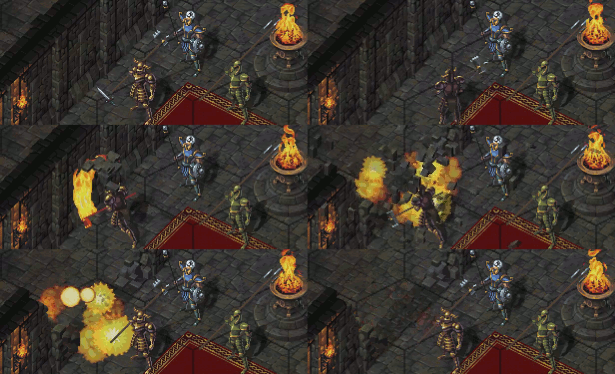
Also, when it comes to the effects of magic, we want it to act as a gradual expansion of the player’s options in combat. The baseline for everything is “medieval dungeon crawling,” and this is never supposed to be displaced by the magic, but rather enhanced by it – by scattering enemy formations with fireballs, breaching dungeon walls with “explosive” skills or freezing water to create an impromptu bridge.

Which style of fighting do you prefer yourself?

In order to get direct experience in melee fighting, I trained with a longsword a bit. I also tried some variations (sword and shield, rapier and dagger), but I had the most fun with group melee combat, as the mix of group and personal decision felt very interesting.

I also tried to make fighter/mage hybrid characters work in a lot of games, but they have underperformed most of the time.

How will you make sure the turn-based combat feels snappy, to not get bogged down in fights that take hours to complete?

That’s one of our major issues actually: long missions can be quite taxing, and that makes it even worse if there’s downtime. That’s also an area where we want to get player feedback, because as developers, our own perception in this context is skewed.

I also added tools to control the “sanity” of the levels generated, to make sure they wouldn’t need too much backtracking.

Do you want to add anything about the game, about yourself, or maybe something else?

I believe these questions were already in-depth enough that there isn’t much else that could be added. Except perhaps for the standard request that is: Remember to wishlist Zodiac Legion on Steam! It’s really a ton of help.

Any tips for other indie developers out there?

After its debut at a festival, the feedback for Zodiac Legion was pretty negative: the UI was confusing, and the game suffered from pacing issues. Seeing players struggle with the controls was rather heartbreaking. We went back to the drawing board, and reworked quite a few mechanics, the maps, and the UI. That took more than a year, but then the stars finally began to align, and we got some press recognition from journalists or youtubers like Splattercat who showed their interest in the game. Then, the first Steam demo was met with a mixed reception, as new issues altogether had crept in.

I think when crossing a valley of despair, it’s critically important to just focus on the task at hand – otherwise things can get quite intimidating.

Just to make sure, it will be out this year, right?

The plan is indeed to release the game in 2024!
------------------------------------

I want to thank Galdred for taking the time to answer all these questions – he turned out to be a real sport about it. Good answers too. Now we just have to wait for Zodiac Legion to be released in Early Access later this year. Going by what is said in the interview, Zodiac Legion seems like a genuine passion project – which is usually the titles that stand out and are played for years. If you find this interview interesting, make sure to wishlist Zodiac Legion on Steam!
 

The Wall

Dumbfuck!
Dumbfuck Zionist Agent
Joined
Jul 19, 2017
Messages
3,695
Location
SERPGIA
10 years in production this year. This is never coming out, is it? Fallout, Arcanum, Deus Ex, Gothic... All had multiple releases in a span of decade

Decade is.... WeW! A looong ass time

#BTW: Zodiac Legion is among my TOP10 most expected games. For this year and past 5 years :-D:cool:
 

Serus

Arcane
Patron
Joined
Jul 16, 2005
Messages
6,907
Location
Small but great planet of Potatohole
You really just going to fire shots at cleve like that?
The worst part is that I don't even have a bunker to show for it!
I don't know where are you from but you can move to Albania. I heard they have tons and tons of those from the commie times. Possibly very cheap.
 

As an Amazon Associate, rpgcodex.net earns from qualifying purchases.
Back
Top Bottom