


Found your problem.That's what you want


-
Welcome to rpgcodex.net, a site dedicated to discussing computer based role-playing games in a free and open fashion. We're less strict than other forums, but please refer to the rules.
"This message is awaiting moderator approval": All new users must pass through our moderation queue before they will be able to post normally. Until your account has "passed" your posts will only be visible to yourself (and moderators) until they are approved. Give us a week to get around to approving / deleting / ignoring your mundane opinion on crap before hassling us about it. Once you have passed the moderation period (think of it as a test), you will be able to post normally, just like all the other retards.
You are using an out of date browser. It may not display this or other websites correctly.
You should upgrade or use an alternative browser.
You should upgrade or use an alternative browser.
Indie Vampire Syndicate: Gangs of MoonFall - Isometric Cyberpunk Vampire RPG
- Thread starter Tyranicon
- Start date
DoWhocares
Literate
- Joined
- Feb 3, 2024
- Messages
- 29
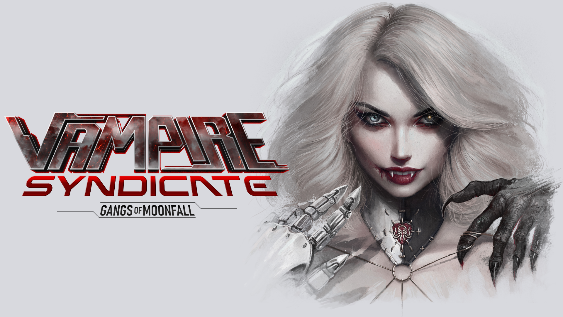
If we're talking an actual proper game - the top (new) one looks interesting and intriguing. I'd be curious to see what it's about. The bottom one looks like generic weeb shit - instant pass.What do you guys think of new cover art in this style? Not exactly like this, but something similar. I'll probably redo the title logo too, since it's not what I want.
View attachment 47903
Current cover art:
View attachment 47904
If we're talking a porn game - same principle applies with the caveat that I've no interest in seeing hot chicks getting railed by weird-ass leathery monsters. And that arm suggests that that's what you'll be getting here.
Harthwain
Magister
- Joined
- Dec 13, 2019
- Messages
- 4,814
Sounds like a "you" problem to me.Found your problem.That's what you want
BruceVC
Magister
Nice, any full body images so we can comment on those aesthetics and voluptuous overall form?
Peachcurl
Cipher
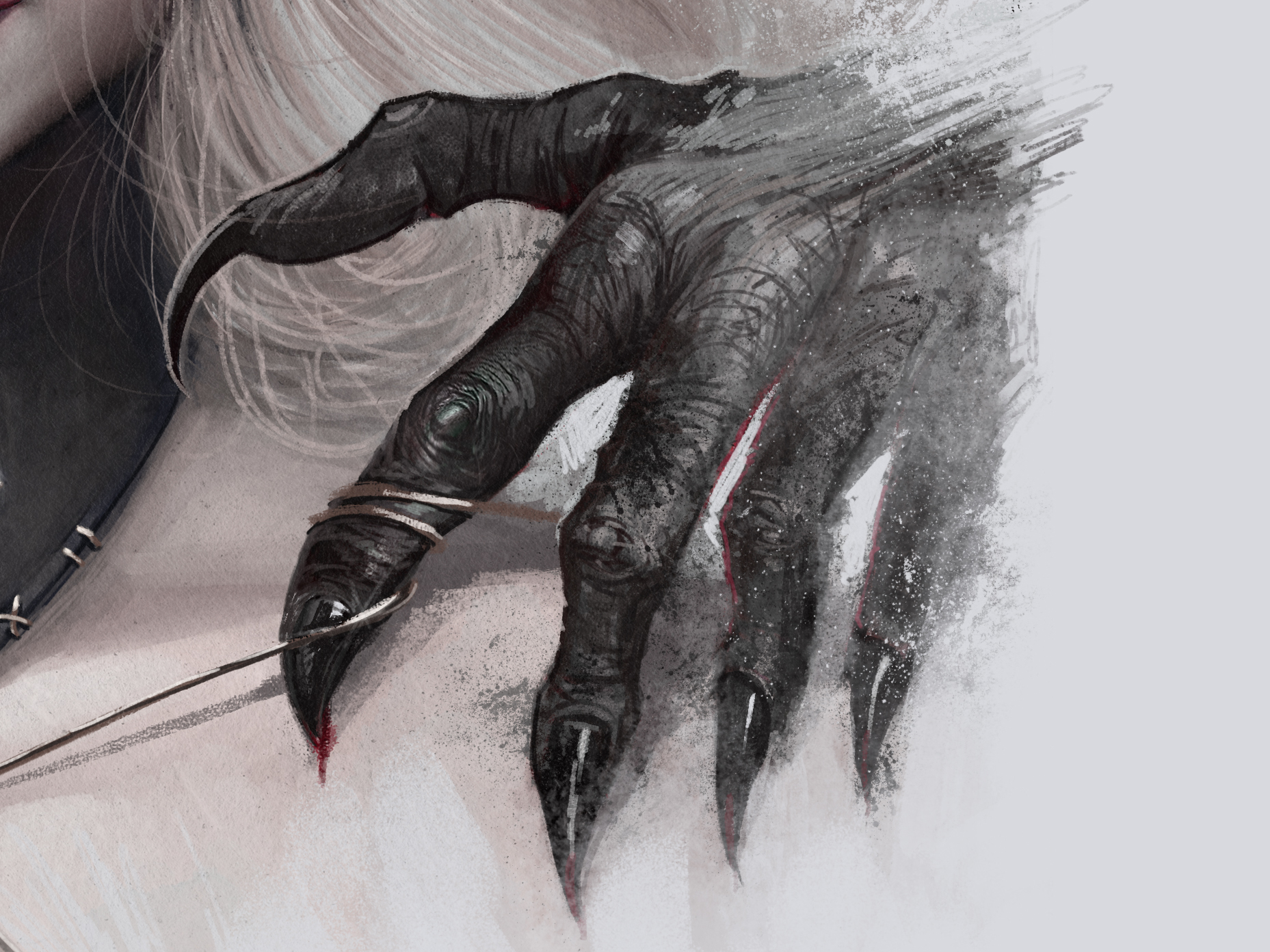
She looks nice, I like the eye in the shadow with that slight glow. But whose hands are those? The black one might be hers, in a somewhat awkward pose. But the robot hand? It's a bit confusing, is this with the "palm" up? Else, the thumb is not in the right place. I mean, it's not a real hand, so anything is possible, but it looks odd.
Tyranicon
A Memory of Eternity

- Joined
- Oct 7, 2019
- Messages
- 6,095
Nice, any full body images so we can comment on those aesthetics and voluptuous overall form?
It's Iolanthe, the cover character. The hair is slightly different and so is the face.
She looks nice, I like the eye in the shadow with that slight glow. But whose hands are those? The black one might be hers, in a somewhat awkward pose. But the robot hand? It's a bit confusing, is this with the "palm" up? Else, the thumb is not in the right place. I mean, it's not a real hand, so anything is possible, but it looks odd.
The hands are not hers. It's just symbolism for the overarching "vampire vs machine" theme the game has.
Peachcurl
Cipher
I see. Makes sense then, but some who see that image will first assume it's her hands from the context (and then wonder about pose).
Maybe you could:
- show at least some shadowy contours of the hands' owners in the background. If that comes with a darker background, I think that'd also be good for contrast to her light hair.
- or show her hands as well, maybe folded together or flat against each other in the middle?
Maybe you could:
- show at least some shadowy contours of the hands' owners in the background. If that comes with a darker background, I think that'd also be good for contrast to her light hair.
- or show her hands as well, maybe folded together or flat against each other in the middle?
DoWhocares
Literate
- Joined
- Feb 3, 2024
- Messages
- 29
Maybe go for a marionette type deal, with both hands above your vampire lady and strings going down towards her, one hand demon the other robot.
Kinda like here, but you know, more simple and setting appropriate:

Kinda like here, but you know, more simple and setting appropriate:
Gargaune
Magister
- Joined
- Mar 12, 2020
- Messages
- 3,217
Honestly, man, I'm not feeling it. These new variants ain't hitting the cyberpunk mark and they ain't doing much for the vampire bit either. I get what you're going for with the hands, but I don't think it's landing. If you're going for "cybervamp", I liked the first cover better for a starting point:So, help me out. This is what I have so far, not final. Thoughts?
The red lines behind are good, put you in that artificial, neon mood, maybe add some tiny scrolling 1s and 0s, GitS/Matrix-like to really drive the point home. Give her one "regular" vampire eye, cover the other with a Google Glass (it's only lame in reality, in fiction it's cool).
And most importantly - gimme that mouth wide open, baby. Vampires (especially vampire waifus) ain't gonna be very obvious shit by design, let alone in a 200px banner, so play up those chompers all the way and have her snarl at the viewer for a full frontal of them pearly whites. You know, bad pussycat look.
If you're worried about visibility, you can try it on a white background. Or even flip the red with the black - red field, black "circuitry" behind her. Might be a bit too intense, but worth a shot if you're messing around for now. And if you're not thrilled with the anime aesthetic, you can try the same concept with a softer, "Western" shading style for the character, but I think the concept itself was better grounded.
Not trying to be a downer, but I'd imagine "cyberpunk vampires" as a theme is going to be more easily communicated (visually) to a scrolling audience than "vampire caught between the pull of monster and machine." It might be more artistic and distinct, but I'm not sure it's as clearly evocative. Dunno, wouldn't wanna steer you wrong, just my take.
Tyranicon
A Memory of Eternity
- Joined
- Oct 7, 2019
- Messages
- 6,095
Strangely enough I'm actually a big Powerwolf fan. Was playing a lot of their stuff when working on my BG3 parody.Kinda like here, but you know, more simple and setting appropriate:
And if you're not thrilled with the anime aesthetic, you can try the same concept with a softer, "Western" shading style for the character, but I think the concept itself was better grounded.
That's actually the point, I'm not replacing the anime-esque cover, I just need something different to represent the very non-anime 3D renders.
If I already have dual artstyles, I might as well go ahead and have dual covers too and really capitalize on it.
It's a little busy. Something I don't like about the hair - maybe it's blowing to the sides too much? The complicated symbol on the neckpiece doesn't read well; I'd say get rid of it. I disagree with Gargaune that it needs to be more blatantly VAMPIRE VAMPIRE VAMPIRE; in fact I thought the fangs were too on the nose. I like that other picture of the character where you can't see the fangs and you figure out she's a vampire from context. I love the thing with the hands - it hints volumes about the game's setting and central conflicts. Her tiny chin and huge eyes make her look like she's about 9 here which I hope is not what you are going for. I have many other thoughts and feelings but I'm on vacation so I won't be checking in regularly for a while. Hope this helps.So, help me out. This is what I have so far, not final. Thoughts?
BruceVC
Magister
That works as long as its an attractive Vampiress, this is a porn game after allMaybe go for a marionette type deal, with both hands above your vampire lady and strings going down towards her, one hand demon the other robot.
Kinda like here, but you know, more simple and setting appropriate:

BruceVC
Magister
Unacceptable, whats more important? Being on vacation or commenting on a Vampire porn game ....always prioritize the important thingsIt's a little busy. Something I don't like about the hair - maybe it's blowing to the sides too much? The complicated symbol on the neckpiece doesn't read well; I'd say get rid of it. I disagree with Gargaune that it needs to be more blatantly VAMPIRE VAMPIRE VAMPIRE; in fact I thought the fangs were too on the nose. I like that other picture of the character where you can't see the fangs and you figure out she's a vampire from context. I love the thing with the hands - it hints volumes about the game's setting and central conflicts. Her tiny chin and huge eyes make her look like she's about 9 here which I hope is not what you are going for. I have many other thoughts and feelings but I'm on vacation so I won't be checking in regularly for a while. Hope this helps.So, help me out. This is what I have so far, not final. Thoughts?

- Joined
- Oct 1, 2008
- Messages
- 2,684

I like it but agree that the way it's framed makes it unclear that the hands are symbolic or whatever it is you intended them to be. The black hand looks like it's supposed to be hers, while the metal hand looks like someone is reaching directly towards her from out of frame. If you're just trying to convey tech vs. monster, can you do so directly with her instead? You already have her showing as a bit of a duality... just lean into that more and integrate the metal parts into the left side and the monster parts more into the right instead of having two hands serving that role.
Gargaune
Magister
- Joined
- Mar 12, 2020
- Messages
- 3,217
My bad, missed that context.That's actually the point, I'm not replacing the anime-esque cover, I just need something different to represent the very non-anime 3D renders.
KeighnMcDeath
RPG Codex Boomer
- Joined
- Nov 23, 2016
- Messages
- 13,062
I don't recall if I got their last album or not as I keep listening to Sabaton now. I have the urge to go back to Alestorm though.
RaggleFraggle
Ask me about VTM
- Joined
- Mar 23, 2022
- Messages
- 1,059
That claw is too awkwardly placed to be hers
That's the point. It isn't hers.That claw is too awkwardly placed to be hers
KeighnMcDeath
RPG Codex Boomer
- Joined
- Nov 23, 2016
- Messages
- 13,062
She's looking for blood sausage.
SAUSAGE TIME!!
WOOF WOOF!!
Are those her hands or someone elses?
It reminds me of a nurse I knew at a doctor's office while drawing my blood. We were talking about pulse and blood pressure and she commented that grasping the penis is a perfectly valid area to take a pulse.
SAUSAGE TIME!!
WOOF WOOF!!
Are those her hands or someone elses?
It reminds me of a nurse I knew at a doctor's office while drawing my blood. We were talking about pulse and blood pressure and she commented that grasping the penis is a perfectly valid area to take a pulse.
Last edited:
True Ukrainian
Arcane


Art looks awkward. Also doesn't tell the viewer anything about syndicates or gangs.
KeighnMcDeath
RPG Codex Boomer
- Joined
- Nov 23, 2016
- Messages
- 13,062
Can we make our main character to be like Cage?
AdolfSatan
Arcane
- Joined
- Dec 27, 2017
- Messages
- 1,890
Yeah, dual art style is the worst possible decision one could make. You will receive some bashing based solely on it that will discredit other aspects of the game.
Some more specific critiques:
Is the name « Vampire Syndicate: Gangs of Moonfall », or is it « Vampire: Syndicate: Gangs of Moonfall » ? Because the triple font and hierarchy leads me to read it as the latter.
The art itself is too complex for its own good, the excessive light sources are creating irrational shadow patterns that make it look off, and the hands look like they were tacked on without regards for the composition because they’re just weightlessly hovering over the character.
Most importantly, I assume this is a banner you’ll use on Steam and other platforms. Have you checked to see how it looks at the size it will actually be displayed at? Have you tested it in lower resolution screens (most of the world is using 1080p, and right next to it is 768p)? Have you considered that a good chunk of your players might have less-than-ideal eyesight? You have a lot of minute details that won’t render nicely when you translate this picture to real-life use.
Tyranicon
A Memory of Eternity
- Joined
- Oct 7, 2019
- Messages
- 6,095
It's Vampire Syndicate: Gangs of MoonFall. I'm considering getting a new logo but I don't want to throw more money and time into it.Yeah, dual art style is the worst possible decision one could make. You will receive some bashing based solely on it that will discredit other aspects of the game.
Some more specific critiques:
Is the name « Vampire Syndicate: Gangs of Moonfall », or is it « Vampire: Syndicate: Gangs of Moonfall » ? Because the triple font and hierarchy leads me to read it as the latter.
The art itself is too complex for its own good, the excessive light sources are creating irrational shadow patterns that make it look off, and the hands look like they were tacked on without regards for the composition because they’re just weightlessly hovering over the character.
Most importantly, I assume this is a banner you’ll use on Steam and other platforms. Have you checked to see how it looks at the size it will actually be displayed at? Have you tested it in lower resolution screens (most of the world is using 1080p, and right next to it is 768p)? Have you considered that a good chunk of your players might have less-than-ideal eyesight? You have a lot of minute details that won’t render nicely when you translate this picture to real-life use.
I'm happy with the artwork, but you are right about the lighting and the floatiness of the hands. But it's something I can live with.
I'm actually old hand at resizing for the Steam banners and stuff by now. I'm not good at it, I'm sure a professional will tear their hair out at the way I butcher things, but such is being a solodev.


As an Amazon Associate, rpgcodex.net earns from qualifying purchases.