Putting the 'role' back in role-playing games since 2002.
Donate to Codex
Good Old Games
  • Welcome to rpgcodex.net, a site dedicated to discussing computer based role-playing games in a free and open fashion. We're less strict than other forums, but please refer to the rules.

    "This message is awaiting moderator approval": All new users must pass through our moderation queue before they will be able to post normally. Until your account has "passed" your posts will only be visible to yourself (and moderators) until they are approved. Give us a week to get around to approving / deleting / ignoring your mundane opinion on crap before hassling us about it. Once you have passed the moderation period (think of it as a test), you will be able to post normally, just like all the other retards.

Game News Bard's Tale IV Kickstarter Update #49: Beta Feedback, Bard's Tale 1 Remaster Coming August 14th

Infinitron

I post news
Patron
Staff Member
Joined
Jan 28, 2011
Messages
99,592
Codex Year of the Donut Serpent in the Staglands Dead State Divinity: Original Sin Project: Eternity Torment: Tides of Numenera Wasteland 2 Shadorwun: Hong Kong Divinity: Original Sin 2 A Beautifully Desolate Campaign Pillars of Eternity 2: Deadfire Pathfinder: Kingmaker Pathfinder: Wrath I'm very into cock and ball torture I helped put crap in Monomyth
Tags: Brian Fargo; inXile Entertainment; Krome Studios; Paul Marzagalli; The Bard's Tale IV: Barrows Deep; The Bard's Tale Trilogy

Krome Studios' remaster of the original Bard's Tale trilogy was supposed to be released on Steam Early Access last month, with only the first game included initially. However, in a brief Bard's Tale IV Kickstarter update on the day of its intended release, inXile informed backers that they'd changed their plans and now intended to release the trilogy as a regular product at a later date in mid-August, though still including only Bard's Tale 1 at first. The episodic (for lack of a better term) remastered trilogy now has its own pages on Steam and GOG, with an exact release date of August 14th. According to inXile's press release, it'll cost $15. The second and third chapters in the trilogy are scheduled for release this fall and winter, respectively. Here's the launch trailer, which prominently showcases the remaster's new animations.


In actual Bard's Tale IV news, today's Kickstarter update features a list of changes and improvements that inXile have decided to implement based on player feedback. Some of these changes should make our resident blobber purists a bit happier.

We were thrilled with the reception of the beta both from the public and our backers, particularly through the submission form link that let players give their feedback directly from the game. It was great to read all the kind words, and even where there was criticism, it was constructive. On that note, we've been poring over the comments and data in the near-month since the beta's release and discussing it in-depth daily.

We are now at a point where we can share some early feedback from the dev team on your comments. As we begin to implement fixes and other tweaks, we wanted to give you an update on some of the changes we have planned for the launch version of the game (as well as some changes that we are considering) thanks to you. Here's a list, along with a call out of some of the many names whose comments were read and considered.
  • Courtesy of feedback from users such as Zortok, we are increasing the number of mastery slots from 3 to 4.
  • Courtesy of feedback from users such as mdntblue, we are working on granting mercenary tokens earlier so that you can make you own characters sooner.
  • Courtesy of feedback from users such as dpisacane, we are speeding up how quickly you get to six party members.
  • Courtesy of feedback from users such as Paranoiac, merchants will have multiple pages so that it is easier for you to sell your stuff.
  • Courtesy of feedback from users such as Sirtechfan, along similar lines, we’re tuning the item economy for the early part of the game based on your feedback.
  • Courtesy of feedback from users such as Drool, we are working on improved ways to compare items in the shop. You will be able to compare items in a store with items equipped on your characters.
  • Courtesy of feedback from users such as Nystrom, one quality of life feature for inventory: we’ll have pages for inventory items, lore items, and quest items so players can more easily track/understand what they are picking up.
  • Courtesy of feedback from users such as lemiarty, starting inventory will be larger.
  • Courtesy of feedback from users such as Jalis, after the eight main narrative quests, there will be significantly fewer waypoints telling you where to go. For the most part, it will be a destination marker and that’s it.
  • Courtesy of feedback from users such as Omelet79, we are adding a cost to resetting your characters’ skill trees. It is no longer freely available anywhere. You now pay using a mercenary token at the Review Board to do so.
  • Courtesy of feedback from users such as Entrei, adding a “surrender” button on combat that allows you to reload your most recent checkpoint rather than play out a losing combat. We will be sure to add a “Are you sure?” double-check to avoid any accidental activations!
If you didn’t see your suggestion here, that’s not because we haven’t seen it. We are tracking and considering everything that is coming in. The above are items that we’ve reached consensus on, and wanted to share with you now. Thank you again for the feedback so far. It is helping to make The Bard's Tale IV: Barrows Deep a better game.​

The update also includes links to all the recent Bard's Tale IV previews and a glimpse at one of the game's character models that inXile have polished for release. Perhaps the game will meet the high graphical standard they set for themselves during the Kickstarter after all.
 
Last edited by a moderator:

Sacibengala

Prophet
Joined
Aug 16, 2014
Messages
1,154
It is bad for me wanting to play the remasters but don't care too much about the IV? I'll probably play all the remasters before I risk the new one.
 

duanth123

Arcane
Joined
Mar 22, 2008
Messages
822
Location
This island earth
Some of these changes should make our resident blobber purists a bit happier.

I think most of the purists won't be playing this piece of shit.

edgy.png
Edgy x 1
Infinitron

So thirsty.
 
Last edited:

Invictus

Arcane
The Real Fanboy
Joined
Nov 3, 2013
Messages
2,790
Location
Mexico
Divinity: Original Sin 2
I bet these will cost $5-10 bucks a piece... and to be honest from what I have seen of the reworked artwork and the more than welcome addition of automap I will definetly be buying the first game
Also really looking forward to the Bard’s Tale 4, looks like a fun & entertaining game
 

Strange Fellow

Peculiar
Patron
Joined
Jun 21, 2018
Messages
4,241
Steve gets a Kidney but I don't even get a tag.
Yeah but they have to make it scale to our modern screens.
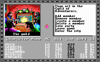
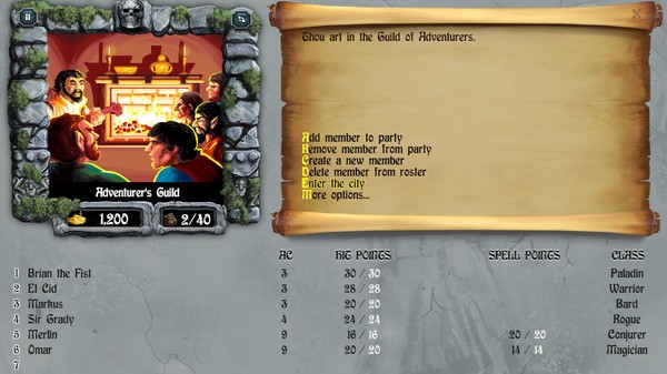
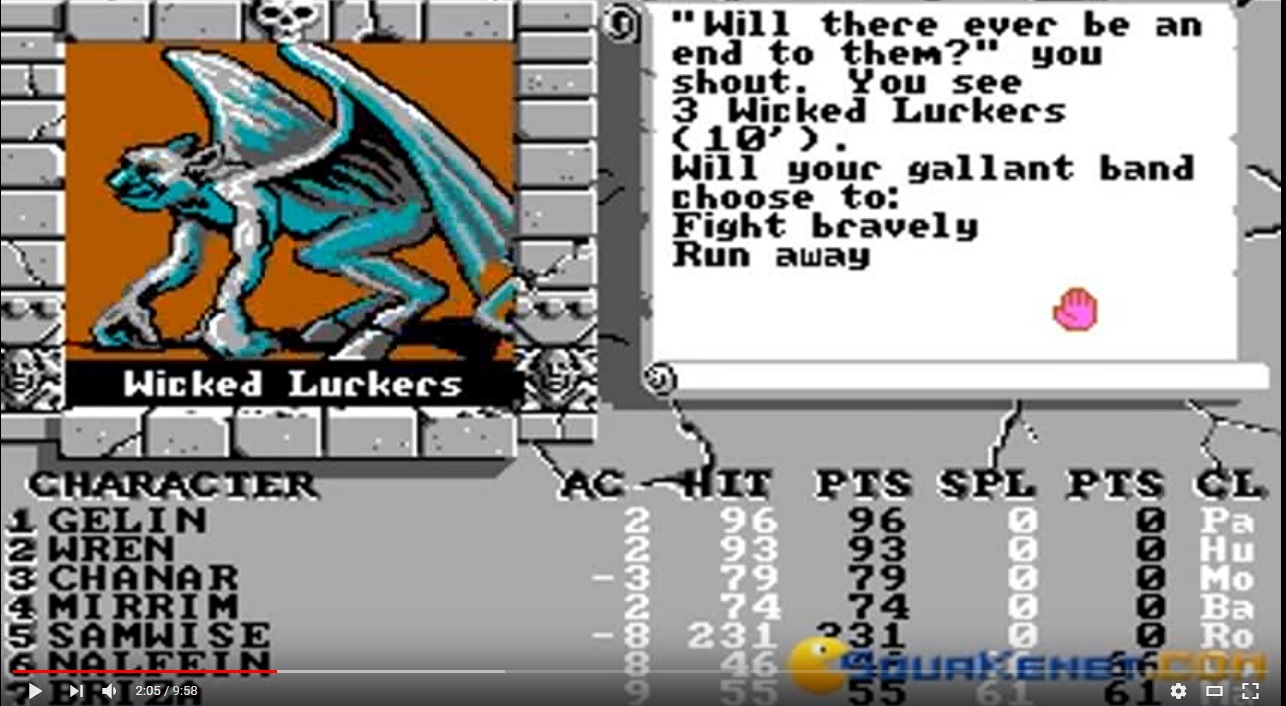
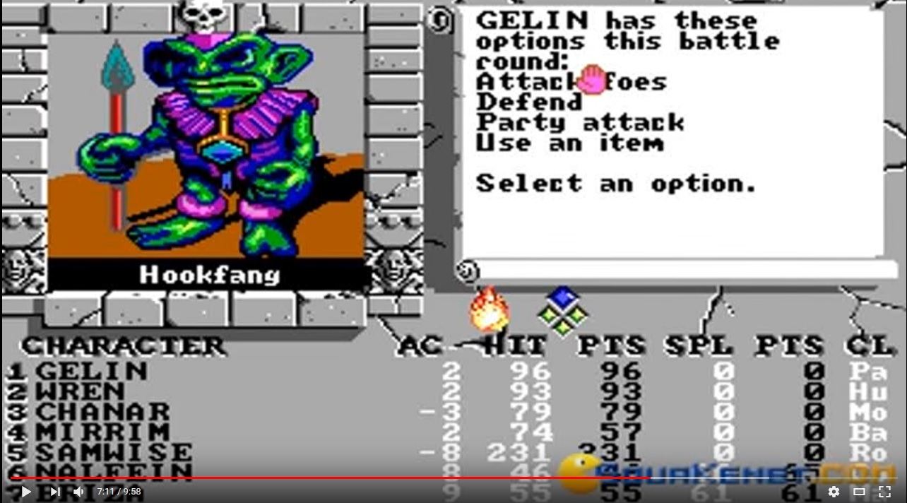
They've definitely taken some liberties with the style, and made it look more cartoonish. In the original they look like people, or at least as close as you can reasonably get with 100x100 pixels. In the remaster they look a little like Pixar characters.
tales-of-the-unknown-volume-i-the-bards-tale_2.gif
ss_435b2b6056500ed1c82752282c57b814f56eb0e0.600x338.jpg

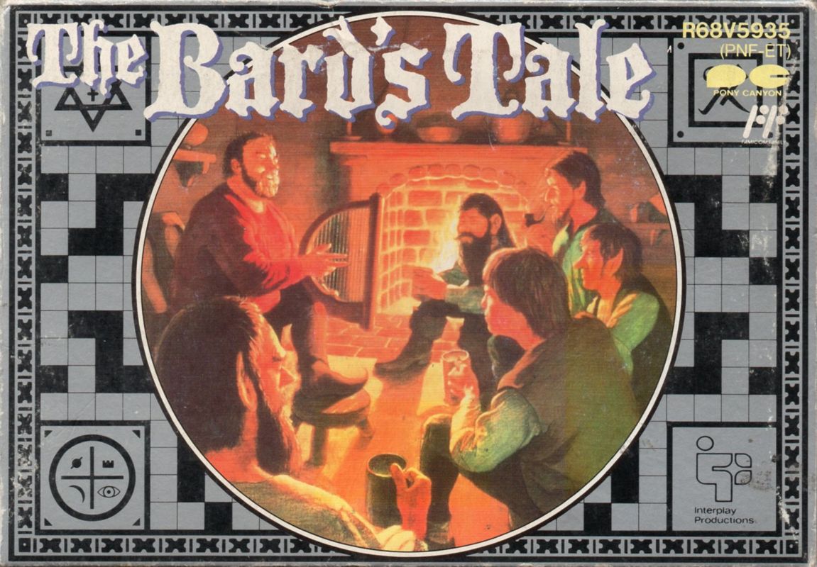
This is the mood I imagine they were aiming for with the originals:
460344-tales-of-the-unknown-volume-i-the-bard-s-tale-nes-front-cover.jpg

I think the smoothed look changes the mood of the game. I'm getting the impression, from both this and BT4, that InXile think older RPGs were more childish than they really were. Maybe I'm biased.
 

Mortmal

Arcane
Joined
Jun 15, 2009
Messages
9,495
Yeah but they have to make it scale to our modern screens.
They've definitely taken some liberties with the style, and made it look more cartoonish. In the original they look like people, or at least as close as you can reasonably get with 100x100 pixels. In the remaster they look a little like Pixar characters.
tales-of-the-unknown-volume-i-the-bards-tale_2.gif
ss_435b2b6056500ed1c82752282c57b814f56eb0e0.600x338.jpg

This is the mood I imagine they were aiming for with the originals:
460344-tales-of-the-unknown-volume-i-the-bard-s-tale-nes-front-cover.jpg

I think the smoothed look changes the mood of the game. I'm getting the impression, from both this and BT4, that InXile think older RPGs were more childish than they really were. Maybe I'm biased.
You arent biased, its the same for pen and paper rpg artworks like pathfinder , art is now lot more cartoonish compare to 80's
 

Infinitron

I post news
Patron
Staff Member
Joined
Jan 28, 2011
Messages
99,592
Codex Year of the Donut Serpent in the Staglands Dead State Divinity: Original Sin Project: Eternity Torment: Tides of Numenera Wasteland 2 Shadorwun: Hong Kong Divinity: Original Sin 2 A Beautifully Desolate Campaign Pillars of Eternity 2: Deadfire Pathfinder: Kingmaker Pathfinder: Wrath I'm very into cock and ball torture I helped put crap in Monomyth
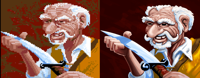
The thing is that the cartoony appearance is basically how that art would actually look like if you just increased the resolution and added more colors. It's interesting to look at what game developers did back in the day when they went from EGA to VGA, though. Monkey Island is an extreme case:

micomparison.jpg


These really aren't the same images at all, but the top image is maybe the sort of thing the EGA pixel artists were imagining when they drew the bottom one.
 

Darkzone

Arcane
Joined
Sep 4, 2013
Messages
2,323
The changes that inXile has announced are welcomed.

Yeah but they have to make it scale to our modern screens.
They've definitely taken some liberties with the style, and made it look more cartoonish. In the original they look like people, or at least as close as you can reasonably get with 100x100 pixels. In the remaster they look a little like Pixar characters.
This is the mood I imagine they were aiming for with the originals.
I think the smoothed look changes the mood of the game. I'm getting the impression, from both this and BT4, that InXile think older RPGs were more childish than they really were. Maybe I'm biased.
You arent biased, its the same for pen and paper rpg artworks like pathfinder , art is now lot more cartoonish compare to 80's
The 77-81 art of D&D and Dragon magazin was also very cartoonish:
basics.jpg

monster_manual.jpg
Only later the revised editions from 1983-1986 featured more realistic art by Larry Elmore and Jeff Easley.
 
Last edited:

Decado

Old time handsome face wrecker
Patron
Joined
Dec 1, 2010
Messages
2,674
Location
San Diego
Codex 2014
I will try BTIV but I am looking forward to the remasters. It will be cool to find 15 KAEL'S AXEs in a row, apparently that motherfucker just loved axes I guess, I dunno.
 

Drowed

Arcane
Joined
Dec 28, 2011
Messages
1,743
Location
Core City
The thing is that the cartoony appearance is basically how that art would actually look like if you just increased the resolution and added more colors. It's interesting to look at what game developers did back in the day when they went from EGA to VGA, though. Monkey Island is an extreme case:

micomparison.jpg


These really aren't the same images at all, but the top image is maybe the sort of thing the EGA pixel artists were imagining when they drew the bottom one.

The thing is that your example shows essentially the opposite of what you said: with the possibility of showing more details, the drawing became less cartoony, not more.

What makes many current remakes look more like cartoons is that the overwhelming majority of them are basically done by a tracing process (vectors), where more details are added later. But this is a mistake, because as the example you have shown confirms, the art of the time was made within the limitations of hardware by de devs. When developers had more tools to work with, this art was basically redone to take full advantage of the equipment's potential. It wasn't just a matter of adding more subtle colors or details, but adjusting the style to take full advantage of what could be done.

As you yourself said, it's a matter of developers being able to finally show images closer to their actual intent without the limitations. There are games where the style was actually close to cartoons, yeah, but in other cases this similarity existed as a consequence of the available tools. It wasn't the intention, and looking closely, we can see that.
 

Strange Fellow

Peculiar
Patron
Joined
Jun 21, 2018
Messages
4,241
Steve gets a Kidney but I don't even get a tag.
I don't think I was trying to say what you think I was.
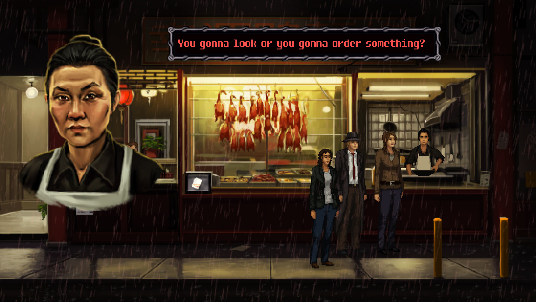
I do. The Monkey Island example is substantially less "realistic" in VGA than EGA. That didn't have to happen. Look at the upcoming Unavowed, for instance:
ce1e0c783a0bb27cd5302c78f1db8567ac84c170fb0e332b89e01c035e4c94e5.jpg
Much more lifelike and detailed than the BT remasters without lapsing into airbrushed cartoonishness. Why not do it like that?
 

Mightmagic

Augur
Joined
Oct 29, 2013
Messages
118
I don't think I was trying to say what you think I was.
I do. The Monkey Island example is substantially less "realistic" in VGA than EGA. That didn't have to happen. Look at the upcoming Unavowed, for instance:
ce1e0c783a0bb27cd5302c78f1db8567ac84c170fb0e332b89e01c035e4c94e5.jpg
Much more lifelike and detailed than the BT remasters without lapsing into airbrushed cartoonishness. Why not do it like that?
screenshot of TBT 3

e1fc12947afeacc6a058ce30677dd3de.jpg


i don't think it's realistic. The design of monsters was cartoonish
 

getter77

Augur
Joined
Oct 12, 2008
Messages
871
Location
GA, USA
Art change is solid enough, would've preferred them tossing a sack of cash at the Shrine of Orm lead/artist to do it their way, but still.
 

Gord

Arcane
Joined
Feb 16, 2011
Messages
7,049
They've definitely taken some liberties with the style, and made it look more cartoonish. In the original they look like people, or at least as close as you can reasonably get with 100x100 pixels.

Hmm, just like real people you say...

9ff8304ecfa6fbf519f8a7aecf2f61d8_original.png


Not so sure it's so simple, actually. At the least original Bards Tale was somewhat inconsistent there already.
Anyway, I think what we see in the Remasters is what can realistically be expected without blowing the budget out of proportions for a side-project like this.
And within these limitations, it's quite decent, imho.
 

Strange Fellow

Peculiar
Patron
Joined
Jun 21, 2018
Messages
4,241
Steve gets a Kidney but I don't even get a tag.
^Yes, lots of poor choices of words from me ITT. My argument has nothing to do with realism.
I don't think I was trying to say what you think I was.
I do. The Monkey Island example is substantially less "realistic" in VGA than EGA. That didn't have to happen. Look at the upcoming Unavowed, for instance:
ce1e0c783a0bb27cd5302c78f1db8567ac84c170fb0e332b89e01c035e4c94e5.jpg
Much more lifelike and detailed than the BT remasters without lapsing into airbrushed cartoonishness. Why not do it like that?
screenshot of TBT 3

e1fc12947afeacc6a058ce30677dd3de.jpg


i don't think it's realistic. The design of monsters was cartoonish
Note the quotation marks, and the fact that I was talking about a different game. But you're right of course, the monsters were cartoonish, and I didn't mean that they should make it all grimdark. Maybe "detailed" would be a better word. As it is now, I'd say the remasters actually have less detail than the originals. Same goes for the Monkey Island screens. I always figured those old fantasy RPGs were aiming for low-res Larry Elmore-style drawings, not Toy Story. I wish the remaster people thought so too.
 

Invictus

Arcane
The Real Fanboy
Joined
Nov 3, 2013
Messages
2,790
Location
Mexico
Divinity: Original Sin 2
I like it, the style of the series is decidedly something in between the cartoony look of the Might and Magic series and somewhat more serious look of Wizardy
 

As an Amazon Associate, rpgcodex.net earns from qualifying purchases.
Back
Top Bottom