Finished this over the springtime and had some leftover thoughts about it written in Notepad++ in tab
new 27 so it's about time to post them since the successor game is out and all...

While it's a competent non-linear platformer (I refuse to use the wretched MV word for this genre), Blasphemous would be totally unremarkable were it not for its top-notch aesthetics, which I guess is an indicator of the glut of solid+ 2D platform games we're being flooded with these days. HAAK, Batbarian, Dead Cells, Vigil... 15 years ago this would have been a modern classic, now it's just one among many. "The one with the sick graphics", though.
Let's air some grievances first, because once you get past the novelty of playing as a walking traffic cone who refills his health bar by facepalming, it's notable how uninspired Blasphemous' game design is. My eyes were glazing over after the first visit in Albero where every damn retard had some collectibles to pimp. Oh here's a upgrade tree for the sword with all the appropriate downslashes, hit combos etc. available. Oh here are some rosary beads for switchable stat boosts. Oh could you bring some spices(!?) when taking a break from your heretic-bashing. Oh if you come across any remains of Brother Torremolinos of Goatse-infested Opulence can you bring them back here we're missing a thigh bone I think. Oh would you mind picking up any random holy relics you can get your hands on, I'm keeping a catalogue here. Oh by the way the currency we use here is calle FOR FUCKS SAKE LET ME GET ON WITH THE GAME.
There's just too much of this stuff. Maybe I've just grown lazy with the autofilling journals of our time but the sidequests in Blasphemous are a total mess. You pick up a bunch of lookalike relics from the levels and chat with the Albero retards everytime you pass through town, and sometimes an item you have triggers something, sometimes not.
That's a big problem with the game. Another one is uneven level design where you are likely to end up in situations where you can't properly see where the instakill spikes are down below. I mean, a Kierkegaardian leap of faith is thematically fitting in Blasphemous, but still. C'mon.
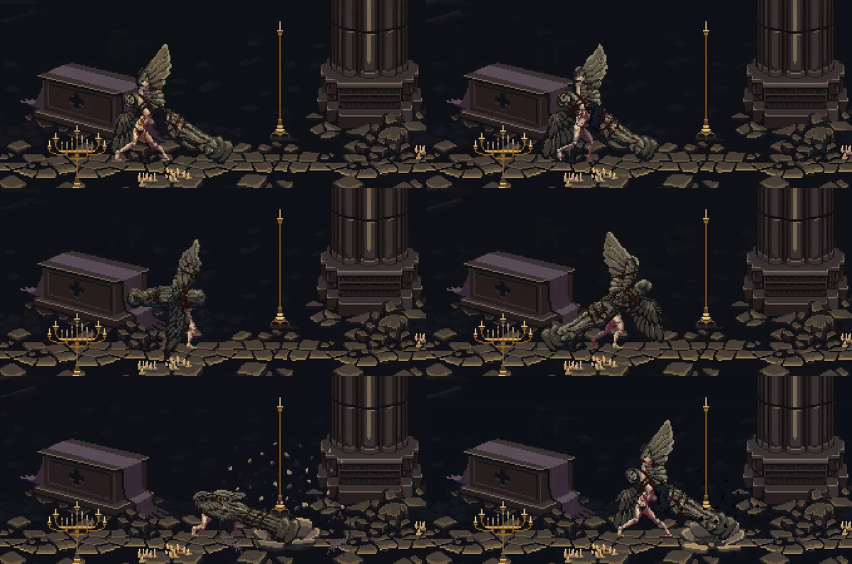
Now, why did I and millions of others play through this via-dolorosa-as-vidya-game? Because the aesthetics are so good, simple as. Take a look at this:
That's a throwaway enemy from the game, one of the very first you see. That's some brilliant animation work. The massive angel statue seems to weigh down on every damn pixel it renders on your computer screen. The impact of the hit, the dent on the ground, the arduousness of her every movement... astonishing. Not all characters or animations are of such high quality, but I think Blasphemous has this distinct look where it's just pure 2D pixel artistry, no outlines, no shaders, nothing superfluous. When you see a screenshot of Blasphemous in action, you recognize it, even if ol' conehead isn't in it.
And it's not just about the pixel animation that sets Blasphemous apart, but the complete thematic and artistic direction in it. The game successfully sells the player character, El Penitente, as being this heretical agent of destruction rampaging through the twisted world of Cvstodia. By the end - at the Crisanta fight to be exact - it feels like YOU are the apocalyptic aggressor and she's the last line of defense, trying to keep you at bay with her desperate yet unwavering attacks. Lots of elements combine to make plenty of memorable scenes throughout the game. They really nailed the overall theme of Catholic horror (although the Grievous Miracle at the core of it behaves more like a capricious djinn than God). I'm not sure if the player character, El Penitente, is intended to be an all-destroying heretic or merely one of many agents acting out the will of the Grievous Miracle in one wicked way or another. The Spanish voiceover is really solid, and adds to the mystique of the game for an illiterate pleb like yours truly. MISTERIOOSOS SONOS LAS STRADAS DE MILAAGROOO-O.
One aspect that gets lost in praise of the graphics is the other side of the audiovisual coin. The level background tracks are generally unremarkable with the occasional flair of a nice flamenco lick but damn, the boss music tracks are something else. There's this very recognizable, distinct drone in all of them that creates an unsettling melancholy mood to these fights. Digging deeper for some lore, the audio designer apparently attempted to build (or print) a hurdy-gurdy himself but it didn't turn out exactly correct so it has this odd tone that's somewhere between a classic hurdy-gurdy and bagpipes. Nevertheless, the devs thankfully went through with it and we got an album's worth of
solid doom metal out of it. When the music and visuals both hit the mark at the same time, Blasphemous is nothing short of glorious. The high point came at the Melquiades fight where the cheekily named boss concept, animation, and music track combine to a very memorable mercykilling of a long-dead archbishop and his eternal funeral procession.


